đŸŒ» Lovelace UI ‱ Minimalist

@tben Already lots of people love your work! :clap:
Why don’t you create a github repository with the cards as generic building blocks? And others enthusiasts with visuals skills like @schumijo could start adding to it!

I could help with the setup if you want, but frontend dev is definitely not my thing unfortunately. That’s why I need something like this where I can just pick the card I want and copy/paste yaml :wink:

Anyway, keep up the good work!

2 Likes

Good Idea @danieldotnl !

I also could help (and even create this repository if needed)

Hi guys :wave: the goal was to share my setup asap. I’ll take care of sharing on Github next week when I return from vacation

5 Likes

FR:
Comme je l’ai dĂ©jĂ  dit : Merci pour le thĂšme et le partage :+1:

Voici une modeste contribution (surtout si c’était dĂ©jĂ  prĂ©sent dans le code :sweat_smile:)

L’ajout par rapport au modĂšle (template) dĂ©jĂ  fournis, est l’utilisation de la clĂ© id afin de combiner plusieurs modĂšle (template) :+1:


EN :
As I said before: Thanks for the theme and sharing :+1:

My small contribution (especially if it was already present in the code :sweat_smile:)

I have added to the template already provided, the id key to merge several template: +1:
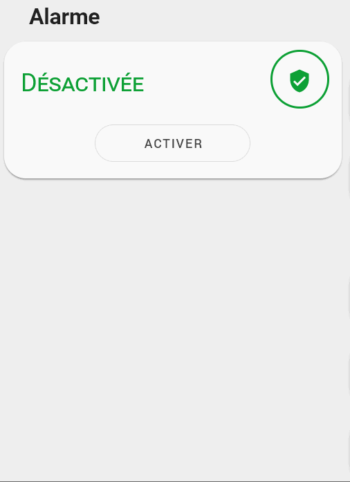

Porte / Door :

#Carte/Card
type: custom:button-card
entity: binary_sensor.porte_cuisine
template:
  - icon_info_bg
  - ouverture_porte
name: Cuisine
#ModĂšle/Template
button_card_templates:
  ouverture_porte:
    template:
      - rouge_on
      - vert_off
    state:
      - icon: mdi:door-open
        label: Porte Ouverte
        id: rouge_on
        value: 'on'
      - icon: mdi:door-closed
        label: Porte Fermée
        id: vert_off
        value: 'off'

FenĂȘtre/Window

#Carte/Card
type: custom:button-card
entity: binary_sensor.fenetre_bureau
template:
  - icon_info_bg
  - ouverture_fenetre
name: Bureau
#ModĂšle/Template
button_card_templates:
  ouverture_fenetre:
    template:
      - rouge_on
      - vert_off
    state:
      - icon: mdi:window-open-variant
        label: FenĂȘtre Ouverte
        id: rouge_on
        value: 'on'
      - icon: mdi:window-closed-variant
        label: FenĂȘtre FermĂ©e
        id: vert_off
        value: 'off'

ModĂšles inclus dans les modĂšles / Templates includes in template (inception :wink: ) :wink:

button_card_templates:
  vert_off:
    state:
      - id: vert_off
        styles:
          icon:
            - color: rgba(var(--couleur-vert),1)
          img_cell:
            - background-color: rgba(var(--couleur-vert), 0.2)
        value: 'off'
  vert_on:
    state:
      - id: vert_on
        styles:
          icon:
            - color: rgba(var(--couleur-vert),1)
          img_cell:
            - background-color: rgba(var(--couleur-vert), 0.2)
        value: 'on'
  rouge_on:
    state:
      - id: rouge_on
        styles:
          icon:
            - color: rgba(var(--couleur-rouge),1)
          img_cell:
            - background-color: rgba(var(--couleur-rouge), 0.2)
        value: 'on'
  rouge_off:
    state:
      - id: rouge_off
        styles:
          icon:
            - color: rgba(var(--couleur-rouge),1)
          img_cell:
            - background-color: rgba(var(--couleur-rouge), 0.2)
        value: 'off'

Edit :
Merci beaucoup, trĂšs jolie
Thank you very much it makes it really pretty:

6 Likes

This will be the next scoop here, looking forward to it.

J’ai retravaillĂ© la carte alarme pour qu’elle colle mieux au dĂ©sign. Je laisse le code pour ceux qui veulent l’amĂ©liorer :+1:

I reworked the alarm card to match the minimalist design. I share the code for those who want to improve it :+1:

type: vertical-stack
cards:
  - card:
      entity: alarm_control_panel.alarme
      states:
        - arm_home
      style:
        .: |
          ha-card > ha-label-badge{
            --alarm-state-color: var(--google-green-500) !important;
          }
          ha-card{
            padding-top: 16px;
            padding-bottom: 12px !important;
            border-radius: 21px;
          }
          ha-card > h1{
             padding-top: 0;
             color: transparent;
          }
          ha-card > h1::before{
             content: "Désactivée";
             color: var(--google-green-500);
             position: absolute;
             font-variant: small-caps;
          }
          #alarmCode{
            display: none;
          }
          #keypad{
            display: none !important;
          }
        '#armActions':
          mwc-button:
            $: |
              #button > span.slot-container{
                color: transparent;
                position: absolute;

              }
              #button{
                width: 150px;
                border-radius: 21px;
              }
              #button > span.slot-container::before{
                color: var(--mdc-theme-primary, #6200ee);
                content: "Activer";
                margin: 0 0 0 50%;
              }
      title: Alarme
      type: alarm-panel
    conditions:
      - entity: alarm_control_panel.alarme
        state: disarmed
    type: conditional
  - card:
      entity: alarm_control_panel.alarme
      states:
        - arm_home
      title: Alarme
      type: alarm-panel
      style:
        .: |
          ha-card > ha-label-badge{
            --alarm-state-color: var(--google-red-500) !important;
          }
          ha-card{
            padding-top: 16px;
            padding-bottom: 12px !important;
            border-radius: 21px;
          }
          ha-card > h1{
             padding-top: 0;
             color: transparent;
          }
          ha-card > h1::before{
             content: "Activée";
             color: var(--google-red-500);
             position: absolute;
             font-variant: small-caps;
          }
        '#armActions':
          mwc-button:
            $: |
              #button > span.slot-container{
                color: transparent;
                position: absolute;    
              }
              #button{
                width: 150px;
                border-radius: 21px;
              }
              #button > span.slot-container::before{
                color: var(--mdc-theme-primary, #6200ee);
                content: "DĂ©sactiver";
                margin: 0 0 0 50%;
              }
        '#keypad':
          mwc-button:
            $: |
              #button{
                border-radius: 12px
              }
    conditions:
      - entity: alarm_control_panel.alarme
        state_not: disarmed
    type: conditional

Il reste a reprendre les couleurs
 Fait
It would be necessary to use the colors of the theme
 Done

6 Likes

this is sexy. many thanks.

Thanks a lot guys !

Sans optimiser le code, voici 2 nouvelles cartes que j’utilise.
Without optimizing templates, 2 cards that I use (like covers).
@tben : correct them if you want, I’m not a designer 


image

image

#templates
button_card_templates:
  list_items_1:
    styles:
      card:
        - box-shadow: none
        - padding: 0px
      grid:
        - grid-template-areas: '"item1"'
        - grid-template-columns: 1fr
        - grid-template-rows: min-content
        - column-gap: 7px
  garage_button:
    variables:
      entity: binary_sensor.default
      name: Default name
      icon: mdi:home
      entity_command: input_boolean.default
    styles:
      card:
        - border-radius: 20px
        - box-shadow: var(--box-shadow)
        - padding: 12px
      grid:
        - grid-template-areas: '"item1" "item2"'
        - grid-template-columns: 1fr
        - grid-template-rows: min-content  min-content
        - row-gap: 12px
    custom_fields:
      item1:
        card:
          entity: '[[[ return variables.entity ]]]'
          name: '[[[ return variables.name ]]]'
          tap_action:
            action: more-info
          template:
            - icon_info
            - ouverture
          state:
            - icon: mdi:garage-open-variant
              value: 'on'
              id: 'on'
              label: Ouvert
            - icon: mdi:garage-variant
              value: 'off'
              id: 'off'
              label: Fermé
          type: custom:button-card
      item2:
        card:
          template: list_items_1
          type: custom:button-card
          custom_fields:
            item1:
              card:
                icon: '[[[ return variables.icon ]]]'
                tap_action:
                  action: call-service
                  service: input_boolean.turn_on
                  service_data:
                    entity_id: '[[[ return variables.entity_command ]]]'
                type: custom:button-card
                template: widget_icon
  portail_close_button:
    variables:
      entity: binary_sensor.default
      name: Default name
      icon: mdi:home
      entity_command: input_boolean.default
    styles:
      card:
        - border-radius: 20px
        - box-shadow: var(--box-shadow)
        - padding: 12px
      grid:
        - grid-template-areas: '"item1" "item2"'
        - grid-template-columns: 1fr
        - grid-template-rows: min-content  min-content
        - row-gap: 12px
    custom_fields:
      item1:
        card:
          entity: '[[[ return variables.entity ]]]'
          name: '[[[ return variables.name ]]]'
          tap_action:
            action: more-info
          template:
            - icon_info
            - ouverture
          state:
            - icon: mdi:gate-open
              value: 'on'
              id: 'on'
              label: Ouvert
            - icon: mdi:gate
              value: 'off'
              id: 'off'
              label: Fermé
          type: custom:button-card
      item2:
        card:
          template: list_items_1
          type: custom:button-card
          custom_fields:
            item1:
              card:
                icon: mdi:arrow-left-bold
                tap_action:
                  action: call-service
                  service: input_boolean.turn_on
                  service_data:
                    entity_id: '[[[ return variables.entity_command ]]]'
                type: custom:button-card
                template: widget_icon
  list_items_2:
    styles:
      card:
        - box-shadow: none
        - padding: 0px
      grid:
        - grid-template-areas: '"item1 item2"'
        - grid-template-columns: 1fr 1fr
        - grid-template-rows: min-content
        - column-gap: 7px
  portail_button:
    variables:
      entity_pieton: input_boolean.default
      entity_voiture: input_boolean.default
      name: Default name
    styles:
      card:
        - border-radius: 20px
        - box-shadow: var(--box-shadow)
        - padding: 12px
      grid:
        - grid-template-areas: '"item1" "item2"'
        - grid-template-columns: 1fr
        - grid-template-rows: min-content  min-content
        - row-gap: 12px
    custom_fields:
      item1:
        card:
          entity: '[[[ return variables.entity ]]]'
          name: '[[[ return variables.name ]]]'
          tap_action:
            action: more-info
          template:
            - icon_info
            - ouverture
          state:
            - icon: mdi:gate-open
              value: 'on'
              id: 'on'
              label: Ouvert
            - icon: mdi:gate
              value: 'off'
              id: 'off'
              label: Fermé
          type: custom:button-card
      item2:
        card:
          template: list_items_2
          type: custom:button-card
          custom_fields:
            item1:
              card:
                icon: mdi:run
                tap_action:
                  action: call-service
                  service: input_boolean.turn_on
                  service_data:
                    entity_id: '[[[ return variables.entity_pieton ]]]'
                type: custom:button-card
                template: widget_icon
            item2:
              card:
                icon: mdi:car
                tap_action:
                  action: call-service
                  service: input_boolean.turn_on
                  service_data:
                    entity_id: '[[[ return variables.entity_voiture ]]]'
                type: custom:button-card
                template: widget_icon
#cards
type: grid
cards:
  - type: horizontal-stack
    cards:
      - type: conditional
        conditions:
          - entity: binary_sensor.door_012
            state: 'off'
        card:
          type: custom:button-card
          variables:
            entity: binary_sensor.door_012
            entity_pieton: input_boolean.portail_pieton_command
            entity_voiture: input_boolean.portail_voiture_command
            name: Portail
          template:
            - portail_button
      - type: conditional
        conditions:
          - entity: binary_sensor.door_012
            state: 'on'
        card:
          type: custom:button-card
          variables:
            entity: binary_sensor.door_012
            entity_command: input_boolean.portail_pieton_command
            name: Portail
          template:
            - portail_close_button
  - type: horizontal-stack
    cards:
      - type: conditional
        conditions:
          - entity: binary_sensor.porte_du_garage
            state: 'off'
        card:
          type: custom:button-card
          variables:
            entity: binary_sensor.porte_du_garage
            entity_command: input_boolean.garage_command
            name: Garage
            icon: mdi:arrow-up-bold
          template:
            - garage_button
      - type: conditional
        conditions:
          - entity: binary_sensor.porte_du_garage
            state: 'on'
        card:
          type: custom:button-card
          variables:
            entity: binary_sensor.porte_du_garage
            entity_command: input_boolean.garage_command
            name: Garage
            icon: mdi:arrow-down-bold
          template:
            - garage_button
columns: 2
square: false

détecteur de fumée / smoke detector

#card:
entity: binary_sensor.smoke_sensor_salon
type: custom:button-card
template:
  - icon_info_bg
  - ouverture
name: Salon
state:
  - icon: mdi:fire
    value: 'on'
    id: 'on'
    label: Incendie !
  - icon: mdi:shield-check
    value: 'off'
    id: 'off'
    label: RAS

Toujours avec l’utilisation des id / Always with id key :

#template
  ouverture:
    template:
      - rouge_on
      - vert_off
    state:
      - label: Ouvert(e)
        id: 'on'
        value: 'on'
      - label: Fermé(e)
        id: 'off'
        value: 'off'

J’aime vraiment le rendu et je suis sĂ»r que @tben tu pourras rendre les cartes encore plus belles :+1:

Edit for bilingual : I really like this theme and I’m sure @tben you can make the cards look even better

4 Likes

Toujours en partant de l’existant, voici pour mes volets somfy :
Modification of the initial code for my somfy shutters :

image

#templates
button_card_templates:
  cover_somfy:
    tap_action:
      action: more-info
    icon: |
      [[[
          var icon = 'mdi:window-shutter';
          if (entity.attributes.current_position == 0){
            var icon = 'mdi:window-shutter';
          } else
            var icon = 'mdi:window-shutter-open';
          return icon ;
      ]]]
    label: |-
      [[[ 
        if (entity.state == 'opening'){
            return 'Ouverture';
        }
        else if (entity.state == 'closing'){
            return 'Fermeture';
        }
        else{
          if (entity.attributes.current_position == 0){
            var etat = "Fermé";
          }else if (entity.attributes.current_position == 100){
            var etat = "Ouvert" ;
          }else{
            var etat = (entity.attributes.current_position) + '%' ;
          }
          return etat ;
        }
      ]]]
    state:
      - styles:
          icon:
            - color: rgba(var(--couleur-vert),1)
          img_cell:
            - background-color: rgba(var(--couleur-vert), 0.2)
        value: closed
      - styles:
          icon:
            - color: rgba(var(--couleur-jaune),1)
          img_cell:
            - background-color: rgba(var(--couleur-jaune), 0.2)
        value: open
      - styles:
          icon:
            - color: rgba(var(--couleur-bleu),1)
          img_cell:
            - background-color: rgba(var(--couleur-bleu), 0.2)
        value: opening
      - styles:
          icon:
            - color: rgba(var(--couleur-bleu),1)
          img_cell:
            - background-color: rgba(var(--couleur-bleu), 0.2)
        value: closing
  list_items_cover_favorite:
    styles:
      card:
        - box-shadow: none
        - padding: 0px
      grid:
        - grid-template-areas: '"item1 item1 item2"'
        - grid-template-columns: 1fr 1fr 1fr
        - grid-template-rows: min-content
        - column-gap: 7px
  cover_buttons_with_favorite:
    variables:
      entity: cover.default
      name: Default name
      sun_position: 0
    styles:
      card:
        - border-radius: 20px
        - box-shadow: var(--box-shadow)
        - padding: 12px
      grid:
        - grid-template-areas: '"item1" "item2"'
        - grid-template-columns: 1fr
        - grid-template-rows: min-content  min-content
        - row-gap: 12px
    custom_fields:
      item1:
        card:
          template: list_items_cover_favorite
          type: custom:button-card
          custom_fields:
            item1:
              card:
                entity: '[[[ return variables.entity ]]]'
                name: '[[[ return variables.name ]]]'
                tap_action:
                  action: more-info
                template:
                  - icon_info
                  - cover_somfy
                type: custom:button-card
            item2:
              card:
                icon: mdi:weather-sunset-down
                tap_action:
                  action: call-service
                  service: cover.set_cover_position
                  service_data:
                    entity_id: '[[[ return variables.entity ]]]'
                    position: '[[[ return variables.sun_position ]]]'
                type: custom:button-card
                template: widget_icon
      item2:
        card:
          template: list_items
          type: custom:button-card
          custom_fields:
            item1:
              card:
                icon: mdi:arrow-down
                tap_action:
                  action: call-service
                  service: cover.close_cover
                  service_data:
                    entity_id: '[[[ return variables.entity ]]]'
                type: custom:button-card
                template: widget_icon
            item2:
              card:
                icon: mdi:pause
                tap_action:
                  action: call-service
                  service: cover.stop_cover
                  service_data:
                    entity_id: '[[[ return variables.entity ]]]'
                type: custom:button-card
                template: widget_icon
            item3:
              card:
                icon: mdi:arrow-up
                tap_action:
                  action: call-service
                  service: cover.open_cover
                  service_data:
                    entity_id: '[[[ return variables.entity ]]]'
                type: custom:button-card
                template: widget_icon
#carte
    type: custom:button-card
    template: cover_buttons_with_favorite
    variables:
      entity: cover.volet_parent
      name: Parents
      sun_position: 13
5 Likes

Pour l’aspirateur / Vacuum :

La carte / edit for bilingual card :

#card
type: custom:button-card
template: aspiro
variables:
  in_progress: Maison
  color: couleur-rouge
entity: script.aspiro_maison
icon: mdi:home
name: Maison
#template
button_card_templates:
  aspiro:
    variables:
      color: default
      in_progress: default
      script: default
    size: 20px
    show_label: true
    label: |
      [[[
        if (states["input_select.vacuum_aspiro_in_progress"].state == variables.in_progress){
            return '💧';
        }
        else if (states["input_select.vacuum_aspiro_last"].state == variables.in_progress){
            return '✔'
        }
      ]]]
    styles:
      card:
        - border-radius: 20px
        - box-shadow: var(--box-shadow)
        - padding: 10px 0px 8px 0px
      grid:
        - grid-template-areas: '"i" "n" "l"'
      name:
        - margin-top: 10px
        - justify-self: center
        - font-weight: bold
        - font-size: 14px
      label:
        - justify-self: center
        - align-self: start
        - font-weight: bolder
        - font-size: 12px
        - filter: opacity(40%)
        - animation: |
            [[[ 
              if (states["input_select.vacuum_aspiro_in_progress"].state == variables.in_progress){
                  return 'blink 0.9s ease infinite';
              }
            ]]]
      icon:
        - color: '[[[ return ''rgb(var(--'' + variables.color + ''))'' ]]]'
      img_cell:
        - background-color: '[[[ return ''rgba(var(--'' + variables.color + ''),0.2)'' ]]]'
        - border-radius: 50%
        - place-self: center
        - width: 42px
        - height: 42px
    tap_action:
      action: call-service
      service: script.turn_on
      service_data:
        entity_id: '[[[return entity.entity_id]]]'
    name: '[[[return entity.entity_id]]]'

Merci / edit for bilingual : Thanks @tben :heart:

5 Likes

Please use the English language for forum posts to be inclusive of the majority and to enable effective moderation.

7 Likes

Come on the guy has been translating everything into English. Bilingual is fine with me.

9 Likes

The replies that were deleted as a result of a moderation request were not bi-lingual. The bi-lingual posts were left as perfectly acceptable.

1 Like

@tom_l
Pour clore cet aparté :
J’ai toujours traduit les informations importantes :wink: pas les politesses. :stuck_out_tongue_winking_eye: :upside_down_face:

To close this digression:
I have always translated important information, not courtesies :upside_down_face: :wink:

La modération est rude ici :face_with_hand_over_mouth:

Moderation is harsh here :face_with_hand_over_mouth:

No worries, I would pay attention the next times.

2 Likes

@clemalex While I appreciate your effort to translate everything, I agree with the moderator. This is an english forum. @tben wrote his initial post in perfect english, so I don’t see what it adds to write your posts bi-lingual. If I start translating my posts in Dutch and someone else in Spanish etc., it becomes a mess.

But let’s not be distracted from the content of this thread which is about a beautiful design. Thank you for the vacuum buttons @clemalex, I was trying to create something like this!

2 Likes

Hi clem, :wave:
It’s nice to see people using the cards for their own use !
Everyone has his own taste but about the color I prefer to use gray when the device is closed or off. I find it less distracting and it allows to draw the eye on other more important elements.
Still on the subject of colors, I used one color per type of device

  • Orange : light and electricity
  • Red : heating
  • Blue : On/off devices
  • Green : exterior

I find that it allows to have a coherence in the whole interface.

Nice work :+1:

4 Likes

Thank you for these explanations, I will apply them!

It is this kind of remark that I was expecting when I said that you could make them even more beautiful


Feel free to explain it in your github :yum: :drooling_face:

:hammer_and_wrench: The Github is in progress :hammer_and_wrench:

2 Likes

It’s perfect :+1: Thanks for explanations :+1:
(yellow when the shutter is moving (electricity consumption)

5 Likes