Hi Thanks, that’s not what I meant though - I’ve already done that step!
Just need to know now how to get the Minimalist dashboard to “force” using Light mode (if that’s even possible) as I prefer to use Dark mode for my other dashboards
is there a master list somewhere of all the card templates e.g. red_on etc? tried looking through both the UI-Minimalist & Button-Card docs but couldn’t find one!
Or some other way of manually (dynamically) changing the icon colour for the Room Entities (little icons)? Trying to get one to change colour to reflect the status of a lock, but it doesn’t seem to work (the icon pic changes, just not the colour!!)


Ok, ive been banging my head on this for hours and cant find the issue. Im sure Ive just missed a small thing somewhere.

Why is it not spaning the whole page?
Why are the nav cards each increasing in size to a point and then the last two are tiny dots?
title: "Home"
path: "home"
cards:
  - type: custom:layout-card
    layout_type: grid
    layout:
      #default
      grid-gap: 1px 1px
      grid-template-columns: 1fr 1fr 1fr 1fr 1fr 1fr
      grid-template-rows: auto
      justify-items: left
      grid-template-areas: |
        "  welcome      welcome      welcome      welcome      welcome      welcome      "
        "  .     devices1     devices2     devices3            .            .            "
        "  person1      person2      .            .            .            .            "
        "  nav1         nav2         nav3         nav4         nav5         nav6         "
        "  nav7         nav8         nav9         .            .            .            "
        "  list1        list2        list3        .            .            .            "
        "  ble          .            .            .            .            .            "
      mediaquery:
        #phone
        "(max-width: 800px)":
          grid-gap: 1px 1px
          grid-template-columns: 1fr 1fr
          grid-template-rows: auto
          grid-template-areas: |
            "  welcome      welcome      "
            "  devices1      devices2     "
            "  devices3      devices3     "
            "  person1       person2       "
            "  nav1             nav2             "
            "  nav3             nav4            "
            "  nav5             nav6            "
            "  nav7             nav8           "
            "  nav9             .                    "
            "  list1             list1             "
            "  list2            list2            "
            "  list3            list3            "
            "  ble              ble              "
Here is my code for the grid.
Each button has its own name
        view_layout:
          grid-column: welcome
What am I doing wrong? 
The under 800px “phone” version is working completely as it should
Sorry, not card templates  don’t know why I wrote that. I meant, Room Entity templates.
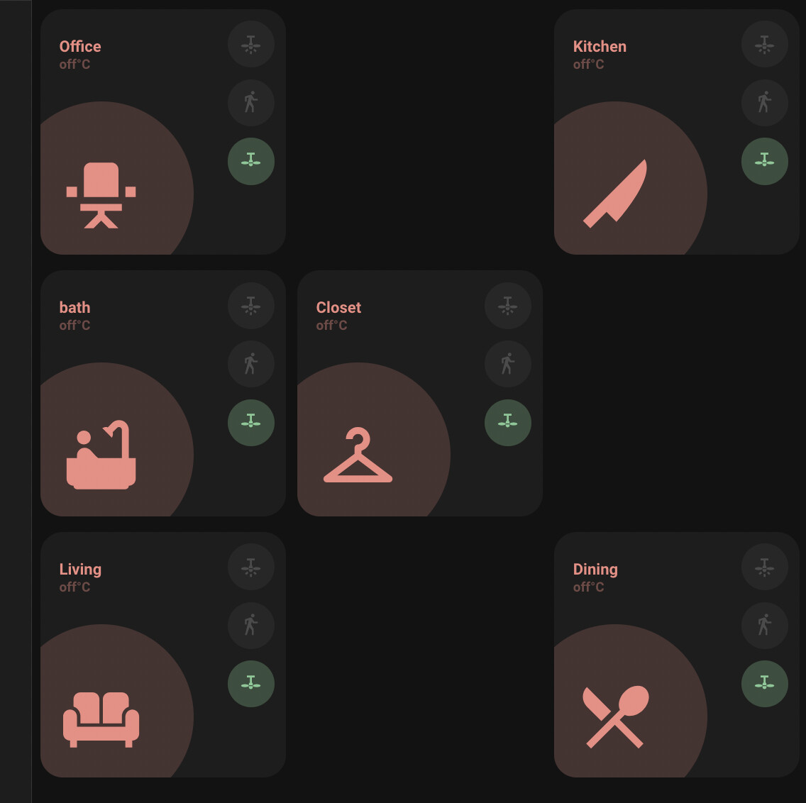
i am trying to do a layout that actually follows the placement of the rooms in the house (since it seemed the most logical way to do room cards). anyhow, i am confused on how to actually lay the cards out in yaml. this is what the layout of our top floor should look like:

and this is the layout code i have:
EDIT: Here is the full code, i know the cards are repetitive, i am just trying to get the layout right
    type: custom:grid-layout
    title: "Home"
    path: home
    layout:

      grid-gap: 2px 2px
      grid-template-columns: 1fr 1fr 1fr;
      grid-template-rows: 1fr 1fr 1fr;
#      grid-template-columns: 33% 33% 33%
#      grid-template-rows: auto
      grid-template-areas: |
        "  office   office   kitchen  "
        "  bath     closet   kitchen  "
        "  living   living   dining   "

    cards:
      - type: 'custom:button-card'
        template:
          - card_room
          - red_no_state
        name: Office
        entity: light.office_light
        icon: mdi:chair-rolling
        tap_action:
          action: navigate
          navigation_path: 'home'
        variables:
          label_use_temperature: true
          label_use_brightness: true
          entity_1:
            entity_id: light.office_light
            templates:
              - yellow_on
            tap_action:
              action: toggle
          entity_2:
            entity_id: binary_sensor.office_motion_sensor_home_security_motion_detection
            templates:
              - blue_on
            tap_action:
              action: none
          entity_3:
            entity_id: fan.office_fan
            templates:
              - green_on
              - red_off
            tap_action:
              action: toggle
        view_layout:
          grid-area: office

      - type: 'custom:button-card'
        template:
          - card_room
          - red_no_state
        name: Kitchen
        entity: light.office_light
        icon: mdi:knife
        tap_action:
          action: navigate
          navigation_path: 'home'
        variables:
          label_use_temperature: true
          label_use_brightness: true
          entity_1:
            entity_id: light.office_light
            templates:
              - yellow_on
            tap_action:
              action: toggle
          entity_2:
            entity_id: binary_sensor.office_motion_sensor_home_security_motion_detection
            templates:
              - blue_on
            tap_action:
              action: none
          entity_3:
            entity_id: fan.office_fan
            templates:
              - green_on
              - red_off
            tap_action:
              action: toggle
        view_layout:
          grid-area: kitchen

      - type: 'custom:button-card'
        template:
          - card_room
          - red_no_state
        name: Dining
        entity: light.office_light
        icon: mdi:silverware
        tap_action:
          action: navigate
          navigation_path: 'home'
        variables:
          label_use_temperature: true
          label_use_brightness: true
          entity_1:
            entity_id: light.office_light
            templates:
              - yellow_on
            tap_action:
              action: toggle
          entity_2:
            entity_id: binary_sensor.office_motion_sensor_home_security_motion_detection
            templates:
              - blue_on
            tap_action:
              action: none
          entity_3:
            entity_id: fan.office_fan
            templates:
              - green_on
              - red_off
            tap_action:
              action: toggle
        view_layout:
          grid-area: dining

      - type: 'custom:button-card'
        template:
          - card_room
          - red_no_state
        name: Living
        entity: light.office_light
        icon: mdi:sofa
        tap_action:
          action: navigate
          navigation_path: 'home'
        variables:
          label_use_temperature: true
          label_use_brightness: true
          entity_1:
            entity_id: light.office_light
            templates:
              - yellow_on
            tap_action:
              action: toggle
          entity_2:
            entity_id: binary_sensor.office_motion_sensor_home_security_motion_detection
            templates:
              - blue_on
            tap_action:
              action: none
          entity_3:
            entity_id: fan.office_fan
            templates:
              - green_on
              - red_off
            tap_action:
              action: toggle
        view_layout:
          grid-area: living

      - type: 'custom:button-card'
        template:
          - card_room
          - red_no_state
        name: Closet
        entity: light.office_light
        icon: mdi:hanger
        tap_action:
          action: navigate
          navigation_path: 'home'
        variables:
          label_use_temperature: true
          label_use_brightness: true
          entity_1:
            entity_id: light.office_light
            templates:
              - yellow_on
            tap_action:
              action: toggle
          entity_2:
            entity_id: binary_sensor.office_motion_sensor_home_security_motion_detection
            templates:
              - blue_on
            tap_action:
              action: none
          entity_3:
            entity_id: fan.office_fan
            templates:
              - green_on
              - red_off
            tap_action:
              action: toggle
        view_layout:
          grid-area: closet

      - type: 'custom:button-card'
        template:
          - card_room
          - red_no_state
        name: bath
        entity: light.office_light
        icon: mdi:bathtub
        tap_action:
          action: navigate
          navigation_path: 'home'
        variables:
          label_use_temperature: true
          label_use_brightness: true
          entity_1:
            entity_id: light.office_light
            templates:
              - yellow_on
            tap_action:
              action: toggle
          entity_2:
            entity_id: binary_sensor.office_motion_sensor_home_security_motion_detection
            templates:
              - blue_on
            tap_action:
              action: none
          entity_3:
            entity_id: fan.office_fan
            templates:
              - green_on
              - red_off
            tap_action:
              action: toggle
        view_layout:
          grid-area: bath
the problem i am having (mostly me not understanding how this works) is that i can’t seem to make the cards span the vertical columns. is there a trick for that?
EDIT: Here is what it ends up looking like:

Great results 
How did you create the Solar Panel card?
And could you share your tapbar? My one is always too big… If you like, you could also share your colors
Try grid-template-rows: auto, or play with this line as this is the issue I think. No issue for me using CM000n’s solution.
thanks, I’ve tried every combination of grid-template-columns and grid-template-rows but it seems that it is something related to the grid-template-areas. as soon as i repeat an area name, things go wonky. for example, this is replacing some areas with . This is the code (excuse all the comment lines as i was trying everything i could think of):
      grid-gap: 2px 2px
      grid-template-columns: 1fr 1fr 1fr;
#      grid-template-rows: 1fr 1fr 1fr;
#      grid-template-columns: 33% 33% 33%
      grid-template-rows: auto
#      grid-template-columns: 33% 33% 33%;
#      grid-template-rows: 33% 33% 33%;
#      grid-template-columns: minmax(150px, 300px) minmax(150px, 300px) minmax(150px, 300px);
#      grid-template-rows: minmax(100px, 200px) minmax(100px, 200px) minmax(100px, 200px);
      grid-template-areas: |
        "  office   .   kitchen  "
        "  bath     closet   .  "
        "  living   .   dining   "
and this is the result
Ok, so then i modify to span the column with this code (i just did office and not others):
      grid-gap: 2px 2px
      grid-template-columns: 1fr 1fr 1fr;
#      grid-template-rows: 1fr 1fr 1fr;
#      grid-template-columns: 33% 33% 33%
      grid-template-rows: auto
#      grid-template-columns: 33% 33% 33%;
#      grid-template-rows: 33% 33% 33%;
#      grid-template-columns: minmax(150px, 300px) minmax(150px, 300px) minmax(150px, 300px);
#      grid-template-rows: minmax(100px, 200px) minmax(100px, 200px) minmax(100px, 200px);
      grid-template-areas: |
        "  office   office   kitchen  "
        "  bath     closet   .  "
        "  living   .   dining   "
and this is the result. the office block does span, but also expands the row. very strange. I must be missing one little thing to make them span correctly.

I’m also getting some weird stuff with the room cards being all different sizes.
I’m definitely no expert LOL! But the room card will force the aspect ratio
looking at the template code
aspect_ratio: "1/1"
so when ever you try to span it leads it being huge. You could try taking it out.
1 Like
And thank you!!! Because seeing your code, I finally had an example that showed me that I was nesting mine.

Finally, needs some fixing, but it spans as it should
type: custom:grid-layout
title: "Home"
path: "home"
layout:
  #default
  grid-gap: 1px 1px
  grid-template-columns: 1fr 1fr 1fr 1fr 1fr 1fr
  grid-template-rows: auto
  justify-items: left
  grid-template-areas: |
    "  welcome      welcome      welcome      welcome      welcome      welcome      "
    "  .     devices1     devices2     devices3            .            .            "
    "  person1      person2      .            .            .            .            "
    "  nav1         nav2         nav3         nav4         nav5         nav6         "
    "  nav7         nav8         nav9         .            .            .            "
    "  list1        list2        list3        .            .            .            "
    "  ble          .            .            .            .            .            "
  mediaquery:
    #phone
    "(max-width: 800px)":
      grid-gap: 1px 1px
      grid-template-columns: 1fr 1fr
      grid-template-rows: auto
      grid-template-areas: |
        "  welcome      welcome      "
        "  devices1     devices2     "
        "  devices3     devices3     "
        "  person1      person2       "
        "  nav1  nav2  "
        "  nav3  nav4  "
        "  nav5  nav6  "
        "  nav7  nav8  "
        "  nav9  .            "
        "  list1        list1        "
        "  list2        list2        "
        "  list3        list3        "
        "  ble          ble          "

cards:
  - type: "custom:button-card"
    template: "card_esh_welcome"
    triggers_update: "input_boolean.minimalist_dropdown"
    variables:
      ulm_card_esh_welcome_collapse: input_boolean.minimalist_dropdown
      ulm_weather: "weather.mascot"
      entity_1:
        nav: "boolean"
        icon: "mdi:gesture-tap-button"
        name: "Boolean"
        color: "blue"
      entity_2:
        nav: "media"
        icon: "mdi:television-classic"
        name: "Media"
        color: "yellow"
      entity_3:
        nav: "network"
        icon: "mdi:network"
        name: Network Stats
        color: "green"
      entity_4:
        nav: "workloads"
        icon: "mdi:nas"
        name: "Workloads"
        color: "purple"
      entity_5:
        nav: "printer"
        icon: "mdi:printer-3d-nozzle"
        name: Printer
        color: "red"
    view_layout:
      grid-column: welcome
If it helps someone
EDIT
But of course! My tablet is doing this… because screw you if you thought it was just going to work buddy!! 

1 Like
that’s definitively it… except… they are using that aspect ratio to control all the icons so it gets distorted when you modify it. guess i am going to have to make my own cards spanning two columns. It took me some time to figure out this layout and i think the cards are all based on grid as well, so it should not be as difficult (i hope)

Is it possible to activate a dynamic scene in the welcome card? I can’t seem to get it to work and pass the additional service_data (dynamic: true) through.
Also is there a way to use button entities? Or are only input_booleans supported?
Since this is a requirement:
button_card_templates: !include_dir_merge_named "custom_components/ui_lovelace_minimalist/__ui_minimalist__/ulm_templates/"
where do we put other button card templates (ex. ones that have nothing to do with UI Minimalist)?
I could create my own yaml file and store in it in a custom subdirectory in the folder above (ex. custom_components/ui_lovelace_minimalist/ui_minimalist/ulm_templates/personal/my_template1.yaml). Just dont know if that’s the recommendation.
Ideally we’d be able to so something like this but it didn’t work:
button_card_templates ui: !include_dir_merge_named "../../custom_components/ui_lovelace_minimalist/__ui_minimalist__/ulm_templates/"
button_card_templates personal: !include "my_templates.yaml"
Put them in config/ui_lovelace_minimalist/custom_cards.
You can put there every template you want and it gets loaded in with that one required line.
It’s not adviced to alter things in the custom_components directory.
Edit: you can also add a yaml file in the custom_cards folder where you include all your other button_card_templates.
1 Like
Could you share your code, please?
Will be putting it up on GitHub this week. Won’t be complete, but good enough to share.
I will warn you though, the code isn’t polished, I’m sure there will be many ways to make it more efficient 
3 Likes
Thanks. I am also new here and I try to inspire from other dashboards. Mine isn’t polished enough as yours and I bet over time - we would make it efficient.
Hi guys,
I would like to modify the “custom_card_homeassistant_updates” so that it disappears from the dashboard if no updates are available. Is it possible to have a card conditionally appearing?