🌻 Lovelace UI • Minimalist

Not sure this will work, but please try. :slight_smile: I just don’t know, if the variables are “pushed through” or if they needed to be set. Just try and report back, please. :slight_smile:

# button_card_templates.yaml
room:
  template: icon_info_bg
  entity: "[[[ return variables.entity; ]]]"
  styles:
    name:
      - color: "[[[ if (variables.image != null) ? 'white' : return 'var(--primary-text-color)'; ]]]"
    label:
      - color:  "[[[ if (variables.image != null) ? 'white' :  ''; ]]]"
    icon:
      - color: "[[[ if (variables.image != null) ? 'white': 'rgba(var(--color-theme),0.2)'; ]]]"
    img_cell:
      - background-color: "[[[ if (variables.image != null) ? 'rgba(255,255,255,0.5)' :'rgba(var(--color-theme),0.05)'; ]]]"
    card:
      - background-blend-mode: multiply
      - background: "[[[ if (variables.image != null) ? 'center / cover url(' + variables.image + ') rgba(0, 0, 0, 0.5)' : ''; ]]]"
# your view, eg "home"
- type: custom:button-card
  template: room
  variables:
    image: path-to-your-image
    entity: "Your entity"
  tap_action:
    action: navigate
    path: path-to-your-page
  name: "Your name"
  label: "Your label"

Short notes: I moved the tap_action from the template definition to your view, as it is more complicated to work with variables and this is the “better way”. I shortened the code as well, where possible. And I changed/deleted some variables, they are not needed (at least I think). :slight_smile:

If this will not work, we need to adjust your button_card_template.yaml, but I wouldn’t advise that. It makes updating and maintenance a nightmare… :wink: If that would be the case, I’d advise you wait, there’s something in the making, that would handle such cases. :slight_smile: Or if you don’t want to wait, I’d advise to inherit the definition, like your_room -inherits-> room -inherits-> icon_info_bg.

Kitties rule! :grin:

Bild

Bild

9 Likes

Thank you, just letting you know I will try when I am back. Will report back :grinning:

1 Like

@tpx01 I tried using your posted settings and editing out the double ‘widget_temperature’ as @manuel_R stated, but I’m just getting blank info in the card.

Screenshot 2021-09-17 163015
Screenshot 2021-09-17 163453

You’re setting the entity in the wrong place. :wink:

What you do:

- type: custom:button-card
  entity: "climate.ac_only"
  name: AC only

What you need to do:

- type: custom:button-card
  variables:
    entity: "climate.ac_only"
    name: AC only

WIth this template you can set the entity only as a variable, but not as entity in the card itself. This has to do with the internal handling. :slight_smile:

Oh that worked. Thanks so much!

1 Like

Thank you @tben for doing the hard work of designing the themes and overall layout of the button cards. I really love it–exactly what I was looking for a mobile phone theme. I was able to follow your well designed button card templates and create some customized versions like a 5-button media player card! Also, button-card uses less system resources than mini-media-player, so my underpowered, $20 Android phones no longer struggle when rendering the HA dashboard.

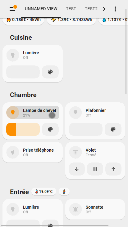
Also created an Energy View that shows some statistics, but mainly is an easy way to see what energy is being used in the house and quickly turn them off.

5 Likes

good evening could you share your configuration? thank you

it is pretty messy so I can’t share it right now, but let me know what button card you are interested in using and I can share the config for that.

i love your 5 button card music

i had to create two button card templates: list_five_items and media_five_buttons. Hopefully it makes sense. I also made another template called media_five_buttons_only that removes the top row that normally shows the icon/picture and info. If you want to learn more of how this works, I would read about CSS grids.

  list_five_items:
    styles:
      card:
        - box-shadow: none
        - padding: 0px
      grid:
        - grid-template-areas: '"item1 item2 item3 item4 item5"'
        - grid-template-columns: 1fr 1fr 1fr 1fr 1fr
        - grid-template-rows: min-content
        - column-gap: 7px
  media_five_buttons:
    variables:
      entity: media_player.speakers
      name: Default name
    styles:
      card:
        - border-radius: var(--border-radius)
        - box-shadow: var(--box-shadow)
        - padding: 12px
      grid:
        - grid-template-areas: '"item1" "item2"'
        - grid-template-columns: 1fr
        - grid-template-rows: min-content  min-content
        - row-gap: 12px
    custom_fields:
      item1:
        card:
          entity: '[[[ return variables.entity ]]]'
          name: '[[[ return variables.name ]]]'
          tap_action:
            action: more-info
          template:
            - media_mini_album
            - icon_info
          type: custom:button-card
      item2:
        card:
          template: list_five_items
          type: custom:button-card
          custom_fields:
            item1:
              card:
                icon: mdi:power
                tap_action:
                  action: call-service
                  service: media_player.toggle
                  service_data:
                    entity_id: '[[[ return variables.entity ]]]'
                type: custom:button-card
                template: widget_icon
            item2:
              card:
                icon: mdi:pause
                tap_action:
                  action: call-service
                  service: media_player.media_play_pause
                  service_data:
                    entity_id: '[[[ return variables.entity ]]]'
                type: custom:button-card
                template: widget_icon
            item3:
              card:
                icon: mdi:skip-next
                tap_action:
                  action: call-service
                  service: media_player.media_next_track
                  service_data:
                    entity_id: '[[[ return variables.entity ]]]'
                type: custom:button-card
                template: widget_icon
            item4:
              card:
                icon: mdi:volume-minus
                tap_action:
                  action: call-service
                  service: media_player.volume_down
                  service_data:
                    entity_id: '[[[ return variables.entity ]]]'
                type: custom:button-card
                template: widget_icon
            item5:
              card:
                icon: mdi:volume-plus
                tap_action:
                  action: call-service
                  service: media_player.volume_up
                  service_data:
                    entity_id: '[[[ return variables.entity ]]]'
                type: custom:button-card
                template: widget_icon
  media_five_buttons_only:
    variables:
      entity: media_player.speakers
      name: Default name
    styles:
      card:
        - border-radius: var(--border-radius)
        - box-shadow: var(--box-shadow)
        - padding: 12px
      grid:
        - grid-template-areas: '"item2"'
        - grid-template-columns: 1fr
        - grid-template-rows: min-content
        - row-gap: 12px
    custom_fields:
      item2:
        card:
          template: list_five_items
          type: custom:button-card
          custom_fields:
            item1:
              card:
                icon: mdi:power
                tap_action:
                  action: call-service
                  service: media_player.toggle
                  service_data:
                    entity_id: '[[[ return variables.entity ]]]'
                type: custom:button-card
                template: widget_icon
            item2:
              card:
                icon: mdi:pause
                tap_action:
                  action: call-service
                  service: media_player.media_play_pause
                  service_data:
                    entity_id: '[[[ return variables.entity ]]]'
                type: custom:button-card
                template: widget_icon
            item3:
              card:
                icon: mdi:skip-next
                tap_action:
                  action: call-service
                  service: media_player.media_next_track
                  service_data:
                    entity_id: '[[[ return variables.entity ]]]'
                type: custom:button-card
                template: widget_icon
            item4:
              card:
                icon: mdi:volume-minus
                tap_action:
                  action: call-service
                  service: media_player.volume_down
                  service_data:
                    entity_id: '[[[ return variables.entity ]]]'
                type: custom:button-card
                template: widget_icon
            item5:
              card:
                icon: mdi:volume-plus
                tap_action:
                  action: call-service
                  service: media_player.volume_up
                  service_data:
                    entity_id: '[[[ return variables.entity ]]]'
                type: custom:button-card
                template: widget_icon
3 Likes

thanks you :+1:

Hi,

I am trying to create a popup inspired by this design to control light brightness and color.
But I have a problem with text that display brightness which is not refreshed (when used outside of popup it works correctly)
Can someone help me ?

Code :

popup_light:
  template: popup_3_items
  custom_fields:
    item1:
      card:
        type: custom:button-card
        template: header_popup
        icon: mdi:lightbulb
        name: Lumière
        show_label: none
        styles:
          icon:
            - color: var(--color-theme)
    item2:
      card:
        type: custom:state-switch
        entity: hash
        default: color
        states:
          brightness:
            type: custom:button-card
            styles:
              grid:
                - grid-template-areas: '"item1"'
                - grid-template-columns: 1fr
                - grid-template-rows: min-content
              card:
                - background: none
                - box-shadow: none
                - padding: 4%
              custom_fields:
                item2:
                  - background-color: blue
                  - border-radius: 12px
                  - position: absolute
                  - left: 64%
                  - top: >
                      [[[
                        var bri = states[variables.entity].attributes.brightness;
                        return Math.round(bri ? (80-(72*bri/256)) : '80') + '%';
                      ]]]
                  - height: 25px
                  - width: 45px
                  - font-size: 11px
                  - line-height: 25px
                  - color: white
            custom_fields:
              item1:
                card:
                  type: "custom:slider-card"
                  entity: "[[[ return variables.entity ]]]"
                  radius: 20px
                  rotate: 270
                  containerHeight: 320px
                  width: 250px
                  height: 100px
                  top: 100px
                  left: 17%
                  thumbHorizontalPadding: 0px
                  thumbWidth: 0px
                  mainSliderColor: rgba(var(--color-theme),0.1)
                  mainSliderColorOff: rgba(var(--color-theme),0.1)
                  secondarySliderColor: var(--color-theme)
                  secondarySliderColorOff: var(--color-theme)
                  card_mod:
                    style: |
                      ha-card {
                        background: none !important;
                        box-shadow: none !important;
                      }
                      .off {
                        border: 1px solid rgba(var(--color-theme),0.3) !important;
                      }
                      .on {
                        border: 1px solid rgba(var(--color-theme),0.3) !important;
                      }
              item2: >
                [[[
                  var bri = states[variables.entity].attributes.brightness;
                  return Math.round(bri ? (bri/256*100) : '0') + '%';
                ]]]
          #####
          color:
            type: custom:light-entity-card
            entity: "[[[ return variables.entity ]]]"
            persist_features: true
            brightness: false
            color_temp: false
            white_value: false
            hide_header: true
            effects_list: false
            card_mod:
              style: |
                ha-card {
                  background: none !important;
                  box-shadow: none !important;
                  padding: 0 0 20px 0 !important;
                }
    item3:
      card:
        type: custom:button-card
        template: list_2_buttons
        custom_fields:
          item1:
            card:
              icon: "mdi:lightbulb-on"
              name: LuminositĂŠ
              type: "custom:button-card"
              template: action_button
              tap_action:
                action: navigate
                navigation_path: "#brightness"
              styles:
                icon:
                  - color: var(--color-theme)
          item2:
            card:
              icon: "mdi:palette"
              name: Couleur
              type: "custom:button-card"
              template: action_button
              tap_action:
                action: navigate
                navigation_path: "#color"
              styles:
                icon:
                  - color: var(--color-theme)

7 Likes

Thank you for sharing! This ticks all the boxes I need. I just got into home assistant and had to port this to the updated version on the github page. I changed my template slightly because when the fan was Off the service buttons still had darker colors, and I think I want them more dimmed in this state.

fan_off
fan_on

Dark mode in the picture below. Not sure if I like how it looks with the blue background on row 1, or if blue should be the bg color for the entire card.

fan_dark_mode

Also, big kudos for @tben for doing all the work to get us this far. This style looks amazing and deserves to be the HA default one :grinning: Hopefully it will be added to HACS soon :pray:

3 Likes

This, unfortunately, turns out to be harder than thought… As this is theoretically not a theme, nor an integration, it doesn’t really fit into the system HACS requires… But we’ll see what we can come up with. :slight_smile:

2 Likes

What happens, if you leave the “wrong” percentage display for a few seconds? Does it update then, or does it stay with the wrong number “forever”?

If the first, I’d guess the updates of the state aren’t handled through to the card. I’d ty to use triggers_update to specifically mark the light entity, or even better, all.

Please try to leave the popup open for at least a minute. Button-card refreshes automatically every minute, so worst case should be, that after that minute the update is handled.

If the latter is the case, we’d need to investigate further. :woozy_face: But my guess is on the handling of updated state attributes inside button-card, as you say without the popup it works. On the other hand it could be browser-mod (or are you using something different for the popup?). We’ll see, please try the above mentioned. :slight_smile:

Popup not refreshed even if I wait one minute.
I also think the problem is linked with browser-mod.

Hmmm, that’s unfortunate. I’m not using browser-mod myself, have it installed but never really got it, and want to uninstall it “for ages”…

I just took a short look in the repo of browser-mod, there seems to be nothing “sticking out” in case of not updated entities.

On thinking further about it, does the real state for the brightness (checked in developer-tools) change? Or does this stay at 29% as well?

can you share your Fan Config? :slight_smile:

It changes. Everything works fine except the display that is not refreshed.