I tried that, but then would the template:edge screw things up.
But when I looked closer at the grid card, I saw that it defaults to «square: true». Adding square: false fixed all the extra spacing
- type: grid
  square: false
  cards:
I ended up setting a couple of different conditional cards.
And probably more as I find myself needing a button quick
1 Like
Nitram
December 9, 2021, 7:33pm
601
Can you share how you use auto-entities in combination with generic cards with sensors (optionally in a horizontal-stack card?)
panhans
December 9, 2021, 8:12pm
602
For me the theme doesnt hide the header / app-toolbar. I have card-mod installed and it works for other cards. Is there another trick to make the header disapear?
I think i had to add this to the theme:
  card-mod-root: |
    app-toolbar {
      display: none;
    }
minimalist-mobile:
  # Journal
  state-icon-color: 'rgb(var(--color-theme))'
  border-radius: '20px'
  error-color: 'var(--google-red)'
  warning-color: 'var(--google-yellow)'
  success-color: 'var(--google-green)'
  info-color: 'var(--google-blue)'
  divider-color: 'rgba(var(--color-theme),.12)'
  accent-color: 'var(--google-yellow)'
  card-mod-theme: minimalist-mobile
  card-mod-root: |
    app-toolbar {
      display: none;
    }
1 Like
I have these two sensors set up to be shown in my navigation card. But somehow one of the sensors are centered. Both cards have the same template, so I’ guessing it must be something with the sensor. But I can’t see what?
- platform: template
  sensors:
    climate:
      value_template: "{{ states.climate.vent_vsr500.attributes.temperature }}°C <br> {{ states.input_select.modus_vtr.state }}"

- platform: template
  sensors:
    door_and_alarm:
      friendly_name: "Dør og alarm"
      icon_template: "mdi:shield"
      value_template: >
        {% if (is_state('input_boolean.lock', 'off') and is_state('alarm_control_panel.sector_alarmpanel_01232552', 'armed_away'))%}
          Dør låst. <br>Alarm aktivert
        {% elif (is_state('input_boolean.lock', 'off') and is_state('alarm_control_panel.sector_alarmpanel_01232552', 'disarmed'))%}
          Dør låst. <br>Alarm deaktivert
        {% elif (is_state('input_boolean.lock', 'on') and is_state('alarm_control_panel.sector_alarmpanel_01232552', 'disarmed'))%}
          Dør ulåst. <br>Alarm deaktivert
        {% elif (is_state('input_boolean.lock', 'on') and is_state('alarm_control_panel.sector_alarmpanel_01232552', 'armed_away'))%}
          Dør ulåst. <br>Alarm aktivert
        {%else%}
          Utilgjengelig
        {%endif%}
Template:
navigation_card_with_sensor:
  #triggers_update: all
  color: var(--google-grey)
  show_icon: true
  show_label: true
  show_name: true
  styles:
    icon:
      - color: 'rgba(var(--color-blue),1)'
    label:
      - justify-self: start
      - align-self: start
      - font-weight: bold
      - font-size: 12px
      - filter: opacity(40%)
      - margin-left: 12px
      - color: 'rgba(var(--color-blue-text),1)'
    name:
      - align-self: end
      - justify-self: start
      - font-weight: bold
      - font-size: 14px
      - margin-left: 12px
      - color: 'rgba(var(--color-blue-text),1)'
    state:
      - justify-self: start
      - align-self: start
      - font-weight: bold
      - font-size: 12px
      - filter: opacity(40%)
      - margin-left: 12px
    img_cell:
      - background-color: 'rgba(var(--color-blue), 0.2)'
      - border-radius: 50%
      - place-self: center
      - width: 42px
      - height: 42px
    grid:
      - grid-template-areas: '"i n" "i l"'
      - grid-template-columns: min-content auto
      - grid-template-rows: min-content min-content
    card:
      - border-radius: var(--border-radius)
      - box-shadow: var(--box-shadow)
      - padding: 12px
      - background-color: 'rgba(var(--color-background-blue), var(--opacity-bg))'
  size: 20px
  name: '[[[ return variables.navigate_name ]]]'
  label: '[[[ return states[variables.navigate_sensor].state ]]]'
  tap_action:
    action: navigate
    navigation_path: '[[[ return variables.navigate_path ]]]'
panhans
December 9, 2021, 8:57pm
605
Have it like this. Reload themes and apply but no success.
petro
December 9, 2021, 9:07pm
606
It’s more about the logic applied in the cards. I was mainly speaking to the thread owner. One example off the top of my head is the battery card doesn’t support binary_sensor batteries. Also the logic behind the percentage icon can be greatly reduced
3 Likes
I was thinking of changing the battery card a bit, to let me know if something is charging.
How can I have this check if sensor.andre_sin_ipad_battery_state = charging instead of entity.state = unavailable?
  custom_fields:
    notification: >
      [[[
        if (entity.state =='unavailable'){
          return `<ha-icon icon="mdi:exclamation" style="width: 12px; height: 12px; color: var(--primary-background-color);"></ha-icon>`
        }
      ]]]
I’ve tried a couple of things but I’m just getting thrown errors
sergio_pt
December 9, 2021, 10:38pm
608
Still optimising, but very happy
6 Likes
Depechie
December 9, 2021, 11:15pm
609
@sergio_pt what media card is that? Looks great!
panhans
December 10, 2021, 7:45am
611
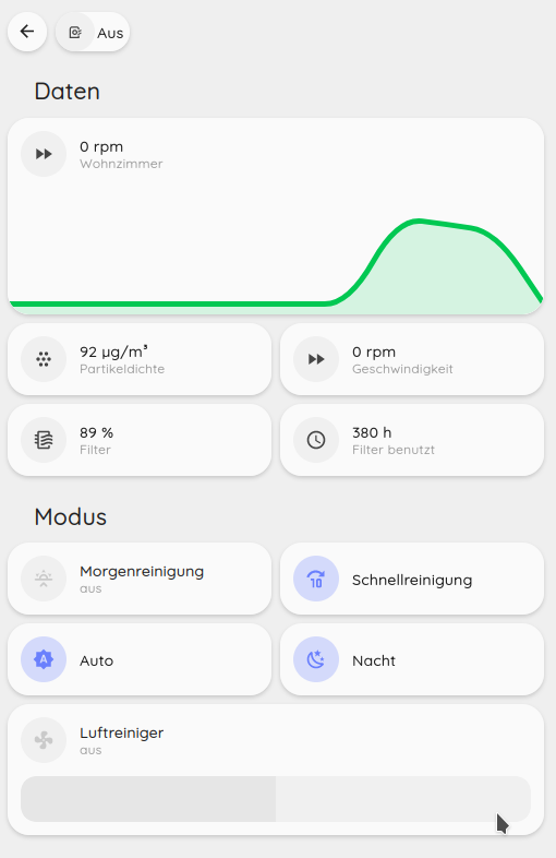
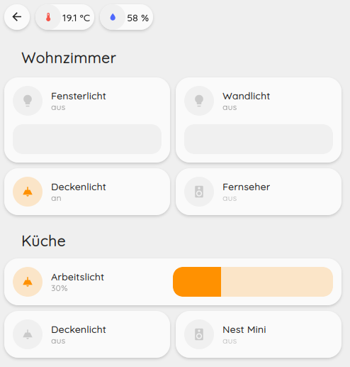
Just, want to share my UI. I worked on some custom chip cards and some room cards with indicators for media, tv and light.
7 Likes
Depechie
December 10, 2021, 8:23am
613
Also super nice!! How did you do that weather one?
The custom cards look very Nice, could you share them? Mainly Interested in the weather & room card.
panhans
December 10, 2021, 9:10am
615
Weather card is only simple-weather-cards (HACS) with some styling:
type: custom:simple-weather-card
entity: weather.dwd_weather_entity
style: |
  ha-card {
    box-shadow: var(--box-shadow) !important;
    border-radius: var(--border-radius) !important;
    padding: 12px !important;
  }
primary_info:
  - extrema
  - humidity
  - precipitation_probability
secondary_info:
  - wind_bearing
  - wind_speed
Room card template:
room:
  template:
    - card_navigate
  triggers_update: all
  custom_fields:
    temp: >
      [[[
        if(variables.room_temperature === '') {
          return "- · -";
        }
        return states[variables.room_temperature].state + "°C · " + states[variables.room_humidity].state + "%";
      ]]]
    notification: >
      [[[
        return `<ha-icon icon="mdi:lightbulb" style="width: 12px; height: 12px; color: var(--primary-background-color);"></ha-icon>`;
      ]]]
    notification2: >
      [[[
          return `<ha-icon icon="mdi:speaker" style="width: 12px; height: 12px; color: var(--primary-background-color);"></ha-icon>`;
      ]]]
    notification3: >
      [[[
          return `<ha-icon icon="mdi:television" style="width: 12px; height: 12px; color: var(--primary-background-color);"></ha-icon>`;
      ]]]
  styles:
    label:
      - justify-self: center
      - align-self: start
      - margin: 8px 0px 0px 0px
    grid:
      - grid-template-areas: '"i" "n" "l" "temp"'
      - grid-template-columns: 1fr
      - grid-template-rows: min-content min-content
    custom_fields:
      notification3:
        - border-radius: 50%
        - position: absolute
        - margin-left: -34px
        - margin-top: -2px
        - height: 16px
        - width: 16px
        - border: 2px solid var(--card-background-color)
        - font-size: 12px
        - line-height: 14px
        - justify-self: center
        - align-self: start
        - display: |
            [[[

              if (variables.room_tv != '' && states[variables.room_tv].state === "playing") {
                return "inline";
              }

              return "none";
            ]]]
        - background-color: rgba(var(--color-red),1)
      notification2:
        - border-radius: 50%
        - position: absolute
        - margin-left: 34px
        - margin-top: 24px
        - height: 16px
        - width: 16px
        - border: 2px solid var(--card-background-color)
        - font-size: 12px
        - line-height: 14px
        - justify-self: center
        - align-self: start
        - display: |
            [[[
              if (variables.room_media != '' && states[variables.room_media].state === "playing") {
                return "inline";
              }

              return "none";
            ]]]
        - background-color: rgba(var(--color-green),1)
      notification:
        - border-radius: 50%
        - position: absolute
        - margin-left: 34px
        - margin-top: -2px
        - height: 16px
        - width: 16px
        - border: 2px solid var(--card-background-color)
        - font-size: 12px
        - line-height: 14px
        - justify-self: center
        - align-self: start
        - display: |
            [[[
              if (variables.room_light != '' && states[variables.room_light].state === "on") {
                return "inline";
              }

              return "none";
            ]]]
        - background-color: rgba(var(--color-yellow),1)
      temp:
        - justify-self: center
        - align-self: start
        - font-weight: bolder
        - font-size: 12px
        - filter: opacity(40%)
Using the room card. When you don’t need a variable simply define an empty string for it e.g. room_media: ‘’
type: custom:button-card
template: room
variables:
  ulm_card_navigate_path: /lovelace-minimalist/esszimmer
  ulm_card_navigate_title: Esszimer
  ulm_card_navigate_icon: mdi:hamburger
  room_light: group.esszimmer_lichter
  room_media: 'media_player.nestmini_esszimmer'
  room_tv: ""
  room_temperature: sensor.wohnzimmer_temperatur
  room_humidity: sensor.wohnzimmer_luftfeuchtigkeit
7 Likes
Yey!
Template:
icon_info_bg_battery:
  color: var(--google-grey)
  show_icon: true
  show_label: true
  show_name: true
  state:
    - value: 'on'
      styles:
        custom_fields:
          notification:
            - border-radius: 50%
            - position: absolute
            - left: 38px
            - top: 8px
            - height: 16px
            - width: 16px
            - border: 2px solid var(--card-background-color)
            - font-size: 12px
            - line-height: 14px
            - background-color: |
                [[[
                  return "rgba(var(--color-red),1)";
                ]]]
  styles:
    icon:
      - color: rgba(var(--color-theme),0.2)
    label:
      - justify-self: start
      - align-self: start
      - font-weight: bold
      - font-size: 12px
      - filter: opacity(40%)
      - margin-left: 12px
    name:
      - align-self: end
      - justify-self: start
      - font-weight: bold
      - font-size: 14px
      - margin-left: 12px
    state:
      - justify-self: start
      - align-self: start
      - font-weight: bold
      - font-size: 12px
      - filter: opacity(40%)
      - margin-left: 12px
    img_cell:
      - background-color: rgba(var(--color-theme),0.05)
      - border-radius: 50%
      - place-self: center
      - width: 42px
      - height: 42px
    grid:
      - grid-template-areas: '"i n" "i l"'
      - grid-template-columns: min-content auto
      - grid-template-rows: min-content min-content
    card:
      - border-radius: var(--border-radius)
      - box-shadow: var(--box-shadow)
      - padding: 12px
    custom_fields:
      notification2:
        - border-radius: 50%
        - position: absolute
        - left: 38px
        - margin-top: 24px
        - height: 16px
        - width: 16px
        - border: 2px solid var(--card-background-color)
        - font-size: 12px
        - line-height: 14px
        - justify-self: center
        - align-self: start
        - display: |
            [[[
              if (variables.lader != '' && states[variables.lader].state === "Charging") {
                return "inline";
              }
                return "none";
            ]]]
        - background-color: rgba(var(--color-green),1)
  custom_fields:
    notification2: |
      [[[
          return `<ha-icon icon="mdi:flash-outline" style="width: 12px; height: 12px; color: var(--primary-background-color);"></ha-icon>`;
      ]]]
  size: 20px


card_battery_with_charging_notification:
  template:
    - icon_info_bg_battery
  triggers_update: all
  hold_action:
    action: more-info
  styles:
    icon:
      - color: 'rgba(var(--color-theme),0.9)'
    label:
      - align-self: end
      - justify-self: start
      - font-weight: bold
      - font-size: 14px
      - margin-left: 12px
      - filter: opacity(100%)
    name:
      - justify-self: start
      - align-self: start
      - font-weight: bolder
      - font-size: 12px
      - filter: opacity(40%)
      - margin-left: 12px
    grid:
      - grid-template-areas: '"i l" "i n"'
      - grid-template-columns: min-content auto
      - grid-template-rows: min-content min-content
  icon: |
    [[[
      var icon = "mdi:help-circle-outline";
      var battery = variables.ulm_card_battery_attribute !== null
        ? states[entity.entity_id].attributes[variables.ulm_card_battery_attribute]
        : states[entity.entity_id].state;

      if (battery == 100) {
        icon = "mdi:battery";
      } else if (battery >= 90) {
        icon = "mdi:battery-90";
      } else if (battery >= 80) {
        icon = "mdi:battery-80";
      } else if (battery >= 70) {
        icon = "mdi:battery-70";
      } else if (battery >= 60) {
        icon = "mdi:battery-60";
      } else if (battery >= 50) {
        icon = "mdi:battery-50";
      } else if (battery >= 40) {
        icon = "mdi:battery-40";
      } else if (battery >= 30) {
        icon = "mdi:battery-30";
      } else if (battery >= 20) {
        icon = "mdi:battery-20";
      } else if (battery >= 10) {
      icon = "mdi:battery-10";
      } else {
        icon = "mdi:battery-outline";
      }

      return icon;
    ]]]
  label: |
    [[[
      var battery = variables.ulm_card_battery_attribute !== null
        ? states[entity.entity_id].attributes[variables.ulm_card_battery_attribute]
        : states[entity.entity_id].state;
      return battery + "%";
    ]]]
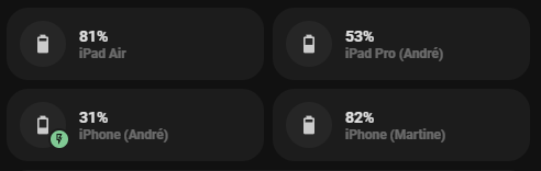
Card:
- type: custom:button-card
  template: card_battery_with_charging_notification
  entity: sensor.andre_sin_ipad_pro_battery_level
  variables:
    ulm_card_battery_attribute: null
    lader: sensor.andre_sin_ipad_pro_battery_state
  name: iPad Pro (André)
10 Likes
sergio_pt
December 10, 2021, 1:23pm
618
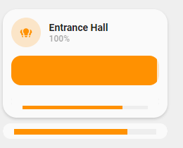
Hi all,
I’m trying to tweak the card_light_slider_collapse template to include a “timer bar component”.
This is the result I have:
Light On with timer:
This is my code:
#################################
#                               #
#         LIGHT PROGRESS        #
#                               #
#################################
card_light_slider_collapse_timer:
  variables:
    ulm_card_light_slider_collapse_name: "[[[ return entity.attributes.friendly_name ]]]"
    timer: "timer.hall_bedroom_timer"
  show_icon: false
  show_name: false
  show_label: false
  triggers_update:
    - "[[[  variables.ulm_card_light_slider_name ]]]"
    - "[[[  entity.entity_id ]]]"
  state:
    - operator: template
      value: "[[[ return entity.state == 'on' ]]]"
      styles:
        grid:
          - row-gap: 12px
        card:
          - background-color: 'rgba(var(--color-background-yellow),var(--opacity-bg))'
  styles:
    grid:
      - grid-template-areas: '"item1" "item2" "item3'
      - grid-template-columns: 1fr
      - grid-template-rows: min-content min-content
    card:
      - border-radius: var(--border-radius)
      - box-shadow: var(--box-shadow)
      - padding: 12px
  custom_fields:
    item1:
      card:
        type: 'custom:button-card'
        variables:
          slider_background_color: 'rgba(0,0,0,0)'
        template:
          - icon_info
          - light
        entity: "[[[ return entity.entity_id ]]]"
        name: "[[[ return variables.ulm_card_light_slider_name ]]]"
        styles:
          card:
            - box-shadow: none
            - border-radius: var(--border-radius) var(--border-radius) 0px 0px
            - padding: 0px
        state:
          - styles:
              card:
                - background: transparent
            value: 'on'
    item2:
      card:
        type: conditional
        conditions:
          - entity: "[[[ return entity.entity_id ]]]"
            state: 'on'
        card:
          type: 'custom:my-slider'
          entity: '[[[ return entity.entity_id ]]]'
          radius: 14px
          height: 42px
          mainSliderColor: rgba(var(--color-yellow),1)
          secondarySliderColor: rgba(var(--color-yellow),0.2)
          mainSliderColorOff: rgba(var(--color-theme),0.05)
          secondarySliderColorOff: rgba(var(--color-theme),0.05)
          thumbHorizontalPadding: '0px'
          thumbVerticalPadding: '0px'
          thumbWidth: 0px
          card_mod:
          style: |
            ha-card {
              border-radius: 14px;
              box-shadow: none;
            }
    item3:
      card:
        type: 'custom:button-card'
        template:
          - yellow
          - ulm_language_variables
        show_name: false
        show_state: false
        show_icon: false
        triggers_update:
          - '[[[ return variables.timer ]]]'
        tap_action:
          action: toggle
        hold_action:
          action: more-info
        custom_fields:
          progress:
            card:
              type: custom:timer-bar-card
              bar_direction: rtl
              entities:
                - '[[[ return variables.timer ]]]'
              full_row: true
              text_width: 0px
              bar_foreground: '#eee'
              bar_background: 'rgba(var(--color-yellow),1)'
              padding: 0px
        styles:
          card:
            - height: | #22px
                [[[
                  if(states[variables.timer].state == 'active'){
                    return '22px';
                  } else{
                    return '0px';
                  }
                ]]]
            - background-color: rgba(255, 255, 240, 0) #'var(--primary-background-color)'
            - padding: 0px !important

            - border-radius: var(--border-radius)
            - border: 0px solid
            - -webkit-border: 0px
            - margin: 0px 0px
            - box-shadow: 0px 0px 0px 0px
          grid:
            - grid-template-areas: '"progress"'
            - grid-template-columns: auto
            - grid-template-rows: 22px
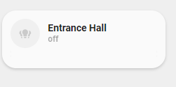
And this is the card usage in Lovelace:
                  - type: 'custom:button-card'
                    template: card_light_slider_collapse_timer
                    variables:
                      ulm_card_light_slider_collapse_name: Entrance Hall
                      timer: timer.hall_entrance_timer
                    entity: light.hall_group
It really doesn’t look that great. But what do you guys think?
3 Likes
rphlwnk
December 10, 2021, 2:45pm
619
Check if the value for card-mod-theme: is set correctly - see this github issue for details: Theme: hide app-toolbar with card-mod issue · Issue #47 · UI-Lovelace-Minimalist/UI · GitHub
1 Like
panhans
December 10, 2021, 4:14pm
620
Yes, it works for the light theme but not the dark. And I am on the dark side. Thats why the issue still exists.


