The security page. Thanks to clemalex for the alarm card mods.

2 Likes
The presence/occupancy page (last one I can post because of this new user media limit but I also have a battery page with an internet monitor and a plant monitor page).

Hello, could you please explain how you have confgured your scenes, because I can’t understand
I love it, more than I dreamed about! 
The github page just looks so smooth and professional.
Since you asked for feedback, I have some:
- fix typo in table headers: exemple → example
- maybe a hint on how to disable the header, as a lot of people will search for it
- when you describe the way you use colors, it’s about when that entity is enabled, right? In disabled state, everything is gray?
- translate the template names into english, so they match the description on github. E.g. pilule → chip, --couleur-vert → color-green etc.
- personally, I’m missing a ‘command card’ that is not related to an entity, but just triggers a service call (I now need to use a random device because it’s required). E.g. to trigger an update of my car data or send the vacuum somewhere.
- Wondering how I can incorporate the new 2021.8 energy stuff in this design…
Amazing, keep up the good work!
1 Like
Hey Daniel, Great feedback! 
I will take them into account and I will correct that when I have time
2 Likes
You can do it with button-card and an automation 

Template’s Back Button of @tben (with witchcraft as @RomRider taught me on another topic from another discussion  )
)
button_card_templates:
  return_button:
    template: pilule
    show_icon: true
    show_name: true
    icon: mdi:arrow-left
    size: 80%
    styles:
      grid:
        - grid-template-areas: '"i"'
    tap_action:
      action: toggle
    entity: input_boolean.back
    name: |
      [[[
       if (entity.state == 'on') {history.back() ;}
      ]]]
automation’s Back Button :
alias: Bouton Retour
description: ''
trigger:
  - platform: state
    entity_id: input_boolean.back
    to: 'on'
condition: []
action:
  - service: input_boolean.turn_off
    target:
      entity_id: input_boolean.back
mode: single
and always the same card :
template: return_button
type: custom:button-card
4 Likes
this is what I was looking for, yes. Where did Romrider describe that? Ive posted in the button-card thread, but didnt yet see a reply to that, maybe I missed it.
So much great job here!
@clemalex , i want to use your Alarm custom card but i need a second button for night mode.
I had it, it works but i don’t know how to change the text for each button “ACTIVER”
Maybe you could help me ?

I’d vote to make this the standard design instead of “Lovelace”.  It is soooo much better.
Oh, and your github page is great, very informative but not overloaded - just like your UI design.
Great work!
2 Likes
Sure

Without any optimization:
type: vertical-stack
cards:
  - card:
      entity: alarm_control_panel.alarme
      states:
        - arm_home
        - arm_away
      style:
        .: |
          ha-card{
            margin-left: 6px;
            margin-right: 6px;
          }
          ha-card > ha-label-badge{
            --alarm-state-color: var(--google-green-500) !important;
          }
          ha-card{
            padding-top: 16px;
            padding-bottom: 12px !important;
            border-radius: 21px;
          }
          ha-card > h1{
             padding-top: 0;
             color: transparent;
          }
          ha-card > h1::before{
             content: "Disabled";
             color: var(--google-green-500);
             position: absolute;
             font-variant: small-caps;
          }
          #alarmCode{
            display: none;
          }
          #keypad{
            display: none !important;
          }
        '#armActions':
          mwc-button:nth-child(1):
            $: |
              #button > span.slot-container{
                color: transparent;
                position: absolute;

              }
              #button{
                width: 150px;
                border-radius: 21px;
              }

              #button > span.slot-container::before{
                color: var(--mdc-theme-primary, #6200ee);
                content: "First";
                margin: 0 0 0 50%;
              }
          mwc-button:nth-child(2):
            $: |
              #button > span.slot-container{
                color: transparent;
                position: absolute;

              }
              #button{
                width: 150px;
                border-radius: 21px;
              }

              #button > span.slot-container::before{
                color: var(--mdc-theme-primary, #6200ee);
                content: "Second";
                margin: 0 0 0 50%;
              }
      title: Alarme
      type: alarm-panel
    conditions:
      - entity: alarm_control_panel.alarme
        state: disarmed
    type: conditional
  - card:
      entity: alarm_control_panel.alarme
      states:
        - arm_home
      title: Alarme
      type: alarm-panel
      style:
        .: |
          ha-card{
            margin-left: 6px;
            margin-right: 6px;
          }
          ha-card > ha-label-badge{
            --alarm-state-color: var(--google-red-500) !important;
          }
          ha-card{
            padding-top: 16px;
            padding-bottom: 12px !important;
            border-radius: 21px;
          }
          ha-card > h1{
             padding-top: 0;
             color: transparent;
          }
          ha-card > h1::before{
             content: "Enabled";
             color: var(--google-red-500);
             position: absolute;
             font-variant: small-caps;
          }
        '#armActions':
          mwc-button:
            $: |
              #button > span.slot-container{
                color: transparent;
                position: absolute;
              }
              #button{
                width: 150px;
                border-radius: 21px;
              }
              #button > span.slot-container::before{
                color: var(--mdc-theme-primary, #6200ee);
                content: "Disable";
                margin: 0 0 0 50%;
              }
        '#keypad':
          mwc-button:
            $: |
              #button{
                border-radius: 12px
              }
    conditions:
      - entity: alarm_control_panel.alarme
        state_not: disarmed
    type: conditional
4 Likes
nowhere 
It’s just a wink I give him when talking about witchcraft.
it showed me that the javascript code could be executed. I then looked for how to take advantage of it to answer your question. Again this morning, I didn’t know it was possible
But I liked the idea so I looked for
A non-basic and diverted use of his fabulous card
maybe we could do without automation.
1 Like
Thanks a lot
1 Like
I love the chips so much that they often don’t fit on my screen 

Is there a way to wrap them to a next line? (I don’t want 2 lines when they do fit on one)
The horizontal-stack doesn’t seem to do this by default.
you can use the swiper card
  - type: custom:swipe-card
#    card_width: '185px'
#    start_card: 6
    parameters:
      simulateTouch: true
      spaceBetween: 8
      preventInteractionOnTransition: true
#      preventClicks: true
#      effect: coverflow
      freeMode: true
    cards:
      - !include /config/lovelace/includes/include_chip_temperature.yaml
      - !include /config/lovelace/includes/include_chip_presence.yaml
      - !include /config/lovelace/includes/include_chip_energy.yaml
      - !include /config/lovelace/includes/include_chip_alarm_clock.yaml
and adapt the parameters to your liking
3 Likes
dont yet understand the history: back command… hmm. how does the name: of the button cause the history to go back?? Or does it set the name, and by clicking the is goes back in history? that would be crafty 
does work indeed… how cool thanks, and to Romrider of course, I’ll post this in button-card, as answer on my own question for reference.
Tnx, but feels like huge overkill just to wrap something 
the swiper card adds the swipe functionality to HA, so it does offer the extra UX. Its more than merely overkill, and kind of nice once you get used to its behavior.
you could probably also wrap them in a grid card, to auto fit and go to the next line. Its what I do with my dynamically created alert buttons
I’ll give it a try, but didn’t you mention that the hold_action doesn’t work? Or did you solve it?

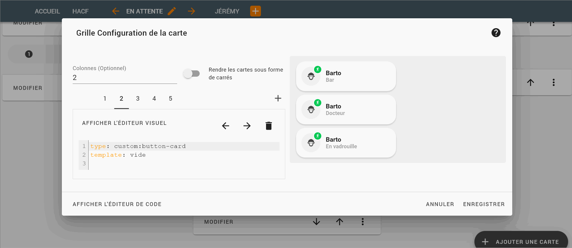
I just saw the vide template.
But there is already a blank card in button-card :


this is not the most important but if you want to keep the template, you might have to add pointer-events property to none :
  vide:
    styles:
      card:
        - background-color: rgba(0,0,0,0)
        - box-shadow: none
        - height: 0px
        - pointer-events: none   #<-- here
3 Likes