You could look into creating a second sensor that always stores the previous value (using an automation, the trigger for when the main sensor changes value will contain the previous value) or retrieve it with a SQL sensor from the DB.
1 Like
Firstly, thanks so much for such a wonderful component. I’ve been meaning to freshen up my switch cards and this has given me the impetus to do it.
Just wondering how people are handling dimmable lights with this card though? I quite like the standard light button with the integrated slider to dim, but would like to have the control and shadow options this custom button card allows.
Thanks
Hi all,
I have a custom field which returns the current weather conditions:
      [[[
        …
        …

        var temp = states['sensor.openweathermap_temperature'].state;

        return `<ha-icon
        icon='${mdi}'
        style='width: 20px; height: 20px; color: var(--text-color-sensor);'>
        </ha-icon>
        <span
        style='color: var(--text-color-sensor); vertical-align: -1px;'>
        ${w} bei ${temp}°C und einer<br>Niederschlagswahrscheinlichkeit von ${nied}%.
        </span>`
      ]]]
I want the temperature to be displayed with 1 digit instead of 2, but having the same problem as described (and resolved) here.
How can I „translate“ the following solution code for use in my custom field?
{{ '%.2f'|format( states('sensor.outside_table_temperature')|float ) }}
@pedolsky I had the same issue and solved this way:
Math.round(states['sensor.openweathermap_temperature'].state * 10) /10 ;
1 Like
OMG… it’s all about brackets’ position…
Thank you so much!

so, solved this by ‘witchcraft’ see 🌻 Lovelace UI • Minimalist - #93 by clemalex where the French connection has been at it  thanks, and posting here for reference:
using this button:
  - type: custom:button-card
    template: button_shortcut_menu
    tooltip: Back
    icon: mdi:arrow-left
    tap_action:
      action: toggle
    entity: input_boolean.back_button
    name: |
      [[[
       if (entity.state == 'on') {history.back() ;}
      ]]]
and an automation on the state of the entity boolean:
automation:

  - alias: Back button
    id: Back button
    mode: single
    trigger:
      platform: state
      entity_id: input_boolean.back_button
      to: 'on'
    action:
      service: input_boolean.turn_off
      target:
        entity_id: input_boolean.back_button
clicking the back button causes the browser to go back in history, way cool indeed. I must confess I dont understand yet how it works, hope Romrider can explain a bit in English in this topic.
Note that I tried it also without automation and the boolean, using only the
    name: |
      [[[
        {history.back() ;}
      ]]]
but that causes a page to automatically go back upon loading, and renders that useless of course though it is funny to see what’s happening
1 Like
Anyone else noticing that button-cards with input_text entities, inside a popup (browser_mod) are not updated when the status has changed? When used on dashboard (so not in popup) the change is reflected instantly as normal. I use input_text entities where I set the states through automations. Just using the simple template, which shows the state on the label field:
label: |
  [[[
    return states['input_text.zigbee_pairing_status'].state;
  ]]]
This works fine on its own, outside of popup. However, inside a popup when the status changes, it doesn’t update it. Closing the popup and then opening it again, shows the new status however. So while viewing the button card inside a popup and changing its state, won’t reflect it.
To be safe, I also added this entity to the main button-card as triggers_update (where the popup is being invoked from using hold_action / fire-dom-event / browser_mod), but that doesn’t help.
Also using this variable doesn’t return the new status in the confirmation, if it has been changed with the popup open. Closing the popup and opening it again, then does return it.
text: |
  [[[
    return "Naam wijzigen naar " + "'" + states['input_text.zigbee_pairing_naam_wijzigen'].state + "'" + "?";
  ]]]
So it seams that at least input_text entities don’t get their status change updated while viewing in browser_mod through popup. I have an other popup view with input_booleans. When changing those (from on to off) it does update it. Using the dev tool for a quick test, confirms this.
Not sure if it’s because it’s a template and templates don’t get updated through popups, or if there is a bug with input_text entities.

Hi,
I was wondering if there is a way to space the buttons out. Right now there is just another button in between with 0% transparency however if you look closely you can see a small shhadow of the card.
I now removed the shadow: However a spacing would be more convenient.
You can use color_type: blank-card
Perfect! Thank you!
Is there a way to make like some sort of dpad so the butoons touch and there is no gap in between them.
Check out stack-in-card (also by RomRider). It allows you to stack cards without any paddings, making them look like one entire card. These are button-cards an a different card entirely under those, all together inside a stack-in-card:

Keep in mind that stack-in-card doesn’t support grid, only vertical and horizontal modes. So if you want to create a grid, you have to nest multiple stack-in-cards in horizontal and vertical mode.
Other way might be using card-mod with a margin variable, but I’m not sure.
Using the name is not optimal (if you want to name the button).
It is better to use a variable 
type: custom:button-card
variables:
back: |
[[[
if (entity.state == 'on') {history.back() ;}
]]]
show_icon: true
icon: mdi:arrow-left
size: 80%
styles:
img_cell:
- width: 24px
card:
- border-radius: 30px
- box-shadow: var(--box-shadow)
- height: 36px
- width: auto
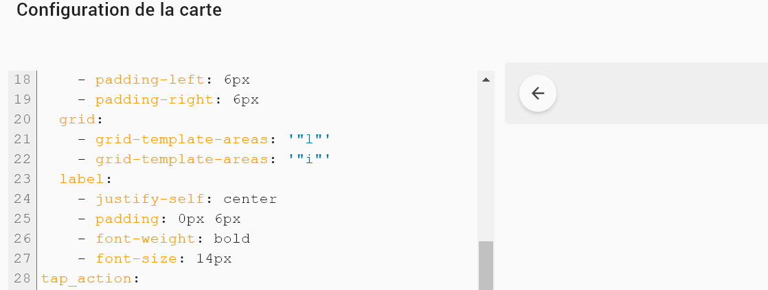
- padding-left: 6px
- padding-right: 6px
grid:
- grid-template-areas: '"l"'
- grid-template-areas: '"i"'
label:
- justify-self: center
- padding: 0px 6px
- font-weight: bold
- font-size: 14px
tap_action:
action: toggle
entity: input_boolean.back
show_name: false
show_state: false
show_label: true
1 Like
right, and for the fun of it I added the forward button too:
  - type: custom:button-card
    template: button_shortcut_menu
    tooltip: Forward
    icon: mdi:arrow-right
    show_name: false
    tap_action:
      action: toggle
    entity: input_boolean.forward_button
    variables:
      next: |
        [[[
         if (entity.state == 'on') {history.forward() ;}
        ]]]

as you can see in my card config, I use tooltip, to hove and display. Thats perfect for all other views, but for these back and forwards, I would love to see the view in the history. Cant find that in inspector, so not sure if at all possible. Would you know of some extra witchcraft?? 
Would you like to share your cat code?
I’ve actually changed my dashboard a lot since then and don’t use any of that any more. As for Cat, it’s actually just the light in the Cat room (where my foster cats live).
My main dashboard looks like this now. Loads more quickly and I can see everything about my home at a glance.

Pity for me. But very nice! Is this tablet view or desktop view?
Is there any way to apply a gradient background-color to a notification field? When I apply the code below, it just goes transparent for the option that should turn gradient. I essentially want the notification field in the top right to be a gradient of green and blue if the result of my entity is ‘both’. All other solid colours work fine, just the gradient that doesn’t.

notification:
          - background-color: >
              [[[
                if (states['[[notification_entity]]'].state === 'on')
                  return "var(--green)";
                if (states['[[notification_entity]]'].state === 'pool')
                  return "var(--blue)";
                if (states['[[notification_entity]]'].state === 'vege')
                  return "var(--green)";
                if (states['[[notification_entity]]'].state === 'both')
                  return 'linear-gradient(90deg, #8AB8A2, #5391AE)';