Try to switch to the desktop theme, in your profile
I had this too… switching to v0.0.4 installed with HACS fixed it for me. What version are you one?
Bingo I was on v0.0.3 as I had just started setting this up a couple of days ago. Updating to v0.0.4 fixed it. Thanks I was going nuts trying to find the issue 
Hey guys,
how can i make these kind of “vertical button”. Like an icon on top and then the text below, not to the right? A little bit like here but not as a sensor but as a button:

Afraid not, no. It seems a bit intermittent. Sometimes it works, but most of the time i either get that error, or no card showing at all. Same with the fan card by @saxel.
Good day. First thank you for sharing this great component.
I’ve installed latest release and I noticed this no longer works: (no pop up)
      - type: "custom:button-card"
        template: card_light
        entity: light.plate01_light_12
        variables:
          ulm_card_light_enable_color: true
          ulm_card_light_force_background_color: true
          ulm_card_light_icon: mdi:ceiling-light-outline
        double_tap_action:
          action: fire-dom-event
          browser_mod:
            command: popup
            title: Popup
            deviceID:
            - this
            card:
              type: entities
              entities:
              - input_boolean.plate01_autoon
              - input_boolean.plate01_autooff
Anyone can recommend a woraround? or just no longer possible.
Thank you.
The card_light has already a pop-up build in. You only have it to enable by setting the variable:
ulm_card_light_enable_popup: true
as stated on the wiki-page: card_light - UI Lovelace Minimalist and popup_light - UI Lovelace Minimalist
Thank you. I did read that and tried it, but it appears to be aimed at controlling the light features.
The popup I’m using is pulling some input booleans.
Ah okay, than you have to create a custom card based on card_light. And specify the double_tap config to each item of the custom_fields, on places where the hold_action is specified.
Otherwise it only works on the border of the card 
custom_fields:
    item1:
      card:
        type: "custom:button-card"
        template:
          - "icon_more_info"
        custom_fields:
          item1:
            card:
              type: "custom:button-card"
              entity: "[[[ return entity.entity_id ]]]"
              icon: "[[[ return variables.ulm_card_light_icon ]]]"
              hold_action:
                action: >
                  [[[
                      if (variables.ulm_card_light_enable_popup){
                        return 'fire-dom-event'
                      }
                      else{
                        return 'more-info'
                      }
                  ]]]
                browser_mod:
                  command: "popup"
                  large: true
                  hide_header: true
                  card:
                    type: "custom:button-card"
                    template: "popup_light_brightness"
                    variables:
                      ulm_popup_light_entity: "[[[ return entity.entity_id ]]]"
              styles:
                icon:
                  - color: >
                      [[[
                          var color = entity.attributes.rgb_color;
                          if (entity.state != "on"){
                            return 'rgba(var(--color-theme),0.2)';
                          }
                          else if (color && variables.ulm_card_light_enable_color){
                            return 'rgba(' + color + ',1)'
                          }
                          else{
                            return 'rgba(var(--color-yellow),1)'
                          }
                      ]]]
                img_cell:
                  - background-color: >
                      [[[
                          var color = entity.attributes.rgb_color;
                          if (entity.state != "on"){
                            return 'rgba(var(--color-theme),0.05)';
                          }
                          else if (color && variables.ulm_card_light_enable_color){
                            return 'rgba(' + color + ',0.2)';
                          }
                          else{
                            return 'rgba(var(--color-yellow),0.2)';
                          }
                      ]]]
          item2:
            card:
              type: "custom:button-card"
              entity: "[[[ return entity.entity_id ]]]"
              name: "[[[ return variables.ulm_card_light_name ]]]"
              hold_action:
                action: >
                  [[[
                      if (variables.ulm_card_light_enable_popup){
                        return 'fire-dom-event'
                      }
                      else{
                        return 'more-info'
                      }
                  ]]]
                browser_mod:
                  command: "popup"
                  large: true
                  hide_header: true
                  card:
                    type: "custom:button-card"
                    template: "popup_light_brightness"
                    variables:
                      ulm_popup_light_entity: "[[[ return entity.entity_id ]]]"
Understand. Thank you for your help.
So I got my slider light card working (I used the auto generated lovelace view). But I cannot make it use the ulm_card_light_slider_collapse_name - it is still using the entity name. Any clues?
  - type: custom:button-card
    template: card_light_slider_collapse
    variables:
         ulm_card_light_slider_collapse_name: Livingroom
    entity: light.living_room_light
card_light_slider_collapse is deprecated
Please look here: card_light - UI Lovelace Minimalist (ui-lovelace-minimalist.github.io)
how did you fix this issue
Question. How do you all navigate between views when using mobile?
I know it’s possible to unhide the toolbar but it does not look native to the Minimalist UI. Besides I’m not sure about placement at the top - lot of stretching. Have any of you played with placement of a IOS like tab bar fixed at the bottom of the viewport? Attached is a quick sketch of a minimal approach. Basically just a styled stripped down version of the toolbar but fixed at the bottom of the view port.
Creating the template is a bit out of reach for me, but perhaps someone else would like a go or have a similar solution in mind?
Although I am an android user I would love to use that. But my skills a limited in copying and editing templates. So if anyone has the skill to do this I would totally appreciate it 

I got that working. But removed it. Could you create a issue on the GitHub repo. With the info and screenshot you just shared. So it’s on our radar m and people can give.  If they like the idea.
Hello all ,
I Love Your this theme and you make HA looking good for Waman … ahaha
I’ve been using this theme from the begening 
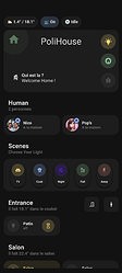
I’ve made two card for my home
The first is a modified version of welcome card from paddy
With this card i try to have a overview of my house : open light or windows or other things

with house State like Ok, Warning or Alert State,
On the right some Icon in the screens it’s light state, if someone is in the house and the last for now is a alert badge but i will put other infos because it’s the same than the general state.
The other Card is the Patio Light button with the hourglass button
It’s a Nested button because my light in the patio is under a Motion detector rule and sometime i need to disable on the fly the motion detector.
Very usefull
I love making this card , i want to make a card for everthing ahah
Vive Home Assistant , Vive Lovelace Minimal !
Can you share the code please?
Thanks, I have missed that. It’s shame, I like that card.
I started using the auto generated yaml mode lovelace. Was not able to make it work in ui-mode

