Hey, would be awesome if you can share the code behind the dashboards & navbar. Maybe also share it on discord server.
Might also be interesting to see if you/we can improve the navbar with your code.
Hey, would be awesome if you can share the code behind the dashboards & navbar. Maybe also share it on discord server.
Might also be interesting to see if you/we can improve the navbar with your code.
This welcome card with scenes was shared earlier in this thread somewhere, for completion here is the code:
UI
- type: custom:button-card
  template: custom_card_welcome_scenes
  variables:
    ulm_custom_card_paddy_welcome_time: sensor.time
    ulm_custom_card_paddy_welcome_weather_provider: weather.nokpan_6
Custom Card:
---
custom_card_welcome_scenes:
  template:
    - ulm_custom_card_paddy_welcome_language_variables
  show_icon: false
  show_name: false
  show_label: false
  styles:
    grid:
      - grid-template-areas: '''item1'' ''item2'' ''item3'' ''item4'''
      - grid-template-columns: 1fr
      - grid-template-rows: min-content min-content
      - row-gap: 12px
    card:
      - border-radius: var(--border-radius)
      - box-shadow: var(--box-shadow)
      - padding: 12px
  custom_fields:
    item1:
      card:
        type: custom:button-card
        show_icon: true
        show_label: true
        show_name: true
        show_entity_picture: true
        entity_picture: |
          [[[
             if (hass.user.name == 'Marnix'){
                return 'https://ehr1jak3csnw0vw3ac9w34o387y1uy6d.ui.nabu.casa/api/image/serve/f21e7210938d206f50bcda9ad649e917/512x512';
             } else if (hass.user.name == 'Lisa'){
                return 'https://ehr1jak3csnw0vw3ac9w34o387y1uy6d.ui.nabu.casa/api/image/serve/0cfc2934d1d03e92c286840954eb4ad4/512x512';
             } else if (hass.user.name == 'admin'){
                return 'https://ehr1jak3csnw0vw3ac9w34o387y1uy6d.ui.nabu.casa/api/image/serve/f21e7210938d206f50bcda9ad649e917/512x512';
             } else if (hass.user.name == 'Yairelis'){
                return 'http://192.168.2.101:8123/api/image/serve/ea60a3981c25a01d39029a1cb5e91505/512x512';
             } else {
                return 'https://www.home-assistant.io/images/home-assistant-logo.svg';
             }
           ]]]
        name: |
          [[[
            let time = states[variables.ulm_custom_card_paddy_welcome_time].state;
            let welcome = '';
             if (time > '18:00'){
              welcome = variables.ulm_custom_card_paddy_welcome_evening;
            } else if (time > '12:00'){
              welcome = variables.ulm_custom_card_paddy_welcome_afternoon;
            } else if (time > '05:00'){
              welcome = variables.ulm_custom_card_paddy_welcome_morning;
            } else {
              welcome = variables.ulm_custom_card_paddy_welcome_hello;
            }
             return welcome + ', ' + user.name + '!';
          ]]]
        styles:
          icon:
            - color: rgba(var(--color-teal),1)
            - width: 42px
          label:
            - justify-self: start
            - align-self: start
            - font-weight: bold
            - font-size: 12px
            - filter: opacity(40%)
            - margin-left: 12px
          name:
            - align-self: start
            - justify-self: start
            - font-weight: bold
            - font-size: 20px
            - margin-left: 12px
          img_cell:
            - background-color: rgba(var(--color-teal),0.2)
            - border-radius: 50%
            - place-self: center
            - width: 42px
            - height: 42px
          grid:
            - grid-template-areas: '"i n"'
            - grid-template-columns: min-content auto
            - grid-template-rows: min-content min-content
          card:
            - box-shadow: none
    item2:
      card:
        type: custom:button-card
        template: card_title_welcome
        name: Scenes
    item3:
      card:
        type: custom:button-card
        template: card_scenes
        styles:
          card:
            - border-radius: none
            - box-shadow: none
            - padding: 12px
        variables:
          entity_1: scene.alles_uit
          entity_2: scene.avond
          entity_3: scene.dag
          entity_4: scene.sfeer
          entity_5: scene.lwp_tv
          name_1: Uit
          name_2: Avond
          name_3: Dag
          name_4: Sfeer
          name_5: LWP
          color_1: red
          color_2: blue
          color_3: green
          color_4: yellow
          color_5: purple
    # item4:
      # card:
        # type: custom:home-feed-card
        # card_id: main_feed
        # show_empty: false
        # more_info_on_tap: true
        # state_color: false
        # compact_mode: true
        # max_item_count: 3
        # show_icons: true
        # entities: |
          # [[[
            # return variables.ulm_custom_card_paddy_welcome_news_entities;
          # ]]]
        # card_mod: null
        # style: |
          # ha-card {
            # border-radius: 14px;
            # box-shadow: none;
            # font-size: 14px;
            # text-align: left;
          # }
card_title_welcome:
  tap_action:
    action: none
  show_icon: false
  show_label: true
  show_name: true
  styles:
    card:
      - background-color: rgba(0,0,0,0)
      - box-shadow: none
      - height: auto
      - width: auto
      - margin-top: '-10px'
      - margin-left: 16px
      - margin-bottom: '-15px'
    grid:
      - grid-template-areas: '''n'' ''l'''
      - grid-template-columns: 1fr
      - grid-template-rows: min-content min-content
    name:
      - justify-self: start
      - font-weight: bold
      - font-size: 20px
    label:
      - justify-self: start
      - font-weight: bold
      - font-size: 1rem
      - opacity: '0.4'
card_scenes:
  show_icon: false
  show_name: true
  show_label: false
  styles:
    grid:
      - grid-template-areas: '''item1 item2 item3 item4 item5'''
      - grid-template-columns: 1fr 1fr 1fr 1fr 1fr
      - grid-template-rows: min-content
      - justify-items: center
      - column-gap: auto
    card:
      - border-radius: var(--border-radius)
      - box-shadow: var(--box-shadow)
      - padding: 12px
  custom_fields:
    item1:
      card:
        type: custom:button-card
        template: card_scenes_pill
        entity: '[[[ return variables.entity_1 ]]]'
        styles:
          icon:
            - color: '[[[ return `rgba(var(--color-${variables.color_1}), 1)`;]]]'
          img_cell:
            - background-color: '[[[ return `rgba(var(--color-${variables.color_1}), 0.20)`;]]]'
        tap_action:
          action: call-service
          service: scene.turn_on
          service_data:
            entity_id: '[[[ return variables.entity_1 ]]]'
    item2:
      card:
        type: custom:button-card
        template: card_scenes_pill
        entity: '[[[ return variables.entity_2 ]]]'
        styles:
          icon:
            - color: '[[[ return `rgba(var(--color-${variables.color_2}), 1)`;]]]'
          img_cell:
            - background-color: '[[[ return `rgba(var(--color-${variables.color_2}), 0.20)`;]]]'
        tap_action:
          action: call-service
          service: scene.turn_on
          service_data:
            entity_id: '[[[ return variables.entity_2 ]]]'
    item3:
      card:
        type: custom:button-card
        template: card_scenes_pill
        entity: '[[[ return variables.entity_3 ]]]'
        styles:
          icon:
            - color: '[[[ return `rgba(var(--color-${variables.color_3}), 1)`;]]]'
          img_cell:
            - background-color: '[[[ return `rgba(var(--color-${variables.color_3}), 0.20)`;]]]'
        tap_action:
          action: call-service
          service: scene.turn_on
          service_data:
            entity_id: '[[[ return variables.entity_3 ]]]'
    item4:
      card:
        type: custom:button-card
        template: card_scenes_pill
        entity: '[[[ return variables.entity_4 ]]]'
        styles:
          icon:
            - color: '[[[ return `rgba(var(--color-${variables.color_4}), 1)`;]]]'
          img_cell:
            - background-color: '[[[ return `rgba(var(--color-${variables.color_4}), 0.20)`;]]]'
        tap_action:
          action: call-service
          service: scene.turn_on
          service_data:
            entity_id: '[[[ return variables.entity_4 ]]]'
    item5:
      card:
        type: custom:button-card
        template: card_scenes_pill
        entity: '[[[ return variables.entity_5 ]]]'
        styles:
          icon:
            - color: '[[[ return `rgba(var(--color-${variables.color_5}), 1)`;]]]'
          img_cell:
            - background-color: '[[[ return `rgba(var(--color-${variables.color_5}), 0.20)`;]]]'
        tap_action:
          action: call-service
          service: scene.turn_on
          service_data:
            entity_id: '[[[ return variables.entity_5 ]]]'
card_scenes_pill:
  show_icon: true
  show_label: false
  show_name: true
  styles:
    grid:
      - grid-template-areas: '''i'' ''n'''
      - grid-template-columns: min-content
      - grid-template-rows: 1fr 1fr
      - row-gap: 12px
      - justify-items: center
      - column-gap: auto
    card:
      - box-shadow: none
      - padding: 5px
      - box-shadow: var(--box-shadow)
      - border-radius: 50px
      - place-self: center
      - width: 52px
      - height: 84px
    icon:
      - color: '[[[ return `rgba(var(--color-theme), 0.20)`;]]]'
      - width: 20px
    img_cell:
      - background-color: '[[[ return `rgba(var(--color-theme), 0.05)`;]]] '
      - border-radius: 50%
      - width: 42px
      - height: 42px
    name:
      - font-weight: bold
      - font-size: 9.5px
      - width: 33px
      - padding-bottom: 7px
    state:
      - color: rgba(var(--color-theme),0.9)
  color: var(--google-grey)
regarding the vacuum card, I still need to do some code cleanup
I can send you the card with background via DM?
Nav bar is a theme someone else created;
---
minimalist-navbar:
  # Journal
  state-icon-color: "rgb(var(--color-theme))"
  border-radius: "20px"
  error-color: "var(--google-red)"
  warning-color: "var(--google-yellow)"
  success-color: "var(--google-green)"
  info-color: "var(--google-blue)"
  divider-color: "rgba(var(--color-theme),.12)"
  accent-color: "var(--google-yellow)"
  card-mod-theme: "minimalist-navbar"

  card-mod-view-yaml: |
    "*:first-child$": |
      #columns .column > * {
        padding-left: 5px;
        padding-right: 5px;
        padding-bottom: 5px;
      }

  # Move navbar
  card-mod-root-yaml: |
    ha-tabs$: |
    .: |
      @media (orientation: portrait) {
        a.menu-link[target="_blank"], ha-button-menu, ha-menu-button, [main-title] {
              display: none !important;
        }
        app-toolbar {
              padding-right: 0px;
              padding-left: 0px;
        }
      }
      app-header {
        top: auto !important;
        bottom: 0 !important;
        transform: unset !important;
        box-shadow: var(--footer-shadow);
      }
      app-toolbar {
        transform: none;
        padding-top:10px !important;
        padding-bottom: 10px !important;
        @include supports-safe-area-insets {
          padding-bottom: calc(env(safe-area-inset-bottom) + 10px) !important;
        }
      }
      #view {
        margin-top: -51px !important;
        @include supports-safe-area-insets {
          margin-top: calc(env(safe-area-inset-top) + 51px) !important;
        }
      }
      ha-tabs {
        --paper-tabs-selection-bar-color: var(--header-tab-indicator-color) !important;
        --mdc-icon-size: 26px;
      }
      paper-tab[aria-selected=true] {
        color: var(--header-active-tab-color) !important;
        background-color: var(--header-active-tab-bg-color) !important

      }
      paper-tab {
        color: var(--header-all-tabs-color) !important;
        border-radius: 50%;
        height:50px;
      }

  # Color themes
  modes:
    light:
      # Header / Footer
      header-active-tab-color: rgba(61, 90, 254, 1) #'var(--google-blue)' #'var(--primary-color)'
      header-active-tab-bg-color: rgba(61, 90, 254, .3)
      header-all-tabs-color: 'var(--paper-item-icon-color)'
      header-tab-indicator-color: 'rgba(0, 0, 0, 0)'
      footer-shadow: 0px -1px 3px 0px rgba(0,0,0,0.12) #0px -0.3px 0.3px 0px rgba(0,0,0,0.12)

      # text
      primary-text-color: "#212121"
      # main interface colors
      primary-color: "#434343"
      google-red: "#F54436"
      google-green: "#01C852"
      google-yellow: "#FF9101"
      google-blue: "#3D5AFE"
      google-violet: "#661FFF"
      google-grey: "#BBBBBB"
      color-red: "245, 68, 54"
      color-green: "1, 200, 82"
      color-yellow: "255, 145, 1"
      color-blue: "61, 90, 254"
      color-purple: "102, 31, 255"
      color-grey: "187, 187, 187"
      color-pink: "233, 30, 99"
      color-theme: "51,51,51"
      color-background-yellow: "250, 250, 250"
      color-background-blue: "250, 250, 250"
      color-background-green: "250, 250, 250"
      color-background-red: "250, 250, 250"
      color-background-pink: "250, 250, 250"
      color-background-purple: "250, 250, 250"
      color-yellow-text: "var(--primary-text-color)"
      color-blue-text: "var(--primary-text-color)"
      color-green-text: "var(--primary-text-color)"
      color-red-text: "var(--primary-text-color)"
      color-pink-text: "var(--primary-text-color)"
      color-purple-text: "var(--primary-text-color)"
      opacity-bg: "1"
      # background and sidebar
      card-background-color: "#FAFAFA"
      primary-background-color: "#EFEFEF"
      secondary-background-color: "#EFEFEF"
      # header
      app-header-text-color: "var(--primary-text-color)"
      app-header-background-color: var( --ha-card-background, var(--card-background-color, white) ) #"var(--primary-background-color)"
      # paper-tabs-selection-bar-color: "var(--primary-text-color)"
      # slider
      slider-color: "rgb(var(--color-blue))"
      slider-bar-color: "rgba(var(--color-blue),0.38)"
      # cards
      box-shadow: "0px 2px 4px 0px rgba(0,0,0,0.16)"
      ha-card-box-shadow: "var(--box-shadow)"
      # sidebar
      sidebar-selected-text-color: "var(--google-red)"
      sidebar-selected-icon-color: "var(--google-red)"
      sidebar-text-color: "#80868b"
      # switch
      switch-checked-color: "var(--google-blue)"
      # media player
      mini-media-player-accent-color: "var(--google-red)"

    dark:
      # Header / Footer
      header-active-tab-color: rgba(61, 90, 254, 1)
      header-active-tab-bg-color: rgba(61, 90, 254, .3)
      header-all-tabs-color: 'var(--paper-item-icon-color)'
      header-tab-indicator-color: 'rgba(0, 0, 0, 0)'
      footer-shadow: 0px -1px 3px 0px rgba(0,0,0,0.12)

      # text
      primary-text-color: "#DDDDDD"
      # main interface colors
      primary-color: "#89B3F8"
      google-red: "#F18B82"
      google-green: "#80C994"
      google-yellow: "#FCD663"
      google-blue: "#89B3F8"
      google-violet: "#BB86FC"
      google-grey: "#BBBBBB"
      color-red: "241, 139, 130"
      color-green: "128, 201, 148"
      color-yellow: "252, 214, 99"
      color-blue: "137, 179, 248"
      color-theme: "221,221,221"
      color-purple: "102, 31, 255"
      color-grey: "187, 187, 187"
      color-pink: "233, 30, 99"
      color-background-yellow: "var(--color-yellow)"
      color-background-blue: "var(--color-blue)"
      color-background-green: "var(--color-green)"
      color-background-red: "var(--color-red)"
      color-background-pink: "var(--color-pink)"
      color-background-purple: "var(--color-purple)"
      color-yellow-text: "var(--color-yellow)"
      color-blue-text: "var(--color-blue)"
      color-green-text: "var(--color-green)"
      color-red-text: "var(--color-red)"
      color-pink-text: "var(--color-pink)"
      color-purple-text: "var(--color-purple)"
      opacity-bg: "0.1"
      # floating button text color
      mdc-theme-on-secondary: "var(--card-background-color)"
      # background and sidebar
      card-background-color: "#1D1D1D"
      primary-background-color: "#121212"
      secondary-background-color: "#121212"
      # header
      app-header-text-color: "var(--primary-text-color)"
      app-header-background-color: "var(--primary-background-color)"
      paper-tabs-selection-bar-color: "var(--primary-text-color)"
      # Sidebar
      sidebar-selected-text-color: "rgb(var(--color-blue))"
      sidebar-selected-icon-color: "rgb(var(--color-blue))"
      # Slider
      slider-color: "rgb(var(--color-blue))"
      slider-bar-color: "rgba(var(--color-blue),0.38)"
      # card
      box-shadow: "none"
      # media player
      mini-media-player-accent-color: "var(--google-blue)"
      # Journal
      state-icon-color: "rgb(var(--color-theme))"
This file should be added in your themes folder
Thank you!
Yes please! 
Is this a mock up or have you actually built it? Are you able to share code if you have, looks incredible!
Sorry ignore, have just seen your replies! If you have the full code that would be awesome 
I’ll clean up some code in the couple of days and will share it later.
Or, if u don’t mind dirty code, I can send it to you via DM?
Hey ya’ll!
So far loving this theme, but I seem to be hitting an odd snag regarding getting the Welcome with Weather card up and running.
I confirmed I have all the dependencies installed, and Lovelace no longer throws the “custom card cannot be found” error, but now it doesn’t appear at all and for some reason the dashboard will refuse to load on my iPhone’s HA app until I remove the lines that include the Welcome card. In fact, it seems to force the app into an infinite reload of sorts.
I have logs open and can’t see anything wrong, and I confirmed the entities I’m feeding to it contain the right data:
views:
  - title: "Home Overview"
    path: 0
    cards:
      - type: "custom:button-card"
        template: "custom_card_paddy_welcome_with_weather"
        variables:
          ulm_custom_card_paddy_welcome_time: sensor.time
          ulm_custom_card_paddy_welcome_weather_provider: weather.accu_weather
My configuration.yaml contains the following (where my themes are)
frontend:
  themes: !include_dir_merge_named themes
and all other cards seem to be working just find aside from the welcome cards  its just odd and a bit frustrating to have just this one card not work.
I believe this custom card is in the right spot too? Just irksome it refuses to show up.
If this isn’t the right place for such a question, please let me know!
From what I read in the new(?) docs, look for ui-minimalist under the config/ directory, and add a new folder for the custom card under the /custom-cards/ folder
It should move the custom templates to the folder declared in the UI-minimalist.YAML file
Hi,
Could you share your configuration for one of these button cards? Icon for Room, for Light, for movement and doors, also temperature. I still trying to build up a card like this. But I’m struggeling with the grids and entities inside…
That would be great… Thank you.
Please read the wiki:
https://ui-lovelace-minimalist.github.io/UI/setup/custom_cards/
How it should look like:
config
└── ui_lovelace_minimalist
    ├── config
    ├── custom_cards
    |   ├── custom_card_1
    |   |   ├── custom_card_1.yaml
    |   |   └── EN.yaml
    |   └── custom_card_2
    |       ├── custom_card_2.yaml
    |       └── EN.yaml
    └── dashboard
And after you have added the custom card so do you have to reload the config under settings.
You can press C and write “UI Lovelace minimalist”
How do you get the ui_lovelace_minimalist
├── config directory? When I download the integration it is not there.
Depends how you installed this theme.
If you used HACS so will it create the folders you need. You can download it manually and make a install that way too.
I recommend you to read the Wiki.
Hi @marvandorth , anyone.
can you think of any reason why the navbar would show incomplete, being to far down?
It also happens with the mobile tap theme.

My issue is there is no config folder under ui_lovelace_minimalist. I installed the theme via HACS.
This is what I currently have:
config
└── ui_lovelace_minimalist
    ├── custom_cards
    |   ├── custom_card_1
    |   |   ├── custom_card_1.yaml
    |   |   └── EN.yaml
    |   └── custom_card_2
    |       ├── custom_card_2.yaml
    |       └── EN.yaml
    └── dashboard
That’s correct. That part in the documentation is a bit outdated. 
My bad… Just copied the file tree from GitHub. Updating the docs for the wiki so it will have correct info. 🤦🏼
Did you get custom card to work?
I have not been able to get the custom card paddy welcome to work. The instructions in the docs tells me to copy the paddy welcome folder to a folder that I do not have.
Copy the folder custom_card_paddy_welcome from your download custom_cards to config/minimalist-templates
Go to the folder config/minimalist-templates/custom_card_paddy_welcome/languages and delete all but the one language file you want to use. For english, delete all but EN.yaml, for german delete all but DE.yaml.
Not sure what is going on but nothing shows up when I input the yaml for the custom card. I don’t receive any mission custom component error on my dashboard either.
Okay, skip the wiki on that card because it haven’t been updated in a while.
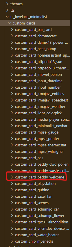
Create a folder in config/ui_lovelace_minimalist/custom_cards/ with name custom_card_paddy_welcome
Copy the files: custom_card_paddy_welcome.yaml and en.yaml to the folder you just created in config/ui_lovelace_minimalist/custom_cards/
Once you have added new custom_cards, you can always reload that folder via Home Assistant and add the new cards to the config. Just go to "Configuration" --> "Settings" in Home Assistant and press the "UI_LOVELACE_MINIMALIST" button within the “YAML configuration reloading” section.
I already had this done. My other custom cards work just not the paddy welcome. Here is my yaml code. Nothing appears for the custom paddy welcome.
views:
  - title: "Home"
    path: home
    cards:
      - type: 'vertical-stack'
        cards:

        # Chips
          - type: horizontal-stack
            cards:
              # Alarm
              - type: 'custom:button-card'
                template: chip_alarm
                entity: alarm_control_panel.ring_alarm
              # Water Leaks
              - type: "custom:button-card"
                template: chip_mdi_icon_state
                variables:
                  ulm_chip_mdi_icon_state_entity: group.water
                  ulm_chip_mdi_icon_state_icon: mdi:water


          # Welcome
          - type: horizontal-stack
            cards:
              - type: 'custom:button-card'
                template: custom_card_paddy_welcome
                variables:
                  ulm_custom_card_paddy_welcome_time: sensor.time