🌻 Lovelace UI • Minimalist

Thanks for that :smiley: ,
I found also a quite similar example to load something in the url() function.
But together pointed me into the right direct to solve for the right syntax as there is not much documentation around for this particular use case.

- background-image: >
          [[[
            return 'linear-gradient(to bottom, rgba(0,0,0,0.3) 0%,rgba(0,0,0,0.8) 100%), url('+ variables.image_path +')'
          ]]]

Did work in my test_card, so I hopes it works in yours too

Thanks for being so helpful!

strange! but no image… :confused:

I have done;

  1. moved the images exactly like you have
  2. checked many times the code…

Please see if you find any mistake!!

my card UI

title: testing room card
theme: minimalist-mobile-tapbar
type: custom:vertical-layout

cards:

###### room card bedroom 1
  - type: horizontal-stack
    cards: 
      - type: 'custom:button-card'
        template: custom_card_room
        name: Bedroom 1
        entity: climate.thermostat_bedroom_1
        icon: mdi:bed-king-outline 
        tap_action:
          action: navigate
          navigation_path: '/lovelace-myhome/011_bedroom_1_full'
        variables:  
          image_path: /local/images/bedroom_1_light.jpg       
          entity_1:
            entity_id: switch.area_presence_hold_bedroom_1
            templates:
              - green_on
            tap_action:
              action: toggle
          entity_5:
            entity_id: climate.thermostat_bedroom_1
            templates:
              - red_on
              - green_off                            
            tap_action:
              action: toggle                    
          entity_6:
            entity_id: light.hanging_lamp_bedroom_1
            templates:
              - yellow_on
            tap_action:
              action: toggle
          entity_7:
            entity_id: light.standing_lamp_bedroom_1
            templates:
              - yellow_on
            tap_action:
              action: toggle
          entity_8:
            entity_id: light.bedroom_1_lights
            templates:
              - pink_on
            tap_action:
              action: toggle  
            hold_action: # not woring!
              action: more_info


###### room card living room 
  - type: horizontal-stack
    cards: 
      - type: 'custom:button-card'
        template:
          - custom_card_room
        name: Living room
        entity: climate.thermostat_living_room
        tap_action:
          action: navigate
          navigation_path: '/lovelace-myhome/011_bedroom_1_full'
        variables:
          image_path: '/local/images/bedroom_1_light.jpg'    
          entity_1:
            entity_id: switch.area_presence_hold_living_room
            templates:
              - green_on
            tap_action:
              action: toggle
          entity_5:
            entity_id: climate.thermostat_living_room
            templates:
              - green_on
              - green_off
          entity_6:
            entity_id: light.hanging_lamp_living_room
            templates:
              - yellow_on
            tap_action:
              action: toggle
            tap_action:
              action: toggle
          entity_7:
            entity_id: light.standing_lamp_living_room
            templates:
              - yellow_on
            tap_action:
              action: toggle
          entity_8:
            entity_id: light.living_room_lights
            templates:
              - pink_on
            tap_action:
              action: toggle        

my custom_room_card

---
custom_card_room:
  template:
    - "ulm_language_variables"
  variables:
    room_card_label: true
    image_path: "your area image url"    
  color: "var(--google-grey-500)"
  show_icon: false
  show_name: true
  show_label: true
  triggers_update: "all"

  label: |-
    [[[
      if (variables.room_card_label) {
        return  '<ha-icon icon="mdi:thermometer" style="width: 16px; height: 16px;"></ha-icon>' + (entity.attributes.current_temperature || entity.attributes.temperature || entity.state || '-') + '°C' + ' | ' 
        + '<ha-icon icon="mdi:water-percent" style="width: 18px; height: 18px;"></ha-icon>' + (entity.attributes.current_humidity || entity.attributes.humidity || entity.state || '-') + '%' + ' | '
        + '<ha-icon icon="mdi:lightbulb-on" style="width: 16px; height: 16px;"></ha-icon>' + ' count ' + (entity.attributes.current_humidity || entity.attributes.humidity || entity.state || '-') + '%';
                                      
      } else if (entity.state == "on") {
          return variables.ulm_on
      } else if (entity.state == "off") {
          return variables.ulm_off
      } else {
        return entity.state
      }
    ]]]

  state:
    - styles:
        custom_fields:
          notification:
            - border-radius: "50%"
            - border: "2px solid var(--card-background-color)"
            - width: "24.5px"
            - height: "24.5px"
            - position: "absolute"
            - left: "50%"
            - top: "50%"
            - transform: "translate(-50%,-50%)"
            - margin-top: "35%"
            - margin-left: "-35%"
            - line-height: 0
            - display: "grid"
            - background-color: >
                [[[
                  return "rgba(var(--color-blue),1)";
                ]]]
      value: "unavailable"
  styles:
    card:
      - border-radius: "var(--border-radius)"
      - box-shadow: "var(--box-shadow)"
      - padding: "12px" 
      - background-image: >
                [[[
                  return 'linear-gradient(to bottom, rgba(0,0,0,0.3) 0%,rgba(0,0,0,0.8) 100%), url('+ variables.image_path +')'
                ]]]
      - background-size: "cover"
      - background-repeat: "no-repeat"
      - background-position-y: "0px"    
    grid:
      - grid-template-areas: "'n n n n n n n n' 'l l l l l l l l' 'i1 i2 i3 i4 i5 i6 i7 i8'"
      - grid-template-columns: " 1fr minmax(0px, 0.5fr) minmax(0px, 0.5fr) . 1fr 1fr 1fr 1fr 1fr"     
      - grid-template-rows: "min-content 2.5fr 1fr"
      - justify-items: "center"
      - gap: "0em 0.5em"

    name:
      - justify-self: "start"
      - align-self: "start"
      - font-weight: "bold"
      - color: "white"
      - font-size: "1.4em"
      - margin-left: "6px"

    label:
      - justify-self: "start"
      - align-self: "start"
      - font-weight: "bold"
      - color: "white"      
      - font-size: "0.7em"
#      - filter: "opacity(70%)"
      - margin-left: "6px"

    state:
      - justify-self: "start"
      - font-weight: "bold"
      - font-size: "14px"
      - filter: "opacity(40%)"
      - margin-left: "6px"
    custom_fields:
      i1:
        - justify-self: "start"
        - align-self: "start"      
        - border-radius: "50%"
        - width: "42px"
        - height: "42px"
        - display: "grid"
      i2:
        - justify-self: "start"
        - align-self: "start"       
        - border-radius: "50%"
        - width: "0px"
        - height: "42px"
        - display: "grid"
      i3:
        - justify-self: "end"
        - align-self: "end"        
        - border-radius: "50%"
        - width: "0px"
        - height: "42px"
        - display: "grid"
      i4:
        - justify-self: "end"
        - align-self: "end"        
        - border-radius: "50%"
        - width: "42px"
        - height: "42px"
        - display: "grid"
      i5:
        - justify-self: "end"
        - align-self: "end"        
        - border-radius: "50%"
        - width: "42px"
        - height: "42px"
        - display: "grid"  
      i6:
        - justify-self: "end"
        - align-self: "end"        
        - border-radius: "50%"
        - width: "42px"
        - height: "42px"
        - display: "grid"   
      i7:
        - justify-self: "end"
        - align-self: "end"        
        - border-radius: "50%"
        - width: "42px"
        - height: "42px"
        - display: "grid"    
      i8:
        - justify-self: "end"
        - align-self: "end"        
        - border-radius: "50%"
        - width: "42px"
        - height: "42px"
        - display: "grid"                          
  custom_fields:
#    notification: >
#      [[[
#        if (entity.state =='unavailable'){
#          return `<ha-icon icon="mdi:exclamation" style="width: 50%; height: 50%; color: var(--primary-background-color);"></ha-icon>`
#        }
#      ]]]
    i1:
      card:
        type: "custom:button-card"
        template: >
          [[[
            var templates = ['widget_icon_room'];
            if (variables?.entity_1?.templates?.length) {
              return ['widget_icon_room'].concat(variables.entity_1.templates);
            }
            return templates;
          ]]]
        variables: "[[[ return variables.entity_1; ]]]"
        entity: >
          [[[
            if (variables.entity_1.entity_id) {
              return variables.entity_1.entity_id;
            }
          ]]]
        state:
          - operator: "template"
            value: "[[[ return !variables.entity_1; ]]]"
            styles:
              card:
                - display: "none"
    i2:
      card:
        type: "custom:button-card"
        template: >
          [[[
            var templates = ['widget_icon_room'];
            if (variables?.entity_2?.templates?.length) {
              return ['widget_icon_room'].concat(variables.entity_2.templates);
            }
            return templates;
          ]]]
        variables: "[[[ return variables.entity_2; ]]]"
        entity: >
          [[[
            if (variables?.entity_2?.entity_id) {
              return variables.entity_2.entity_id;
            }
          ]]]
        state:
          - operator: "template"
            value: "[[[ return !variables.entity_2; ]]]"
            styles:
              card:
                - display: "none"
    i3:
      card:
        type: "custom:button-card"
        template: >
          [[[
            var templates = ['widget_icon_room'];
            if (variables?.entity_3?.templates?.length) {
              return ['widget_icon_room'].concat(variables.entity_3.templates);
            }
            return templates;
          ]]]
        variables: "[[[ return variables.entity_3; ]]]"
        entity: >
          [[[
            if (variables?.entity_3?.entity_id) {
              return variables.entity_3.entity_id;
            }
          ]]]
        state:
          - operator: "template"
            value: "[[[ return !variables.entity_3; ]]]"
            styles:
              card:
                - display: "none"
    i4:
      card:
        type: "custom:button-card"
        template: >
          [[[
            var templates = ['widget_icon_room'];
            if (variables?.entity_4?.templates?.length) {
              return ['widget_icon_room'].concat(variables.entity_4.templates);
            }
            return templates;
          ]]]
        variables: "[[[ return variables.entity_4; ]]]"
        entity: >
          [[[
            if (variables?.entity_4?.entity_id) {
              return variables.entity_4.entity_id;
            }
          ]]]
        state:
          - operator: "template"
            value: "[[[ return !variables.entity_4; ]]]"
            styles:
              card:
                - display: "none"

    i5:
      card:
        type: "custom:button-card"
        template: >
          [[[
            var templates = ['widget_icon_room'];
            if (variables?.entity_5?.templates?.length) {
              return ['widget_icon_room'].concat(variables.entity_5.templates);
            }
            return templates;
          ]]]
        variables: "[[[ return variables.entity_5; ]]]"
        entity: >
          [[[
            if (variables?.entity_5?.entity_id) {
              return variables.entity_5.entity_id;
            }
          ]]]
#        state:
#          - operator: "template"
#            value: "[[[ return !variables.entity_5; ]]]"
#            styles:
#              card:
#                - display: "none"
        state:
          - operator: "template"
            value: >
              [[[
                return (entity.attributes.hvac_action == 'cooling' ||entity.attributes.hvac_action == 'idle' || entity.attributes.hvac_action == 'heating')
              ]]]
            styles:
              icon:
                - icon: "mdi:cube-outline"
                - color: "rgba(var(--color-red),1)"
              img_cell:
                - background-color: "rgba(var(--color-red),0.2)"


    i6:
      card:
        type: "custom:button-card"
        template: >
          [[[
            var templates = ['widget_icon_room'];
            if (variables?.entity_6?.templates?.length) {
              return ['widget_icon_room'].concat(variables.entity_6.templates);
            }
            return templates;
          ]]]
        variables: "[[[ return variables.entity_6; ]]]"
        entity: >
          [[[
            if (variables?.entity_6?.entity_id) {
              return variables.entity_6.entity_id;
            }
          ]]]
        state:
          - operator: "template"
            value: "[[[ return !variables.entity_6; ]]]"
            styles:
              card:
                - display: "none"  
    i7:
      card:
        type: "custom:button-card"
        template: >
          [[[
            var templates = ['widget_icon_room'];
            if (variables?.entity_7?.templates?.length) {
              return ['widget_icon_room'].concat(variables.entity_7.templates);
            }
            return templates;
          ]]]
        variables: "[[[ return variables.entity_7; ]]]"
        entity: >
          [[[
            if (variables?.entity_7?.entity_id) {
              return variables.entity_7.entity_id;
            }
          ]]]
        state:
          - operator: "template"
            value: "[[[ return !variables.entity_7; ]]]"
            styles:
              card:
                - display: "none"  
    i8:
      card:
        type: "custom:button-card"
        template: >
          [[[
            var templates = ['widget_icon_room'];
            if (variables?.entity_8?.templates?.length) {
              return ['widget_icon_room'].concat(variables.entity_8.templates);
            }
            return templates;
          ]]]
        variables: "[[[ return variables.entity_8; ]]]"
        entity: >
          [[[
            if (variables?.entity_8?.entity_id) {
              return variables.entity_8.entity_id;
            }
          ]]]
        state:
          - operator: "template"
            value: "[[[ return !variables.entity_8; ]]]"
            styles:
              card:
                - display: "none"                 
widget_icon_room:
  variables:
    tap_action:
      action: "toggle"
    hold_action:
      action: "none"
  tap_action:
    action: >
      [[[ if (variables?.tap_action?.action) return variables.tap_action.action; else return 'none'; ]]]
    entity: "[[[ return variables.tap_action.entity; ]]]"
    navigation_path: "[[[ return variables.tap_action.navigation_path; ]]]"
    url_path: "[[[ return variables.tap_action.url_path; ]]]"
    service: "[[[ return variables.tap_action.service; ]]]"
    service_data: "[[[ return variables.tap_action.service_data; ]]]"
  hold_action:
    action: >
      [[[ if (variables?.hold_action?.action) return variables.hold_action.action; else return 'none'; ]]]
    entity: "[[[ return variables.hold_action.entity; ]]]"
    navigation_path: "[[[ return variables.hold_action.navigation_path; ]]]"
    url_path: "[[[ return variables.hold_action.url_path; ]]]"
    service: "[[[ return variables.hold_action.service; ]]]"
    service_data: "[[[ return variables.hold_action.service_data; ]]]"
  show_icon: true
  show_name: false
  styles:
    grid:
      - grid-template-areas: "'i'"
    card:
      - height: "100%"       
      - box-shadow: "none"
      - padding: "0px"    
      - border-radius: "50%"
    icon:
      - width: "50%"
      - height: "50%"
      - line-height: "0"
      - color: "rgba(var(--color-theme),0.2)"
    img_cell:
      - border-radius: "50%"
      - background-color: "rgba(var(--color-theme),0.05)"
#  size: "15px"
  color: "var(--google-grey)"

You changed the path from your previous code snippets. Did you change the location of your images? Otherwise try your old path.
A restart will sometimes help

Hey, I just updated and all my custom_cards stopped working. I did read breaking changes - I had cover cards and updated them but my paddy welcome, paddy waste collection and shumijo car card just stopped working.

Thank you!

Hi D0doooh,

I am trying to get status of climate entity as an alert (small icons on top left to the main icon).
your code could be of great help.

I can learn from it how you did it!
please do share you code.
thanks.

Hi there,

finally sorted out the image url problem! :sweat_smile:
the code you suggested was good! I had to learn about the image addressing!

I will keep you posted on the progress!!

1 Like

Any chance you could share this code for the irrigation card when you get the chance please? :slight_smile:

Cannot figure out, what i did wrong, because for any ui-lovalace.yaml change to apply i have to reboot home assistant.

You are doing nothing wrong :wink:
But it can be easier and quicker.
Any change in your ui-lovelace.yaml can be applied with hitting the three dots in the upper-right corner of your dashboard and reload it from there.

If this does not work. You can always tap C on your keyboard. This opens a shortcut menu to reload ui_lovelace_minimalist. Make sure you reload it. After that reload your dashboard with the instructions mentioned above and all changes should be applied without a restart :slightly_smiling_face:

1 Like

For anyone interested, I have created a template for my pool pump smart switch and timer.

image image

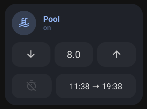
I use an input_boolean to control the timer duration and input_datetime functions to control start and end times (shown bottom right, converted to template sensors to remove seconds for ease of reading in button) based on my solar production and sunset. The timer button essentially overrides any functions to turn on and off the pump.

Here is the code for the template, its rough and probably a long way to achieve this goal, so if anyone wants to clean it up please go ahead :slight_smile:

Template:

card_pool:
#  templates:
#    - "ulm_language_variables"
  variables:
    ulm_card_input_number_name: "n/a"
    ulm_card_switch_name: "n/a"
    timer_entity: "n/a"
    start_entity: "n/a"
    finish_entity: "n/a"
  triggers_update: "all"
  show_icon: false
  show_name: false
  show_label: false
  styles:
    grid:
      - grid-template-areas: '"item1" "item2" "item3"'
      - grid-template-columns: "1fr"
      - grid-template-rows: "min-content  min-content min-content"
      - row-gap: "12px"
    card:
      - border-radius: "var(--border-radius)"
      - box-shadow: "var(--box-shadow)"
      - padding: "12px"
      - background-color: >
          [[[
            if(hass.themes.darkMode)
              if( entity.state === 'on' ){
                return 'rgba(var(--color-blue),0.1)'
              }
          ]]]
  custom_fields:
    item1:
      card:
        type: "custom:button-card"
        template:
          - "icon_info"
          - "ulm_language_variables"
          - "pool"
        tap_action:
          action: "toggle"
        entity: "[[[ return entity.entity_id ]]]"
        name: "[[[ return variables.ulm_card_switch_name ]]]"
        styles:
          card:
            - background-color: "rgba(0,0,0,0)"         
#          icon:
#            - color: >
#                [[[
#                  if( entity.state === 'on' ){
#                    return 'rgba(var(--color-blue),1)'
#                  }
#                ]]]
#          img_cell:
#            - background-color: >
#                [[[
#                  if( entity.state === 'on' ){
#                    return 'rgba(var(--color-blue),0.2)'
#                  } else {
#                  return 'rgba(var(--color-theme),0.05)'
#                  }
#                ]]]
#         label:
#            - color: "rgba(var(--color-blue-text),1)"
#          name:
#            - color: "rgba(var(--color-blue-text),1)"
    item2:
      card:
        type: "custom:button-card"
        template: "list_3_items"
        styles:
          card:
            - background-color: "rgba(0,0,0,0)"
        custom_fields:
          item1:
            card:
              type: "custom:button-card"
              template: "widget_icon"
              tap_action:
                action: "call-service"
                service: "input_number.decrement"
                service_data:
                  entity_id: "[[[ return variables.ulm_card_input_number_entity ]]]"
              icon: "mdi:arrow-down"
          item2:
            card:
              type: "custom:button-card"
              template: "widget_text"
              entity: "[[[ return variables.ulm_card_input_number_entity ]]]"
              tap_action:
                action: "call-service"
                service: "cover.stop_cover"
                service_data:
                  entity_id: "[[[ return variables.ulm_card_input_number_entity ]]]"
          item3:
            card:
              type: "custom:button-card"
              template: "widget_icon"
              tap_action:
                action: "call-service"
                service: "input_number.increment"
                service_data:
                  entity_id: "[[[ return variables.ulm_card_input_number_entity ]]]"
              icon: "mdi:arrow-up"

    item3:
      card:
        type: "custom:button-card"
        template: "list_two_third_items"
        styles:
          card:
            - background-color: "rgba(0,0,0,0)"
        custom_fields:
          item1:
            card:
              type: "custom:button-card"
              template: "widget_icon"
              tap_action:
                action: "toggle"
              haptic: "success"
              entity: "[[[ return variables.timer_entity ]]]"
              icon: "mdi:timer-off-outline"
              state:
                - value: "on"
                  styles:
                    icon:
                      - color: "rgba(var(--color-red),1)"
                - value: "off"
                  styles:
                    icon:
                      - color: "rgba(var(--color-theme),0.2)"           
          item2:
            card:
              type: "custom:button-card"
              template: "widget_text_only_combined"
              variables:
                start_entity_x: "[[[ return variables.start_entity ]]]"
                finish_entity_x: "[[[ return variables.finish_entity ]]]"
              entity: "[[[ return variables.start_entity ]]]"
              tap_action:
                action: "none"
pool:
  label: >-
    [[[
      if (entity.state == 'on') {
        return variables.ulm_on;
      } else if (entity.state == 'off') {
        return variables.ulm_off;
      } else if (entity.state == 'unavailable') {
        return variables.ulm_unavailable;
      } else {
        return entity.state;
      }
    ]]]
  state:
    - value: "on"
      styles:
        icon:
          - color: "rgba(var(--color-blue),1)"
        img_cell:
          - background-color: "rgba(var(--color-blue),0.2)"
        label:
          - color: "rgba(var(--color-blue-text),1)"
        name:
          - color: "rgba(var(--color-blue-text),1)"
    - value: "off"
      styles:
        icon:
          - color: "rgba(var(--color-theme),0.2)"
input_number:
  tap_action:
    action: "more-info"
  show_last_changed: true

widget_text:
  tap_action:
    action: "toggle"
  show_icon: false
  show_label: true
  show_name: false
  label: >-
    [[[
      var unit = entity.attributes.unit_of_measurement != null ? ' ' + entity.attributes.unit_of_measurement : ''
      if (entity.state == 'on') {
        return variables.ulm_on;
      } else if (entity.state == 'off') {
        return variables.ulm_off;
      } else if (entity.state == 'unavailable') {
        return variables.ulm_unavailable;
      } else if (entity.state == 'idle') {
        return variables.ulm_idle;
      } else if (entity.state == 'open') {
        return variables.ulm_open;
      } else if (entity.state == 'closed') {
        return variables.ulm_closed;
      } else {
        return entity.state + unit;
      }
    ]]]
  styles:
    grid:
      - grid-template-areas: "'l'"
    card:
      - box-shadow: "none"
      - padding: "0px"
      - background-color: "rgba(var(--color-theme),0.05)"
      - border-radius: "14px"
      - place-self: "center"
      - height: "42px"
#    state:
#      - color: "rgba(var(--color-theme),0.9)"
  size: "20px"
#  color: "var(--google-grey)"

widget_text_icon:
  tap_action:
    action: "toggle"
  show_icon: true
  show_label: true
  show_name: false
  label: >-
    [[[
      var unit = entity.attributes.unit_of_measurement != null ? ' ' + entity.attributes.unit_of_measurement : ''
      if (entity.state == 'on') {
        return variables.ulm_on;
      } else if (entity.state == 'off') {
        return variables.ulm_off;
      } else if (entity.state == 'unavailable') {
        return variables.ulm_unavailable;
      } else if (entity.state == 'idle') {
        return variables.ulm_idle;
      } else if (entity.state == 'open') {
        return variables.ulm_open;
      } else if (entity.state == 'closed') {
        return variables.ulm_closed;
      } else {
        return entity.state + unit;
      }
    ]]]
  styles:
    grid:
      - grid-template-areas: "'l'"
    card:
      - box-shadow: "none"
      - padding: "0px"
      - background-color: "rgba(var(--color-theme),0.05)"
      - border-radius: "14px"
      - place-self: "center"
      - height: "42px"
    label:
      - font-size: "12px"
#    state:
#      - color: "rgba(var(--color-theme),0.9)"
  size: "20px"
#  color: "var(--google-grey)"

widget_text_only:
  show_icon: false
  show_label: true
  show_name: false
  label: "[[[ return entity.state ]]]"
  styles:
    grid:
      - grid-template-areas: "'l'"
    card:
      - box-shadow: "none"
      - padding: "0px"
      - background-color: "rgba(var(--color-theme),0.05)"
      - border-radius: "14px"
      - place-self: "center"
      - height: "42px"
    label:
      - font-size: "8px"
#    state:
#      - color: "rgba(var(--color-theme),0.9)"
  size: "20px"
#  color: "var(--google-grey)"

widget_text_only_combined:
  variables:
    start_entity_x: ""
    finish_entity_x: ""
  show_icon: false
  show_label: true
  show_name: false
  label: |
    [[[
      var state1 = "";
      if (states[variables.start_entity_x].state){
        var state1 = states[variables.start_entity_x].state;
      }
      var state2 = "";
      if (states[variables.finish_entity_x].state){
        var state2 = states[variables.finish_entity_x].state;
      }
      return state1 + " → " + state2;
    ]]]
  styles:
    grid:
      - grid-template-areas: "'l'"
    card:
      - box-shadow: "none"
      - padding: "0px"
      - background-color: "rgba(var(--color-theme),0.05)"
      - border-radius: "14px"
      - place-self: "center"
      - height: "42px"
    label:
      - font-size: "14px"
#    state:
#      - color: "rgba(var(--color-theme),0.9)"
  size: "20px"
#  color: "var(--google-grey)"

Button code:

                    - type: 'custom:button-card'
                      entity: "switch.pool_pump"
                      template:
                        - "card_pool"
                      variables:
                        ulm_card_input_number_name: "Duration"
                        ulm_card_input_number_entity: "input_number.pool_pump_duration"
                        ulm_card_switch_name: "Pool"
                        start_entity: "sensor.pool_pump_start"
                        finish_entity: "sensor.pool_pump_finish"
                        timer_entity: "input_boolean.pool_pump_override"
6 Likes

Have also created an updated Sonos card which shows what’s playing. HOWEVER I can’t get the entity picture to stretch to the full img_cell, would love someone to help with that :slight_smile:

Template:

---
card_media_player_sonos:
  size: "20px"
  show_icon: true
  show_entity_picture: false
  show_state: false
  show_name: true
  template:
    - "green_playing"
    - "icon_info_bg"
    - "ulm_language_variables"
  label: |
    [[[
        if (entity.state == 'idle'){
          return variables.ulm_off;
        }
        if (entity.state == 'paused'){
          return variables.ulm_paused;
        }
        if (entity.state == 'unavailable'){
          return variables.ulm_unavailable;
        } else {
        return (entity.attributes.source ? entity.attributes.source : variables.ulm_playing)
            + ' • ' +  ( Math.round(entity.attributes.volume_level / 0.01)) + '%' ;
        }
    ]]]

card_media_player_sonos_art:
  size: "20px"
  show_icon: true
  show_entity_picture: true
  show_state: false
  show_name: true
  template:
    - "icon_info_bg"
    - "ulm_language_variables"
  variables:
    - ulm_card_sonos_use_entity_picture: "false"
  styles:
    icon:
      - place-self: >
          [[[
            if (variables.ulm_card_sonos_use_entity_picture !== true){
              return "center";
            } else {
              return "stretch stretch";
            }
          ]]]
  icon: "mdi:play"
  name: "[[[ return states[entity.entity_id].attributes.media_title; ]]]"
  label: "[[[ return states[entity.entity_id].attributes.media_artist; ]]]"

card_media_player_sonos_with_controls_art:
  variables:
    ulm_card_media_player_with_controls_name: "No name set"
  triggers_update:
    - "[[[ ulm_card_media_player_with_controls_entity ]]]"
  styles:
    grid:
      - grid-template-areas: "'item1' 'item2'"
      - grid-template-columns: "1fr"
      - grid-template-rows: "min-content  min-content"
      - row-gap: "12px"
    card:
      - border-radius: "var(--border-radius)"
      - box-shadow: "var(--box-shadow)"
      - padding: "12px"
  custom_fields:
    item1:
      card:
        type: "custom:button-card"
        template: "list_2_items"
        custom_fields:
          item1:
            card:
              type: "custom:button-card"
              template:
                - "ulm_language_variables"
                - "card_media_player_sonos"
              tap_action:
                action: "more-info"
              entity: "[[[ return variables.ulm_card_media_player_with_controls_entity ]]]"
              name: "[[[ return variables.ulm_card_media_player_with_controls_name ]]]"
              styles:
                card:
                  - box-shadow: "none"
                  - padding: "0px"
          item2:
            card:
              type: "custom:button-card"
              template:
                - "ulm_language_variables"
                - "card_media_player_sonos_art"
              tap_action:
                action: "more-info"
              entity: "[[[ return variables.ulm_card_media_player_with_controls_entity ]]]"
              styles:
                card:
                  - box-shadow: "none"
                  - padding: "0px"

    item2:
      card:
        type: "custom:button-card"
        template: "list_items"
        custom_fields:
          item1:
            card:
              type: "custom:button-card"
              template: "widget_icon"
              tap_action:
                action: "call-service"
                service: "media_player.volume_down"
                service_data:
                  entity_id: "[[[ return variables.ulm_card_media_player_with_controls_entity ]]]"
              icon: "mdi:volume-minus"
          item2:
            card:
              type: "custom:button-card"
              template: "widget_icon"
              entity: "[[[ return variables.ulm_card_media_player_with_controls_entity ]]]"
              tap_action:
                action: "call-service"
                service: "media_player.media_play_pause"
                service_data:
                  entity_id: "[[[ return variables.ulm_card_media_player_with_controls_entity ]]]"
              icon: "mdi:pause"
              state:
                - value: "paused"
                  icon: "mdi:play"
                - value: "off"
                  icon: "mdi:play"
          item3:
            card:
              type: "custom:button-card"
              template: "widget_icon"
              tap_action:
                action: "call-service"
                service: "media_player.volume_up"
                service_data:
                  entity_id: "[[[ return variables.ulm_card_media_player_with_controls_entity ]]]"
              icon: "mdi:volume-plus"

icon_info_bg_sonos:
  color: "var(--google-grey)"
  show_icon: true
  show_label: true
  show_name: true
  state:
    - value: "unavailable"
      styles:
        custom_fields:
          notification:
            - border-radius: "50%"
            - position: "absolute"
            - left: "3px"
            - top: "8px"
            - height: "18px"
            - width: "18px"
            - font-size: "12px"
            - line-height: "14px"
            - background-color: >
                [[[
                  return "rgba(var(--color-red),1)";
                ]]]
  styles:
    icon:
      - color: "rgba(var(--color-theme),0.2)"
    label:
      - justify-self: "start"
      - align-self: "start"
      - font-weight: "bold"
      - font-size: "12px"
      - filter: "opacity(40%)"
      - margin-left: "12px"
    name:
      - align-self: "end"
      - justify-self: "start"
      - font-weight: "bold"
      - font-size: "14px"
      - margin-left: "12px"
    state:
      - justify-self: "start"
      - align-self: "start"
      - font-weight: "bold"
      - font-size: "12px"
      - filter: "opacity(40%)"
      - margin-left: "12px"
    img_cell:
      - background-color: "rgba(var(--color-theme),0.05)"
      - border-radius: "50%"
      - place-self: "center"
    grid:
      - grid-template-areas: "'i n' 'i l'"
      - grid-template-columns: "min-content auto"
      - grid-template-rows: "min-content min-content"
    card:
      - border-radius: "var(--border-radius)"
      - box-shadow: "var(--box-shadow)"
      - padding: "12px"
  size: "20px"

green_playing:
  state:
    - styles:
        icon:
          - color: "rgba(var(--color-green),1)"
        img_cell:
          - background-color: "rgba(var(--color-green), 0.2)"
      value: "playing"
1 Like

Something like this will work, cleaned up the code a bit and added a entity return to the "card_media_player_sonos_art. Also removed the icon_info_bg_sonos because it’s not needed and used in the code.

---
card_media_player_sonos:
  size: "20px"
  show_icon: true
  show_entity_picture: false
  show_state: false
  show_name: true
  template:
    - "green_playing"
    - "icon_info_bg"
    - "ulm_language_variables"
  label: |
    [[[
        if (entity.state == 'idle'){
          return variables.ulm_off;
        }
        if (entity.state == 'paused'){
          return variables.ulm_paused;
        }
        if (entity.state == 'unavailable'){
          return variables.ulm_unavailable;
        } else {
        return (entity.attributes.source ? entity.attributes.source : variables.ulm_playing)
            + ' • ' +  ( Math.round(entity.attributes.volume_level / 0.01)) + '%' ;
        }
    ]]]

card_media_player_sonos_art:
  size: "20px"
  show_icon: true
  show_entity_picture: true
  show_state: false
  show_name: true
  template:
    - "icon_info_bg"
    - "ulm_language_variables"
  variables:
    - ulm_card_sonos_use_entity_picture: "false"
  styles:
    icon:
      - place-self: >
          [[[
            if (variables.ulm_card_sonos_use_entity_picture !== true){
              return "center";
            } else {
              return "stretch stretch";
            }
          ]]]
    entity_picture:
      - height: 40px
      - width: 40px
  icon: "mdi:play"
  entity: "[[[ return variables.ulm_card_media_player_with_controls_entity ]]]"
  name: "[[[ return states[entity.entity_id].attributes.media_title; ]]]"
  label: "[[[ return states[entity.entity_id].attributes.media_artist; ]]]"

card_media_player_sonos_with_controls_art:
  variables:
    ulm_card_media_player_with_controls_name: "No name set"
  triggers_update:
    - "[[[ ulm_card_media_player_with_controls_entity ]]]"
  styles:
    grid:
      - grid-template-areas: "'item1' 'item2'"
      - grid-template-columns: "1fr"
      - grid-template-rows: "min-content  min-content"
      - row-gap: "12px"
    card:
      - border-radius: "var(--border-radius)"
      - box-shadow: "var(--box-shadow)"
      - padding: "12px"
  custom_fields:
    item1:
      card:
        type: "custom:button-card"
        template: "list_2_items"
        custom_fields:
          item1:
            card:
              type: "custom:button-card"
              template:
                - "ulm_language_variables"
                - "card_media_player_sonos"
              tap_action:
                action: "more-info"
              entity: "[[[ return variables.ulm_card_media_player_with_controls_entity ]]]"
              name: "[[[ return variables.ulm_card_media_player_with_controls_name ]]]"
              styles:
                card:
                  - box-shadow: "none"
                  - padding: "0px"
          item2:
            card:
              type: "custom:button-card"
              template:
                - "ulm_language_variables"
                - "card_media_player_sonos_art"
              tap_action:
                action: "more-info"
              entity: "[[[ return variables.ulm_card_media_player_with_controls_entity ]]]"
              styles:
                card:
                  - box-shadow: "none"
                  - padding: "0px"

    item2:
      card:
        type: "custom:button-card"
        template: "list_items"
        custom_fields:
          item1:
            card:
              type: "custom:button-card"
              template: "widget_icon"
              tap_action:
                action: "call-service"
                service: "media_player.volume_down"
                service_data:
                  entity_id: "[[[ return variables.ulm_card_media_player_with_controls_entity ]]]"
              icon: "mdi:volume-minus"
          item2:
            card:
              type: "custom:button-card"
              template: "widget_icon"
              entity: "[[[ return variables.ulm_card_media_player_with_controls_entity ]]]"
              tap_action:
                action: "call-service"
                service: "media_player.media_play_pause"
                service_data:
                  entity_id: "[[[ return variables.ulm_card_media_player_with_controls_entity ]]]"
              icon: "mdi:pause"
              state:
                - value: "paused"
                  icon: "mdi:play"
                - value: "off"
                  icon: "mdi:play"
          item3:
            card:
              type: "custom:button-card"
              template: "widget_icon"
              tap_action:
                action: "call-service"
                service: "media_player.volume_up"
                service_data:
                  entity_id: "[[[ return variables.ulm_card_media_player_with_controls_entity ]]]"
              icon: "mdi:volume-plus"

green_playing:
  state:
    - styles:
        icon:
          - color: "rgba(var(--color-green),1)"
        img_cell:
          - background-color: "rgba(var(--color-green), 0.2)"
      value: "playing"

  entity_picture:
    - height: 54px
    - width: 54px
    - border-radius: 100%

I always love looking at other peoples dashboards for inspiration and ideas. I thought i would post some of the new things i added to my home dashboard thanks to mushroom and minimalist.

I recently added chips to my dashboard but I never liked the popups that were generated when you clicked on them, so I created some for myself.

This is my home page:


This is the popup for the wifi chip:

This is The popup for any mode chip:

This is the popup for the Entity Person chip: (i would love to see a chip for person entity like the person card)

This is the popup for the alarm chip:

The motion and door icon on bottom turn red if there is a fault and you can click them to see more info. (thinking about making a custom popup)

Would love to hear feedback and future ides!

21 Likes

Hi guys, i was wondering if it is somehow possible to get 2 cards to the same hight, for example the Graph and the Light card are a different hight.

Would love to know how you did the sidebar? any code you can share?

Using Sidebar card and have a vertical stack card at the bottom.
i also have been using mushroom cards as i like to use the ui editor.

sidebar:
  style: |
    .digitalClock {
        text-align: center;      
    }   
    .date {
        text-align: center;   
    }   
    h1 {
        text-align: center; 
    }
  title: Home
  date: true
  clock: false
  digitalClock: true
  twelveHourVersion: true
  period: false
  width:
    mobile: 0
    tablet: 20
    desktop: 20
  hideTopMenu: false
  hideOnPath: /minimal-tablet/ALT-Dash
  sidebarMenu:
    - action: navigate
      navigation_path: /minimal-tablet/home
      name: Home
      icon: mdi:home
      active: true
    - action: navigate
      navigation_path: /minimal-tablet/lights
      name: Lights
      icon: mdi:lightbulb-group
    - action: navigate
      navigation_path: /minimal-tablet/climate
      name: Climate
      icon: mdi:thermostat
    - action: navigate
      navigation_path: /minimal-tablet/media
      name: Media
      icon: mdi:music-box-multiple
    - action: navigate
      navigation_path: /minimal-tablet/security
      name: Security
      icon: mdi:shield-home
  bottomCard:
    type: custom:mod-card
    cardStyle: |
      :host {
        width: 100%;
        position: absolute;
        bottom: 0;
        left: 0;
      }
      ha-card {
        background: transparent;
        color: #FFF;
        overflow: hidden !important;
        box-shadow: none !important;
      }
    cardOptions:
      style: |
        ha-card {
          margin-bottom: 0px;
        }
      card:
        type: vertical-stack
        cards:
          - type: conditional
            conditions:
              - entity: media_player.spotify
                state: idle
            card:
              type: markdown
              style: |
                ha-card {
                 --ha-card-background: transparent;
                 box-shadow: none;
                 }
              content: >-
                {% if now().hour  < 5 %} Good Night {{'\U0001F634'}}

                {% elif now().hour < 12 %} Good Morning {{'\u2615\uFE0F'}}

                {% elif now().hour < 18 %} Good Afternoon
                {{'\U0001F44B\U0001F3FB'}}

                {% else %} Good Evening {{'\U0001F44B\U0001F3FB'}}{% endif %}{%
                if states('sensor.current_lights_on') | float > 0 %}There are
                {{states('sensor.current_lights_on')}} lights on. {% endif %} 


                It is {{states('weather.home')}} outside and the current
                temperature is {{state_attr('weather.home',
                'temperature')}} ℉.

                {%- endif %}
          - type: conditional
            conditions:
              - entity: media_player.spotify
                state_not: unavailable
              - entity: media_player.spotify
                state_not: idle
            card:
              type: custom:mini-media-player
              entity: media_player.spotify
              name: Spotify
              icon: mdi:spotify
              artwork: material
              info: scroll
              hide:
                source: true
                shuffle: false
                power: true
          - type: vertical-stack
            cards:
              - type: custom:mushroom-chips-card
                chips:
                  - type: template
                    icon: mdi:calendar-clock
                    content: Scheduler
                    tap_action:
                      action: navigate
                      navigation_path: /minimal-tablet/scheduler
                    icon_color: red
                  - type: template
                    icon: mdi:floor-plan
                    content: Plan
                    tap_action:
                      action: navigate
                      navigation_path: /minimal-tablet/floor-plan
                    icon_color: purple
                  - type: template
                    icon: mdi:filter
                    content: Filter
                    tap_action:
                      action: navigate
                      navigation_path: /minimal-tablet/filter
                    icon_color: yellow
                alignment: center
              - type: custom:mushroom-chips-card
                chips:
                  - type: template
                    icon: mdi:account-multiple
                    content: People
                    tap_action:
                      action: navigate
                      navigation_path: /minimal-tablet/person
                    icon_color: green
                  - type: template
                    icon: mdi:car
                    content: Sonata
                    tap_action:
                      action: navigate
                      navigation_path: /minimal-tablet/car
                    icon_color: blue
                  - type: template
                    icon: mdi:server
                    content: Server
                    tap_action:
                      action: navigate
                      navigation_path: /minimal-tablet/server
                    icon_color: orange
                alignment: center
4 Likes

Wow, your dashboard is awesome. can you share all of your code?

EDIT: Resolved. I found that under my profile, the Theme didn’t save previously.

This looks awesome so I’m trying to get it installed and setup. I went through the instructions and started to create a dashboard but it seems that part of the themes aren’t being loaded correctly.

I’ve started with a Room Card:

---
button_card_templates: !include_dir_merge_named "custom_components/ui_lovelace_minimalist/__ui_minimalist__/ulm_templates/"

title: Home
theme: minimalist-mobile-tapbar
background: "var(--background-image)"
# views: !include_dir_merge_list "views/"
views:
  - title: Home
    path: 0
    icon: mdi:script
    cards:
      - type: custom:button-card
        template: card_title
        name: Rooms
      - type: vertical-stack
        cards:
          - type: grid
            cards:
              - type: 'custom:button-card'
                template:
                  - card_room
                  - red_no_state
                name: Kids Bathroom
                entity: light.kids_bathroom_light
                icon: mdi:shower-head
                tap_action:
                  action: navigate
                  navigation_path: '/ui-lovelace-minimalist/bathroom'
                variables:
                  label_use_temperature: false
                  label_use_brightness: true
                  entity_1:
                    entity_id: light.kids_bathroom_light
                    templates:
                      - pink_on
                    tap_action:
                      action: toggle
                  entity_2:
                    entity_id: switch.kids_bathroom_fan
                    templates:
                      - green_on
                      - red_off
                    tap_action:
                      action: toggle
            columns: 2

The entity icons should be showing in a different color but they aren’t changing:
image

I searched through my folders and found the templates like pink_on, green_off, etc. They were installed here under the config folder:
custom_components/ui_lovelace_minimalist/lovelace/ulm_templates/card_templates/colors

Amazing job! Do you happen to know how to get the sidebar working?