Swiss Army Knife Custom card

The release is here!
Welcome to the release of the public release candidate of the Swiss Army Knife custom card!
This card has been in development since September 2020. For about 6 months, it has been in private beta with 40 Home Assistant users, and it was finally time to release a release candidate.
In the nearly 2 years of development, the work has been interrupted several times for more important things in life, and also suffered from a bit of feature creep you might say. In January 2022 for example, I felt the available Material Design themes were not enough to get the most out of this custom card, and so the Material 3 themes for Home Assistant were born, including 22 examples ![]()
As a result, this custom card and its 12 examples, the Material 3 themes with 22 example themes, and the two manuals took about 1.500 hours to make!
Do check the manual to install the card. It is available in HACS, but requires additional manual steps!
I really enjoyed making all of this, so I hope you will like it too once you see your own visualizations!
The manual (around 55 pages) and the 12 examples contain a ton of information about how to define tools and get the visualization you see in the examples.
Please try to use all that available information before asking here! You need to invest some time into this card.
Thanx,
Marco
What is this custom card??
Well, if you look at the examples below, you literally see what kind of card this is: it is a versatile custom card that can be used to create unique visualizations!
YAML to define Tools, Toolsets, CSS styling and Animations
The designs are fully defined in YAML, and with the available 17 basic, advanced, and Home Assistant-specific SVG-based tools you can implement your visualization.
Things like templates make re-use between designs possible. On top of that, several CSS styling and built-in animation options are available.
You can even define your own CSS classes and animations, and use them in your designs.
User interactions and haptic feedback
You can define user interactions per tool to call the ‘more info’ dialog or to control lights or switches. You can even define more than 1 action per tap action.
Haptic feedback can complement the click/tap action if your mobile phone supports that.
Material 3 themes to have nice light/dark themes
If you want to make the most of this card’s styling, use one of the Material 3 themes for Home Assistant. This gives you fully compatible light and dark themes!
Swiss Army Knife card examples 11 and 12 use these Home Assistant Material 3 themes to implement cards that adapt to theme colors and to theme modes (dark/light).
Examples and 10 step tutorials
The documentation contains 12 examples and some (new, new, new) 10 step or less tutorials.
The tutorials are new and show you how to create a card in maximum 10 steps. The examples are sometimes a bit more advanced for some users.
And for whom is it meant?
It is not a standard card. It has no fixed design, nor fixed functionality. It doesn’t do anything out-of-the-box!
This card needs YOU. It needs some time to learn this card, understand its possibilities, and create a design. If that is what you want, this is your card. Let your creativity flow and enjoy the results!
Fun fact…
A year ago, some Home Assistant users happened to see some of the example views on my iPhone. They didn’t recognize Home Assistant as they were curious about what domotica system I was using
If designing is not your thing, but YAML is what you like, use or adapt one of the examples made by me or someone else in the community!
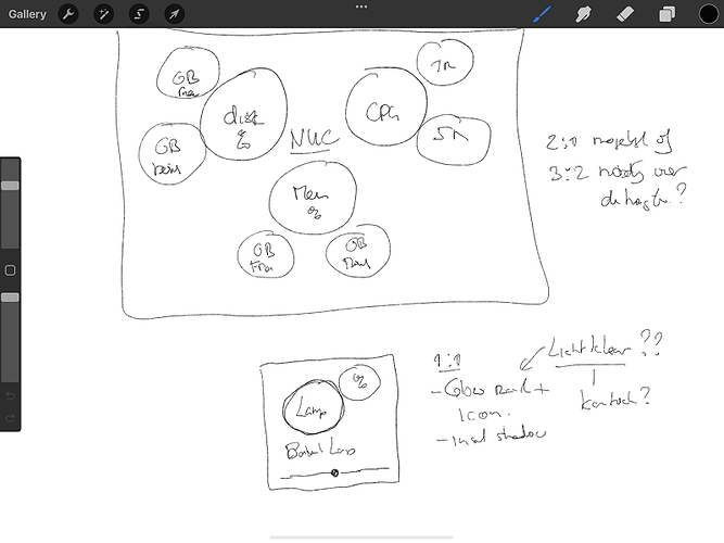
And don’t feel intimidated by the word “design”. Most of my designs look like this: A simple sketch on my iPad that is later implemented in a YAML view using trial-and-error!
Either way, Enjoy!
The manuals…
Because of the numerous possibilities of this custom card, a simple Github README won’t suffice.
The Swiss Army Knife manual is about 55 pages, and the Material 3 themes manual is around 40 pages.
Manual for the Swiss Army Knife custom card…
…and the Material 3 Themes used by some of the cards
The 12 examples from my own installation
The examples are available in their own dashboard. From that dashboard, the examples are manually included. So you can include what you want while trying out this card.
All these examples are available on Github in the ha-config folder, and described in the installation manual. Each example has its own page which describes how to adapt/use them in your own installation.
Some of the examples use a Neumorphic design, while others use a simple and clean flat design.
I must say, I’m curious about what others can create.
You are welcome to flood the forums with all sorts of visualizations!
| Examples using a Light Material 3 Theme… | Examples using a Dark Material 3 Theme… |
|---|---|
| Example 11: Boiler and Electricity cards | |
 |
 |
| Example 12: Wide cards showing lots of sensors | |
 |
 |
| Yes, you can animate things… | …only if you want that of course |
|---|---|
| Example 9: High Contrast | Example 10: A colorful mix |
 |


