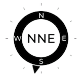
I am writing a custom LVGL Widget, based on meter to display a compass, for displaying wind direction.
There seems to be a common pattern whereby a widget declares itself as being 100% high and wide, allowing the parent container to specify the actual size.
I am following this pattern, but find that I need to know the size that has been provided in order to calculate sizes internally.
To solve this, I am passing in the size as a variable, but I do not like this approach.
This is how I place the widget:
      - obj:
          height: 140
          width: 140
          align: CENTER
          border_width: 0
          pad_all: 0
          scrollbar_mode: "OFF"
          widgets:
            - meter: !include { file: widgets/compass-rose.yaml, vars: {id: "compass", diameter: 140} }
See how the size value is used 3 times :-/
Here is the sensor:
  - platform: homeassistant
    entity_id: $wind_bearing_sensor #### a reference to your actual wind bearing sensor
    id: wind_bearing
    on_value:
      - lvgl.indicator.update:
          id: lv_compass_bearing
          value: !lambda |-
            return x > 180 ? x - 180 : x + 180;

      - lvgl.label.update:
          id: lv_compass_direction
          text: !lambda |-
            switch(int(x)) {
              case 0 ... 11: return "N";
              case 12 ... 34: return "NNE";
              case 35 ... 56: return "NE";
              case 57 ... 79: return "ENE";
              case 80 ... 101: return "E";
              case 102 ... 124: return "ESE";
              case 125 ... 146: return "SE";
              case 147 ... 169: return "SSE";
              case 170 ... 191: return "S";
              case 192 ... 214: return "SSW";
              case 215 ... 236: return "SW";
              case 237 ... 259: return "WSW";
              case 260 ... 281: return "W";
              case 282 ... 304: return "WNW";
              case 305 ... 326: return "NW";
              case 327 ... 348: return "NNW";
              default: return "N";
            }
Here is the widget:
#- meter:
    align: CENTER
    height: 100%
    width: 100%
    border_width: 0
    pad_all: 0
    scales:
      - range_from: 1
        range_to: 360
        angle_range: 360
        rotation: 0
        ticks:
          width: 1
          count: 13
          length: 5
        indicators:
          - image:
              id: lv_${id}_bearing
              src: direction_pointer
              pivot_x: 8
              pivot_y: ${1 + (diameter/2)} #### this is where I need the size set by the parent
              value: 0
          - arc:
              color: screen_black
              r_mod: -16
              width: 16
              start_value: 1
              end_value: 360
    widgets:
      - obj: # to cover the middle part of meter indicator line
          height: 16
          width: 16
          radius: 8
          align: CENTER
          border_width: 0
          bg_color: screen_white
          pad_all: 0
      - label:
          id: lv_${id}_direction
          align: CENTER
          text_color: screen_black
          text_font: montserrat_24
          text: " "
      - label:
          text: "N"
          text_color: screen_white
          text_font: montserrat_14
          align: TOP_MID
          y: 17
      - label:
          text: "S"
          text_color: screen_white
          text_font: montserrat_14
          align: BOTTOM_MID
          y: -16
      - label:
          text: "E"
          text_color: screen_white
          text_font: montserrat_14
          align: RIGHT_MID
          x: -20
      - label:
          text: "W"
          text_color: screen_white
          text_font: montserrat_14
          align: LEFT_MID
          x: 16
I find I require the diameter for the the image I am using for the indicator, it needs to have it’s pivot_y set to half the diameter, if it is going to be resizable. (A tall thin image with an arrow at the top)
I tried to calculate this using SIZE_CONTENT but it did not compile.
Is there another way to doing this?
Another question is how to specify colours when this may be shown on LCDs or E-Paper, where the black and white need inverting. What is the cleanest approach?