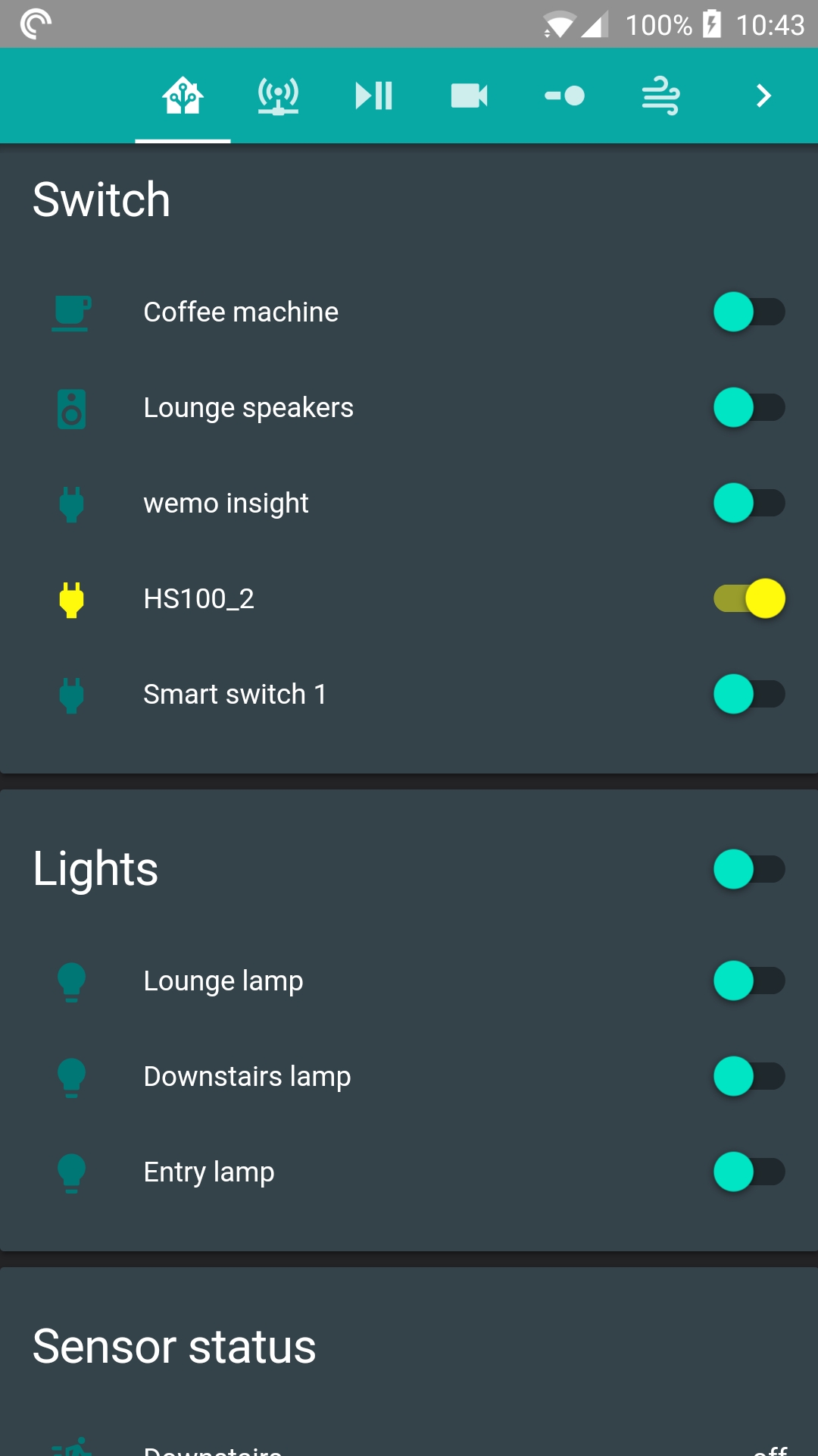
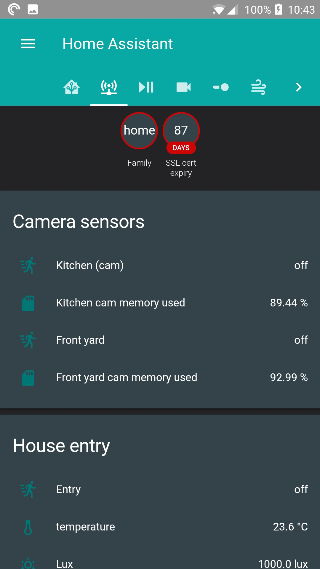
Hi, I’ve created a material dark theme. It should be easily changeable by just changing the hex code of the inital colour. If you end up with random pink colour, it is the colour I have set to show when I couldn’t find where it is displayed in my home assistant instance. It looks pretty good and should be easy to change if you don’t like the shades. It looks good on my computer as well but i don’t have any screenshots of it.
material_dark_green:
  light_green: "#08a8a5"
  dark_green: "#017775"
  dark_grey: "#232326"
  light_grey: "#344249"

  red: "#d10404"
  yellow: "#fffa0c"
  white: "#f7f7f7"
  pink: "#ff0090"

#Top bar, activate text on script, selected icon on home assistant menu, top panel of media players, text in config page, text on developer tools states page, mqtt publish text, logbook text
  primary-color: "var(--light_green)"
# divider on dev tools info page
  light-primary-color: "var(--red)"
# some hyperlinked text
  dark-primary-color: "var(--red)"
# not sure where used
  text-primary-color: "var(--pink)"
# main background, top of side panel
  primary-background-color: "var(--dark_grey)"
# not sure where used
  sidebar-text_-_background: "var(--pink)"
# card background colour, part of media player background
  paper-card-background-color: "var(--light_grey)"
# mqtt pubish header and thats it
  paper-card-header-color: "var(--white)"
# main background colour of states page
  secondary-background-color: "var(--dark_grey)"
# most of the text used
  primary-text-color: "var(--white)"
#secondary pieces of text
  secondary-text-color: "var(--white)"
#main background of side panel
  paper-listbox-background-color: "var(--light_grey)"
#not sure where used
  paper-toggle-button-checked-ink-color: "var(--pink)"
#switch colour when on
  paper-toggle-button-checked-button-color: "var(--yellow)"
#Backgroud of switch/toggle when on
  paper-toggle-button-checked-bar-color: "var(--yellow)"
#slide knob on brightness/volumes when not 0
  paper-slider-knob-color: "var(--yellow)"
#slide knob on brightness/volumes when 0
  paper-slider-knob-start-color: "var(--red)"
#don't know where used
  paper-slider-pin-color: "var(--pink)"
#colour of brightness/volume slider line in used portion
  paper-slider-active-color: "var(--yellow)"
#not sure where used
  paper-slider-secondary-color: "var(--pink)"
# background of brightness/volume slider line not used portion
  paper-slider-container-color: "var(--red)"
#not sure where used
  paper-progress-secondary-color: "var(--pink)"
#background of theme selection toggle tiny use
  paper-item-selected_-_background-color: "var(--light_green)"
#text, not sure which one "var(--white)"
  paper-item-icon_-_color: "var(--pink)"
# icon on state page when off
  paper-item-icon-color: "var(--dark_green)"
#states icon when active
  paper-item-icon-active-color: "var(--yellow)"
#colour of switch toggle when off, icon on selected page of menu
  paper-grey-50: "var(--light_green)"
#background of selected screen on menu "var(--light_green)"
  paper-grey-200: "var(--dark_green)"
#Backgound of label icon
  label-badge-background-color: "var(--light_grey)"
#colour of text in label icon
  label-badge-text-color: "var(--white)"
#colour of edge of sensor labels
  label-badge-red: "var(--red)"
#not sure where used
  label-badge-blue: "var(--pink)"
  label-badge-green: "var(--pink)"
  label-badge-yellow: "var(--pink)"
  label-badge-grey: "var(--pink)"
# Row 1 on entities page
  table-row-background-color: "var(--light_grey)"
# row 2 on entities page
  table-row-alternative-background-color: "var(--dark_grey)"