I am using mini-graph-card (v.0.11.0) on Home Assistant 2023.3.4.
I want to display two temperature graphs side by side, with the color of the graph line corresponding to the severity (green, orange and red).
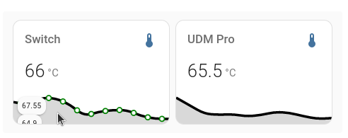
But, I do get a black line, and only the datapoints (visible on mouse hover) are the desired colors.
What am I doing wrong?
This code is wrong since “color_thresholds” is not a per-entity option.
Typo here.
Typo here.
I strongly suggest to ask similar questions in the already present dedicated mini-graph-card thread instead of creating new threads; you will get answers faster & solutions will not be scattered among many threads.
I corrected the state adaptive typo but I think that µSv/h is the correct abbreviation for micro Sieverts per hour. I moved color thresholds but still get odd results. This code
using a current value of .26 and high/low values of .33 and .25 shows a green state but a black line. If I change the second threshold value from .35 to .28 (or any value between .33 and .26) then I get a green line with orange peaks. In other words, it seems to work properly only when the second threshold is within established values.
Increasing the line width makes it appear more green. guess I need to use a brighter color. I will move to an established discussion as you suggested. Thanks for help.
The problem I am having seems like it belongs here,
There is smoothing in the color and when I set the color 0 to be blue I do see that there is some blue but not at 0, I had the background hidden at the beginning (so just teh line) and it was really confusing cause only the dots would appear in the correct color (like how it looked in @Thomas01’s post).
The fix for this smoothing (wich I think is done very badly cause the smoothing happens BEFORE the first value that is added) is adding this line to your yaml:
color_thresholds_transition: hard
If someone knows how to properly do the smoothing that would be really nice!
Hope this helps someone and have a nice day!
The black line appears when values are configured in the color_thresholds field that are outside of the values present in the current graph.
To avoid this problem set the lower_bound and the upper_bound values.