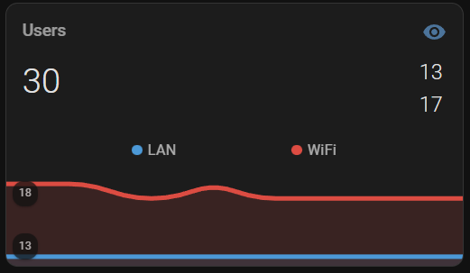
I am attempting to build a mini_graph_card that displays 2 values on a graph and a third as a number. However, no combination of ‘show_state’ options or placements seems to make it change which value is displayed as a number. In the screenshot below, it is showing the LAN state, rather that total.
It shouldn’t but the order of the entities matters. I was fiddling with this last night and the first one is always shown no matter the value of show_state. The others show up in addition if show_state is true.
Another quirk I found is that the legend moves to under the chart if you set fill: false under show: Setting show_fill: for each entity doesn’t affect the legend’s position.
Thank you! That worked! Do you know if there is a way to get it to show the current values of the other two entities on the graph? The labels to the right are not correct it would seem.
Example:
If you look at the number on the bottom left and top right, they do not agree. I was hoping to show the values on the graph itself for LAN and WiFi vs having them in the top right.
The numbers on the left are a scale, not current values. I think they show the highest and lowest figures for all the entities with the same unit for the duration of the graph. This would probably get messed up if you used the labeling hack I mentioned above…