stickerey
(Stickerey)
1
Does anyone know how to achieve this look with the mini media player?
I tried the code found in GitHub - kalkih/mini-media-player: Minimalistic media card for Home Assistant Lovelace UI but all it does for me is putting the cards near each other (img2), and it doesn’t give this stacked look.
The look I’m after:

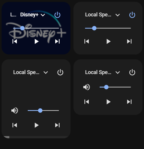
What I get:
Try putting both rows into their own Horizontal Stack Card.
So one horizontal stack card for the media players, then another for the buttons underneath.
1 Like
stickerey
(Stickerey)
3
I guess it is like that now:
  - type: horizontal-stack
    cards:
      - entity: media_player.lg_webos_smart_tv
        type: custom:mini-media-player
        info: short
        artwork: cover
        hide:
          mute: true
          icon: true
          power_state: false
      - entity: media_player.tamas_s_echo
        type: custom:mini-media-player
        info: short
        artwork: cover
        hide:
          mute: true
          icon: true
          power_state: false
  - type: horizontal-stack
    cards:
      - entity: media_player.tamas_s_echo_plus
        type: custom:mini-media-player
        hide:
          icon: true
      - entity: media_player.tamas_s_echo_dot
        type: custom:mini-media-player
        hide:
          icon: true
stickerey
(Stickerey)
5
 well, unfortunately this doesn’t do the trick
Can you share a screenshot of how it renders?
reotto
(Rick Otto)
7
If the media player in the upper left stops playing does the one below it move up and become more aligned?
stickerey
(Stickerey)
8
it is in the original post. a screenshot under the “What I get” part