Yes you can do that indeed, but I will try tomorrow to follow my own guide on a clean HA install to see if I could have missed something since you are not the first one with this issue.
I’ll do the same :). I’m very grateful for your help and time and would be very happy to donate!
I manually added color: white to all the texts and icons, also “style: → icon: → color: white” to vacuum cards’ footer icons and this truly looks great! (well, not this exact screenshot, but anyway). I’ll remove this ugly picture after you have seen what I mean :).
One question, independent of this color issue of mine. in your screenshots it feels like the background that starts with the cropped sky from camera continues behind each card down to the bottom of the whole dashboard, circling overfooter as well. Mine looks like just oversized card that ends just after temperature card - any idea how to tweak that?
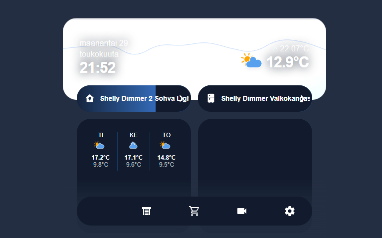
Included here screenshot (don’t mind the ugly titles of my two test lights and one missing icon on the footer). It is also very white and bright sky currently over here, so I need to tweak contrast as well. It is probably karma, but when it is this bright clouds, that stupid blue is beneficial 
The size of this card is correct (the camera header) but there should be a gradient with the same color as the background that fade in front of that white camera. I really don’t understand why there is so much missing part from my CSS on your dashboard.
I really need to try it on a clean HA install.
And I will maybe add a donate link, thanks for that suggestion 
Now I know atleast why the gradient is so brutal. I have this cropping going on on the camera picture (top). I need to move the gradient’s top as well.
There is now an update of my modified Noctis theme that fixes the issue of the bluish color that appeared in some places where the color should have been white (finally!).
Please update it @quenthal @oky_lister @sheby @Guykhmel and everyone with this issue, it’s definitely fixed.
I’ve also fully fixed and modified the header_live_weather_background. It’s now working with every camera size. You can now easily crop your camera with its top/right position and you can use an image if you don’t want to use a camera. This also fixes the position of the gradient.
@quenthal and @Guykhmel can you tell me if it’s working for you?
And finally I’ve updated the installation guide to fix some errors in it.
Thanks a lot everyone for submitting me these issues!
This works great!
  header_live_weather_background:
    card:
      type: custom:vertical-stack-in-card
      cards:
        - type: picture-glance
          entities: []
          # Static image:
          image: https://images.pexels.com/photos/2470655/pexels-photo-2470655.jpeg
          camera_view: auto
          style: |

1 Like
Yes finally! But is it the new header or the old one? You can also remove camera_view: auto.
Can you also update the theme to see if it fixes the bluish color issue?
1 Like
I can confirm font color works great now! White icons and text where it should be without forcing it manually etc. Thank you again!
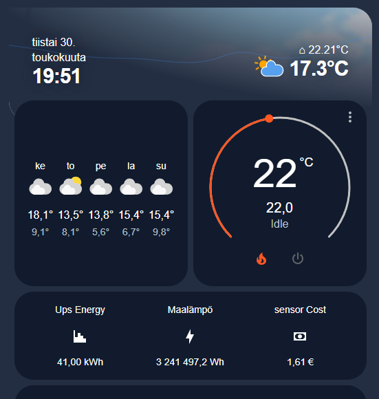
About the gradient; it managed to get in fade the camera picture but instead of this slightly brighter shade it fades to the bigger background. Ie. it doesn’t “cover” all the cards on the dashboard like in your screenshots.
EDIT: added picture about this gradient (again, don’t mind the cards, just to show the background and fade):

3 Likes
Your header is working like it should, it doesn’t cover all the cards like you say. But have you modified the position of the gradient? Because it’s not in the right place on your screenshot.
Here is a screenshot of what mine look like on desktop:

Thanks
Updated the theme and it’s indeed white text
Thanks!
1 Like
Yes, you’re correct now when I look at it.
That is probably because I was still using the top/left etc. from the older version. With new version, when I change “right” for cropping the camera picture I get some corruption as seen in picture. The shaded camera picture: top left is 90 degree sharp corner instead of round (barely visible though). Bottom right of the shaded picture has small corruption; white curve. If I use default right value (0) that corrupt curve is not visible.
I can live with the original one with “inverted” gradient. I think it adds those borders because there is picture outside the cropped part for gradient and ha-part-after to render over or something.
Sharp eye! I had this issue as well and didn’t see it, it’s fixed now, thanks!
Just replace border-radius: 0 var(--ha-card-border-radius); with border-radius: 0 var(--ha-card-border-radius) 0 0;
That fixed that “curve” :). It now looks like this. Just to confirm, is that top left corner sharp 90 degrees instead of round as it should and planned? With previous version I think it was rounded as well.

1 Like
Yes I’ve changed it to avoid the same issue you had before on the bottom left border, but I use HA mainly on mobile, this desktop view with a rounded border is here just to look “fancy” 
I think that all your issues are now fixed. And every issues I was aware of in general.
Have fun with the rest of your dashboard(s) and if you need help again don’t hesitate to ask.
1 Like
Thanks again!
In addition to phones and vertically mounted tablet I’m planning to use this with NSPanel Pro. Below quick and dirty picture before any adjustments - with ultra small screen such as this, I need to make smaller margins for main header and footer menu. I managed to move footer_sticky_menu closer to the bottom, adjusting bottom and keyframes positions. It could very well be that with NSPanel Pro I may remove it completely as I probably use this as room specific devices.
For main header I thinned margins closed to 0px.
But one question: how could I force weekday and month in one line? As you can see, those are quite long strings in finnish, so it is in three lines as in my screenshots and pictures.

EDIT: Managed to do that; increased width of the element where days and months are, and increased margin-left with same increase:

I will truly enjoy with this great work of yours! I need to adjust the balance between thin header and relevant sky picture from camera tomorrow, when there is clouds and something :).
3 Likes
It’s so cool to see what you’ve managed to do, I can’t wait to see the end result!
This might be more generic css/lovelace card question than regarding this UI, bu here goes;
Is it possible to force height of the topmost card, paper-buttons-row? With these slow tablets it may load last and /or it’s height s changing during reload and then the cards below move up and down while refreshing.
They all have a defined height already, this issue is probably because card-mod starts only after the page is fully loaded (I guess). I sometimes have this issue too and I don’t know if there is anything I can do about it, but if you find something that can fix that please post it here.
Hi… Mabye im stupid… But how do you get rid of HAs own header? Relly like ur setup!
Hi and thanks! You just have to install card-mod and then add this to your theme file:
  card-mod-root-yaml: |
    .: |
      @media only screen and (max-width: 768px) {
          .header {
            display: none;
            opacity: 0;
          }
          #view {
            padding-top: 0 !important;
            margin-top: 0 !important;
            height: calc(100vh - env(safe-area-inset-top)) !important;
          }
      }
1 Like