Mobile friendly - no scrolling dashboard

Hi all, I have been working on a dashboard layout design that is minimalist in nature, and all easy clicks from a mobile device. I also tried to design things in a way with no scrolling. If there is interest i will try to document this on github.

Most of this is made using the custom button-card module. Love that thing.

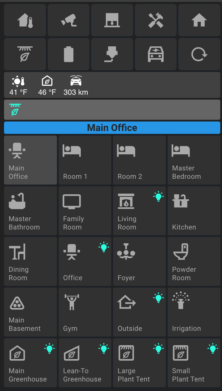
Everything starts from a main screen. On this screen there are what i call action buttons at the top - quick access to things like all blinds, car, 3d printer etc.

Then below that i have a status bar that displays certain sensors that are important to me.

Then there are status icons that tell me when things are happening like the dryer is running or the door is unlocked or the car is charging.

Then i have a blue bar with the name of the current screen/room.

Finally i have the rooms that each can be clicked. On each room tile, there are little green icons that will light up if any light or audio device are on in those rooms.

When you click into a room, there are buttons for each device. You click to toggle them on and off. Some devices like dimmable lights or blinds have a position arc that shows the brightness or the position of the blinds.

By clicking on the settings in each button, the more-info dialog will pop up where things like colors or brightness of lights can be adjusted etc.

I also created a couple cards, one for sonos and one for a google home device.

On the sonos device you can click on the content button on the far right and it will pop up a window of media source tiles.

I even get into some greenhouse controls and sensors.

I created lots of similar styled buttons for lots of different devices including switches/receptacles that display current power usage.

So just wanted to share a bit of what i have been working on. this is very easy to navigate on a phone and that’s what i was going for. there are lots of other little features here and there. Always working on it.

Feedback welcome. I tried to do this all with as few addon modules as possible.

5 Likes

I have something similar for mine, although I don’t use a separate icon for the lights. I have a light group for each floor, and for rooms that have more than 1 light. I use those entities for the cards so the icon shows which lights are on. The tap action navigates to that floor/room view and the hold action turns off all lights in that floor/room.

All other icons work similarly to indicate their state (Working is lit if any of my computers are turned on during workday, Wakeup Schedule is lit if my next wake-up time is set because it’s a workday or something in my schedule is set to wake me up, Recycling is lit if my recycling bin is set outside waiting to be emptied.).

It’s still a work in progress, I haven’t cleaned up all of the floor/room views to where I want them yet, the floor views just show a list of icons for the rooms and an entities card for all individual lights on that floor, and the room views are mostly just a dump of all controls and entities for now until I decide how I want to organize them. So there is scrolling on some of my views until I get time to redesign them.

Main Menu:

Floor view:

Wake-up schedule:

Car battery monitor:

Looks nice - maybe i missed it, but did you link your source? If not, can you?

1 Like

Sorry for the slow response… yes we’ve certainly done some similar things. I had to design those 1/2 width buttons on mine to get more things on a given screen and eliminate scrolling. Always trying to tighten up the views.

Thank you for sharing… i do really like your color scheme and your button design on the front screen with the darker buttons and outlines… may have to borrow that. :slight_smile:

Hey there, not sure if you were looking for the source of my layout or mark’s… or both :). I was trying to gauge the interest and see if its worth building this out as a documented dashboard scheme that others can use. I have been tightening up all the button-card templates etc. I will likely put this all on github. It mainly uses three modules - button-card, mod-card, and decluttering-card and a lot of CSS tweaks. I had also experimented with other modules for various things like climate but i found once i tweaked them to the way i wanted it, better to just design it in button card from scratch.

I hope to have this documented on github soon.

1 Like

I’d be very interested to see the source code too. I love the styled buttons - very clean look.

1 Like

I will get working on documenting everything
Thanks for the interest.

Few new screenshots from some UI tweaks. More to come.


Yah I would like to see the details of the buttons and

Really interested to see the details of all this. Been trying to get something similar setup

Yup, same here. Would love to see the code!

Hey all… thanks for the interest! I have to admit ive over promised and under contributed :). I thought id have it all posted by now. Im in the process of putting everything up on github. This is a new thing for me but thought it would be the best way to share it. Im also trying to clean it up a bit. Stay tuned and ill get it posted within the next week.

2 Likes