Mushroom Cards - Build a beautiful dashboard easily šŸ„ (Part 1)

iā€™ve finally finished my vacuum card
i saw some examples in this thread - all beautiful ! but I don;t want to have an interactive map
here is my view, all icons and states and written as templates, changing the dustbox or mode, changes the icon etc

Iā€™m super happy :slight_smile:

image

5 Likes

I tried searching this thread before posting,
But I didnā€™t findā€¦ :unamused:
I would appreciate it if someone could direct meā€¦

@meni123 check this postā€¦it should get you somewhere :wink:

How do i remove the auto-entities and the boolean, so i can just make something similar but just manually assigning lights?

Hi Rhysb

Do you know how can we achieve the function of back chip with a template or anything else? I am trying to configure heading for my pages like this :

type: custom:layout-card
layout_type: custom:masonry-layout
cards:
  - type: grid
    columns: 2
    square: false
    cards:
      - type: custom:banner-card
        color: white
        entities: null
        heading:
          - Yatak Odası
        link: window.history.back()
        style: |
          ha-card  {
            background: rgba(var(--rgb-primary-text-color), 0.0);
            margin-top: -20px;
            margin-left: -5px;
            width: 300px;
          }
          ha-card .heading {
            font-size: 3.5em;
            margin: 40px;
            color: black;
            font-family: 'Amatic SC', cursive;
            margin-left: 6px;
          }
          ha-card .overlay-strip {
            font-size: 1em;
            font-family: 'Roboto';
            font-weight: 900;
            background: none;
            margin-left: 6px;
          }
      - type: custom:mushroom-chips-card
        chips:
          - type: back
        alignment: end
        card_mod:
          style: |
            ha-card {
              margin: 10px -1px 0 0
              background: rgba(var(--rgb-primary-text-color), 0.0);
              color: #e1e1e1;
              box-shadow: 0px 0px;
            }
card_mod:
  style: |
    ha-card {
      background: rgba(var(--rgb-primary-text-color), 0.0);
      color: #e1e1e1;
      box-shadow: 0px 0px;
      width: 350px
    }

I want to go back to the previous page when clicked on ā€œYatak Odasıā€ header.

And also how can I position ā€œback chipā€ in the code to the left of the heading. Currently it is on the right but when I place it to the left the heading gets smaller.

I have a problem with toggling a light from a template card. Lights always turn on at 1% brightness unless I hardcode a brightness value in the template. Hope somebody has a solution.

When I use the light card the light is toggled on and off to the intial brightness. So if the light is at 25% when it is toggled off and on again, the light stays at 25%.

However, if I do the same with the template card, the light doesnā€™t turn on at 25% but at 1%. Any ideas?

Hey, what theme are you using? I am currently using the UI minimalist mobile theme but I donā€™t use the UI minimalist dashboard at all. I would like to remove the UI minimalist but I love the mobile theme. Is there some other mobile theme similar to ui minimalist?
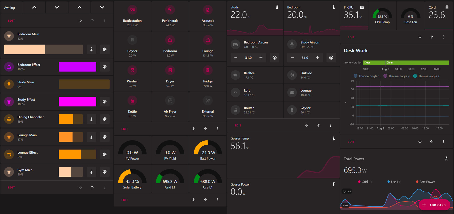
How do you put the navigation on the bottom?

thatā€™s actually part of the mobile theme from UI minimalist theme guys.

I would love to keep that but delete the UI minimalist integration.

Does anyone know of a way to ā€œreuseā€ a mushroom-template-card? If I set up a custom battery card, how can I reuse it for multiple batteries, without having to copy and paste all the options over and over.

This kit is amazingā€¦ literally shrunk my dashboard by 50% in space with no loss of functionality and it is much better looking than the old horseshoe cards I was using, which are now no longer maintained.

@CkretAjint I used a decluttering templateā€¦ the syntax can be a bit fidgety though, but thatā€™s Jinja not Mushroom.

This is the template itself in the lovelace dashboard header (admittedly its a bit pesky to put the colours in direct hex, rather than use the theme colours, but I couldnā€™t get that working with the template card).

  power_switch:
    card:
      type: custom:mushroom-template-card
      primary: '[[name]]'
      secondary: '{{ state_attr(''[[entity]]'', ''current_consumption'') }} W'
      icon: '[[icon]]'
      icon_color: |
        {% if is_state('[[entity]]', 'on') -%}
          #BB0051
        {%- else -%}
          #4D4D4D
        {%- endif %}
      layout: vertical
      tap_action:
        action: toggle
      hold_action:
        action: more-info
      entity: '[[entity]]'
      badge_color: ''

And then I can accomplish switch with power monitoring in a couple of lines

          - type: custom:decluttering-card
            template: power_switch
            variables:
              - entity: switch.battlestation_switch
              - icon: mdi:desktop-tower-monitor
              - name: Battlestation

What that does is give me a way to control all my plugs in a single place, as below, or embed them in per-room dashboards, but at the same time see the on-off state and power usage.

4 Likes

Does anyone know if itā€™s possible to change the icon colour for the media card?

It lets you change the icon itself but not the colour. I assumed because the other cards had this option but the media card didnā€™t, it wasnā€™t possible.

I did try editing the using Yaml and adding icon_colour but that didnā€™t work

Can this be done?

Thanks

I use decluttering-cards for that (https://github.com/custom-cards/decluttering-card)
The downside is, youā€™ll lose UI control over that section. I usually just design my card with the UI once, then copy/paste and create a decluttering-card from that

1 Like

Hey @rhysb,

thanks so much for the code. Awesome! I managed to adapt the code and works perfectly.

The only tiny thing is that I use the mushroom theme with the rounded corners. However I think you are using a different theme as your corner radius is slightly different so that it matches with the radius of the icon. So for me there is a small gap in the corner. Not the end of the world but I was wondering which theme you are using so that I can get this 100%

Thanks so much

Screen Shot 2022-08-09 at 23.31.01

1 Like

Using Mushroom theme with ha-card-border-radius: 20px.

There are some tweaks unrelated to border radius.

mushroom-custom.yaml
Mushroom Custom:
    # HA variables
    ha-card-box-shadow: 0px 2px 4px 0px rgba(0,0,0,0.16)
    ha-card-border-radius: 20px
    # Mushroom layout
    #mush-spacing: 12px
    # Title
    #mush-title-padding: 24px 12px 16px
    #mush-title-spacing: 12px
    #mush-title-font-size: 24px
    #mush-title-font-weight: normal
    #mush-title-line-height: 1.2
    # Subtitle
    #mush-subtitle-font-size: 16px
    #mush-subtitle-font-weight: normal
    #mush-subtitle-line-height: 1.2
    # Card
    #mush-card-primary-font-size: 14px
    #mush-card-secondary-font-size: 12px
    #mush-card-primary-font-weight: bold
    #mush-card-secondary-font-weight: bolder
    #mush-card-primary-line-height: 1.5
    #mush-card-secondary-line-height: 1.5
    # Chip
    #mush-chip-spacing: 8px
    #mush-chip-padding: 0 0.25em
    #mush-chip-height: 36px
    #mush-chip-border-radius: 18px
    #mush-chip-font-size: 0.3em
    #mush-chip-font-weight: bold
    #mush-chip-icon-size: 0.5em
    #mush-chip-avatar-padding: 0.1em
    #mush-chip-avatar-border-radius: 50%
    #mush-chip-box-shadow: var(--ha-card-box-shadow)
    #mush-chip-background: var(--ha-card-background)
    # Control
    #mush-control-border-radius: 12px
    #mush-control-height: 42px
    #mush-control-button-ratio: 1
    #mush-control-icon-size: 0.5em
    # Slider
    #mush-slider-threshold: 10
    # Badge
    #mush-badge-size: 16px
    mush-badge-icon-size: 0.8em
    #mush-badge-border-radius: 50%
    # Icon
    #mush-icon-border-radius: 50%
    #mush-icon-size: 42px
    #mush-icon-symbol-size: 0.5em
    # Colors
    mush-rgb-red: 244, 67, 54
    mush-rgb-pink: 233, 30, 99
    mush-rgb-purple: 156, 39, 176
    mush-rgb-deep-purple: 103, 58, 183
    mush-rgb-indigo: 63, 81, 181
    mush-rgb-blue: 33, 150, 243
    mush-rgb-light-blue: 3, 169, 244
    mush-rgb-cyan: 0, 188, 212
    mush-rgb-teal: 0, 150, 136
    mush-rgb-green: 76, 175, 80
    mush-rgb-light-green: 139, 195, 74
    mush-rgb-lime: 205, 220, 57
    mush-rgb-yellow: 255, 235, 59
    mush-rgb-amber: 255, 193, 7
    mush-rgb-orange: 255, 152, 0
    mush-rgb-deep-orange: 255, 87, 34
    mush-rgb-brown: 121, 85, 72
    mush-rgb-grey: 158, 158, 158
    mush-rgb-blue-grey: 96, 125, 139
    mush-rgb-black: 0, 0, 0
    mush-rgb-white: 255, 255, 255
        
    #mush-rgb-info: var(--mush-rgb-blue)
    #mush-rgb-success: var(--mush-rgb-green)
    #mush-rgb-warning: var(--mush-rgb-orange)
    #mush-rgb-danger: var(--mush-rgb-red)

    mush-rgb-state-fan: var(--mush-rgb-teal)
    mush-rgb-state-light: var(--mush-rgb-amber)
    #mush-rgb-state-entity: var(--mush-rgb-blue)
    #mush-rgb-state-switch: var(--mush-rgb-blue)

    #mush-rgb-state-alarm-disarmed: var(--mush-rgb-info)
    #mush-rgb-state-alarm-armed: var(--mush-rgb-success)
    #mush-rgb-state-alarm-triggered: var(--mush-rgb-danger)

    #mush-rgb-state-person-home: var(--mush-rgb-success)
    #mush-rgb-state-person-not-home: var(--mush-rgb-danger)
    #mush-rgb-state-person-zone: var(--mush-rgb-info)
    #mush-rgb-state-person-unknown: var(--mush-rgb-grey)
    
    #mush-rgb-state-cover-open: var(--mush-rgb-blue)
    #mush-rgb-state-cover-closed: var(--mush-rgb-disabled)
    
    #mush-rgb-state-climate-auto: var(--mush-rgb-green)
    #mush-rgb-state-climate-cool: var(--mush-rgb-blue)
    #mush-rgb-state-climate-dry: var(--mush-rgb-amber)
    #mush-rgb-state-climate-fan-only: var(--mush-rgb-teal)
    #mush-rgb-state-climate-heat: var(--mush-rgb-deep-orange)
    #mush-rgb-state-climate-heat-cool: var(--mush-rgb-green)
    #mush-rgb-state-climate-idle: var(--mush-rgb-grey)
    #mush-rgb-state-climate-off: var(--mush-rgb-disabled)

    # Fonts
    primary-font-family: 'Open Sans, sans-serif'
    paper-font-common-base_-_font-family: "var(--primary-font-family)"
    paper-font-common-code_-_font-family: "var(--primary-font-family)"
    paper-font-body1_-_font-family: "var(--primary-font-family)"
    paper-font-subhead_-_font-family: "var(--primary-font-family)"
    paper-font-headline_-_font-family: "var(--primary-font-family)"
    paper-font-caption_-_font-family: "var(--primary-font-family)"
    paper-font-title_-_font-family: "var(--primary-font-family)"
    ha-card-header-font-family: "var(--primary-font-family)"

    # You must keep this to support light/dark theme
    modes:
        light: 
            mush-rgb-disabled: 189, 189, 189
        dark:
            mush-rgb-disabled: 111, 111, 111
4 Likes

Yes, you can change the Mushroom Media Player icon color like this:

type: custom:mushroom-media-player-card
entity: media_player.currently_playing
volume_controls:
  - volume_set
media_controls:
  - previous
  - play_pause_stop
  - next
  - on_off
use_media_info: true
card_mod:
  style: |
    ha-card {
      --rgb-state-media-player: var(--rgb-pink);
    }

Or in your theme file with the undocumented variable:

mush-rgb-state-media-player: var(--mush-rgb-green)
1 Like

Can you post this code and Iā€™ll have a look.

Ok this is the code. I was using browser mode before but I decided to abandon it because of the limitations like device id etcā€¦ So now I am trying to imitate it with opening a simple page in dashboard. But I replace the code like in the below example it works fine but the back chip is too small to press on mobile. And another problem is because I am using ā€œmargin-left:ā€ when the page first loads the ā€œbedroomā€ word slides from right to left.

What I neeed most is the function of the back chip.

I trıed

tap_action:
  action: navigate
  navigation_path: '[[[window.history.back()]]]'

But it only navigates to the home page not the page I came from.

ype: custom:stack-in-card
cards:
  - type: grid
    columns: 2
    square: false
    cards:
      - type: custom:layout-card
        cards:
          - type: custom:mushroom-chips-card
            chips:
              - type: back
            card_mod:
              style: |
                :host([dark-mode]) {
                  width: 50px;
                } 
                :host {
                  background: #1a1a1a;
                  margin-top: 15px;
                }
                ha-card  {
                  background: #1a1a1a;
                  margin-top: 18px;
                  margin-left: 0px;
                }
      - type: custom:banner-card
        color: white
        entities: null
        heading:
          - Bedroom
        link: window.history.back()
        alignment: end
        style: |
          ha-card  {
            background: #1a1a1a;
            margin-top: 0px;
            margin-left: -180px;
            background: none;
          }
          ha-card .heading {
            font-size: 3.5em;
            margin: 30px;
            color: black;
            font-family: 'Amatic SC', cursive;
          }
          ha-card .overlay-strip {
            font-size: 1em;
            font-family: 'Roboto';
            font-weight: 900;
            background: none;
          }

Looks nice! Can you share the code?

My entire dashboard is YAML based, so that is not a concern for myself. Thanks for the direction!

1 Like