hey, thanks for sharing great card!
Is there a way to resize it in simple way? I would like to make it bigger
Hello 
Mushroom will not become obsolete. We want to add the best of Mushroom into official HA cards but it will not be a simple copy paste. Mushroom has grown very quickly and a lot of features have been added. That’s why the editor looks a bit overloaded and development can be complicated due to the amount of copy paste code between cards.
In tile card, the approach is different :
- unique card : the card adapts to the entity domain and supported features.
- editor : the editor is split into sections for easier card editing
-
features: additional controls are now in a list to easily add/remove features. - actions : In Mushroom, the whole card can be clicked with tap, double tap and hold action. In tile card, the icon and text are 2 different zone for action.
With the tile card, we want to improve the default dashboard but also improve the experience for people that love the customize their dashboard.
if you haven’t looked at the state of the open home, I invite you to test the prototype which shows a concept of where we want to go : Figma of the concept.
This dashboard is heavily inspired by Mushroom, Apple Home and Google Home.
Also, we want to improve the more info dialog when clicking an entity. Many people want more control on the mushroom card but the available space is very small. Improving the more info dialog with big slider/button can greatly improve usability.
      .primary:after {
        content: " (Every [[frequency]] days)";
        color: rgb(var(--card-background-color));
        font-style: bold;
        font-size: 9px
      }
Is it possible to nest an If statement in here?
I use a decluttering template and when i define frequency i’d like to achieve something that will for example display as below
frequency: 30
7 Days = Weekly
30 Days = Monthly
90 Days = 3 Monthly
180 Days = 6 Monthly
365 Days = Yearly

I use the frequency to determine which script is used and also the progress for the radial gradient.
Yes, it dynamically adjusts to the icon size. Just add --icon-size: 80px; to .shape.
Like this:
card_mod:
  style:
    mushroom-shape-icon$: |
      .shape {
        background: radial-gradient(var(--card-background-color) 60%, transparent 0%), conic-gradient(rgb(var(--rgb-blue)) {{ ((states(config.entity) | as_datetime | as_local - now() | as_local).days + 1) / 10 * 100 }}% 0%, var(--card-background-color) 0% 100%);
        --icon-size: 80px;
      }
Yes, you can do it like this:
      .primary:after {
        {% set period = {
          '7' : 'Weekly',
          '30' : 'Monthly',
          '90' : '3 Monthly',
          '180' : '6 Monthly',
          '365' : 'Yearly',
          } %}
        content: " ({{ period[ [[frequency]] ] }})";
        color: rgb(var(--card-background-color));
        font-style: bold;
        font-size: 9px
      }
You can also pass the frequency to the script like this:
hold_action:
  action: call-service
  service: script.reset_reminder
  service_data:
    frequency: 30
  target:
    entity_id: input_datetime.reminder_date
alias: Reset Reminder
sequence:
  - service: input_datetime.set_datetime
    data:
      datetime: "{{ now() + timedelta(days=frequency) }}"
    target:
      entity_id: "{{ entity_id }}"
mode: single
Hi everyone. Is there a chance to swap mushroom-shape-icon and mushroom-state-item positions? So the icon would be on the right and state info on the left?
Thanks
Yes, have a look here:
That’s perfect. Many thanks
You can use forwards to keep the last frame like this:
type: custom:mushroom-template-card
primary: Fountain
icon: mdi:fountain
icon_color: light-blue
card_mod:
  style:
    mushroom-shape-icon$: |
      ha-icon {
        {% if is_state('light.christmas_tree', 'on') %}
          --icon-animation: fountain 1.5s ease infinite;
        {% else %}
          --icon-animation: no-fountain 1s linear 3 forwards;
        {% endif %}
      }
      @keyframes fountain {
        0%, 100 { clip-path: polygon(0 100%, 0 0, 100% 0, 100% 100%); }
        50% { clip-path: polygon(0 100%, 0 47%, 100% 47%, 100% 100%); }
        60% { clip-path: polygon(0 100%, 100% 100%, 100% 37%, 79% 36%, 71% 21%, 56% 25%, 44% 25%, 31% 20%, 20% 36%, 0 36%); }
        70% { clip-path: polygon(0 100%, 100% 100%, 100% 36%, 79% 36%, 71% 22%, 81% 1%, 24% 0, 31% 21%, 20% 36%, 0 36%); }
        80% { clip-path: polygon(0 100%, 100% 100%, 100% 36%, 79% 36%, 76% 28%, 100% 0, 0 0, 23% 28%, 20% 36%, 0 36%); }
      }
      @keyframes no-fountain {
        100% { clip-path: polygon(0% 50%, 100% 50%, 100% 100%, 0% 100%); }
      }
is there a way to start with a line break for secondary information? i want to try with the tempetature and humidity isnt that close to name of the room, look at “Stue” in the top left
tried with br and {{- '\n' -}}
Awesome. I had 5 scripts for resetting different intervals. using the following. and calling a script for example script.reset_reminder_30
      tap_action:
        action: call-service
        service: '[[service]]_[[frequency]]'
        data: {}
        target:
          entity_id: '[[entity]]'
        confirmation:
          text: Are you sure you want to reset the timer?
anyhow the above did not work until i edited.
content: " ({{ period[ [[frequency]] ] }})";
to be
content: " ({{ period[ '[[frequency]]' ] }})";
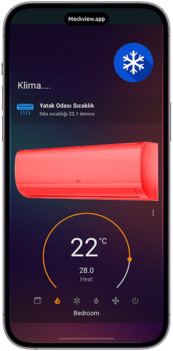
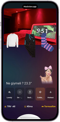
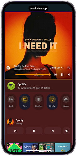
Finally I have finished my design after months. Here are the final view.
My finished pages :
-
Custom Spotify Page with music control and room presence : https://www.reddit.com/r/homeassistant/comments/yt3umn/home_assistant_custom_spotify_page_with_music/
-
Custom Football Page : https://www.reddit.com/r/homeassistant/comments/yv1ee5/home_assistant_custom_football_page/
-
Custon Animated Weather Page :
- Home Assistant Custom Spotify button
Love the thought of improving the usability and UI of the more info dialog.
For Mushroom, I would still love to see the option for separate tap targets/actions for the icon and card. My wife is already used to that functionality from HomeKit and the tile card works great with it, but the Mushroom template card is so much more powerful. I know I and many others that have mentioned it in the Issues on GitHub would love to see this so we can have the best of both worlds.
Is it possible we can expect this important functionality added?
Where are you adding the template code? Automation?
awesome thanks mate. I modified this a bit to fit my needs with picture

here the code if s.o is interested
type: custom:vertical-stack-in-card
cards:
  - type: custom:mushroom-template-card
    picture: ‘image_path‘
    icon: none
    entity: entity.entity
    icon_color: none
    primary: Harmony
    secondary: '{{ states(''entity.entity'') }}'
    layout: horizontal
    card_mod:
      style:
        mushroom-state-info$: |
          .primary {
            font-size: 18px !important;
            position: relative;
            top: -80px;
            left: -105px;
            overflow: visible !important;
            color: var(primary-text-color);
            font-weight: bold;
            text-overflow: ellipsis;
          }
          .secondary {
            font-size: 14px !important;
            position: relative;
            overflow: visible !important;
            top: -85px;
            left: -105px;
          }
        mushroom-shape-avatar$: |
          .picture {
            height: 100px !important;
            width: 100px !important;
            border-radius: 0px !important;
            margin-top: 50px;
          }
        mushroom-shape-icon$: |
          .shape {
            position: relative;
            border-radius: 0px !important;
          }
        .: |
          ha-card {
            margin-top: 55px;
            --secondary-text-color: grey;
            background: none;
          }
          :host {
            --mush-icon-size: 100px;
          }
  - type: custom:mushroom-template-card
    primary: none
    icon_color: |-
      {% if is_state(entity, 'on') %}
        var(--color-blue)
      {%else%}
        disabled
      {% endif %}
    icon: |-
      {% if is_state(entity, 'on') %}
        mdi:television
      {%else%}
        mdi:television-off
      {% endif %}
    secondary: none
    entity: entity.entity
    tap_action:
      action: call-service
      service: switch.toggle
      data: {}
      target:
        entity_id: entity.entity
    card_mod:
      style:
        mushroom-shape-icon$: |
          .shape {
            width: 35px;
            height: 35px;
          }
        .: |
          ha-card {
            width: 55px;
            margin-left: 70%;
            top: -180px;
            background: none;
          }
  - type: custom:mushroom-template-card
    primary: none
    entity: entity.entity
    icon: |-
      {% if is_state(entity, 'on') %}
        si:nvidia
      {%elif is_state(entity, 'off') %}
        si:nvidia
      {% endif %}
    icon_color: |-
      {% if is_state(entity, 'on') %}
        var(--color-green)
      {%elif is_state(entity, 'off') %}
        disabled
      {% endif %}
    secondary: none
    card_mod:
      style:
        mushroom-shape-icon$: |
          .shape {
            width: 35px;
            height: 35px;
          }
        .: |
          ha-card {
            width: 55px;
            margin-left: 70%;
            top: -200px;
            background: none;
          }
  - type: custom:mushroom-template-card
    primary: none
    entity: entity.entity
    tap_action:
      action: toggle
    icon: |-
      {% if is_state(entity, 'on') %}
        mdi:netflix
      {%elif is_state(entity, 'off') %}
        mdi:netflix
      {% endif %}
    icon_color: |-
      {% if is_state(entity, 'on') %}
        var(--color-red)
      {%elif is_state(entity, 'off') %}
        disabled
      {% endif %}
    secondary: none
    card_mod:
      style:
        mushroom-shape-icon$: |
          .shape {
            width: 35px;
            height: 35px;
          }
        .: |
          ha-card {
            width: 55px;
            margin-left: 70%;
            top: -220px;
            background: none;
          }
  - type: custom:mushroom-template-card
    primary: none
    entity: entity.entity
    tap_action:
      action: toggle
    icon: |-
      {% if is_state(entity, 'on') %}
        mdi:sony-playstation
      {%elif is_state(entity, 'off') %}
        mdi:sony-playstation
      {% endif %}
    icon_color: |-
      {% if is_state(entity, 'on') %}
        var(--color-purple)
      {%elif is_state(entity, 'off') %}
        disabled
      {% endif %}
    secondary: none
    card_mod:
      style:
        mushroom-shape-icon$: |
          .shape {
            width: 35px;
            height: 35px;
          }
        .: |
          ha-card {
            width: 55px;
            margin-left: 70%;
            top: -240px;
            background: none;
          }
card_mod:
  style: |
    ha-card {
      height: 192px !important;
      width: 192px !important;
}Would it be possible to get this into a chip?

Hi, how tivimate work in HA? Share please code
Hi
Been playing with with animated chips, but having problemas to make them work.
Any sugestions on this code?
Thanks in advance.
type: custom:mushroom-chips-card
chips:
  - type: template
    entity: fan.luz_e_exaustor_wc_suite_channel_1
    icon: mdi:fan
    icon_color: green
    tap_action:
      action: toggle
    double_tap_action:
      action: none
  - type: template
    entity: binary_sensor.lumi_lumi_sensor_motion_aq2_occupancy
    icon: mdi:motion-sensor
    icon_color: orange
    tap_action:
      action: none
    double_tap_action:
      action: none
card_mod:
  style:
    mushroom-template-chip:nth-child(1)$: |
      ha-icon {
        {{ 'animation: rotation 1s linear infinite;' if is_state('binary_sensor.lumi_lumi_sensor_motion_aq2_occupancy', 'on') }}
      }
      @keyframes rotation {
        0% {
          transform: rotate (0deg);
        }
        100% {
          transform: rotate (360deg);
        }
      }
    mushroom-template-chip:nth-child(2)$: |
      ha-icon {
         --icon-animation: clip 2s linear infinite;
      }
      @keyframes clip {
        50% { clip-path: polygon(0 0, 58% 1%, 100% 100%, 0% 100%); }
      }
Nice! Will you share the first part of your code. Weather and chips?


