Mushroom Cards - Build a beautiful dashboard easily šŸ„ (Part 1)

Iā€™m trying to get the Chips cards to work with the swipe-card in a specific way.

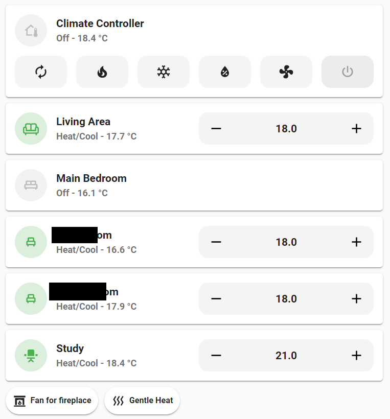
Basically I have a couple of chips on the top of my dashboard with (mostly) counters: numbers of doors open, windows open, covers open, etc. These chips are conditional to only show when count > 0.

firefox_tj3RzIPn3H

Issue is that when a lot of Chips are shown, they drop down to the next line, which is not aesthetically pleasing.

To remedy this, I wrapped the whole horizontal stack of Chips in a swipe-card and this works well: instead of dropping to the next line, the chips continue ā€˜off-screenā€™ and can be seen when swiping to the left. The issue here is however that when I release the container, it snaps back to the start. I would like it to keep the position where it is released. Similar to how itā€™s shown here: https://swiperjs.com/demos (right below ā€™ Premium Swiper templates & plugins from UI Initiative).

Does anyone know what parameters of the swipe card to use in order to achieve this?

This is the current YAML:

type: custom:swipe-card
parameters:
  width: 1000
cards:
  - type: horizontal-stack
    cards:
      - type: custom:mushroom-chips-card
        chips:
          - type: menu
          - type: alarm-control-panel
            entity: alarm_control_panel.ha_alarm
            content_info: name
            tap_action:
              action: fire-dom-event
              browser_mod:
                command: popup
                deviceID: this
                title: Alarm
                card:
                  type: custom:mushroom-alarm-control-panel-card
                  entity: alarm_control_panel.ha_alarm
                  name: Thuis
                  layout: vertical
                  states:
                    - armed_away
          - type: conditional
            conditions:
              - entity: sensor.count_lights_on
                state_not: '0'
            chip:
              type: entity
              entity: sensor.count_lights_on
              icon_color: amber
              icon: mdi:lightbulb
              tap_action:
                action: navigate
                navigation_path: lampen
          - type: conditional
            conditions:
              - entity: sensor.count_active_climate
                state_not: '0'
            chip:
              type: entity
              entity: sensor.count_active_climate
              icon_color: deep-orange
              icon: mdi:radiator
              tap_action:
                action: navigate
                navigation_path: verwarming
              use_entity_picture: true
          - type: conditional
            conditions:
              - entity: sensor.count_windows_open
                state_not: '0'
            chip:
              type: entity
              entity: sensor.count_windows_open
              icon_color: red
              icon: mdi:window-open-variant
              tap_action:
                action: navigate
                navigation_path: ramen
          - type: conditional
            conditions:
              - entity: sensor.count_doors_open
                state_not: '0'
            chip:
              type: entity
              entity: sensor.count_doors_open
              icon_color: green
              icon: mdi:door-open
              tap_action:
                action: navigate
                navigation_path: deuren
              use_entity_picture: true
          - type: conditional
            conditions:
              - entity: sensor.count_covers_down
                state_not: '0'
            chip:
              type: entity
              entity: sensor.count_covers_down
              icon_color: purple
              icon: mdi:window-shutter
              tap_action:
                action: navigate
                navigation_path: zonneschermen
          - type: conditional
            conditions:
              - entity: sensor.count_fans_on
                state_not: '0'
            chip:
              type: entity
              entity: sensor.count_fans_on
              icon_color: lime
              icon: mdi:fan
              tap_action:
                action: navigate
                navigation_path: ventilatie
          - type: conditional
            conditions:
              - entity: sensor.count_media_active
                state_not: '0'
            chip:
              type: entity
              entity: sensor.count_media_active
              icon_color: indigo
              icon: mdi:cast-connected
              tap_action:
                action: navigate
                navigation_path: mediaspelers
          - type: conditional
            conditions:
              - entity: sensor.count_motion_detected
                state_not: '0'
            chip:
              type: entity
              entity: sensor.count_motion_detected
              icon_color: light-blue
              icon: mdi:motion-sensor
              tap_action:
                action: navigate
                navigation_path: beweging
        alignment: start

4 Likes

Hi @piitaya
First of all many thanks for all your hard work on the Mushroom cards. Itā€™s absolutely fabulous.

Would it be a good idea to also show an ā€œidle badgeā€ in the above example when the HVAC action is idle? In that case you always know that the entity has a HVAC action and the actual state of the action.

Climate entities without HVAC action will just show the colored icon without the use of badges as there is no HVAC Action available. For example the icon will be colored red when itā€™s actually heating but there will be no badge (as there is no HVAC action).
So this means this would be the same visual apperance as a climate entity where the HVAC mode is heat and the HVAC action is idle. Which means itā€™s actually not heating.

1 Like

Could this be used for Amazon polly? I canā€™t seem to get it to work replacing alexa with the service below.

tts.amazon_polly_say
amazon_polly_say

Hello,

I did it with cover :wink:

dropdown

    type: custom:stack-in-card
    cards:
      - type: custom:layout-card
        layout_type: grid
        layout:
          grid-template-rows: 25px
          grid-template-areas: |
            "entity menu"
        cards:
          - type: custom:mushroom-cover-card
            entity: cover.volet_amis_prop
            fill_container: true
            show_position_control: true
            show_buttons_control: false
            icon_type: entity-picture
            view_layout:
              grid-area: entity
              grid-column-start: 1
              grid-column-end: 3
          - type: custom:mushroom-chips-card
            alignment: end
            view_layout:
              grid-area: menu
            card_mod:
              style: |
                ha-card {
                  background-color: transparent !important;
                  margin-top: 10px;
                  margin-right: 5px;
                  text-align: right;
                  box-shadow: none !important;
                }
            chips:
              - type: entity
                entity: input_select.mode_volet_amis
4 Likes

Thanks. But not sure how I would make that work. I donā€™t know how to get to the media source select to use it.

Hi all - really stoked to see the update land recently that included mushroom climate cards, theyā€™re very aesthetically pleasing!

I was previously using ā€˜simple-thermostatā€™ card to control our home climate system and I much prefer the look of the mushroom card.

Iā€™m missing a few functionality pieces that I liked from my old setup, and wondering if thereā€™s a way to include these.

My A/C includes state attributes for the temperature in-duct and the target zone for climate control. The system uses one A/C unit and variable zones control target temperatures in each room. Is there a way to include these state attributes in the secondary information, or alternatively, to support templates?

The other feature is support for fan speeds (ideally collapsible when the system is on/off).

Have attached lovelace screenshots of simple-thermostat and mushroom cards.


And actually, I can get to it by clicking the media icon on the left. I was just hoping to get one click select.

Using the card layout as I did, you should be able to place any card on top right. So reorganize entities /cards you already have to acheive your wish. Cards are yaml code and relies on existing entities, so noboby can do it from 1 screenshot

1 Like

Is there a way to set templatable parameters in a conditional chip card (or add conditions to a template chip card??)

At the moment Iā€™m using the state switch card together with the template chip card but itā€™s causing weird formatting problems (it is creating line breaks in some but not all of my template chip cards)

Thanks!

1 Like

Is this a sensor you created and if so could you please shareā€¦

binary_sensor.updater

I like your media control page. Is this a special card I can use as well?

I was working on something similar and Have used this here:

type: custom:swipe-card
card_width: 100px
parameters:
  slidesPerView: auto
  spaceBetween: 10
cards:

Maybe you need do adjust the card widthā€¦

How do you get the squeezebox page in HA? Or is it just iframe?
I am searching for a long time for a good LMS lovelace card, but it seems it doesnā€™t exist.

hey mate, im like what you have done.

Question your first Tab seems to have alot of info, so you dont mind scrolling i guess??

Whats the best way to accomplish the task of seeing all lights that are on? I have this conditional chip card which then opens to my light group (just a few for testing).

But Iā€™d like to ONLY see lights that are on. Is that possible?

image

Have the Conditional Chip open a Conditional card,

Use Auto entities to show lights that are on with Card-mod Popup

Youā€™d probably need to do it how heā€™s doing it. Create a drop down helper with all the source names and then use conditional cards. When Input equals x then play on the correct source.

Thanks! Iā€™ll try this.

The players are the ā€œmini media playerā€ cards. The music page is a webpage card (iframe) that shows the Squeezebox server layout.