5ur3n
August 9, 2022, 5:53pm
2237
This kit is amazing… literally shrunk my dashboard by 50% in space with no loss of functionality and it is much better looking than the old horseshoe cards I was using, which are now no longer maintained.
@CkretAjint I used a decluttering template… the syntax can be a bit fidgety though, but that’s Jinja not Mushroom.
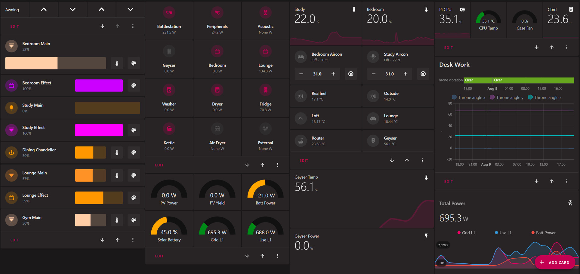
This is the template itself in the lovelace dashboard header (admittedly its a bit pesky to put the colours in direct hex, rather than use the theme colours, but I couldn’t get that working with the template card).
  power_switch:
    card:
      type: custom:mushroom-template-card
      primary: '[[name]]'
      secondary: '{{ state_attr(''[[entity]]'', ''current_consumption'') }} W'
      icon: '[[icon]]'
      icon_color: |
        {% if is_state('[[entity]]', 'on') -%}
          #BB0051
        {%- else -%}
          #4D4D4D
        {%- endif %}
      layout: vertical
      tap_action:
        action: toggle
      hold_action:
        action: more-info
      entity: '[[entity]]'
      badge_color: ''
And then I can accomplish switch with power monitoring in a couple of lines
          - type: custom:decluttering-card
            template: power_switch
            variables:
              - entity: switch.battlestation_switch
              - icon: mdi:desktop-tower-monitor
              - name: Battlestation
What that does is give me a way to control all my plugs in a single place, as below, or embed them in per-room dashboards, but at the same time see the on-off state and power usage.
4 Likes
Does anyone know if it’s possible to change the icon colour for the media card?
It lets you change the icon itself but not the colour. I assumed because the other cards had this option but the media card didn’t, it wasn’t possible.
I did try editing the using Yaml and adding icon_colour but that didn’t work
Can this be done?
Thanks
tmatheussen
August 9, 2022, 7:48pm
2239
I use decluttering-cards for that (https://github.com/custom-cards/decluttering-card )
1 Like
hesspoint
August 9, 2022, 9:34pm
2240
Hey @rhysb ,
thanks so much for the code. Awesome! I managed to adapt the code and works perfectly.
The only tiny thing is that I use the mushroom theme with the rounded corners. However I think you are using a different theme as your corner radius is slightly different so that it matches with the radius of the icon. So for me there is a small gap in the corner. Not the end of the world but I was wondering which theme you are using so that I can get this 100%
Thanks so much
1 Like
rhysb
August 10, 2022, 8:57am
2241
Using Mushroom theme with ha-card-border-radius: 20px.
There are some tweaks unrelated to border radius.
mushroom-custom.yaml
Mushroom Custom:
    # HA variables
    ha-card-box-shadow: 0px 2px 4px 0px rgba(0,0,0,0.16)
    ha-card-border-radius: 20px
    # Mushroom layout
    #mush-spacing: 12px
    # Title
    #mush-title-padding: 24px 12px 16px
    #mush-title-spacing: 12px
    #mush-title-font-size: 24px
    #mush-title-font-weight: normal
    #mush-title-line-height: 1.2
    # Subtitle
    #mush-subtitle-font-size: 16px
    #mush-subtitle-font-weight: normal
    #mush-subtitle-line-height: 1.2
    # Card
    #mush-card-primary-font-size: 14px
    #mush-card-secondary-font-size: 12px
    #mush-card-primary-font-weight: bold
    #mush-card-secondary-font-weight: bolder
    #mush-card-primary-line-height: 1.5
    #mush-card-secondary-line-height: 1.5
    # Chip
    #mush-chip-spacing: 8px
    #mush-chip-padding: 0 0.25em
    #mush-chip-height: 36px
    #mush-chip-border-radius: 18px
    #mush-chip-font-size: 0.3em
    #mush-chip-font-weight: bold
    #mush-chip-icon-size: 0.5em
    #mush-chip-avatar-padding: 0.1em
    #mush-chip-avatar-border-radius: 50%
    #mush-chip-box-shadow: var(--ha-card-box-shadow)
    #mush-chip-background: var(--ha-card-background)
    # Control
    #mush-control-border-radius: 12px
    #mush-control-height: 42px
    #mush-control-button-ratio: 1
    #mush-control-icon-size: 0.5em
    # Slider
    #mush-slider-threshold: 10
    # Badge
    #mush-badge-size: 16px
    mush-badge-icon-size: 0.8em
    #mush-badge-border-radius: 50%
    # Icon
    #mush-icon-border-radius: 50%
    #mush-icon-size: 42px
    #mush-icon-symbol-size: 0.5em
    # Colors
    mush-rgb-red: 244, 67, 54
    mush-rgb-pink: 233, 30, 99
    mush-rgb-purple: 156, 39, 176
    mush-rgb-deep-purple: 103, 58, 183
    mush-rgb-indigo: 63, 81, 181
    mush-rgb-blue: 33, 150, 243
    mush-rgb-light-blue: 3, 169, 244
    mush-rgb-cyan: 0, 188, 212
    mush-rgb-teal: 0, 150, 136
    mush-rgb-green: 76, 175, 80
    mush-rgb-light-green: 139, 195, 74
    mush-rgb-lime: 205, 220, 57
    mush-rgb-yellow: 255, 235, 59
    mush-rgb-amber: 255, 193, 7
    mush-rgb-orange: 255, 152, 0
    mush-rgb-deep-orange: 255, 87, 34
    mush-rgb-brown: 121, 85, 72
    mush-rgb-grey: 158, 158, 158
    mush-rgb-blue-grey: 96, 125, 139
    mush-rgb-black: 0, 0, 0
    mush-rgb-white: 255, 255, 255

    #mush-rgb-info: var(--mush-rgb-blue)
    #mush-rgb-success: var(--mush-rgb-green)
    #mush-rgb-warning: var(--mush-rgb-orange)
    #mush-rgb-danger: var(--mush-rgb-red)

    mush-rgb-state-fan: var(--mush-rgb-teal)
    mush-rgb-state-light: var(--mush-rgb-amber)
    #mush-rgb-state-entity: var(--mush-rgb-blue)
    #mush-rgb-state-switch: var(--mush-rgb-blue)

    #mush-rgb-state-alarm-disarmed: var(--mush-rgb-info)
    #mush-rgb-state-alarm-armed: var(--mush-rgb-success)
    #mush-rgb-state-alarm-triggered: var(--mush-rgb-danger)

    #mush-rgb-state-person-home: var(--mush-rgb-success)
    #mush-rgb-state-person-not-home: var(--mush-rgb-danger)
    #mush-rgb-state-person-zone: var(--mush-rgb-info)
    #mush-rgb-state-person-unknown: var(--mush-rgb-grey)

    #mush-rgb-state-cover-open: var(--mush-rgb-blue)
    #mush-rgb-state-cover-closed: var(--mush-rgb-disabled)

    #mush-rgb-state-climate-auto: var(--mush-rgb-green)
    #mush-rgb-state-climate-cool: var(--mush-rgb-blue)
    #mush-rgb-state-climate-dry: var(--mush-rgb-amber)
    #mush-rgb-state-climate-fan-only: var(--mush-rgb-teal)
    #mush-rgb-state-climate-heat: var(--mush-rgb-deep-orange)
    #mush-rgb-state-climate-heat-cool: var(--mush-rgb-green)
    #mush-rgb-state-climate-idle: var(--mush-rgb-grey)
    #mush-rgb-state-climate-off: var(--mush-rgb-disabled)

    # Fonts
    primary-font-family: 'Open Sans, sans-serif'
    paper-font-common-base_-_font-family: "var(--primary-font-family)"
    paper-font-common-code_-_font-family: "var(--primary-font-family)"
    paper-font-body1_-_font-family: "var(--primary-font-family)"
    paper-font-subhead_-_font-family: "var(--primary-font-family)"
    paper-font-headline_-_font-family: "var(--primary-font-family)"
    paper-font-caption_-_font-family: "var(--primary-font-family)"
    paper-font-title_-_font-family: "var(--primary-font-family)"
    ha-card-header-font-family: "var(--primary-font-family)"

    # You must keep this to support light/dark theme
    modes:
        light:
            mush-rgb-disabled: 189, 189, 189
        dark:
            mush-rgb-disabled: 111, 111, 111
4 Likes
rhysb
August 10, 2022, 9:20am
2242
Yes, you can change the Mushroom Media Player icon color like this:
type: custom:mushroom-media-player-card
entity: media_player.currently_playing
volume_controls:
  - volume_set
media_controls:
  - previous
  - play_pause_stop
  - next
  - on_off
use_media_info: true
card_mod:
  style: |
    ha-card {
      --rgb-state-media-player: var(--rgb-pink);
    }
Or in your theme file with the undocumented variable:
mush-rgb-state-media-player: var(--mush-rgb-green)
1 Like
rhysb
August 10, 2022, 9:44am
2243
Can you post this code and I’ll have a look.
berkans
August 10, 2022, 11:39am
2244
Ok this is the code. I was using browser mode before but I decided to abandon it because of the limitations like device id etc… So now I am trying to imitate it with opening a simple page in dashboard. But I replace the code like in the below example it works fine but the back chip is too small to press on mobile. And another problem is because I am using “margin-left:” when the page first loads the “bedroom” word slides from right to left.
What I neeed most is the function of the back chip.
I trıed
tap_action:
  action: navigate
  navigation_path: '[[[window.history.back()]]]'
But it only navigates to the home page not the page I came from.
ype: custom:stack-in-card
cards:
  - type: grid
    columns: 2
    square: false
    cards:
      - type: custom:layout-card
        cards:
          - type: custom:mushroom-chips-card
            chips:
              - type: back
            card_mod:
              style: |
                :host([dark-mode]) {
                  width: 50px;
                }
                :host {
                  background: #1a1a1a;
                  margin-top: 15px;
                }
                ha-card  {
                  background: #1a1a1a;
                  margin-top: 18px;
                  margin-left: 0px;
                }
      - type: custom:banner-card
        color: white
        entities: null
        heading:
          - Bedroom
        link: window.history.back()
        alignment: end
        style: |
          ha-card  {
            background: #1a1a1a;
            margin-top: 0px;
            margin-left: -180px;
            background: none;
          }
          ha-card .heading {
            font-size: 3.5em;
            margin: 30px;
            color: black;
            font-family: 'Amatic SC', cursive;
          }
          ha-card .overlay-strip {
            font-size: 1em;
            font-family: 'Roboto';
            font-weight: 900;
            background: none;
          }
FutureCow
August 10, 2022, 12:41pm
2245
Looks nice! Can you share the code?
My entire dashboard is YAML based, so that is not a concern for myself. Thanks for the direction!
1 Like
Love the cards but would like pointers on getting a mushroom style gauge card?
I’ve set up recurring reminders which I’d like to display as horizontal bar type gauges to track percentage of remaining time.
Also in progress of building water softener salt level sensor which id like to track percentage with a horizontal bar gauge too.
I see the fan and lights have a horizontal bar gauge but cannot use sensor entities with these?
Ah thank you so I need to install card mod to do this?
Also, is there anyone to change the colour depending on state for when something is playing and when it’s idle? I worked out how to do this using other template cards but how would it work using card mod?
Thanks again
metec
August 10, 2022, 9:01pm
2249
This is awesome. Could we customize it so instead of the icon, we can display the current/preset temperature (via a template)? Also, would be cool if we could show the climate presets as buttons.
It’s “Offices” not “Office’s”
Nice dashboard. Thanks for the github link. Many good examples in there.
2 Likes
you can help? the files that you uploaded to github in which path do I have to copy them
rhysb
August 11, 2022, 6:26am
2253
Yes, the first method requires card_mod. Adding the variable to your theme does not.
You can change the Mushroom Media Player icon and it’s color based on the media type like this:
type: custom:mushroom-media-player-card
entity: media_player.currently_playing
volume_controls:
  - volume_set
media_controls:
  - next
  - previous
  - play_pause_stop
use_media_info: true
collapsible_controls: false
card_mod:
  style: |
    ha-card {
      {% set media_type = state_attr(config.entity,
      'media_content_type') %}
      --rgb-state-media-player:
      {% if media_type == 'tvshow' %}
        var(--rgb-blue)
      {% elif media_type == 'movie' %}
        var(--rgb-green)
      {% elif media_type == 'music' %}
        var(--rgb-red)
      {% elif media_type == 'playlist' %}
        var(--rgb-light-blue)
      {% else %}
        var(--rgb-amber)
      {% endif %};
    }
    mushroom-shape-icon {
      --card-mod-icon:
      {% if media_type == 'tvshow' %}
        mdi:television-classic
      {% elif media_type == 'movie' %}
        mdi:movie-open
      {% elif media_type == 'music' %}
        mdi:music
      {% elif media_type == 'playlist' %}
        mdi:music
      {% else %}
        mdi:plex
      {% endif %};
    }
5 Likes
Mosher
August 11, 2022, 6:43am
2254
Hey! Great job. Could you share how to make the pop-uo as you show on second image?
berkans
August 11, 2022, 6:48am
2255
It is a hacs add on called browser mode.
You can find it on here :
and here is the code :
type: custom:layout-card
layout_type: masonry
layout: {}
cards:
  - type: custom:stack-in-card
    cards:
      - type: vertical-stack
        cards:
          - type: picture-entity
            show_name: false
            show_state: false
            camera_view: auto
            entity: light.duvar_sag
            image: /local/png2/hue3.png
            tap_action:
              action: toggle
            double_tap_action:
              action: call-service
              service: script.turn_on
              data: {}
              target:
                entity_id: script.browser_mode_pop_up_close
          - type: custom:mushroom-template-card
            primary: Hue Sağ
            entity: light.duvar_sag
            secondary: Salon
            picture: /local/png/colorbulb15.png
            tap_action:
              action: toggle
            card_mod:
              style: |
                :host([dark-mode]) {
                  background: rgba(var(--rgb-primary-background-color), 0.2);
                }
                :host {
                  background: rgba(var(--rgb-primary-text-color), 0.025);
                  --mush-icon-size: 43px;
                  height: 66px;
                  margin-left: -5px !important;
                }
                ha-card {
                  padding: 1px;
                  background: rgba(var(--rgb-primary-background-color), 0.1);
                    }
          - type: custom:light-entity-card
            shorten_cards: false
            consolidate_entities: true
            child_card: false
            hide_header: true
            header: ''
            color_wheel: true
            persist_features: true
            brightness: true
            color_temp: true
            white_value: false
            color_picker: true
            smooth_color_wheel: true
            speed: false
            intensity: false
            force_features: true
            show_slider_percent: true
            full_width_sliders: false
            brightness_icon: weather-sunny
            white_icon: file-word-box
            temperature_icon: thermometer
            speed_icon: speedometer
            intensity_icon: transit-connection-horizontal
            entity: light.duvar_sag
            effects_list: false
            card_mod:
              style: |
                ha-card {
                  padding: -15px;
                  background: rgba(var(--rgb-primary-background-color), 0.1);
                  }
    card_mod:
      style: |
        ha-card {
          background: rgba(var(--rgb-primary-background-color), 0.1);
          --paper-item-icon-active-color: #2196f3;
          --paper-item-icon-color: #6f6f6f;
        }
        :host {
          --ha-card-background: rgba(var(--rgb-primary-text-color), 0.025);

        }
2 Likes
Pulpyy
August 11, 2022, 10:06am
2257
Hi,
Sorry for late reply.
icon_type: entity-picture
And added attribute to cover entity using cutomize.yaml
cover.volet_amis_prop:
  entity_picture: "/local/images/devices/volets/volet65.png"
1 Like