Amazing, thank you
OK, this takes me down a new rabbit hole of knowledge, thanks again for sharing the know-how.
1 Like
Love this contribution. I’m going around my current dashboard and trying to animate where I can using some of your examples. For the most part I’ve gotten everything figured out except this last little piece when trying to add in the chip styling code to remove the shadow and outline around the individual chips. Any tips on how to achieve this? Anything I’ve tried with card mod just disables the animation.
Providing my code and gif

type: custom:stack-in-card
cards:
  - type: custom:mushroom-template-card
    primary: Garage
    secondary: '{{ states(''sensor.livingroom'') }}'
    icon: mdi:garage
    entity: input_boolean.garage_light
    tap_action:
      action: navigate
      navigation_path: garage
    hold_action:
      action: toggle
    icon_color: '{{ ''orange'' if is_state(entity, ''on'') else ''disabled'' }}'
    fill_container: true
    layout: horizontal
    multiline_secondary: false
    card_mod:
      style: |
        :host([dark-mode]) {
          background: rgba(var(--rgb-primary-background-color), 0.2);
        }
        :host {
          background: rgba(var(--rgb-primary-text-color), 0.025);
          --mush-icon-size: 56px;
          height: 66px;
          margin-left: -22px !important;
        }
  - type: custom:mushroom-chips-card
    chips:
      - type: template
        icon: mdi:washing-machine
        icon_color: |2-
            {% if is_state(entity, 'off') %}
            grey
            {% else %}
            blue
            {% endif %}
        entity: sensor.washer
        tap_action:
          action: more-info
      - type: template
        icon: mdi:tumble-dryer
        icon_color: |2-
            {% if is_state(entity, 'off') %}
            grey
            {% else %}
            red
            {% endif %}
        entity: sensor.dryer
        tap_action:
          action: more-info
    card_mod:
      style:
        mushroom-template-chip:nth-child(1)$: |
          {% if is_state('sensor.washer','on') %}
          ha-icon {
            animation: shake 800ms ease-in-out infinite, drum 2s ease infinite;
          }
          @keyframes shake {
            0%, 100% { transform: translate(0, 0) rotate(0); }
            20%  { transform: translate(0.4px, -0.4px) rotate(-4deg); }
            40%  { transform: translate(-0.4px, 0.4px) rotate(4deg); }
            60%  { transform: translate(0.4px, 0.4px) rotate(-4deg); }
            80%  { transform: translate(-0.4px, -0.4px) rotate(4deg); }
          }
          @keyframes drum {
            50%  { clip-path: polygon(0 0, 0 100%, 35% 100%, 34% 68%, 60% 41%, 71% 56%, 65% 74%, 47% 79%, 32% 69%, 35% 100%, 100% 100%, 100% 0); }
          }
          {% else %}

          {% endif %}
          }
        mushroom-template-chip:nth-child(2)$: |
          {% if is_state('sensor.dryer','on') %}
          ha-icon {
            animation: shake 800ms ease-in-out infinite, drum 1s infinite;
            transform-origin: 100% 100%;
          }
          @keyframes shake {
            0%, 100% { transform: rotate(4deg); }
            50%  { transform: rotate(-4deg); }
          }
          @keyframes drum {
            50%  { clip-path: polygon(0 0, 0 100%, 35% 100%, 36% 74%, 31% 43%, 61% 40%, 71% 69%, 62% 78%, 36% 73%, 35% 100%, 100% 100%, 100% 0); }
          }
          {% else %}

          {% endif %}
          }
    alignment: end
card_mod:
  style: |
    ha-card {
      height: 102px;
      {% if is_state('input_boolean.garage_light', 'on') %}
         background: rgba(255, 152, 0, 0.1);
      {% endif %}
    }
3 Likes
This should do the trick:
type: custom:stack-in-card
cards:
  - type: custom:mushroom-template-card
    primary: Garage
    secondary: '{{ states(''sensor.livingroom'') }}'
    icon: mdi:garage
    entity: input_boolean.garage_light
    tap_action:
      action: navigate
      navigation_path: garage
    hold_action:
      action: toggle
    icon_color: '{{ ''orange'' if is_state(entity, ''on'') else ''disabled'' }}'
    fill_container: true
    layout: horizontal
    multiline_secondary: false
    card_mod:
      style: |
        :host([dark-mode]) {
          background: rgba(var(--rgb-primary-background-color), 0.2);
        }
        :host {
          background: rgba(var(--rgb-primary-text-color), 0.025);
          --mush-icon-size: 56px;
          height: 66px;
          margin-left: -22px !important;
        }
  - type: custom:mushroom-chips-card
    chips:
      - type: template
        icon: mdi:washing-machine
        icon_color: |2-
            {% if is_state(entity, 'off') %}
            grey
            {% else %}
            blue
            {% endif %}
        entity: sensor.washer
        tap_action:
          action: more-info
      - type: template
        icon: mdi:tumble-dryer
        icon_color: |2-
            {% if is_state(entity, 'off') %}
            grey
            {% else %}
            red
            {% endif %}
        entity: sensor.dryer
        tap_action:
          action: more-info
    card_mod:
      style:
        mushroom-template-chip:nth-child(1)$: |
          {% if is_state('sensor.washer','on') %}
          ha-icon {
            animation: shake 800ms ease-in-out infinite, drum 2s ease infinite;
          }
          @keyframes shake {
            0%, 100% { transform: translate(0, 0) rotate(0); }
            20%  { transform: translate(0.4px, -0.4px) rotate(-4deg); }
            40%  { transform: translate(-0.4px, 0.4px) rotate(4deg); }
            60%  { transform: translate(0.4px, 0.4px) rotate(-4deg); }
            80%  { transform: translate(-0.4px, -0.4px) rotate(4deg); }
          }
          @keyframes drum {
            50%  { clip-path: polygon(0 0, 0 100%, 35% 100%, 34% 68%, 60% 41%, 71% 56%, 65% 74%, 47% 79%, 32% 69%, 35% 100%, 100% 100%, 100% 0); }
          }
          {% else %}

          {% endif %}
          }
        mushroom-template-chip:nth-child(2)$: |
          {% if is_state('sensor.dryer','on') %}
          ha-icon {
            animation: shake 800ms ease-in-out infinite, drum 1s infinite;
            transform-origin: 100% 100%;
          }
          @keyframes shake {
            0%, 100% { transform: rotate(4deg); }
            50%  { transform: rotate(-4deg); }
          }
          @keyframes drum {
            50%  { clip-path: polygon(0 0, 0 100%, 35% 100%, 36% 74%, 31% 43%, 61% 40%, 71% 69%, 62% 78%, 36% 73%, 35% 100%, 100% 100%, 100% 0); }
          }
          {% else %}

          {% endif %}
          }
        .: |
          ha-card {
            --chip-box-shadow: none;
            --chip-background: none;
            --chip-spacing: 0;
          }
    alignment: end
card_mod:
  style: |
    ha-card {
      height: 102px;
      {% if is_state('input_boolean.garage_light', 'on') %}
         background: rgba(255, 152, 0, 0.1);
      {% endif %}
    }
4 Likes
This is super exciting! I’ve been keeping a close eye on your examples, and am really excited to finally leverage (a.k.a. borrow :)) your code. Thanks again for being willing to share it.
2 Likes
Mushroom Animations  - Part 2
Hit the limit for characters in a single post so have had to split it 
Mushroom Title Animations
These ones run once to transition in the Mushroom Title.

Typewriter Animation
type: custom:mod-card
card:
  type: custom:mushroom-title-card
  title: Mushroom.
  subtitle: Typewriter
card_mod:
  style:
    mushroom-title-card$: |
      h1 {
        width: 9ch;
        animation: typing 5s steps(9), cursor 0.25s step-end 30 alternate;
        overflow: hidden;
        border-right: 2px solid transparent;
        font-family: monospace;
      }
       @keyframes typing {
        0% { width: 0; }
      }
      @keyframes cursor {
        50% { border-color: var(--primary-text-color); }
      }

Scale-in Animation
type: custom:mod-card
card:
  type: custom:mushroom-title-card
  title: Mushroom 🍄
  subtitle: Scale-in
card_mod:
  style:
    mushroom-title-card$: |
      * {
          animation: scale-in 1s;
          transform-origin: 15%;
      }
      @keyframes scale-in {
        0% { transform: scale(0); opacity: 0; }
        100% { transform: scale(1); opacity: 1; }
      }

Fade-in Animation
type: custom:mod-card
card:
  type: custom:mushroom-title-card
  title: Mushroom 🍄
  subtitle: Fade-in
card_mod:
  style:
    mushroom-title-card$: |
      * {
        animation: fade 1s ease-in;
      }
      @keyframes fade {
        0% { opacity: 0; }
        100% { opacity: 1; }
      }

Focus Animation
type: custom:mod-card
card:
  type: custom:mushroom-title-card
  title: Mushroom 🍄
  subtitle: Focus
card_mod:
  style:
    mushroom-title-card$: |
      * {
        animation: focus 1.5s;
      }
      @keyframes focus {
        0% { filter: blur(10px); opacity: 0; }
      }

Drop-in Animation
type: custom:mod-card
card:
  type: custom:mushroom-title-card
  title: Mushroom 🍄
  subtitle: Drop-in
card_mod:
  style:
    mushroom-title-card$: |
      * {
        animation: drop-in 1.1s both;
      }
      @keyframes drop-in {
        0% { transform: translateY(-400px); animation-timing-function: ease-in; filter: blur(40px); opacity: 0; }
        38% { transform: translateY(0); animation-timing-function: ease-out; filter: blur(0); opacity: 1; }
        55% { transform: translateY(-16px); animation-timing-function: ease-in; }
        72% { transform: translateY(0); animation-timing-function: ease-out; }
        81% { transform: translateY(-7px); animation-timing-function: ease-in; }
        90% { transform: translateY(0); animation-timing-function: ease-out; }
        95% { transform: translateY(-2px); animation-timing-function: ease-in; }
        100% { transform: translateY(0); animation-timing-function: ease-out; }
      }

Slide-in Animation
type: custom:mod-card
card:
  type: custom:mushroom-title-card
  title: Mushroom 🍄
  subtitle: Slide-in
card_mod:
  style:
    mushroom-title-card$: |
      * {
        animation: slide-in 1.1s both;
      }
      @keyframes slide-in {
        0% { transform: translateX(600px) scaleX(2.5) scaleY(0.2); animation-timing-function: ease-in; filter: blur(40px); opacity: 0; }
        38% { transform: translateX(0) scaleY(1) scaleX(1); animation-timing-function: ease-out; filter: blur(0); opacity: 1; }
        55% { transform: translateX(68px) scaleY(1.1) scaleX(0.95); animation-timing-function: ease-in; }
        72% { transform: translateX(0) scaleY(1) scaleX(1); animation-timing-function: ease-out; }
        81% { transform: translateX(32px) scaleY(1.05) scaleX(0.98); animation-timing-function: ease-in; }
        90% { transform: translateX(0) scaleY(1) scaleX(1); animation-timing-function: ease-out; }
        95% { transform: translateX(8px); animation-timing-function: ease-in; }
        100% { transform: translateX(0); animation-timing-function: ease-out; }
      }

Flicker Animation
type: custom:mod-card
card:
  type: custom:mushroom-title-card
  title: Mushroom 🍄
  subtitle: Flicker
card_mod:
  style:
    mushroom-title-card$: |
      * {
        animation: flicker 1.1s both;
      }
      @keyframes flicker {
        0%, 10%, 10.2%, 20%, 20.6%, 30%, 30.6%, 45%, 55.1%, 57%, 60.1%, 65%, 75.1%, 77%, 85.1%, 86% { opacity: 0; }
        10.1%, 20.1%, 30.1%, 30.5%, 45.1%, 50%, 55%, 57.1%, 60%, 65.1%, 75%, 77.1%, 85%, 86.1%, 100% { opacity: 1; }
      }
Mushroom Spinner Animations

Comet Spinner
type: custom:mushroom-template-card
icon: none
primary: Comet
card_mod:
  style:
    mushroom-shape-icon$: |
      .shape {
        border-right: 4px solid;
        border-bottom: 4px solid transparent;
        --shape-animation: spin 1s linear infinite, comet 10s infinite;
        --shape-color: none;
        --icon-size: 38px;
      }
      @keyframes comet {
        0% { border-right-color: rgb(var(--rgb-red)); }
        6.25% { border-right-color: rgb(var(--rgb-deep-orange)); }
        12.5% { border-right-color: rgb(var(--rgb-orange)); }
        18.75% { border-right-color: rgb(var(--rgb-amber)); }
        25% { border-right-color: rgb(var(--rgb-yellow)); }
        31.25% { border-right-color: rgb(var(--rgb-lime)); }
        37.5% { border-right-color: rgb(var(--rgb-light-green)); }
        43.75% { border-right-color: rgb(var(--rgb-green)); }
        50% { border-right-color: rgb(var(--rgb-teal)); }
        56.25% { border-right-color: rgb(var(--rgb-cyan)); }
        62.5% { border-right-color: rgb(var(--rgb-light-blue)); }
        68.75% { border-right-color: rgb(var(--rgb-blue)); }
        75% { border-right-color: rgb(var(--rgb-indigo)); }
        81.25% { border-right-color: rgb(var(--rgb-deep-purple)); }
        87.5% { border-right-color: rgb(var(--rgb-purple)); }
        93.75% { border-right-color: rgb(var(--rgb-pink)); }
        100% { border-right-color: rgb(var(--rgb-red)); }
      }

Crescent Spinner
type: custom:mushroom-template-card
icon: none
primary: Crescent
card_mod:
  style:
    mushroom-shape-icon$: |
      .shape {
        border: 1px solid rgba(var(--rgb-disabled), 0.8);
        border-right: 3px solid rgba(var(--rgb-light-blue));
        --shape-animation: spin 1s linear infinite;
        --shape-color: none;
        --icon-size: 40px;
      }

Munch Spinner
type: custom:mushroom-template-card
icon: none
primary: Munch
card_mod:
  style:
    mushroom-shape-icon$: |
      ha-icon, .shape {
        --icon-animation: spin 1.5s linear infinite reverse;
        --shape-animation: spin 2s linear infinite;
        border-radius: 50%;
        border: 4px solid transparent;
        border-right-color: rgb(var(--rgb-amber));
        border-top-color: rgb(var(--rgb-amber));
        --shape-color: none;
        --icon-symbol-size: 34px;
        --icon-size: 34px;
      }

Double Spinner
type: custom:mushroom-template-card
icon: none
primary: Double
card_mod:
  style:
    mushroom-shape-icon$: |
      ha-icon {
        --icon-animation: spin 1s linear infinite reverse;
        border-radius: 50%;
        border: 4px double transparent;
        border-right-color: rgb(var(--rgb-deep-orange));
        border-top-color: rgb(var(--rgb-deep-orange));
      }
      .shape {
        border: 4px double transparent;
        border-left-color: rgb(var(--rgb-amber));
        border-bottom-color: rgb(var(--rgb-amber));
        --shape-animation: spin 2s linear infinite;
        --shape-color: none;
        --icon-symbol-size: 20px;
        --icon-size: 34px;
      }

St. Nick Spinner
type: custom:mushroom-template-card
icon: none
primary: St. Nick
card_mod:
  style:
    mushroom-shape-icon$: |
      ha-icon {
        --icon-animation: spin 0.5s linear infinite reverse;
        border-radius: 50%;
        border: 8px dotted rgb(var(--rgb-red));
      }
      .shape {
        border: 4px dashed rgb(var(--rgb-green));
        --shape-animation: spin 2s linear infinite;
        --shape-color: none;
        --icon-symbol-size: 5px;
        --icon-size: 34px;
      }

Gradient Spinner
type: custom:mushroom-template-card
icon: none
primary: Gradient
card_mod:
  style:
    mushroom-shape-icon$: |
      .shape {
         background: radial-gradient(farthest-side, rgb(var(--rgb-blue)) 94%, transparent) top/4px 4px no-repeat, conic-gradient(transparent 30%, rgb(var(--rgb-blue)));
         -webkit-mask: radial-gradient(farthest-side, transparent calc(100% - 4px), #000 0);
         --shape-animation: spin 1s infinite linear;
      }

Dots Spinner
type: custom:mushroom-template-card
icon: none
primary: Dots
card_mod:
  style:
    mushroom-shape-icon$: |
      .shape {
          border: 4px dotted transparent;
          --shape-animation: spin 800ms ease-in-out infinite, color 10s infinite;
          --shape-color: none;
          --icon-size: 34px;
      }
      @keyframes color {
        0% { border-right-color: rgb(var(--rgb-red)); border-top-color: rgb(var(--rgb-red)); }
        6.25% { border-right-color: rgb(var(--rgb-deep-orange)); border-top-color: rgb(var(--rgb-deep-orange)); }
        12.5% { border-right-color: rgb(var(--rgb-orange)); border-top-color: rgb(var(--rgb-orange)); }
        18.75% { border-right-color: rgb(var(--rgb-amber)); border-top-color: rgb(var(--rgb-amber)); }
        25% { border-right-color: rgb(var(--rgb-yellow)); border-top-color: rgb(var(--rgb-yellow)); }
        31.25% { border-right-color: rgb(var(--rgb-lime)); border-top-color: rgb(var(--rgb-lime)); }
        37.5% { border-right-color: rgb(var(--rgb-light-green)); border-top-color: rgb(var(--rgb-light-green)); }
        43.75% { border-right-color: rgb(var(--rgb-green)); border-top-color: rgb(var(--rgb-green)); }
        50% { border-right-color: rgb(var(--rgb-teal)); border-top-color: rgb(var(--rgb-teal)); }
        56.25% { border-right-color: rgb(var(--rgb-cyan)); border-top-color: rgb(var(--rgb-cyan)); }
        62.5% { border-right-color: rgb(var(--rgb-light-blue)); border-top-color: rgb(var(--rgb-light-blue)); }
        68.75% { border-right-color: rgb(var(--rgb-blue)); border-top-color: rgb(var(--rgb-blue)); }
        75% { border-right-color: rgb(var(--rgb-indigo)); border-top-color: rgb(var(--rgb-indigo)); }
        81.25% { border-right-color: rgb(var(--rgb-deep-purple)); border-top-color: rgb(var(--rgb-deep-purple)); }
        87.5% { border-right-color: rgb(var(--rgb-purple)); border-top-color: rgb(var(--rgb-purple)); }
        93.75% { border-right-color: rgb(var(--rgb-pink)); border-top-color: rgb(var(--rgb-pink)); }
        100% { border-right-color: rgb(var(--rgb-red)); border-top-color: rgb(var(--rgb-red)); }
      }

Radial Spinner
type: custom:mushroom-template-card
icon: none
primary: Radial
card_mod:
  style:
    mushroom-shape-icon$: |
      ha-icon {
        --icon-animation: spin 1.5s linear infinite;
        border-radius: 50%;
        border: 3px solid rgb(var(--rgb-blue));
        border-right-color: transparent;
      }
      .shape {
        border: 3px solid rgb(var(--rgb-red));
        border-right-color: transparent;
        --shape-animation: spin 2s linear infinite;
        --shape-color: none;
        --icon-symbol-size: 24px;
        --icon-size: 36px;
      }

Dual Spinner
type: custom:mushroom-template-card
icon: none
primary: Dual
card_mod:
  style:
    mushroom-shape-icon$: |
      .shape {
        --shape-animation: spin 1s ease infinite;
        border: 4px solid transparent;
        border-top-color: rgb(var(--rgb-deep-orange));
        border-bottom-color: rgb(var(--rgb-deep-orange));
        --shape-color: none !important;
        --icon-size: 34px;
      }

Morse Spinner
type: custom:mushroom-template-card
icon: none
primary: Morse
card_mod:
  style:
    mushroom-shape-icon$: |
      ha-icon {
        --icon-animation: spin 1s linear infinite reverse;
        border-radius: 50%;
        border: 4px dashed transparent;
        border-right-color: rgb(var(--rgb-pink));
        border-left-color: rgb(var(--rgb-pink));
      }
      .shape {
        border: 4px dashed transparent;
        border-right-color: rgb(var(--rgb-purple));
        border-left-color: rgb(var(--rgb-purple));
        --shape-animation: spin 2s linear infinite;
        --shape-color: none;
        --icon-symbol-size: 20px;
        --icon-size: 34px;
      }

Fade Spinner
type: custom:mushroom-template-card
icon: none
primary: Fade
card_mod:
  style:
    mushroom-shape-icon$: |
      .shape {
        --shape-animation: fade 25s linear infinite reverse;
        --shape-color: none;
      }
      @keyframes fade {
        6.24%, 12.49%, 18.74%, 24.99%, 31.24%, 37.49%, 43.74%, 49.99%, 56.24%, 62.49%, 68.74%, 74.99%, 81.24%, 87.49%, 93.74%, 100%  { box-shadow: 0 0 20px 20px transparent inset; }
        0% { box-shadow: 0 0 0 0 rgba(var(--rgb-red), 0.7) inset; }
        6.25% { box-shadow: 0 0 0 0 rgba(var(--rgb-deep-orange), 0.7) inset; }
        12.5% { box-shadow: 0 0 0 0 rgba(var(--rgb-orange), 0.7) inset; }
        18.75% { box-shadow: 0 0 0 0 rgba(var(--rgb-amber), 0.7) inset; }
        25% { box-shadow: 0 0 0 0 rgba(var(--rgb-yellow), 0.7) inset; }
        31.25% { box-shadow: 0 0 0 0 rgba(var(--rgb-lime), 0.7) inset; }
        37.5% { box-shadow: 0 0 0 0 rgb(var(--rgb-light-green), 0.7) inset; }
        43.75% { box-shadow: 0 0 0 0 rgb(var(--rgb-green), 0.7) inset; }
        50% { box-shadow: 0 0 0 0 rgb(var(--rgb-teal), 0.7) inset; }
        56.25% { box-shadow: 0 0 0 0 rgb(var(--rgb-cyan), 0.7) inset; }
        62.5% { box-shadow: 0 0 0 0 rgb(var(--rgb-light-blue), 0.7) inset; }
        68.75% { box-shadow: 0 0 0 0 rgb(var(--rgb-blue), 0.7) inset; }
        75% { box-shadow: 0 0 0 0 rgb(var(--rgb-indigo), 0.7) inset; }
        81.25% { box-shadow: 0 0 0 0 rgb(var(--rgb-deep-purple), 0.7) inset; }
        87.5% { box-shadow: 0 0 0 0 rgb(var(--rgb-purple), 0.7) inset; }
        93.75% { box-shadow: 0 0 0 0 rgb(var(--rgb-pink), 0.7) inset; }
      }

Dotty Spinner
type: custom:mushroom-template-card
icon: mdi:dots-circle
primary: Dotty
card_mod:
  style:
    mushroom-shape-icon$: |
      ha-icon {
        --icon-animation: spin 1s linear infinite reverse, color 60s infinite;
      }
      @keyframes color {
        0% { border-color: rgb(var(--rgb-red)); color: rgb(var(--rgb-red)); }
        6.25% { border-color: rgb(var(--rgb-deep-orange)); color: rgb(var(--rgb-pink)); }
        12.5% { border-color: rgb(var(--rgb-orange)); color: rgb(var(--rgb-purple)); }
        18.75% { border-color: rgb(var(--rgb-amber)); color: rgb(var(--rgb-deep-purple)); }
        25% { border-color: rgb(var(--rgb-yellow)); color: rgb(var(--rgb-indigo)); }
        31.25% { border-color: rgb(var(--rgb-lime)); color: rgb(var(--rgb-blue)); }
        37.5% { border-color: rgb(var(--rgb-light-green)); color: rgb(var(--rgb-light-blue)); }
        43.75% { border-color: rgb(var(--rgb-green)); color: rgb(var(--rgb-cyan)); }
        50% { border-color: rgb(var(--rgb-teal)); color: rgb(var(--rgb-teal)); }
        56.25% { border-color: rgb(var(--rgb-cyan)); color: rgb(var(--rgb-green)); }
        62.5% { border-color: rgb(var(--rgb-light-blue)); color: rgb(var(--rgb-light-green)); }
        68.75% { border-color: rgb(var(--rgb-blue)); color: rgb(var(--rgb-lime)); }
        75% { border-color: rgb(var(--rgb-indigo)); color: rgb(var(--rgb-yellow)); }
        81.25% { border-color: rgb(var(--rgb-deep-purple)); color: rgb(var(--rgb-amber)); }
        87.5% { border-color: rgb(var(--rgb-purple)); color: rgb(var(--rgb-orange)); }
        93.75% { border-color: rgb(var(--rgb-pink)); color: rgb(var(--rgb-deep-orange)); }
        100% { border-color: rgb(var(--rgb-red)); color: rgb(var(--rgb-red)); }
      }
      .shape {
        --shape-color: none;
        border: 5px dotted transparent;
        --shape-animation: spin 2s linear infinite, color 60s infinite;
        --icon-symbol-size: 30px;
        --icon-size: 32px;
      }

Plain Spinner
type: custom:mushroom-template-card
icon: none
primary: Plain
card_mod:
  style:
    mushroom-shape-icon$: |
      .shape {
        border: 5px solid rgb(var(--rgb-disabled));
        border-left-color: transparent;
        --shape-animation: spin 1s linear infinite;
        --shape-color: none;
        --icon-size: 32px;
      }

Toggle Spinner
type: custom:mushroom-template-card
icon: none
primary: Toggle
card_mod:
  style:
    mushroom-shape-icon$: |
      ha-icon {
        --icon-animation: spin 1s linear infinite reverse;
        border-radius: 50%;
        border: 4px solid transparent;
        border-right-color: rgb(var(--rgb-cyan));
        border-left-color: rgb(var(--rgb-cyan));
      }
      .shape {
        border: 4px solid transparent;
        border-top-color: rgb(var(--rgb-cyan));
        border-left-color: rgb(var(--rgb-cyan));
        --shape-animation: spin 1s linear infinite;
        --shape-color: none;
        --icon-symbol-size: 34px;
        --icon-size: 34px;
      }

Spheres Spinner
type: custom:mushroom-template-card
icon: none
primary: Spheres
card_mod:
  style:
    mushroom-shape-icon$: |
      ha-icon {
        --icon-animation: spin 1s linear infinite reverse;
        border-radius: 50%;
        border: 12px dotted transparent;
        border-right-color: rgb(var(--rgb-blue));
        border-left-color: rgb(var(--rgb-blue));
      }
      .shape  {
        border: 12px dotted transparent;
        border-right-color: rgb(var(--rgb-red));
        border-left-color: rgb(var(--rgb-red));
        --shape-animation: spin 2s linear infinite;
        --shape-color: none;
        --icon-symbol-size: 18px;
        --icon-size: 18px;
      }

Triple Spinner
type: custom:mushroom-template-card
icon: mdi:loading
icon_color: red
primary: Triple
card_mod:
  style:
    mushroom-shape-icon$: |
      ha-icon {
        --icon-animation: spin 4s linear infinite;
        border-radius: 50%;
        border: 4px solid transparent;
        border-bottom-color: rgb(var(--rgb-blue));
      }
      .shape {
        --shape-color: none !important;
        border: 4px solid transparent;
        border-bottom-color: rgb(var(--rgb-green));
        --shape-animation: spin 2s linear infinite;
        --shape-color: none;
        --icon-symbol-size: 42px;
        --icon-size: 34px;
      }
Mushroom Card Active Animations

Activate Background
type: custom:mushroom-template-card
primary: Activate Mushroom
icon: mdi:mushroom
icon_color: red
secondary: Background
tap_action:
  action: none
hold_action:
  action: none
card_mod:
  style: |
    ha-card:active {
      background: rgba(var(--rgb-disabled), 0.1);
      transition: 0s;
    }

Activate Box-Shadow
type: custom:mushroom-template-card
primary: Activate Mushroom
icon: mdi:mushroom
icon_color: red
secondary: Box-Shadow
tap_action:
  action: none
hold_action:
  action: none
card_mod:
  style: |
    ha-card:active {
      box-shadow: 0 0 20px rgba(var(--rgb-disabled), 0.8);
      transition: 0s;
    }

Activate Scale-Out
type: custom:mushroom-template-card
primary: Activate Mushroom
icon: mdi:mushroom
icon_color: red
secondary: Scale-Out
tap_action:
  action: none
hold_action:
  action: none
card_mod:
  style: |
    ha-card:active {
      transform: scale(1.02);
      transition: 0s;
    }

Activate Scale-In
type: custom:mushroom-template-card
primary: Activate Mushroom
icon: mdi:mushroom
icon_color: red
secondary: Scale-In
tap_action:
  action: none
hold_action:
  action: none
card_mod:
  style: |
    ha-card:active {
      transform: scale(0.975);
      transition: 0s;
    }

Activate Push Down
type: custom:mushroom-template-card
primary: Activate Mushroom
icon: mdi:mushroom
icon_color: red
secondary: Push Down
tap_action:
  action: none
hold_action:
  action: none
card_mod:
  style: |
    ha-card:active {
      transform: translateY(1.5px);
      transition: 0s;
      box-shadow: 0 0.5px 2px 0 rgba(0, 0, 0, 0.16);
    }

Activate Push In
type: custom:mushroom-template-card
primary: Activate Mushroom
icon: mdi:mushroom
icon_color: red
secondary: Push In
tap_action:
  action: none
hold_action:
  action: none
card_mod:
  style: |
    ha-card:active {
      transform: translateY(-1.5px);
      transition: 0s;
      box-shadow: 0 0.5px 2px 0 rgba(0, 0, 0, 0.16);
    }

Activate Ripple
type: custom:mushroom-template-card
primary: Activate Mushroom
icon: mdi:mushroom
icon_color: red
secondary: Ripple
tap_action:
  action: none
hold_action:
  action: none
card_mod:
  style: |
    ha-card {
      overflow: hidden;
    }
    ha-card:after {
      display: none;
      content: "";
      position: absolute;
      border-radius: 50%;
      background-color: rgba(var(--rgb-disabled), 0.1);
      width: 100px;
      height: 100px;
      margin-top: -50px;
      margin-left: -50px;
      top: 50%;
      left: 50%;
      animation: ripple 750ms;
      opacity: 0;
    }
    ha-card:active:after {
      display: block;
    }
    @keyframes ripple {
      from { opacity: 1; transform: scale(0); }
      to { opacity: 0; transform: scale(10); }
    }

Activate 3D Perspective
type: custom:mushroom-template-card
primary: Activate Mushroom
icon: mdi:mushroom
icon_color: red
secondary: 3D Perspective
tap_action:
  action: none
hold_action:
  action: none
card_mod:
  style: |
    :host {
      perspective: 900px;
    }
    ha-card:active {
      transform: rotateY(20deg);
      transition: 0s;
    }

Activate 3D Tilt
type: custom:mushroom-template-card
primary: Activate Mushroom
icon: mdi:mushroom
icon_color: red
secondary: 3D Tilt
tap_action:
  action: none
hold_action:
  action: none
card_mod:
  style: |
    :host {
      perspective: 1000px;
    }
    ha-card:active {
      transform: rotate3d(0.5, -0.9, 0, 10deg) rotate(1deg);
      transition: 0s;
    }

Activate 3D Flap
type: custom:mushroom-template-card
primary: Activate Mushroom
icon: mdi:mushroom
icon_color: red
secondary: 3D Flap
tap_action:
  action: none
hold_action:
  action: none
card_mod:
  style: |
    :host {
      perspective: 900px;
    }
    ha-card:active {
      transform: rotateX(25deg);
      transform-origin: center bottom;
      transition: 0s;
    }

Activate Icon Spin
type: custom:mushroom-template-card
primary: Activate Mushroom
icon: mdi:mushroom
icon_color: red
secondary: Icon Spin
tap_action:
  action: none
hold_action:
  action: none
card_mod:
  style: |
    ha-card:active mushroom-shape-icon {
        display: flex;
        #--icon-animation: spin 1s;
        transform: rotate(360deg);
        transition: 500ms;
    }
Applying Active Animations to your Theme
Rather than applying the active animations to each card, you can apply the to all cards by adding the card_mod to your theme.
Mushroom Custom:
  card-mod-theme: "Mushroom Custom"

  card-mod-card: |
    ha-card:active {
      transform: scale(1.02);
      transition: 0s;
    }
 Continued in
87 Likes
quick question, what does “|-” before template mean?
it’s yaml for multi-line use https://yaml-multiline.info or https://www.w3schools.io/file/yaml-multiline-strings/
hi  i Copied exact your code. It seems like coloring the bar is not working. May you can help me
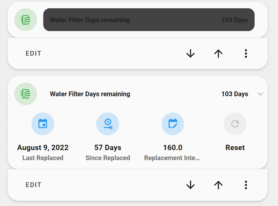
type: custom:stack-in-card
cards:
  - type: custom:layout-card
    layout_type: custom:grid-layout
    layout:
      grid-template-columns: 42px auto 12px
      margin: '-4px -4px -8px -4px;'
    cards:
      - type: custom:mushroom-template-card
        entity: sensor.water_filter_days_remaining
        icon: mdi:air-filter
        icon_color: |
          {% set filter_days = states(entity) | int %}
          {% if filter_days < 31 %}
            red
          {% elif filter_days < 91 %}
            orange
          {% else %}
            green
          {% endif %}
        card_mod:
          style: |
            ha-card {
              background: none;
              --ha-card-box-shadow: 0px;
            }
      - type: custom:bar-card
        entity: sensor.water_filter_days_remaining
        height: 42px
        min: '0'
        max: '200'
        entity_row: true
        severity:
          - color: rgb(var(--mush-rgb-green))
            from: 110
            to: 200
          - color: rgb(var(--mush-rgb-orange))
            from: 31
            to: 109
          - color: rgb(var(--mush-rgb-red))
            from: 0
            to: 30
        positions:
          icon: 'off'
          indicator: 'off'
        card_mod:
          style: |
            ha-card {
              padding: 12px;
              margin-left: 12px;
              --bar-card-border-radius: 12px;
            }
            bar-card-value {
              margin: 12px;
              font-size: 12px;
              font-weight: bolder;
            }
            bar-card-name {
              margin: 12px;
              font-size: 12px;
              font-weight: bolder;
            }
            bar-card-backgroundbar {
              opacity: 0.2;
              filter: brightness(1);
            }
      - type: custom:mushroom-template-card
        entity: input_boolean.water_filter_dropdown
        icon: mdi:chevron-down
        icon_color: disabled
        hold_action:
          action: none
        card_mod:
          style:
            mushroom-shape-icon:
              $: |
                .shape ha-icon {
                  transition: transform 0.14s !important;
                  {{ 'transform: rotate(-180deg);' if is_state(config.entity, 'on') }}
                }
              .: |
                ha-card {
                  align-items: flex-end;
                  box-shadow: none;
                }
                mushroom-shape-icon {
                  --shape-color: none !important;
                }
  - type: custom:stack-in-card
    mode: horizontal
    cards:
      - type: custom:mushroom-entity-card
        entity: input_datetime.water_filter_replaced
        icon: mdi:calendar
        name: Last Replaced
        layout: vertical
        primary_info: state
        secondary_info: name
        card_mod:
          style: |
            ha-card {
              width: 130px;
              margin-left: auto;
              margin-right: auto;
            }
      - type: custom:mushroom-entity-card
        entity: sensor.water_filter_days_since_replacement
        name: Since Replaced
        layout: vertical
        primary_info: state
        secondary_info: name
        card_mod:
          style: |
            ha-card {
              width: 130px;
              margin-left: auto;
              margin-right: auto;
            }
      - type: custom:mushroom-entity-card
        entity: input_number.water_filter_threshold
        icon: mdi:calendar-edit
        name: Replacement Interval
        layout: vertical
        primary_info: state
        secondary_info: name
        card_mod:
          style: |
            ha-card {
              width: 130px;
              margin-left: auto;
              margin-right: auto;
            }
      - type: custom:mushroom-template-card
        primary: Reset
        secondary: ''
        icon: mdi:refresh
        layout: vertical
        tap_action:
          action: call-service
          service: script.reset_water_filter_date_to_today
          data: {}
          target: {}
        hold_action:
          action: none
        double_tap_action:
          action: none
    card_mod:
      style: |
        ha-card {
          margin-top: -14px;
        }
card_mod:
  style: |
    ha-card {
      {{ 'height: 66px;' if is_state('input_boolean.water_filter_dropdown', 'off') }}
    }
3 Likes
Hello the cards I see here are great, but my design skills are beter in Adobe then do the technical stuff :). I was wondering if somebody can build this card. I have an airco which I can turn on/off with a outlet and also show the power. I like to have them bought in one card. Is this possible and how?


Im sure someone else can do it better 
type: custom:stack-in-card
cards:
  - type: custom:mushroom-chips-card
    chips:
      - type: entity
        entity: switch.solar
        icon: mdi:toggle-switch
        icon_color: light-green
        content_info: none
    alignment: end
    card_mod:
      style: |
        ha-card {
          --chip-box-shadow: none;
          --chip-background: none;
  - type: custom:mini-graph-card
    entities:
      - sensor.solar_energy
    label: null
    show:
      labels: true
      icon: false
    color_thresholds:
      - value: 0
        color: '#c5dde3'
      - value: 5
        color: '#12c2f3'
      - value: 8
        color: '#b3f312'
3 Likes
Add the mushroom variables to your theme file.
Hey, how have you removed the default dashboard bar at the top? By “default bar” I mean this one:

Your custom one looks really sleek, those are mushroom chips, am I right?
Use the kiosk mode or sidebar-card in HACS. Set the hideTopMenu on True
sidebar:
  digitalClock: true
  date: true
  dateFormat: dddd DD MMMM YYYY
  hideTopMenu: false
Thank you for the quick service :). This is a good start.
looking in how to get the on for CCTV working, I can get it working but only for both icons, but want to have it only for one, any idea how to fix that if possible?
type: custom:vertical-stack-in-card
mode: vertical
fill_container: true
cards:
  - type: custom:vertical-stack-in-card
    horizontal: true
    cards:
      - type: custom:mushroom-template-card
        entity: switch.cctv
        layout: vertical
        icon: |-
          {% if is_state('switch.cctv', 'on') %}
            mdi:cctv
          {% else %}
            mdi:cctv-off
          {% endif %}
        icon_color: |-
          {% if is_state('switch.cctv', 'on') %}
            yellow
          {% else %}
            #6f6f6f
          {% endif %}
Just add your if/on to the --icon-animation like this:
type: custom:vertical-stack-in-card
mode: vertical
fill_container: true
cards:
  - type: custom:vertical-stack-in-card
    horizontal: true
    cards:
      - type: custom:mushroom-template-card
        entity: switch.cctv
        layout: vertical
        icon: |-
          {% if is_state(entity, 'on') %}
            mdi:cctv
          {% else %}
            mdi:cctv-off
          {% endif %}
        icon_color: |-
          {% if is_state(entity, 'on') %}
            yellow
          {% else %}
            #6f6f6f
          {% endif %}
        card_mod:
          style:
            mushroom-shape-icon$: |
              ha-icon {
                {% if is_state(config.entity, 'on') %}
                  --icon-animation: scan 5s ease-in-out infinite;
                {% endif %}
                transform-origin: 90% 80%
              }
              @keyframes scan {
                0%, 100% { transform: rotate(20deg); }
                50% { transform: rotate(-15deg); }
              }
1 Like
Does anybody know how I could add battery levels for my blinds into upper right corner of the cover card? Completely lost here…
type: custom:mushroom-cover-card
entity: cover.living_room_blinds
name: Living Room Blinds
show_position_control: true
show_buttons_control: true
sorry for the late reply i was out of town. Im also using an iphone but i dont have those borders. Neither on an android device.
But i think u already found a solution 
1 Like
great! this part I was missing: {% if is_state(config.entity, ‘on’) %}
keep up the good work!
2 Likes