ryzn
December 30, 2023, 2:12pm
247
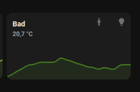
Thank you a lot. Now there is (I hope) only one puzzle piece missing, which I could not solve until now. Is it now also possible to center the icon in the chips?
I could not find the correct css command.
Enclose my current code (border in the screenhsot above is only temporaly set to 1px to show better the position of the icon):
card_mod:
      style: |
        mushroom-template-chip,
        mushroom-conditional-chip,
        mushroom-entity-chip,
        mushroom-weather-chip,
        mushroom-light-chip,
        mushroom-menu-chip,
        mushroom-spacer-chip {
          max-width: 3em;
          min-width: 3em;
          --chip-background: none;
          --chip-font-size: 0.6em;
          --chip-height: 1.25em;
          --chip-icon-size: 0.9em;
          --chip-border-width: 0px !important;
        }
        ha-card {
          padding-top: 0px !important;
          padding-right: 10px !important;
          padding-left: 15px;
         }
RomainRou
January 1, 2024, 9:27pm
248
hello already and a big thank you to you Dimitri for your explanations which allowed me to modify my mushroom cards, on the other hand I have a problem with the mushroom-shape-icon it only changes the background when the lights are on or that my entities are activated, how can I remedy this? all my cards are configured the same
type: custom:mushroom-light-card
entity: light.la_salle_a_manger
use_light_color: true
show_color_temp_control: true
collapsible_controls: false
show_brightness_control: true
card_mod:
  style:
    mushroom-shape-icon$: |
      .shape {
        --shape-color: transparent !important;
      }
    .: |
      @keyframes blink {
      0% {opacity: 1}
      50% {opacity: 0.2}
      100% {opacity: 1}
      }
      ha-card {
       --ha-card-background: transparent;
       border-color: transparent;
      }
      mushroom-button{
      background-color: transparent;
      --bg-color: transparent;
      }
      ha-state-icon {
      {% if is_state('light.la_salle_a_manger', 'on') %}
        animation: blink 1s linear infinite;
        filter: drop-shadow(#ffffff 0rem 0rem 6px);
      }
      {% else %}
        filter: drop-shadow(#ffffff 0rem 0rem 6px);
      {% endif %}
      }
n.3
January 1, 2024, 11:27pm
249
Hey, I’m searching for few hours now, but can’t find any option to show only the icon of a chips light card. I don’t need any text, because the color indicats the state. How can I do it?
type: custom:stack-in-card
mode: vertical
cards:
  - type: custom:stack-in-card
    mode: horizontal
    cards:
      - type: custom:mushroom-entity-card
        entity: sensor.temperatur_nicole_taster
        name: Nicole
        hide_icon: true
        tap_action:
          action: navigate
          navigation_path: nicole
      - type: custom:mushroom-chips-card
        chips:
          - type: light
            entity: light.nicole_spots
            use_light_color: false
        alignment: end }
    style: |
      ha-card {
        background-color: rgba(0,0,0,0);
        box-shadow: none;
      }
  - type: custom:mini-graph-card
...
Hi, just use background: transparent !important; instead. This will then apply regardless of entity state.
type: custom:mushroom-light-card
entity: light.la_salle_a_manger
use_light_color: true
show_color_temp_control: true
collapsible_controls: false
show_brightness_control: true
card_mod:
  style:
    mushroom-shape-icon$: |
      .shape {
        background: transparent !important;
      }
    .: |
      @keyframes blink {
        0% {opacity: 1}
        50% {opacity: 0.2}
        100% {opacity: 1}
      }
      ha-card {
        --ha-card-background: transparent;
        border-color: transparent;
      }
      mushroom-button{
        background-color: transparent;
        --bg-color: transparent;
      }
      ha-state-icon {
        {% if is_state('light.la_salle_a_manger', 'on') %}
          animation: blink 1s linear infinite;
          filter: drop-shadow(#ffffff 0rem 0rem 6px);
        {% else %}
          filter: drop-shadow(#ffffff 0rem 0rem 6px);
        {% endif %}
      }
It was mentioned here, but i need to get some time and mention it in the guide itself:
Odd. Seems that you need to use background instead now for this card.
Ill look into it because --shape-color still works for the Template card for example.
EDIT: --shape-color still works. The light needs to be on for it to take effect. If you want to change the color whether light is off or on use background instead. The remaining syntax is the same. Ill update the guide to make this clear and check whether this also applies to things like the cover card.
2 Likes
A few ways to do that, but the simplest would just be to use a template chip instead:
type: custom:stack-in-card
mode: vertical
cards:
  - type: custom:stack-in-card
    mode: horizontal
    cards:
      - type: custom:mushroom-entity-card
        entity: sensor.temperatur_nicole_taster
        name: Nicole
        hide_icon: true
        tap_action:
          action: navigate
          navigation_path: nicole
      - type: custom:mushroom-chips-card
        chips:
          - type: template
            entity: light.lounge_main_light
            icon: mdi:lightbulb
            icon_color: |-
              {% if states(config.entity) == 'on' %}
                amber
              {% else %}
                disabled
              {% endif %}
            tap_action:
              action: toggle
        alignment: end }
    style: |
      ha-card {
        background-color: rgba(0,0,0,0);
        box-shadow: none;
      }
1 Like
RomainRou
January 2, 2024, 9:07am
253
thank you, super responsive, I read everything but this little detail had to get through
1 Like
n.3
January 2, 2024, 10:22am
254
Thank you a lot! It works. I added twi chips and want to remove the spacing but padding-right or padding doesn’t work. I also use it with !important but nothing. Any idea? I want the icons in one row:
If the card is widther you see the spacing
RkcCorian
January 2, 2024, 1:08pm
255
May I ask you, how you show on the “Bad” card the additional information like 18,1 and 17,0 and 19,0?
try like this:
type: custom:stack-in-card
mode: vertical
cards:
  - type: custom:stack-in-card
    mode: horizontal
    cards:
      - type: custom:mushroom-entity-card
        entity: sensor.lounge_downstairs_temperature
        name: Nicole
        hide_icon: true
        tap_action:
          action: navigate
          navigation_path: nicole
      - type: custom:mushroom-chips-card
        chips:
          - type: template
            entity: light.lounge_main_light
            icon: mdi:lightbulb
            icon_color: |-
              {% if states(config.entity) == 'on' %}
                amber
              {% else %}
                disabled
              {% endif %}
            tap_action:
              action: toggle
          - type: template
            entity: light.lounge_main_light
            icon: mdi:lightbulb
            icon_color: |-
              {% if states(config.entity) == 'on' %}
                amber
              {% else %}
                disabled
              {% endif %}
            tap_action:
              action: toggle
        alignment: end
        card_mod:
          style: |
            ha-card {
              --chip-spacing: 0px;
            }
    style: |
      ha-card {
        background-color: rgba(0,0,0,0);
        box-shadow: none;
      }
  - type: custom:mini-graph-card
    entities:
      - entity: sensor.lounge_downstairs_temperature
the --chip-spacing: 0px; is the important bit. you can also set this to a negative number to get them even closer.
its a climate card and chips together like this:
type: custom:stack-in-card
cards:
  - type: custom:mushroom-climate-card
    entity: climate.office_heating
    show_temperature_control: true
  - type: custom:mushroom-chips-card
    chips:
      - type: template
        icon: mdi:test-tube
        icon_color: deep-orange
        content: |-
          {{state_attr('climate.office_heating','current_temperature')}}
    alignment: end
    card_mod:
      style: |
        ha-card {
          position: absolute;
          top: 12px;
          right: 12px;
        }
n.3
January 2, 2024, 3:03pm
258
No, this is not working. I also tried .chip-container, but nothing happens.
Here is my full code @RkcCorian
type: custom:stack-in-card
mode: vertical
cards:
  - type: custom:stack-in-card
    mode: horizontal
    cards:
      - type: custom:mushroom-entity-card
        entity: sensor.temperatur_flur
        name: Flur
        hide_icon: true
        tap_action:
          action: navigate
          navigation_path: flur-og
      - type: custom:mushroom-chips-card
        chips:
          - type: template
            entity: binary_sensor.prasenz_flur_og
            icon: mdi:human-male
            icon_color: |-
              {% if states(config.entity) == 'on' %}
                green
              {% else %}
                disabled
              {% endif %}
          - type: template
            entity: light.flur
            icon: mdi:lightbulb
            icon_color: |-
              {% if states(config.entity) == 'on' %}
                amber
              {% else %}
                disabled
              {% endif %}
            tap_action:
              action: toggle
        alignment: end
        card_mod:
          style: |
            .chip-container {
              --chip-spacing: 0px;
            }
  - type: custom:mini-graph-card
    hours_to_show: 24
    graph: line
    entities:
      - sensor.temperatur_flur
    show:
      state: false
      name: false
      icon: false
    color_thresholds:
      - value: 0
        color: '#800080'
      - value: 10
        color: '#0000FF'
      - value: 21
        color: '#008000'
      - value: 23
        color: '#FFFF00'
      - value: 24
        color: '#FF6600'
      - value: 25
        color: '#FF0000'
      - value: 26
        color: '#FF69B4'
    points_per_hour: 1
it does. like i said if you use a negative value the chips will get even closer. even overlap. you ust dont have a lot of space left on a mobile dashboard.
type: custom:stack-in-card
mode: vertical
cards:
  - type: custom:stack-in-card
    mode: horizontal
    cards:
      - type: custom:mushroom-entity-card
        entity: sensor.temperatur_flur
        name: Flur
        hide_icon: true
        tap_action:
          action: navigate
          navigation_path: flur-og
      - type: custom:mushroom-chips-card
        chips:
          - type: template
            entity: binary_sensor.prasenz_flur_og
            icon: mdi:human-male
            icon_color: |-
              {% if states(config.entity) == 'on' %}
                green
              {% else %}
                disabled
              {% endif %}
          - type: template
            entity: light.flur
            icon: mdi:lightbulb
            icon_color: |-
              {% if states(config.entity) == 'on' %}
                amber
              {% else %}
                disabled
              {% endif %}
            tap_action:
              action: toggle
        alignment: end
        card_mod:
          style: |
            .chip-container {
              --chip-spacing: -10px;
            }
  - type: custom:mini-graph-card
    hours_to_show: 24
    graph: line
    entities:
      - sensor.temperatur_flur
    show:
      state: false
      name: false
      icon: false
    color_thresholds:
      - value: 0
        color: '#800080'
      - value: 10
        color: '#0000FF'
      - value: 21
        color: '#008000'
      - value: 23
        color: '#FFFF00'
      - value: 24
        color: '#FF6600'
      - value: 25
        color: '#FF0000'
      - value: 26
        color: '#FF69B4'
    points_per_hour: 1
n.3
January 2, 2024, 4:02pm
260
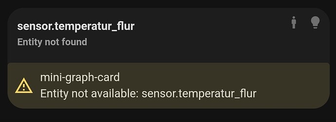
very confusing… I copied your code into a new view and it is not working…
I also set the value to -20 and more
I also checked hacs and I using v3.2.2. Any idea, where the problem could be?
Maybe try a !important; after--chip-spacing: -20px; like this:--chip-spacing: -20px !important;
Unsure why it would change anything, but worthb a shot.
RkcCorian
January 2, 2024, 4:13pm
262
Many thanks! Unfortunately the custom Stack-In-Card is not working and is not maintained since 2020, if I’m right. Card is nor working after install (HACS) · Issue #45 · custom-cards/stack-in-card (github.com)
Works fine if you have it installed. If you are concerned you can use the vertical-stack-in-card instead in mode: horizontal like this:
type: custom:vertical-stack-in-card
mode: horizontal
cards:
  - type: custom:mushroom-climate-card
    entity: climate.office_heating
    show_temperature_control: true
  - type: custom:mushroom-chips-card
    chips:
      - type: template
        icon: mdi:test-tube
        icon_color: deep-orange
        content: |-
          {{state_attr('climate.office_heating','current_temperature')}}
    alignment: end
    card_mod:
      style: |
        ha-card {
          position: absolute;
          top: 12px;
          right: 12px;
        }
1 Like
RkcCorian
January 2, 2024, 4:29pm
264
I try but this is also not working. I might be stupid in installation. I download via HACS and add it to my configuration.yaml like. You might have a hint for me?
frontend:
  themes: !include_dir_merge_named themes
  extra_module_url:
    - /config/www/community/lovelace-card-mod/card-mod.js
    - /config/www/community/vertical-stack-in-card/vertical-stack-in-card.js
If you have HACS and use HAOS you should not need to do anything after downloading, you only need to refresh the page.
RkcCorian
January 2, 2024, 4:37pm
266
Ahhh, thanks for the info. Anyhow it is then not working
Can you show me what you get when trying please?


