Mushroom Cards Card Mod Styling/Config Guide

Hi,

I am struggling a bit with the following:

I would like to get some more space between the title and subtitle but margin seems to do nothing. Could you please help?

card_mod:
  style: |
    ha-card {
    --title-font-size: 70px !important;
    --subtitle-font-size: 20px !important;
    --title-margin-bottom: 20px; 
    }

Try this method…

card_mod:
  style: |
    ha-card {
    --title-font-size: 70px !important;
    --subtitle-font-size: 20px !important;
    --subtitle-line-height:  40px !important;
    }

Good day smart community. I try to make my dashboard a little bit prettier with mushroom cards animations . Most of my cards I figure it out how to animate, but 2 I have no idea what to do.
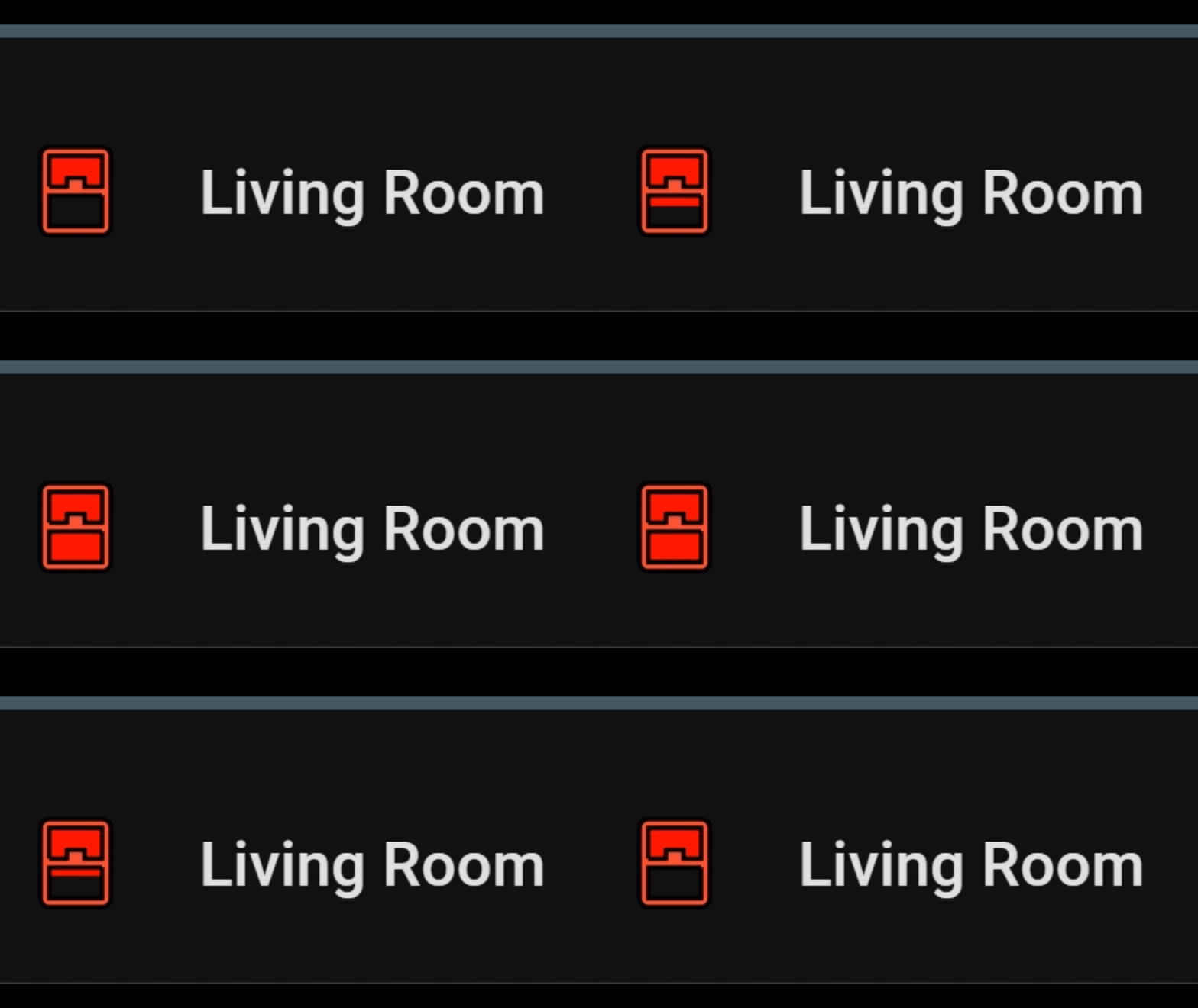
One is Windows card: I want window icon to open and close up and down like garage door animation , but no luck

type: custom:mushroom-template-card
primary: Living Room
icon: mdi:window-open
icon_color: red
entity: binary_sensor.window_contact
tap_action:
  action: none
hold_action:
  action: none
double_tap_action:
  action: none
card_mod:
  style:
    mushroom-shape-icon$: |
      .shape {
        --shape-color: none !important;
      }
    .: |

      ha-card {
        background: none !important;
        border: none !important;
      }
visibility:
  - condition: state
    entity: binary_sensor.window_contact
    state: "on"
```
![image|392x133](upload://r0d0ua3ztfo14X1EMzEuyO0zxd2.png)
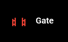
Second: it's a gates, which I want to open and close like  doors swing left and right
```
type: custom:mushroom-template-card
primary: Gate
icon: mdi:gate-open
icon_color: red
entity: binary_sensor.gates_window_door_is_open
tap_action:
  action: none
hold_action:
  action: none
double_tap_action:
  action: none
card_mod:
  style:
    mushroom-shape-icon$: |
      .shape {
        --shape-color: none !important;
      }
    .: |
      ha-card {
        background: none !important;
        border: none !important;
      }
visibility:
  - condition: state
    entity: binary_sensor.gates_window_door_is_open
    state: "on"
```
![image|318x164](upload://hwFLLB8HGUDdeRMWl0QnqLPMJkU.png)
And here is an examples of my garage door and regular door 
Thank you @dimitri, @ildar and @Liquid_Cooled for examples and help
```
type: custom:mushroom-template-card
primary: Garage Door
icon: mdi:garage
icon_color: red
entity: binary_sensor.garage_door_contact
tap_action:
  action: none
hold_action:
  action: none
double_tap_action:
  action: none
card_mod:
  style:
    mushroom-shape-icon$: |
      .shape {
        --shape-color: none !important;
      }
    .: |
      ha-card {
        background: none !important;
        border: none !important;
      }
      ha-state-icon {
        animation: door 3s steps(1) infinite alternate; 
      }
      @keyframes door {
        0% { clip-path: inset(0 0 0 0); }
        25%  { clip-path: polygon(0 0, 100% 0, 100% 100%, 68% 100%, 69% 73%, 32% 73%, 31% 100%, 0 100%); }
        50%  { clip-path: polygon(0 0, 100% 0, 100% 100%, 68% 100%, 69% 61%, 32% 61%, 31% 100%, 0 100%); }
        75% { clip-path: polygon(0 0, 100% 0, 100% 100%, 68% 100%, 69% 48%, 32% 48%, 31% 100%, 0 100%); }
      }    
visibility:
  - condition: state
    entity: binary_sensor.garage_door_contact
    state: "on"
```
```
type: custom:mushroom-template-card
primary: Door to Garage
icon: mdi:door
icon_color: red
entity: binary_sensor.door_to_garage_contact
tap_action:
  action: none
hold_action:
  action: none
double_tap_action:
  action: none
card_mod:
  style:
    mushroom-shape-icon$: |
      .shape {
        perspective: 45px;
       --shape-color: none !important;  
      }
    .: |
      ha-state-icon {
        animation: open 6s ease-in-out infinite;
        transform-origin: 30%;
      }
      @keyframes open {
        0%, 66% { transform: rotateY(0deg); }
        33% { transform: rotateY(-120deg); }
      }
      ha-card {
        background: none !important;
        border: none !important;
      }  
visibility:
  - condition: state
    entity: binary_sensor.door_to_garage_contact
    state: "on"
```

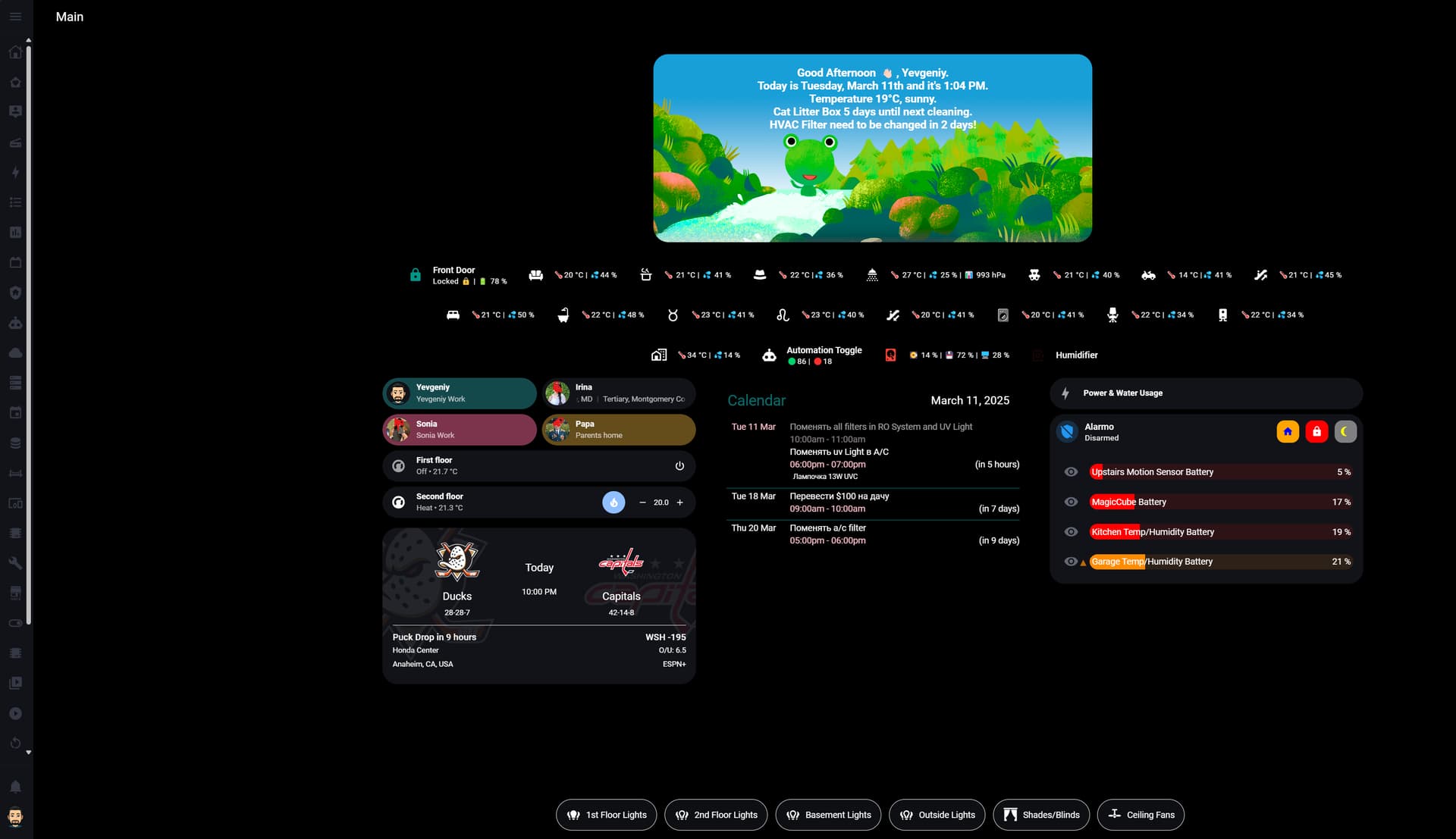
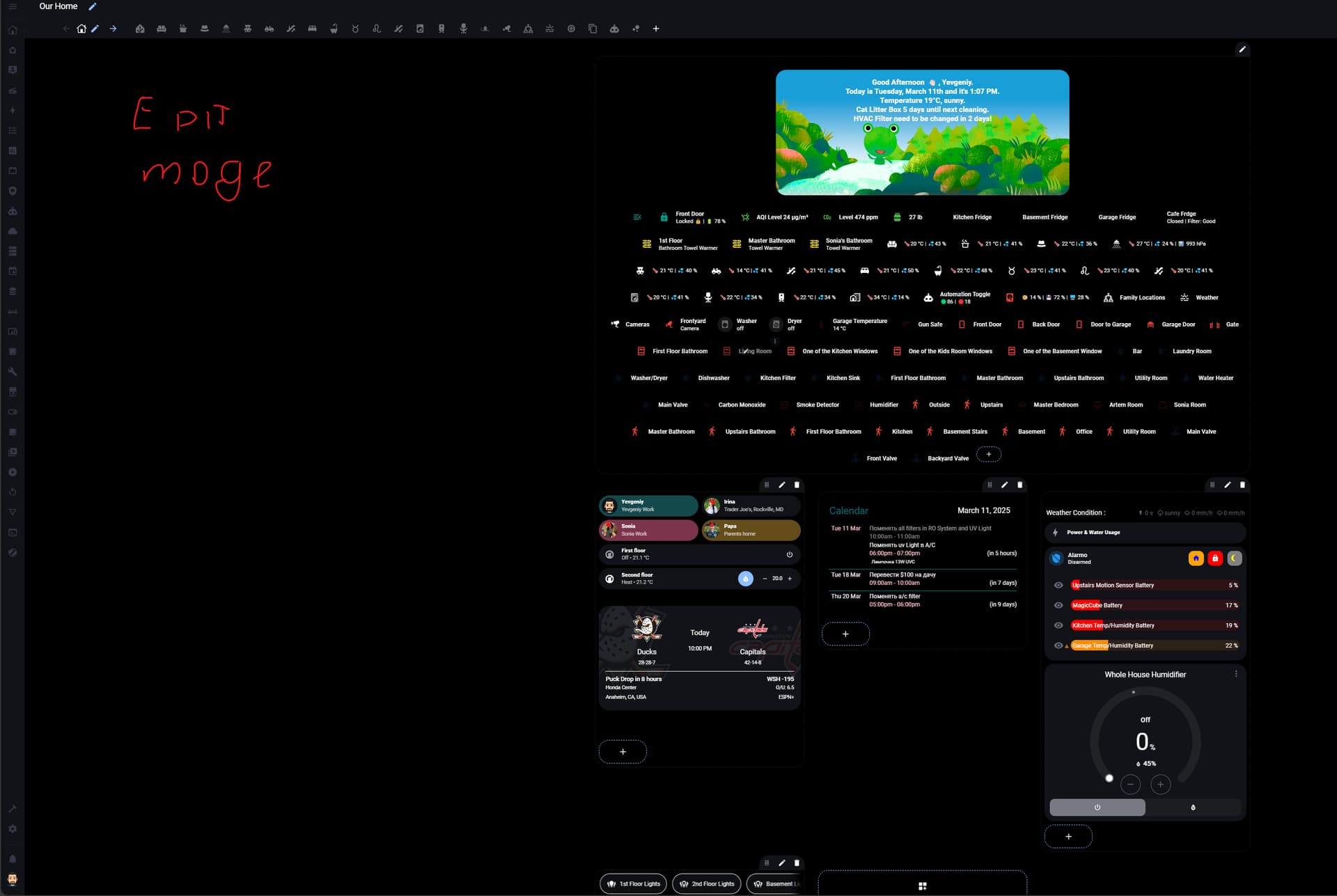
This is how my dashboard looks right now


Edit Mode

Can you describe how you want the window to look when it’s open?

Here is an example I threw together

type: custom:mushroom-template-card
primary: Living Room
icon: mdi:window-closed
icon_color: red
entity: binary_sensor.window_contact
tap_action:
  action: none
hold_action:
  action: none
double_tap_action:
  action: none
card_mod:
  style:
    mushroom-shape-icon$: |
      .shape {
        background: none !important;
        stroke: black;
         }
      .shape:before {
       content: "";
       position: absolute;
       top: 27%;
       right: 33%;
       width: 14px;
       height: 10.5px;
       background: red;}      
    .: |
      ha-card {
        background: none !important;
        border: none !important;
        }
      ha-state-icon:before {
      content: " ";
      position: absolute;
      top: 51%;
      right: 30%;
      width: 14px;
      height: 10px;
      background: red;
      animation: window 3s infinite alternate; }
      @keyframes window {
         0% {  transform: translateY(0px);
            }
        100% {transform: translateY(-10px);
            }
          }

Window Animation (2)

3 Likes

Thank you so much. It’s exactly what I want.

1 Like

clip-path is great, but can be extremely complicated with certain icons. I tend to use pseudo elements for more dynamic icon animation effects :grinning:

2 Likes

I can do some simple stuff, but something like that is above my paygrade :rofl:
Thank you again.

1 Like

This one was fun for me. Made several iterations!!

2 Likes

I know , I am asking to much but can you please check gates card also :blush:

Sure, just give me until tomorrow evening( US Central Time) Logging off soon.

Do you want the gate panels to swing or just collapse left and right?

1 Like

Thank you. Swing, please. I am on EST time

Let me know if you are looking for something different

type: custom:mushroom-template-card
primary: Gate
icon: mdi:gate
icon_color: brown
entity: binary_sensor.gates_window_door_is_open
tap_action:
  action: none
hold_action:
  action: none
double_tap_action:
  action: none
card_mod:
  style:
    mushroom-shape-icon$: |
      .shape {
        perspective: 90px;
        background: none !important;
      }
    .: |
      ha-state-icon {
        animation: gate 6s ease-in-out infinite;
        transform-origin: 0%;
      }
        @keyframes gate {
        0%, 66% { transform: rotateY(0deg); }
        33% { transform: rotateY(-100deg); }
1 Like

Thank you. I did it like that and it swing whole gate. What I would like to see, is mdi:gate-open


with 2 half’s of the gate swing to open, one to the left and the other part to the right.

It will require overlaying icons which I think we have done before with one of your dashboards.

It was the fireplace animation

1 Like

I think we did this with fireplace

type: custom:mushroom-template-card
icon: mdi:fireplace
icon_color: teal
primary: Living Room
card_mod:
  style:
    mushroom-shape-icon$: |
      .shape:after {
         content: "";
         height: 11px;
         width: 11.6px;
         border-width: 0;
         position: absolute;
         margin-top:5px;
         left:14px; 
         clip-path: polygon(71% 83%, 78% 73%, 81% 64%, 80% 55%, 76% 47%, 69% 41%, 63% 36%, 59% 30%, 56% 22%, 59% 13%, 59% 13%, 52% 15%, 45% 20%, 39% 28%, 35% 40%, 36% 49%, 38% 58%, 33% 57%, 30% 51%, 31% 35%, 24% 44%, 19% 58%, 22% 66%, 26% 76%, 35% 85%, 48% 88%, 61% 86%);
         {% if states('light.living_room_lights') == 'on' %}
         background: linear-gradient(to top left, #FFFF11 22%, #FF1A16 57%);
         animation: fire 400ms ease-in-out infinite, drum 2s ease infinite;
         {% endif %}     
                }
      @keyframes fire {
        0%, 100% { transform: translate(0, 0) rotate(0); }
        20%  { transform: translate(0.4px, -0.4px) rotate(4deg); }
        40%  { transform: translate(-0.4px, 0.4px) rotate(-4deg); }
        60%  { transform: translate(0.4px, 0.4px) rotate(4deg); }
         }
    .: |
      ha-card{ 
        --card-primary-font-size: 10px;
        --card-primary-font-weight: bold;
        width: 150px;
        margin-left: 5px !important;
        {% if states('light.living_room_lights') == 'on' %}
        box-shadow: 0px 0px 5px 5px #CBC3E3 !important;
        {% else %}
        box-shadow: 5px 10px 5px -3px rgba(0,0,0,0.75);
        {% endif %}      
        {% if is_state('light.living_room_lights','on') %}
        background: rgba(255, 152, 0, 0.1) !important;
        {% endif %}
        }                               }                                
tap_action:
  action: navigate
  navigation_path: living-room-1
fill_container: true
layout: horizontal
multiline_secondary: false

And it’s one of my favorite animations.
I can stack the icons. Lets see how it turns out.

2 Likes

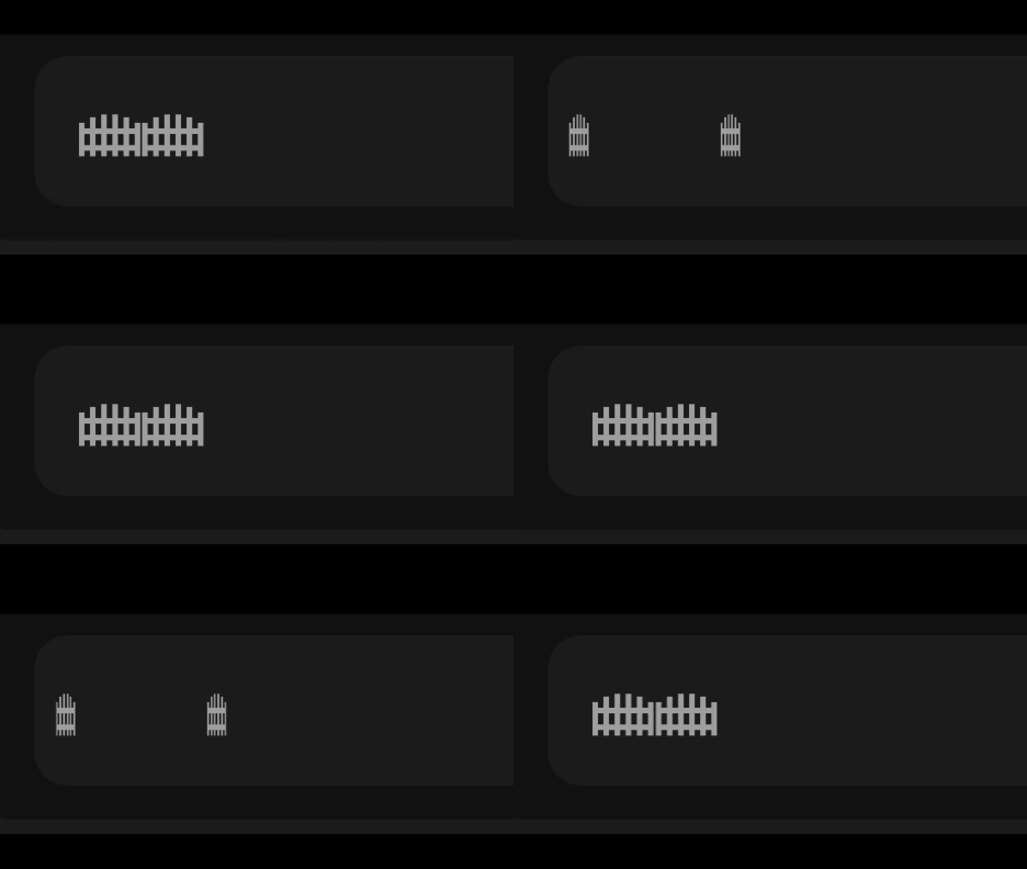
closer

gate

type: custom:stack-in-card
mode: horizontal
cards:
  - type: custom:mushroom-template-card
    primary: " "
    icon: mdi:gate
    icon_color: grey
    card_mod:
      style:
        mushroom-shape-icon$: |
          .shape {
            background: none !important;
          }
        .: |
          ha-state-icon {
            animation: gate 6s ease-in-out infinite;
            transform-origin: 0%;
          }
            @keyframes gate {
            0%, 66% { transform: rotateY(0deg); }
            33% { transform: rotateY(-110deg); }}
          ha-card {
           border: none;}               
  - type: custom:mushroom-template-card
    primary: null
    icon: mdi:gate
    icon_color: grey
    entity: binary_sensor.gates_window_door_is_open
    card_mod:
      style:
        mushroom-shape-icon$: |
          .shape {
            transform: scaleX(-1);
            background: none !important;
          }
        .: |
          ha-state-icon {
            animation: gate 6s ease-in-out infinite;
            transform-origin: 0%;
          }
            @keyframes gate {
            0%, 66% { transform: rotateY(0deg); }
            33% { transform: rotateY(-110deg); }
                }
          ha-card {
           left: -302px;
           top: -.1px;
           border: none;}
card_mod:
  style: |
    ha-card { border: none;}

1 Like

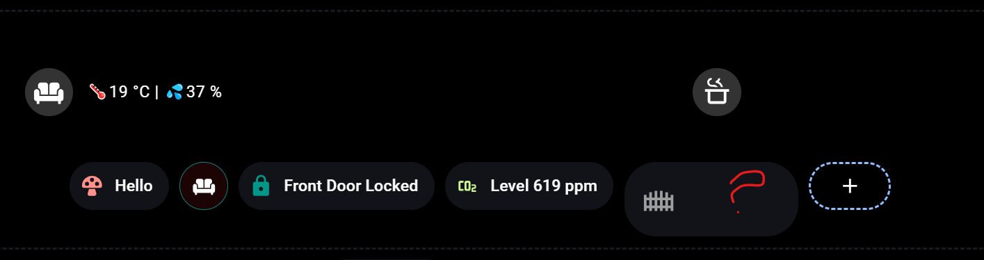
Yes it is close. When I put your code in badges area, it’s showing only one part of the card, but in main area it’s showing exactly like yours.

I’ll test that format but try reducing the left margin left: -302px; to something a lot lower.

          ha-card {
           left: -302px;
           top: -.1px;
           border: none;}
2 Likes