Use something like this
type: custom:mushroom-chips-card
alignment: center
chips:
  - type: template
    icon: mdi:trash-can
    content: |
      Line 1
    card_mod:
          style: |
        ::slotted(span) {
           white-space: pre-line !important;
           text-align: center;
           color: blue !important;
          }
        ::slotted(span):after {
         content:"Line 2";
         font-size: 20px;
         color: green !important;
        }
        ha-card {
          --chip-background: orange;
          --chip-border-color: darkorange;
1 Like
rbalaev
September 29, 2025, 7:34am
1521
Thank you so much, it worked!
ausfas
September 29, 2025, 12:26pm
1522
thanks a lot !
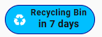
type: custom:mushroom-chips-card
alignment: center
chips:
  - type: template
    icon: mdi:recycle
    content: Recycling Bin
    card_mod:
      style: |
        ::slotted(span) {
          display: block;
          text-align: center;
          font-size: 8px;        /* style for line 1 */
          font-weight: 100;
        }
        /* second line appended dynamically */
        ::slotted(span)::after {
          content: "in {{ state_attr('sensor.recycle_bin','daysTo') }} days";
          display: block;
          font-size: 12px;       /* style for line 2 */
          font-weight: 700;
          margin-top: 1px;       /* << add spacing */
          line-height: 1.4;      /* optional extra control */
        }
        ha-card {
          --chip-background: deepskyblue;
          --chip-border-color: darkblue;
          --card-mod-icon-color: white;
          color: black;
        }
Dan1jel
September 29, 2025, 8:06pm
1523
Thanks for pointing this out, noticed one icon was missing its background, but for me, i dont need “more-info”, is there no other way to just have/keep a background without an action attached to it?
Frosty
September 30, 2025, 7:20am
1524
Quick and easy way, just create a template switch in the ui that doesn’t do anything and use that as the entity in the template card for all the ones you want a background for.
Dan1jel
September 30, 2025, 9:37am
1525
Right now i have so the battery shows when pressing the icon, before i had “long-press” to show more-info, this works but i would like the icon and the button to act as one… But ill see if i go with the template in the future or if i keep it like this.
Thanks for the reply though!
1 Like
Diggs
September 30, 2025, 4:34pm
1526
Hi,
I’m looking for help with a mushroom template card. After updating Mushroom to a newer version, this card is broken, and the icon no longer resizes. Can anyone help?
type: custom:mushroom-template-card
icon: mdi:solar-power-variant
grid_options:
  columns: 12
  rows: 6
badge_color: ""
multiline_secondary: false
badge_icon: ""
hold_action:
  action: none
double_tap_action:
  action: none
tap_action:
  action: navigate
  navigation_path: ...
color: white
vertical: true
features_position: bottom
card_mod:
  style: |
    mushroom-state-item {
      --icon-size: 240px;
    }
    mushroom-shape-icon {
      --shape-color: transparent !important;  /* removes circle background */
      --icon-color: var(--primary-text-color);  /* optional: custom icon color */
    }
    ha-state-icon {
      animation: rays 2s ease infinite;
    }

    @keyframes rays {
      0%, 100% { clip-path: inset(0 0 0 0); }
      80% { clip-path: polygon(100% 99%, 0% 99%, 11% 50%, 57% 48%, 56% 31%, 41% 31%, 33% 25%, 29% 18%, 27% 11%, 27% 6%, 74% 6%, 73% 15%, 69% 23%, 62% 29%, 71% 42%, 87% 47%); }
    }
before home assistant upgrade to 2025.10.0 this code working great !
            - type: custom:mushroom-template-card
                entity: light.lumiere_salon
                icon: mdi:sofa
                icon_color: |
                  {% if is_state(entity, 'on') %}
                  #03A9F4
                  {% else %}
                    grey
                  {% endif %}
                primary: Pièce de vie
                secondary: |
                  Te️mp: {{ states('sensor.thermometre_salon_temperature') | float(0) | r
                  Hum: {{ states('sensor.thermometre_salon_humidity') | float(0) | round
                  consigne: {{ state_attr('climate.thermostat_salon', 'temperature') | f
                multiline_secondary: true
                layout: horizontal
                tap_action:
                  action: none
                double_tap_action:
                  action: none
                hold_action:
                  action: none
                badge_icon: |
                  {% if is_state('binary_sensor.presence_sensor_fp2_5456_presence_sensor
                    mdi:motion-sensor
                  {% else %}
                    mdi:motion-sensor-off
                  {% endif %}
                badge_color: |
                  {% if is_state('binary_sensor.presence_sensor_fp2_5456_presence_sensor
                    orange
                  {% else %}
                    grey
                  {% endif %}
                card_mod:
                  style:
                    ha-tile-info$: |
                      :host {
                        top: -38px;
                        text-align: left !important;
                        overflow: visible !important;
                        white-space: normal !important;
                      }
                      .primary {
                        font-size: 16px !important;
                        width: 200px !important;
                        position: relative !important;
                        left: 0px; !important;
                      }
                      .secondary {
                        width: 100px !important;
                        position: relative !important;
                        left: -122px; !important;
                      }
                    ha-tile-icon$: |
                      .container {
                        width: 125px !important;
                        height: 125px !important;
                        --mdc-icon-size: 90px !important;
                        border-radius: 50% !important;
                      }
                      :host {
                        position: relative;
                        left: -28px;
                        top: 70px !important;
                        }
                    ha-tile-badge$: |
                      .badge {
                        width: 17px !important;
                        height: 17px !important;
                        border-radius: 50% !important;
                        position: relative !important;
                        left: -16px !important;
                        top: 10px !important;
                      }
                    .: |
                      ha-card {
                        background: transparent !important;
                        }
ErikSteiner
October 3, 2025, 3:18pm
1530
Hey there, I try to change the background of it dynamically. I want to make it for a window. If the window is closed, it should be black, but if the window is open, it should be orange.
Can somebody help me?
type: custom:mushroom-chips-card
chips:
  - type: template
    entity: binary_sensor.fensterkontakt_wohnzimmer_contact
    content: "{{ 'Offen' if is_state(entity,'on') else 'Geschlossen' }}"
    icon: "{{ 'mdi:window-open' if is_state(entity,'on') else 'mdi:window-closed' }}"
    icon_color: green
    card_mod:
      style: |
        ha-card {
          --chip-background: deepskyblue;
          --chip-border-color: darkblue;
          --card-mod-icon-color: white;
          color: black;
        }
Zenia
October 3, 2025, 3:35pm
1531
Try something like that
icon: |-
  {% if is_state(entity, 'open') %}
    mdi:window-open
  {% else %}
    mdi:window
  {% endif %}
icon_color: |-
  {% if is_state(entity, 'open') %}
    orange
  {% else %}
    black
  {% endif %}
My code for lock
type: custom:mushroom-legacy-template-card
primary: Front Door
secondary: |-
  {% if is_state(entity, 'unlocked') %}
    Unlocked 🔓
  {% else %}
    Locked 🔒 | 🔋 {{states('sensor.front_door_lock_battery_level_2') | int(0)}} %
  {% endif %}
icon: |-
  {% if is_state(entity, 'unlocked') %}
    mdi:lock-open-variant-outline
  {% else %}
    mdi:lock
  {% endif %}
icon_color: |-
  {% if is_state(entity, 'unlocked') %}
    red
  {% else %}
    teal
  {% endif %}
entity: lock.front_door_lock_2
fill_container: true
card_mod:
  style:
    mushroom-shape-icon$: |
      .shape {
        --shape-color: none !important;
      }
    .: |
      ha-card {
        {% set state = states('sensor.front_door_lock_battery_level_2') %}
          {% if is_number(state) and state | float < 25 %}
        box-shadow: 0px 0px 5px 5px #CBC3E3 !important;
        {% else %}
        box-shadow: 5px 10px 5px -3px rgba(0,0,0,0.75);
        {% endif %}
        background: none !important;
        }
ErikSteiner
October 3, 2025, 3:52pm
1532
It works. This is my window:
type: template
entity: this.entity_id
content: "{{ 'Offen' if is_state(entity,'on') else 'Geschlossen' }}"
icon: "{{ 'mdi:window-open' if is_state(entity,'on') else 'mdi:window-closed' }}"
card_mod:
  style: |
    ha-card {
      --chip-border-color:
        {% if states(config.entity) == 'on' %}
          orange
        {% else %}
          var(--chip-border-color)
        {% endif %};
    }}
However, I noticed, that there is a slight difference to the temperature and humidity card:
  - type: custom:auto-entities
    show_empty: true
    show_debug: true
    card_param: chips
    card:
      type: custom:mushroom-chips-card
      alignment: start
      icon_color: red
    filter:
      include:
        - options:
            type: entity
            icon_color: red
          area: wohnzimmer
          attributes:
            device_class: temperature
        - options:
            type: entity
            icon_color: blue
          area: wohnzimmer
          attributes:
            device_class: humidity
Is it possible, to have the same border color for the window, like the other two?
Zenia
October 3, 2025, 4:04pm
1533
I don’t see if your other 2 chips have a card_mod or not
ErikSteiner
October 3, 2025, 8:53pm
1534
No, they don’t. I solved it by using a similar color for the border of the window. So it matches now the temperature and humidity card:
card_mod:
  style: |
    ha-card {
      --chip-border-color:
        {% if states(config.entity) == 'on' %}
          orange
        {% else %}
          #343434
        {% endif %};
    }}
1 Like
scw2wi
October 5, 2025, 6:34am
1535
Does anybody know how to remove the icon shape in the mushroom-template-card?
I tried several things according to some examples I found, but nothing worked so far.
# Warning: Code not working, except "border: none"
      card_mod:
        style:
          ha-tile-icon$: |
            .icon {
              background: none !important;
            }
          .: |
            ha-card {
              border: none;
            }
# Warning: Code for "shape-color" not working!
      card_mod:
        style: |
          ha-card {
            border: none;
          }
          ha-tile-icon {
            --tile-icon-color: var(--primary-color) !important;
            --shape-color: transparent !important;
          }
Update:
Now I found a solution, how to hide the shape around the icon of the mushroom-template-card.
      card_mod:
        style:
          ha-tile-icon$: |
            .container.background::before {
              background-color: transparent !important;
            }
          .: |
            ha-card {
              border: none;
            }
I am always strugling around because I do not fully understand how card-mod really works or how the syntax can easily be identified. Maybe my CSS knowledge is not sufficient for that.
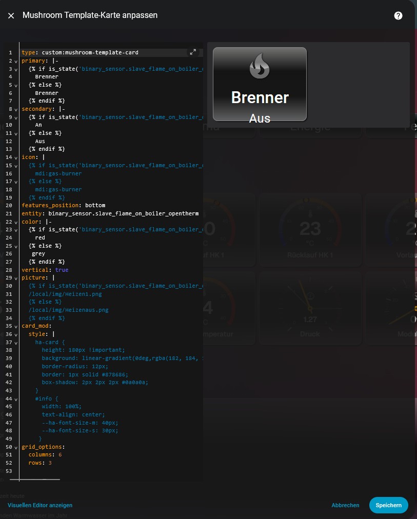
Hello,
Can someone tell me exactly what I need to enter in the Mushroom template card to make the image larger?
I can change the size in the browser, but I don’t know the command in Home Assistant.
I would appreciate any help.
Test this…
card_mod:
  style:
    ha-tile-icon$: |
      .container {
        border: 1px solid white;
        width: 70px !important;
        height: 70px !important;
            }
I’d suggest using this…
card_mod:
  style:
    ha-tile-icon$: |
      .container {
        --tile-icon-color: none !important;
       }
Hi all,
What am I missing here ?