Can you show your code for cards ?
just create a new dashboard in HA, and raw edit it. Just paste the dashboard code from above and some things will show up. Good place to start I guess

hello thanks for sharing this great dashboard & i just have a question if you like the
input_select.dashboard_modes
below or is it the same as the others ? thanks in advance!
Hi,
I’m having difficulties with the navigation.
I get an error when clicking a tile saying script.dashboard_navigation doesn’t exist.
Can you provide the code for the script of give some guidance in how to get it working?
srry for not providing it. There might be more, but let see if you can go a bit further now. Here is the script. Just create one in the gui , raw edit and paste the code:
alias: Dashboard Navigation
sequence:
  - if:
      - condition: or
        conditions:
          - condition: template
            value_template: "{{'MacBook' in browser_id }}"
          - condition: template
            value_template: "{{'Tablet' in browser_id }}"
          - condition: template
            value_template: "{{'Werklaptop' in browser_id }}"
    then:
      - service: input_select.select_option
        data:
          option: "{{ view }}"
        target:
          entity_id: input_select.dashboard_view
    else:
      - service: browser_mod.navigate
        data_template:
          path: "{{ navigate }}"
          browser_id: "{{ browser_id }}"
mode: single
2 Likes

Thanks, this will certainly help 

hi How do you resize the card, my card is over laping When in PC and in mobile phone is not accurate im using px, tried to use vw also but cant resize it i am using grid card also
1 Like
Mini graph card showing power use over a 24-hour period, with toggle buttons at the top for the plugs.

type: custom:vertical-stack-in-card
cards:
  - type: grid
    square: false
    columns: 3
    cards:
      - type: custom:mushroom-entity-card
        entity: switch.tasmota_plug_pc
        layout: vertical
        primary_info: none
        secondary_info: none
        name: PC
        icon_color: red
        icon: mdi:monitor
        tap_action:
          action: toggle
      - type: custom:mushroom-entity-card
        entity: switch.tasmota_plug_kettle
        layout: vertical
        primary_info: none
        secondary_info: none
        name: Kettle
        icon_color: green
        icon: mdi:kettle
        tap_action:
          action: toggle
      - type: custom:mushroom-entity-card
        entity: switch.tasmota_plug_washing
        layout: vertical
        primary_info: none
        secondary_info: none
        name: Washing
        icon_color: blue
        icon: mdi:washing-machine
        tap_action:
          action: toggle
  - type: custom:mini-graph-card
    entities:
      - entity: sensor.tasmota_plug_pc_energy_power
        name: Temperature
        color: var(--red-color)
      - entity: sensor.tasmota_plug_kettle_energy_power
        name: Humidity
        color: var(--green-color)
      - entity: sensor.tasmota_plug_washing_energy_power
        name: Humidity
        color: var(--blue-color)
    hours_to_show: 24
    line_width: 2
    font_size: 50
    animate: true
    smoothing: false
    height: 200
    points_per_hour: 3
    show:
      name: false
      icon: false
      state: false
      legend: false
      fill: fade
1 Like
I have been in the process of rebuilding my mobile dashboard using the mushroom cards, so with getting inspiration from the community, especially the room cards above by @MRobi, i have come up with a matching variant for my person cards that follows the theme i am using across my dashboard.
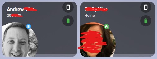
*Excuse the amateurish scribbles lol
It uses the following components from HACS
HACS - Mushroom Cards
HACS - Vertical Stack In Card
And here is the original post by @MRobi that i used for my room cards and drew inpiration from
MROBI - Mushroom Room Cards
Now this is just my first attempt and im considering what chips to put across the right hand side, at the moment its just the battery state and the battery level of our mobiles but as its an icon and not text not sure about what to do with waze travel times or anything else.
The picture itself is in colour when at home and grayscale when away from home and the icon and icon colour will change based on the state,
Below is my code;
type: vertical-stack
cards:
  - type: horizontal-stack
    cards:
      - type: custom:vertical-stack-in-card
        cards:
          - type: custom:mushroom-person-card
            entity: person.andrew
            use_entity_picture: true
            icon: mdi:account
            icon_color: |
              {% if is_state(config.entity, 'home') %}
                #03A9F4
              {% else %}
                grey
              {% endif %}
            layout: horizontal
            tap_action:
              action: navigate
              navigation_path: /dashboard-mobile/andrew
            double_tap_action:
              action: navigate
              navigation_path: /dashboard-mobile/andrew
            hold_action:
              action: none
            card_mod:
              style:
                mushroom-state-info$: |
                  .primary {
                    font-size: 16px !important;
                    position: relative;
                    top: -50px;
                    left: -155px;
                    width: 130px;
                    overflow: visible !important;
                    white-space: normal !important;
                  }
                  .secondary {
                    position: relative;
                    overflow: visible !important;
                    top: -52px;
                    left: -155px;
                  }
                mushroom-shape-icon$: |
                  .shape {
                    position: relative;
                    left: -43px;
                    top: 55px;
                  }
                mushroom-shape-avatar$: |
                  .picture {
                    position: relative;
                    left: -43px;
                    top: 55px;
                    {% if is_state(config.entity, 'home') %}
                    {% else %}
                      filter: grayscale(100%);
                    {% endif %}
                    }
                .: |
                  :host {
                    --mush-icon-size: 146px;
                  }
                style: |
                  mushroom-badge-icon {
                    left: 65px;
                    top: 60px;
                  }
          - type: custom:mushroom-chips-card
            chips:
              - type: template
                entity: sensor.andrews_iphone_12_pro_max_battery_state
                icon: >-
                  {% set
                  state=states('sensor.andrews_iphone_12_pro_max_battery_state')
                  %} {% if state=='Charging' %}
                    mdi:cellphone-charging
                  {% else %}
                    mdi:cellphone
                  {% endif %}
                icon_color: >-
                  {% set
                  state=states('sensor.andrews_iphone_12_pro_max_battery_state')
                  %} {% if state=='Charging' %}
                    green
                  {% else %}
                    white
                  {% endif %}
                tap_action:
                  action: none
                hold_action:
                  action: none
              - type: template
                entity: sensor.andrews_iphone_12_pro_max_battery_level
                icon: >-
                  {% set bl = states('sensor.andrews_iphone_12_pro_max_battery_level') | int %}
                  {% if bl < 10 %} mdi:battery-outline
                  {% elif bl < 20 %} mdi:battery-10
                  {% elif bl < 30 %} mdi:battery-20
                  {% elif bl < 40 %} mdi:battery-30
                  {% elif bl < 50 %} mdi:battery-40
                  {% elif bl < 60 %} mdi:battery-50
                  {% elif bl < 70 %} mdi:battery-60
                  {% elif bl < 80 %} mdi:battery-70
                  {% elif bl < 90 %} mdi:battery-80
                  {% elif bl < 100 %} mdi:battery-90
                  {% elif bl == 100 %} mdi:battery
                  {% else %} mdi:battery-unknown
                  {% endif %}
                icon_color: >-
                  {% set bl = states('sensor.andrews_iphone_12_pro_max_battery_level') | int %}
                  {% if bl < 10 %} red
                  {% elif bl < 20 %} red
                  {% elif bl < 30 %} red
                  {% elif bl < 40 %} orange
                  {% elif bl < 50 %} orange
                  {% elif bl < 60 %} orange
                  {% elif bl < 70 %} green
                  {% elif bl < 80 %} green
                  {% elif bl < 90 %} green
                  {% elif bl < 100 %} green
                  {% elif bl == 100 %} green
                  {% else %} grey
                  {% endif %}
                tap_action:
                  action: none
                hold_action:
                  action: none
            card_mod:
              style:
                .: |
                  ha-card {
                    width: 66px;
                    margin-left: 80%;
                    top: -170px;
                    background: none;
                    --chip-border-width: 0;
                  }
        card_mod:
          style: |
            ha-card:active {
              transform: scale(0.9);
              transition: 0s;
            }
            ha-card {
              height: 178px ;
              margin-left: auto;
              margin-right: auto;
            }

      - type: custom:vertical-stack-in-card
        cards:
          - type: custom:mushroom-person-card
            entity: person.emily
            use_entity_picture: true
            icon: mdi:account
            icon_color: |
              {% if is_state(config.entity, 'home') %}
                #03A9F4
              {% else %}
                grey
              {% endif %}
            layout: horizontal
            tap_action:
              action: navigate
              navigation_path: /dashboard-mobile/emily
            double_tap_action:
              action: navigate
              navigation_path: /dashboard-mobile/emily
            hold_action:
              action: none
            card_mod:
              style:
                mushroom-state-info$: |
                  .primary {
                    font-size: 16px !important;
                    position: relative;
                    top: -50px;
                    left: -155px;
                    width: 130px;
                    overflow: visible !important;
                    white-space: normal !important;
                  }
                  .secondary {
                    position: relative;
                    overflow: visible !important;
                    top: -52px;
                    left: -155px;
                  }
                mushroom-shape-icon$: |
                  .shape {
                    position: relative;
                    left: -43px;
                    top: 55px;
                  }
                mushroom-shape-avatar$: |
                  .picture {
                    position: relative;
                    left: -43px;
                    top: 55px;
                    {% if is_state(config.entity, 'home') %}
                    {% else %}
                      filter: grayscale(100%);
                    {% endif %}
                    }
                .: |
                  :host {
                    --mush-icon-size: 146px;
                  }
                style: |
                  mushroom-badge-icon {
                    left: 65px;
                    top: 60px;
                  }
          - type: custom:mushroom-chips-card
            chips:
              - type: template
                entity: sensor.emilys_iphone_12_pro_max_battery_state
                icon: >-
                  {% set
                  state=states('sensor.andrews_iphone_12_pro_max_battery_state')
                  %} {% if state=='Charging' %}
                    mdi:cellphone-charging
                  {% else %}
                    mdi:cellphone
                  {% endif %}
                icon_color: >-
                  {% set
                  state=states('sensor.emilys_iphone_12_pro_max_battery_state')
                  %} {% if state=='Charging' %}
                    green
                  {% else %}
                    white
                  {% endif %}
                tap_action:
                  action: none
                hold_action:
                  action: none
              - type: template
                entity: sensor.emilys_iphone_12_pro_max_battery_level
                icon: >-
                  {% set bl = states('sensor.emilys_iphone_12_pro_max_battery_level') | int %}
                  {% if bl < 10 %} mdi:battery-outline
                  {% elif bl < 20 %} mdi:battery-10
                  {% elif bl < 30 %} mdi:battery-20
                  {% elif bl < 40 %} mdi:battery-30
                  {% elif bl < 50 %} mdi:battery-40
                  {% elif bl < 60 %} mdi:battery-50
                  {% elif bl < 70 %} mdi:battery-60
                  {% elif bl < 80 %} mdi:battery-70
                  {% elif bl < 90 %} mdi:battery-80
                  {% elif bl < 100 %} mdi:battery-90
                  {% elif bl == 100 %} mdi:battery
                  {% else %} mdi:battery-unknown
                  {% endif %}
                icon_color: >-
                  {% set bl = states('sensor.emilys_iphone_12_pro_max_battery_level') | int %}
                  {% if bl < 10 %} red
                  {% elif bl < 20 %} red
                  {% elif bl < 30 %} red
                  {% elif bl < 40 %} orange
                  {% elif bl < 50 %} orange
                  {% elif bl < 60 %} orange
                  {% elif bl < 70 %} green
                  {% elif bl < 80 %} green
                  {% elif bl < 90 %} green
                  {% elif bl < 100 %} green
                  {% elif bl == 100 %} green
                  {% else %} grey
                  {% endif %}
                tap_action:
                  action: none
                hold_action:
                  action: none
            card_mod:
              style:
                .: |
                  ha-card {
                    width: 66px;
                    margin-left: 80%;
                    top: -170px;
                    background: none;
                    --chip-border-width: 0;
                  }
        card_mod:
          style: |
            ha-card:active {
              transform: scale(0.9);
              transition: 0s;
            }
            ha-card {
              height: 178px ;
              margin-left: auto;
              margin-right: auto;
            }
Any suggestions / comments welcome
3 Likes
@ingo.niehues Please excuse my ignorance but i have know idea how to use the templates … do you put these in the raw yaml file for your page or is there a specific place to put them.
Any help greatly appreciated
1 Like
Does anyone know how i could make the background of a card a map ? i think woukld look good if the background was a map representing the current location
1 Like
updated version for HA 2023.5
also finally managed to move the backarrow of a sub-view 
---
Navbar:
  card-mod-theme: "Navbar"
  header-height: "78px"
  card-mod-view-yaml: |
    "*:first-child$": |
      #columns .column > * {
        padding-left: 5px;
        padding-right: 5px;
        padding-bottom: 5px;
      }
  # Move navbar
  card-mod-root-yaml: |
    ha-tabs$: |
      #tabsContent {
        width: 97%;
      }
      paper-icon-button {
        display: none;
      }
    .: |
      @media (orientation: portrait) {
        a.menu-link[target="_blank"], ha-button-menu, ha-menu-button, [main-title] {
          display: none !important;
        }
      }
      div#view {
        transform: initial;
        padding: 0 !important;
        margin: 0 !important;
        width: 100%;
        padding-bottom: var(--header-height) !important;
      }
      .header {
        top: auto !important;
        bottom: 0px !important;
        box-shadow: var(--footer-shadow);
        height: var(--header-height) !important;
      }
      .toolbar {
        height: var(--header-height) !important;
        padding: 10px 0px !important;
        background: var(--card-background-color);
      }
      #view {
        padding-top: calc(-1 * var(--header-height)) !important;
      }
      ha-tabs {
        --paper-tabs-selection-bar-color: var(--header-tab-indicator-color) !important;
        --mdc-icon-size: 26px;
        display: flex;
        justify-content: space-between;
        padding: 10px;
        margin-top: 15px;
        height: var(--header-height) !important;
      }
      paper-tab[aria-selected=true] {
        color: var(--header-active-tab-color);
        background-color: var(--header-active-tab-bg-color);
      }
      paper-tab {
        color: var(--header-all-tabs-color);
        --paper-tab-ink: var(--card-background-color);
        border-radius: 25px;
        height: 50px;
        padding: 0 1.58rem;
      }
      .main-title {
        padding-bottom: 10px;
      }
      .mdc-icon-button {
        padding-bottom: 20px;
      }
      ha-icon-button-arrow-prev {
        padding-bottom: 10px;
        padding-left: 20px;
      }
  # Mushroom layout
  mush-spacing: 12px
  # Title
  mush-title-padding: 24px 12px 16px
  mush-title-spacing: 12px
  mush-title-font-size: 24px
  mush-title-font-weight: normal
  mush-title-line-height: 1.2
  # Subtitle
  mush-subtitle-font-size: 16px
  mush-subtitle-font-weight: normal
  mush-subtitle-line-height: 1.2
  # Card
  mush-card-primary-font-size: 14px
  mush-card-secondary-font-size: 12px
  mush-card-primary-font-weight: bold
  mush-card-secondary-font-weight: bolder
  mush-card-primary-line-height: 1.5
  mush-card-secondary-line-height: 1.5
  # Chip
  mush-chip-spacing: 8px
  mush-chip-padding: 0 0.25em
  mush-chip-height: 36px
  mush-chip-border-radius: 18px
  mush-chip-font-size: 0.3em
  mush-chip-font-weight: bold
  mush-chip-icon-size: 0.5em
  mush-chip-avatar-padding: 0.1em
  mush-chip-avatar-border-radius: 50%
  mush-chip-background: var(--ha-card-background)
  # Control
  mush-control-border-radius: 12px
  mush-control-height: 42px
  mush-control-button-ratio: 1
  mush-control-icon-size: 0.5em
  # Slider
  mush-slider-threshold: 10
  # Badge
  mush-badge-size: 16px
  mush-badge-icon-size: 0.75em
  mush-badge-border-radius: 50%
  # Icon
  mush-icon-border-radius: 50%
  mush-icon-size: 42px
  mush-icon-symbol-size: 0.5em
  # Colors
  mush-rgb-red: 244, 67, 54
  mush-rgb-pink: 233, 30, 99
  mush-rgb-purple: 156, 39, 176
  mush-rgb-deep-purple: 103, 58, 183
  mush-rgb-indigo: 63, 81, 181
  mush-rgb-blue: 33, 150, 243
  mush-rgb-light-blue: 3, 169, 244
  mush-rgb-cyan: 0, 188, 212
  mush-rgb-teal: 0, 150, 136
  mush-rgb-green: 76, 175, 80
  mush-rgb-light-green: 139, 195, 74
  mush-rgb-lime: 205, 220, 57
  mush-rgb-yellow: 255, 235, 59
  mush-rgb-amber: 255, 193, 7
  mush-rgb-orange: 255, 152, 0
  mush-rgb-deep-orange: 255, 87, 34
  mush-rgb-brown: 121, 85, 72
  mush-rgb-grey: 158, 158, 158
  mush-rgb-blue-grey: 96, 125, 139
  mush-rgb-black: 0, 0, 0
  mush-rgb-white: 255, 255, 255

  mush-rgb-info: var(--mush-rgb-blue)
  mush-rgb-success: var(--mush-rgb-green)
  mush-rgb-warning: var(--mush-rgb-orange)
  mush-rgb-danger: var(--mush-rgb-red)

  mush-rgb-state-fan: var(--mush-rgb-green)
  mush-rgb-state-light: var(--mush-rgb-orange)
  mush-rgb-state-entity: var(--mush-rgb-blue)
  mush-rgb-state-switch: var(--mush-rgb-blue)

  mush-rgb-state-alarm-disarmed: var(--mush-rgb-info)
  mush-rgb-state-alarm-armed: var(--mush-rgb-success)
  mush-rgb-state-alarm-triggered: var(--mush-rgb-danger)

  mush-rgb-state-person-home: var(--mush-rgb-success)
  mush-rgb-state-person-not-home: var(--mush-rgb-danger)
  mush-rgb-state-person-zone: var(--mush-rgb-info)
  mush-rgb-state-person-unknown: var(--mush-rgb-grey)

  mush-rgb-state-cover-open: var(--mush-rgb-blue)
  mush-rgb-state-cover-closed: var(--mush-rgb-disabled)

  mush-rgb-state-climate-auto: var(--mush-rgb-green);
  mush-rgb-state-climate-cool: var(--mush-rgb-blue);
  mush-rgb-state-climate-dry: var(--mush-rgb-orange);
  mush-rgb-state-climate-fan-only: var(--mush-rgb-blue-grey);
  mush-rgb-state-climate-heat: var(--mush-rgb-deep-orange);
  mush-rgb-state-climate-heat-cool: var(--mush-rgb-green);
  mush-rgb-state-climate-idle: var(--mush-rgb-grey);
  mush-rgb-state-climate-off: var(--mush-rgb-disabled);

  # You must keep this to support light/dark theme
  modes:
      light:
          header-active-tab-color: "rgb(var(--mush-rgb-blue))"
          header-active-tab-bg-color: none
          header-all-tabs-color: "rgb(var(--mush-rgb-disabled))"
          header-tab-indicator-color: "var(--card-background-color)"
          app-header-text-color: "var(--primary-text-color)"
          app-header-background-color: "var(--primary-background-color)"
          paper-tabs-selection-bar-color: "var(--card-background-color)"
          footer-shadow: "0px -1px 3px 0px rgba(0,0,0,0.12)"
          # Card
          ha-card-border-radius: 12px
          # ha-card-border-width: 0px
          mush-rgb-disabled: 189, 189, 189
          paper-tab-selected: 33, 150, 243
      dark:
        # Header / Footer
          header-active-tab-color: "rgb(var(--mush-rgb-blue))"
          header-active-tab-bg-color: none
          header-all-tabs-color: "rgb(var(--mush-rgb-disabled))"
          header-tab-indicator-color: "var(--card-background-color)"
          app-header-text-color: "var(--primary-text-color)"
          app-header-background-color: "var(--primary-background-color)"
          paper-tabs-selection-bar-color: "var(--card-background-color)"
          footer-shadow: "0px -1px 3px 0px rgba(0,0,0,0.12)"
          # Card
          ha-card-border-radius: 12px
          ha-card-border-width: 0px
          mush-rgb-disabled: 111, 111, 111
          paper-tab-selected: 255, 255, 255
1 Like
These are beautiful. May I suggest an addition that I feel would appeal to most? How would I go about adding a lights counter as a notification on the bulb icon? I already have the sensors defined, just having trouble figuring out how to implement on the card.
You can find information about how to save templates here:
Click the 3 dots in the upper right corner of your lovelace-view and select “edit dashboard”. Then you will have to click the 3 dots again and select “RAW configuration”. scroll down all the way to the bottom. There you can add your templates like this:
button_card_templates: # You can put your templates below this text
  header: # this is the name of the 1st template and below the configuration for the 1st template
    styles:
      card:
        - padding: 5px 15px
        - background-color: var(--paper-item-icon-active-color)
      name:
        - text-transform: uppercase
        - color: var(--primary-background-color)
        - justify-self: start
        - font-weight: bold
      label:
        - text-transform: uppercase
        - color: var(--primary-background-color)
        - justify-self: start
        - font-weight: bold

  header_red: # this is the name of the 2nd template and below the configuration for the 2nd template
    template: header
    styles:
      card:
        - background-color: '#FF0000'

  my_little_template: [...] # this is the name of the 3rd template and below the configuration for the 3rd template
Love the fact this gives me practically an extra chip to play with Only question is how would I go about adding a light count to display on the lightbulb entity? Cheers!
Give this a try:
badge_icon: |
  {% if states(entity) == 'on' %}
    mdi:numeric-{{expand(state_attr(entity, 'entity_id'))| selectattr('state','eq','on')|map(attribute='entity_id')|list|count}}
  {% else %}
  {% endif %}
badge_color: |
  {% if states(entity) == 'on' %}
    red
  {% else %}
  {% endif %}
It kind of butts up against the edges of the card so you may want to slightly adjust the card-mod section to move the bulb and chips slightly down
      ha-card {
        width: 66px;
        margin-left: 68%;
        top: -176px;
        background: none;
      }
Changing it from -178 to -176 should do the trick
2 Likes
Did you ever figure this out. I am in the same position. Don’t know what to do with the excess code.
Thanks
Friend, can you help me?
How did you create “update.wud_container_local_adguardhome”?
I would love to use your system on my home assistant, but I’m quite new to home. Could you explain me? I’ve replaced the switch.docker_cloudflared_tunnel id with mine, but it looks like “update.wud_container_local_adguardhome” is a custom entity being used to control or monitor the update state of a specific Docker container called “adguardhome”.
Help me create this entity?