joseluis9595:
|-
Unfortunately, that didn’t work, but thank you anyway!
I’ve now created a template where a sensor counts the number of lights switched on in each room (area). Essentially the same as here for the entire area.
Then this works too:
badge:
  show: >
    [[[ return Number(states['sensor.lichter_an_flur_eg']?.state || 0) > 0; ]]]
  color: yellow
mase
December 22, 2025, 9:20pm
351
i think it´s selected_color: on a route.
...
    routes:
      - icon: mdi:home-outline
        label: Home
        selected_color: red
        url: >
          /dashboard-main/home
...
or give styles:a try:
    styles:
      .navbar-card.desktop{
        .button.active {
          --icon-primary-color: red;
        }
      }
0xsilk
December 24, 2025, 7:13pm
352
Hi all, here’s a snippet of my template I defined in the raw config editor of my dashboard:
navbar-templates:
  jt_nav:
    routes:
      - url: /new-dashboard/0
        icon: mdi:home
        label: Home
      - url: /new-dashboard/lights
        icon: mdi:lightbulb-group
        label: Lights
        hold_action:
          action: navigate
          navigation_path: /config/devices/dashboard
        badge:
          show: true
          count: |-
            [[[return Object.keys(states)
              .filter(id => id.startsWith('light.') && states[id].state === 'on')
              .filter(id => {
                const areaId = hass.entities?.[id]?.area_id;
                return areaId !== 'outside';
              }).length;]]]
      - url: /config/automation/dashboard
        icon: mdi:creation
        label: Automations
      - url: /config/dashboard
        icon: mdi:cog
        label: Settings
      - icon: mdi:dots-horizontal
        label: More
        tap_action:
          action: open-popup
        popup:
          - icon: mdi:cog
            url: /config/dashboard
          - icon: mdi:hammer
            url: /developer-tools/yaml
          - icon: mdi:power
            tap_action:
              action: call-service
              service: homeassistant.restart
              service_data: {}
              confirmation:
                text: Are you sure you want to restart Home Assistant?
views:
Template is working fine when I reference it in other views. However, since I moved this section up to the top of the config, I don’t see this card in the edit view anymore, so how am I supposed to make changes to it via the UI?
kbrown01
January 1, 2026, 10:34pm
353
Can the popup be styled in two columns? I have this with 11 popup entries. Can I putthose in two columns so they look better?
In other words, can a popup have a grid?
jata
January 1, 2026, 11:01pm
354
Have you managed to get templates working?
It is a little tricky to work it out at first but once you get a template working on another view it is easy to replicate.
The main points are:
setup the navbar via GUI on your main homepage of a dashboard
create and configure navbar template yaml at top of dashboard yaml
on other views add a new navbar and select the template from the gui
then view yaml for this navbar and delete all default config so you only have template related yaml
copy and paste the tamplate based navbar to any other views where you need it
mluck
January 1, 2026, 11:23pm
355
No I never did get it to work but I think (not 100% sure) it was for a simple reason that was unclear to me at first.
Templates appear to work for views within a dashboard, but not across dashboards. And my dashboards are complex enough that I don’t use views much so.
jata
January 1, 2026, 11:28pm
356
yep - correct. Templates will only work within a dashboard. You would need to add the template to each dashboard for your use case I think
mluck
January 2, 2026, 12:01am
357
Well I appreciate your effort just the same. Good news is that my dashboard navigation is fairly static.
1 Like
This will need some tweaking to look nice, but adding something like this to the styles gives you 2 columns:
.navbar-popup.open-up {
    display: grid !important;
    grid-template-columns: 1fr 1fr;
    grid-gap: 12px;
}
kbrown01
January 2, 2026, 7:36pm
359
Nice start, I can firm that this looks great … with one issue.
So I am trying to target one popup of many with 2 vs 1 column,
But not this one
First popup is “Lights” second one is “Household” … same navbar
iAR
January 13, 2026, 7:32am
360
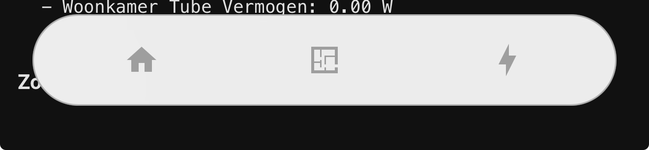
I’ve installed NavBar Card and I noticed that -when in dark mode on my iPhone- the NavBar is white. I am stuggling with css to make it dark for dark mode. Any advise?
werns84
January 15, 2026, 5:55am
361
Use your background map and apply transparency:
background: rgb( from var(--ha-card-background, var(--card-background-color, "#fff")) r g b / 0.5);
OUARZA
January 16, 2026, 2:34pm
362
Hello,
type: grid
cards:
  - type: custom:navbar-card
    desktop:
      position: top
    mobile:
      floating: false
      position: bottom
    routes:
      - icon: local:icone/home-blank
        label: Home
        url: /dashboard-mathieu/smartphone
        icon_color: white
      - hold_action:
          action: navigate
          navigation_path: /config/devices/dashboard
        icon: local:icone/lightbulb-on
        label: Lumières
        url: /dashboard-mathieu/lumieres
        icon_color: white
      - icon: local:icone/temperature-sun
        label: Températures
        url: /dashboard-mathieu/meteo
        icon_color: white
      - icon: local:icone/music_video
        label: Média
        url: /dashboard-mathieu/media
        icon_color: white
      - icon: local:icone/camera-cctv
        label: Caméras
        url: /dashboard-mathieu/camera
        icon_color: white
      - icon: local:icone/pool
        label: Piscine
        url: /dashboard-mathieu/piscine
        icon_color: white
      - icon: local:icone/sprinkler
        label: Arrosage
        url: /dashboard-mathieu/arrosage
        icon_color: white
      - icon: local:icone/screwdriver-wrench
        label: Outils
        url: /dashboard-mathieu/outils
        icon_color: white
      - icon: mdi:alert-circle-outline
        label: ""
        url: /dashboard-mathieu/test
    styles: |
      ha-card {
        background: transparent !important;
        box-shadow: none !important;
        padding: 0 !important;              /* supprime les marges internes */
        border-radius: 0 !important;

        --navbar-box-shadow: none;

        --navbar-background-color: transparent;
        --navbar-route-icon-size: 50px;
        --navbar-route-label-font-size: 16px;
      }
    grid_options:
      columns: 48
      rows: auto
column_span: 4
iAR
January 16, 2026, 2:37pm
363
I am not really sure where to place this and how!?
This is my CSS config now:
.navbar-card,
.navbar-card.mobile.floating,
.navbar-card.desktop,
.media-player {
  border-radius: 34px !important;

  background-color: rgba(255, 255, 255, 0.92) !important;
  backdrop-filter: blur(40px);
  -webkit-backdrop-filter: blur(40px);

  /* zichtbare rand */
  border: 1px solid rgba(0, 0, 0, 0.25) !important;

  box-shadow:
    inset 0 0 0 1px rgba(255, 255, 255, 0.35),
    0 8px 24px rgba(0, 0, 0, 0.12);
}

.navbar-card.mobile.floating {
  bottom: 20px !important;
}

.navbar-card.desktop {
  padding: 0 !important;
}
JFBruns
January 17, 2026, 9:48pm
364
Hi, installed 1.3 / when I use the UI, The only options for the desktop are: Min width / pop up label / Hidden. The other options I saw on your video & instructions are not showing. Kind of new at this, Any thoughts?
werns84
January 21, 2026, 5:38am
365
I just put that
      styles: |
          .navbar-card {
            --navbar-primary-color: var(--primary-color, var(--state-active-color));
            background: rgb( from var(--ha-card-background, var(--card-background-color, "#fff")) r g b / 0.5);
            backdrop-filter: blur(33px);
            '-webkit-backdrop-filter': blur(33px) !important;
      }
So for you it would be
styles: |-
    .navbar-card {
      --navbar-primary-color: var(--primary-color, var(--state-active-color));
      background: rgb( from var(--ha-card-background, var(--card-background-color, "#fff")) r g b / 0.5);
      backdrop-filter: blur(40px);
      '-webkit-backdrop-filter': blur(40px) !important;
          }
    .navbar-card.mobile.floating,
    .media-player {
      border-radius: 34px !important;
      background-color: rgba(255, 255, 255, 0.92) !important;
      backdrop-filter: blur(40px);
      -webkit-backdrop-filter: blur(40px);

      /* zichtbare rand */
      border: 1px solid rgba(0, 0, 0, 0.25) !important;
      box-shadow:
        inset 0 0 0 1px rgba(255, 255, 255, 0.35),
        0 8px 24px rgba(0, 0, 0, 0.12);
    }

    .navbar-card.mobile.floating { bottom: 20px !important;    }
    .navbar-card.desktop { padding: 0 !important;   }
Try to avoid using hard-coded colors because when you use dark mode, or another theme, your colors won’t follow and you’ll have to redo everything each time.
1 Like
nelsonamen
January 24, 2026, 11:09am
366
Hi
** edit: ** I think I have some sort of cacheing issue. I thought if I do a hard reload, it should update my changes to the yaml. But it doesn’t seem to. I’m not sure how to force it to reload. My navbar config is in a lovelace_gen card for reusability. I wonder if that has anything to do with it
Great card! I am having a bit of trouble trying to style the icon and text color for unselected items. I have tried a number of things. Below is an example:
styles: |
  .navbar-card {
    background: rgba(255, 255, 255, 0.4);
    backdrop-filter: blur(10px);
    border: none;
    box-shadow: 0 10px 15px rgba(0, 0, 0, 0.1) !important;
  }
  .button{
    --icon-primary-color: red;
  }
  ha-ripple {
    display: none !important;
  }
I am trying to make them more legible because depending on the background they can blend in.
iAR
January 31, 2026, 2:33pm
368
werns84:
styles: |-
    .navbar-card {
      --navbar-primary-color: var(--primary-color, var(--state-active-color));
      background: rgb( from var(--ha-card-background, var(--card-background-color, "#fff")) r g b / 0.5);
      backdrop-filter: blur(40px);
      '-webkit-backdrop-filter': blur(40px) !important;
          }
    .navbar-card.mobile.floating,
    .media-player {
      border-radius: 34px !important;
      background-color: rgba(255, 255, 255, 0.92) !important;
      backdrop-filter: blur(40px);
      -webkit-backdrop-filter: blur(40px);

      /* zichtbare rand */
      border: 1px solid rgba(0, 0, 0, 0.25) !important;
      box-shadow:
        inset 0 0 0 1px rgba(255, 255, 255, 0.35),
        0 8px 24px rgba(0, 0, 0, 0.12);
    }

    .navbar-card.mobile.floating { bottom: 20px !important;    }
    .navbar-card.desktop { padding: 0 !important;   }
That, unfortunately is not working: