NdR UI based on SoftUI

Hello Guys,

This is my first thread here.
I decided to share with you my “UI Project”, which reached a “sharable” point I guess.

This is still a work in progress, so every suggestion is accepted and, of course, you can use this code for your own setup.

The UI is based on two themes: Clear and Slate. Please, refer to @N-l1 instructions to find out how to set up the whole stuff.

The custom cards used are the following:

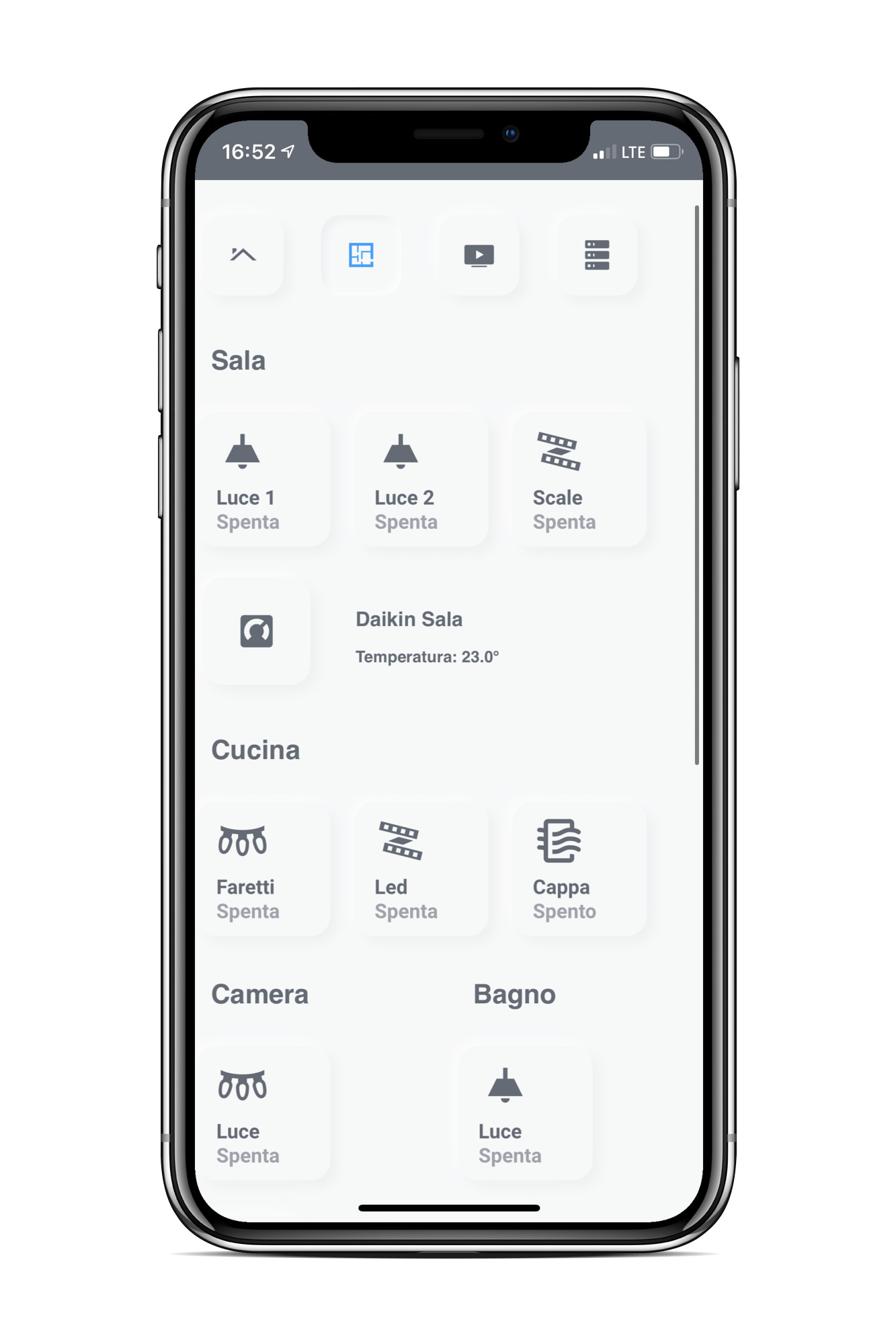
The intent was to create a simple and minimalistic UI, with a scalable design (for smartphone and tablets, but also for PC monitors). I achieved this thanks to Layout Card Gridder, which allows you to set 2 breakpoints and relative cards layout.

My code: NdR UI

############## UPDATED: see the thread for more info! ##############

Here below some screenshots:

Smartphone - Light & Dark Mode


More Screenshots


Tablet Light & Dark Mode

Screenshots

.

Popup

11 Likes

Sieht gut aus gefällt mir.
Teilen sie den Code

Gruss Uwe

I totally forgot to mention the Github Repo :sweat_smile:

Here it is: NdR UI

I added it to the main thread too :upside_down_face:

danke und einen schönen tag

Repo Updated!

Changes:

Added:

  • Security section inside Home View;
  • Popups for Camera Stream and Presence Detection.
  • no-header Theme;
  • no-top-header Theme;

Removed:

  • Custom Header code;

Changes:

  • Home View now has only one Breakpoint since I don’t need the third column (gridaeas 50% - 50% and 100%).
  • Clear and Slate Theme now have two options: you can decide if you want a Compact Header or hide it at all. Please check the yaml files and see the comments.

New Release

No new features in this Release, only some little improvement

Changes:

  • Fixed the more-info popup for weather. Now it shows an animated weather card (Thanks to bramkragten)
Screenshot

  • Splitted the popups code into another file for better organization.
  • Used CSS min for better visualization on mobile, thanks to KTibow
Code Changes From
- type: 'custom:button-card'
  entity: light.entity # Change this to the entity you want to control
  icon: 'mdi:led-strip-variant'
  name: Light
  size: 30%
  styles:
    img_cell:
    # You can adjust padding of the icon
      - padding-left: 30px
      - justify-content: start
    card:
      - margin: 5px
      - width: 100px
      - height: 100px
      - ...

To

- type: 'custom:button-card'
  entity: light.entity # Change this to the entity you want to control
  icon: 'mdi:led-strip-variant'
  name: Light
  size: 30%
  styles:
    img_cell:
    # You can adjust padding of the icon
      - padding-left: 30px
      - justify-content: start
    card:
      - margin: 5px
      - width: min(25vw, 100px)
      - height: min(25vw, 100px)
      - ...