Hello - I have been looking high and low for some guidance but have been unsuccessful on how to add the percentage attribute to my Fan’s custom card. The card is built so that a user can select low, med, full and off. the card is working find but the state for the fan only shows on/off. I am looking for a way to add the percentage attribute next to the status if possible. Any assistance would be greatly appreciated!
Here are a few images of the current card and I have added an entity card below just for testing…

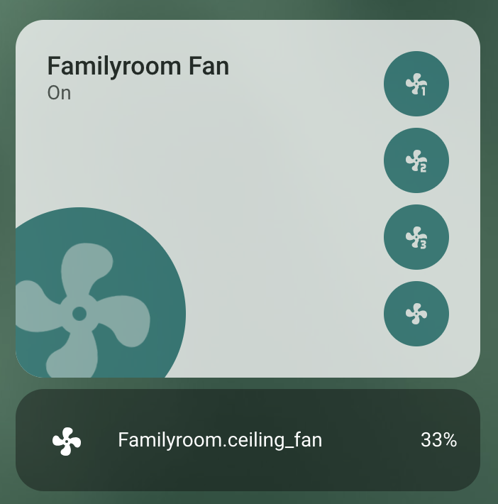

here is the code for the button:
type: custom:button-card
name: Familyroom Fan
icon: mdi:fan
entity: fan.familyroom_ceiling_fan
show_state: true
tap_action:
  action: none
custom_fields:
  btn:
    card:
      type: custom:mushroom-chips-card
      chips:
        - type: entity
          tap_action:
            action: perform-action
            perform_action: fan.set_percentage
            target:
              entity_id: fan.familyroom_ceiling_fan
            data:
              percentage: 33
          icon: mdi:fan-speed-1
          entity: fan.familyroom_ceiling_fan
          content_info: none
          card_mod:
            style: |
              ha-card {
                --chip-background: teal;
                padding: 5px !important;
                border-radius: 100px !important;

                }

        - type: entity
          tap_action:
            action: perform-action
            perform_action: fan.set_percentage
            target:
              entity_id: fan.familyroom_ceiling_fan
            data:
              percentage: 67
          icon: mdi:fan-speed-2
          entity: fan.familyroom_ceiling_fan
          content_info: none
          card_mod:
            style: |
              ha-card {
                --chip-background: teal;
                padding: 5px !important;
                border-radius: 100px !important;

                }
        - type: entity
          tap_action:
            action: perform-action
            perform_action: fan.set_percentage
            target:
              entity_id: fan.familyroom_ceiling_fan
            data:
              percentage: 100
          icon: mdi:fan-speed-3
          entity: fan.familyroom_ceiling_fan
          content_info: none
          card_mod:
            style: |
              ha-card {
                --chip-background: teal;
                padding: 5px !important;
                border-radius: 100px !important;

                }
        - type: entity
          entity: fan.familyroom_ceiling_fan
          tap_action:
            action: perform-action
            perform_action: fan.turn_off
            target:
              entity_id: fan.familyroom_ceiling_fan
          content_info: none
          card_mod:
            style: |
              ha-card {
                --chip-background: teal;
                padding: 5px !important;
                border-radius: 100px !important;

                }
styles:
  grid:
    - grid-template-areas: "\"n btn\" \"s btn\" \"i btn\""
    - grid-template-columns: 1fr min-content
    - grid-template-rows: min-content min-content 1fr
  card:
    - padding: 22px
  img_cell:
    - justify-content: start
    - position: absolute
    - width: 150px
    - height: 150px
    - left: 0
    - bottom: 0
    - margin: 0 0 -30px -30px
    - background: teal
    - border-radius: 200px
  icon:
    - width: 120px
    - color: black
    - opacity: "0.5"
  custom_fields:
    btn:
      - justify-content: end
      - align-self: start
  name:
    - justify-self: start
    - align-self: start
    - font-size: 18px
    - font-weight: 500
    - color: null
  state:
    - min-height: 80px
    - justify-self: start
    - align-self: start
    - font-size: 14px
    - opacity: "0.7"
state:
  - value: "on"
    styles:
      card:
        - background-color: white
        - filter: opacity(75%)
      icon:
        - animation:
            - rotating 1s linear infinite
        - color: null
      name:
        - color: "#1A1A1A"
      state:
        - color: black
  - value: "off"
    styles:
      icon:
        - filter: grayscale(100%)