Hello everyone,
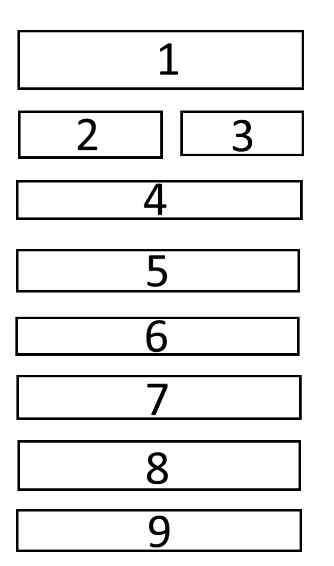
I’ve been struggling for weeks with layout-card and its configuration because I can’t seem to position the cards the way I want. I’ve tried every possible way, but I’m definitely missing something. I would like to achieve something similar to what is depicted in the first image (desktop) and make the dashboard responsive as shown in the second image (mobile). I kindly ask for your help. Below is the latest version of the YAML, but it’s just one of the many attempts I’ve made.
It would be very helpful if someone could also share something similar to have at least a starting point.
When referring to cell names for actual cards you just need to use single digit cell name and it will span across multiple grid cells as defined above.
Obvilusly if you would like to add some margins around cards (like in your diagram) then it will make things more complex; you either need to apply some CSS formatting of cells to add padding, or add dedicated rows/columns in the grid to handle spape between cells.
Perhaps…I’m not css expert, just sharing my personal experience
Personally I do not use frames in my grids, but rather percentage - this is due to very uneven width of cells. Then each need to be defined explicitly.
Hey! First of all, I would like to thank you for the great support you have provided! The suggestion from mirekmal was very helpful and helped me understand that I was on the right track but might have been missing something! Anyway, the images were just an example. At the moment, I don’t need to include specific borders or margins; that will probably be done in a later step! Now I can finally enjoy my dashboard thanks to you all! Super!
