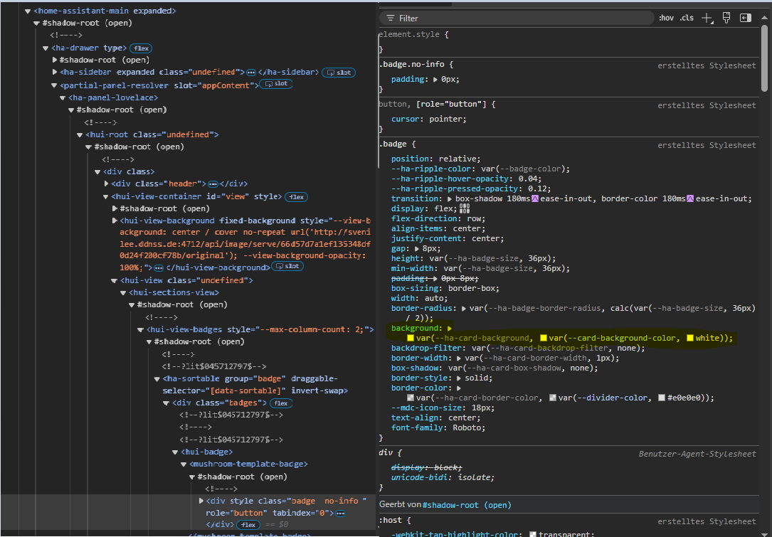
I try to get the mushroom-template-badge background transparent
I found the right position here:
when I change manualy it works…
type: custom:mushroom-template-badge
card_mod:
  style:
    mushroom-template-badge:
      $: |
        .badge {
          background: rgba(0,0,0,0) !important;
        }
content: ""
icon: mdi:arrow-left-bold
color: ""
tap_action:
  action: navigate
  navigation_path: /dashboard-home/1
hold_action:
  action: none
double_tap_action:
  action: none
if all you are going to do is set a default background to all cards (which is what you are doing now), you don’t need card-mod for that, but can simply put that same value in a regular theme
1 Like
Daemo
February 21, 2025, 4:52pm
84
Thanks! You are right, I am clearly a noob with themes
transparent:
  modes:
    dark:
        card-background-color: rgb(0, 0, 0, 0.7)
    light:
        card-background-color: rgb(255, 255, 255, 0.7)
Sorry for the off-topic
1 Like
Ideefiks
June 8, 2025, 10:35pm
85
I have done the same thing and it is pretty cool indeed, thanks for sharing! What I did not manage however was to introduce animations in these badges, as apparently card-mod does not work with the new badges. Have you figured this out by any chance or is it a matter of waiting for a card-mod update?
It surely does, 2 methods are available.
Ideefiks
June 9, 2025, 1:28am
87
Thanks Ildar, great post, sure I will revisit often in the future! But it didn’t solve my current issue, what am I doing wrong?
Method 1: hack card-mod.js I have version 3.4.4 and did not find hui-state-badge-element (nor hui-entity-badge)
Method 2: use mod-card. I tried the following but get no animation
type: custom:mod-card
card:
  type: custom:hui-entity-badge
  icon: mdi:fan
  entity: sensor.wh_warmepumpe_betrieb
  name: Werking
  show_name: true
card_mod:
  style:
    hui-entity-badge:
      $: |
        ha-state-icon {
          animation: spin 1s linear infinite;
        }
Are your @keyframes defined for your specified animation?
Ideefiks
June 9, 2025, 2:06am
89
No, but I thought that was not necessary for spin. I can for example make the fan spin in other cards without @keyframes
It’s card dependent. I haven’t tested your code, but I wouldn’t assume the keyframes aren’t necessary throughout all of HA.
Other cards like Mushroom have certain animation keyframes predefined(spin is one) in their source code. They may appear to be unnecessary but they are for any animation.
Ideefiks
June 9, 2025, 3:48am
91
Thanks, you were right, providing keyframes did the trick!
Ideefiks
June 9, 2025, 9:03pm
92
@RomMuc @Mariusthvdb @Ildar_Gabdullin @LiQuid_cOOled many thanks for the help and inspiration! Still a newbie at HA but it is amazing to see how much is possible with the support and examples this community provides.
Hoping it will help others this is my YAML for a mushroom template badge with card-mod to dynamically change the icon, icon color, animation including spin speed and border. It shows the operational state of my heatpump, whilst the fan spinning (or not) and border depend on the power request. Cheers
type: custom:mod-card
card:
  type: custom:mushroom-template-badge
  entity: sensor.wh_warmepumpe_betrieb
  tap_action:
    action: more-info
  label: Werking
  content: "{{ state_translated('sensor.wh_warmepumpe_betrieb') }}"
  icon: |
    {% if states('sensor.wh_warmepumpe_leistungsanforderung') | float(0) > 0 %}
    {{ 'mdi:fan' }}
    {% else %}
    {{ 'mdi:fan-off' }}
    {% endif %}
  color: >
    {% set state = states('sensor.wh_warmepumpe_leistungsanforderung') |
    float(0) %}

    {% if states('sensor.wh_warmepumpe_betrieb') ==
    'heatpump_operationmode_cooling' %}

    {{ 'navy' }}

    {% elif state > 0 %}

    {% from 'dynamic_colors.jinja' import hp_vermogen_color_map, gradient_color
    %}

    {{ gradient_color(state, hp_vermogen_color_map) }}

    {% else %}

    {{ 'cornflowerblue' }}

    {% endif %}
card_mod:
  style:
    mushroom-template-badge:
      $: |
        {% set perc = states('sensor.wh_warmepumpe_leistungsanforderung') |
          float(0) %}

        {% if perc > 0 %}

        ha-state-icon {
          animation: spin {{ (1.4 - perc / 100 ) ~ "s"}} linear infinite;
        }
        @keyframes spin {
          0% {
            transform: rotate(0deg);
          }
          100% {
            transform: rotate(359deg);
          }
        }

        .badge::before {
          content: '';
          position: absolute;
          top: -1px;
          left: -1px;
          right: -1px;
          bottom: -1px;
          border: 1px solid var(--badge-color);
          border-radius: inherit;
          mask: conic-gradient(rgba(0, 0, 0, 1) 0% {{perc}}%, rgba(0, 0, 0, 0) {{perc}}% 100%);
        }

        {% endif %}
RomMuc
June 10, 2025, 2:52pm
93
Thanks @Ideefiks for sharing! I struggled yesterday in getting the mushroom template to work with the animations, but with your example it now works
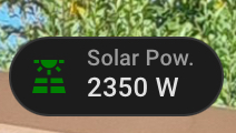
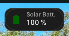
I use it for a battery indicator with a pulse when charging/uncharging. Any idea which part of the badge creates this wrapping rounded black rectangle on the Sol Battery badge compared to Solar Power? I suspect it is card-mod, but I haven’t figured out yet which and how to make it transparent…
type: custom:mod-card
card:
  type: custom:mushroom-template-badge
  content: "{{ states.sensor.qcells_cloud_soc.state_with_unit }}"
  icon: |
    {% if states('sensor.qcells_cloud_battery_charge') | float(2) > 0 %}
    mdi:battery-charging

    {% elif states('sensor.qcells_cloud_battery_discharge') | float(2) > 0 %}
    mdi:battery-arrow-down

    {% elif states('sensor.qcells_cloud_soc') | float(2) < 11 %}
    mdi:battery-10

    {%- else -%}
    mdi:battery
    {% endif %}
  color: >
    {% if states('sensor.qcells_cloud_battery_charge') | float(2) > 0 %}
    DarkGreen

    {% elif states('sensor.qcells_cloud_battery_discharge') | float(2) > 0 %}
    DarkOrange

    {% elif states('sensor.qcells_cloud_soc') | float(2) < 11 %}   Red

    {%- else -%}   DarkGreen        {% endif %}
  entity: sensor.qcells_cloud_soc
  label: Solar Batt.
  tap_action:
    action: more-info
card_mod:
  style:
    mushroom-template-badge:
      $: |
        :host {
          background: transparent !important;
          box-shadow: none !important;
        }
      $: |
        ha-state-icon {
          {% if states('sensor.qcells_cloud_battery_charge') | float(2) > 0 %}
            animation: pulse 2s ease-in-out infinite;
          {% elif states('sensor.qcells_cloud_battery_discharge') | float(2) > 0 %}
            animation: pulse 2s ease-in-out infinite;
          {%- else -%}
            animation: none;
          {% endif %}
        }
        @keyframes pulse {
          0% {
            transform: scale(1);
            opacity: 0.7;
          }
          50% {
            transform: scale(1.2);
            opacity: 1;
          }
          100% {
            transform: scale(1);
            opacity: 0.7;
          }
        }
Ideefiks
June 10, 2025, 9:18pm
94
Nope, sorry. I use card-mod for the animation and to draw a progress border on the same location as the default border of the badge and I don’t get that additional rectangle.
Post your current code. It will help with debugging.
I have trouble getting correct placement in my badge. Can somebody help?
type: custom:mod-card
card:
  type: custom:hui-entity-badge
  show_name: true
  show_state: true
  show_icon: true
  entity: sensor.count_fans_on
  name: " "
  double_tap_action:
    action: none
  hold_action:
    action: none
  tap_action:
    action: navigate
    navigation_path: "#climate"
card_mod:
  style:
    .: |
      ha-card {
        {% if states(config.card.entity)|int(0) > 0 %}
          border: 1px solid var(--primary-color) !important;
        {% else %}
          border: 1px solid var(--border-color) !important;
        {% endif %}
        border-radius: 24px !important;
        overflow: hidden !important;
      }
    hui-entity-badge:
      $:
        ha-badge:
          $: |
            {% if states(config.card.entity)|int(0) > 0 %}
              .badge {
                --card-mod-icon: mdi:fan;
                --card-mod-icon-color: var(--primary-color);
                border-radius: 22px !important;
              }
            {% else %}
              .badge {
                --card-mod-icon: mdi:fan-off;
                --card-mod-icon-color: var(--disabled-text-color);
                border-radius: 22px !important;
              }
            {% endif %}
        .: |
          {% if states(config.card.entity)|int(0) > 0 %}
            ha-state-icon {
              animation: spin 1s linear infinite;
            }
            @keyframes spin {
              0% {
                transform: rotate(0deg);
              }
              100% {
                transform: rotate(359deg);
              }
            }
          {% endif %}
RomMuc
June 11, 2025, 5:33am
98
Sorry, I thought I had done it but I must have missed a last Save
Mariusthvdb:
border-radius: 50%;
This should fix your background issue…
card_mod:
  style:
    mushroom-template-badge$: |
      ha-state-icon {
        {% if states('sensor.qcells_cloud_battery_charge') | float(2) > 0 %}
          animation: pulse 2s ease-in-out infinite;
        {% elif states('sensor.qcells_cloud_battery_discharge') | float(2) > 0 %}
          animation: pulse 2s ease-in-out infinite;
        {%- else -%}
          animation: none;
        {% endif %}
         }
       @keyframes pulse {
        0% {
          transform: scale(1);
          opacity: 0.7;
        }
        50% {
          transform: scale(1.2);
          opacity: 1;
        }
        100% {
          transform: scale(1);
          opacity: 0.7;
         }
        }
    .: |
      ha-card {
        background: none;
        border: none;
          }
1 Like
You’ll have to be more specific with what is out of place
What I meant is that when states(config.card.entity)|int(0) > 0, border shows primary-color and badge is enlarged, make it little bigger compared to other badges. I’m not sure why it’s enlarged.
You are adding the border to the card not the badge. Give me a few and I’ll post an example you can try.
Adjust the border width and colors to your liking…
card_mod:
  style:
    hui-entity-badge$:
      ha-badge$: |
        {% if states(config.card.entity)|int(0) > 0 %}
          .badge {
            --card-mod-icon: mdi:fan;
            --card-mod-icon-color: var(--primary-color);
            border-radius: 22px !important;
            border: 1.5px solid blue !important;
          }
        {% else %}
          .badge {
            --card-mod-icon: mdi:fan-off;
            --card-mod-icon-color: var(--disabled-text-color);
            border-radius: 22px !important;
            border: 1.5px solid red !important;
             }
         {% endif %}}
           }
      .: |
           {% if states(config.card.entity)|int(0) > 0 %}
            ha-state-icon {
              animation: spin 1s linear infinite;
               }
            @keyframes spin {
              0% { transform: rotate(0deg);}
            100% {transform: rotate(359deg);}
            {% endif %}
             }
    .: |
      ha-card {
       background none;
       border:none;
         }
You can also set show_name: to false and delete name: " "
type: custom:mod-card
card:
  type: custom:hui-entity-badge
  show_name: false
  show_state: true
  show_icon: true
  entity: sensor.count_fans_on
The code can slimmed down even more…
1 Like

 .
.