ludbA
January 8, 2026, 5:31pm
2
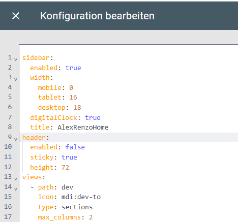
Where do I place this exactly in the dashboard yaml? Is it at the same level as the “views” element - I tried adding the sidebar there and it does not appear (reloaded config as well).
My dashboard is constructed with “sections”.
1 Like
Bobsilvio
January 9, 2026, 12:10pm
4
New Header Push/Flip mode for show original TopBar
icon: mdi:application
or
action: service-js
Bobsilvio
January 9, 2026, 12:14pm
5
ludbA:
Where do I place this exactly in the dashboard yaml? Is it at the same level as the “views” element - I tried adding the sidebar there and it does not appear (reloaded config as well).
My dashboard is constructed with “sections”.
You have a yaml? or use default Homeassistant dashboard
if use original Ha lovelace use…Dashboard → ⋮ (menu) → Modifica dashboard → ⋮ → Editor configurazione raw (Raw configuration editor)
title: XXX
sidebar:
header:
views:
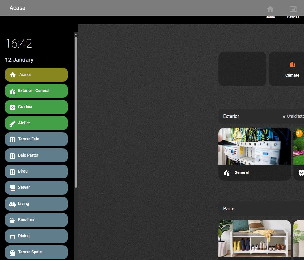
Did this, sidebar does not show up (added a title and digitalclock)
I removed sidebar-card.js from the ressources again as my HA became slow and partialy unresponsive after the addition.
use a minimal config, see folder example in github:
sidebar:
title: "Casa"
debug: false # se true, log in console
width:
mobile: 0 # % (0 = nascosta)
tablet: 16
desktop: 16
breakpoints:
mobile: 767 # max width "mobile"
tablet: 1624 # max width "tablet"
hideTopMenu: false # nasconde la top bar originale HA
showTopMenuOnMobile: false # MA la rimette visibile su mobile (width <= mobile)
hideHassSidebar: true # nasconde la sidebar standard di HA
clock: true # analogico
digitalClock: false # orologio digitale
digitalClockWithSeconds: false
twelveHourVersion: false # 12h (AM/PM) se true
period: false # mostra “AM/PM” (solo se 12h)
# Data
date: true # mostra la data
dateFormat: "DD MMMM" # formato moment.js (default: "DD MMMM")
#Menu
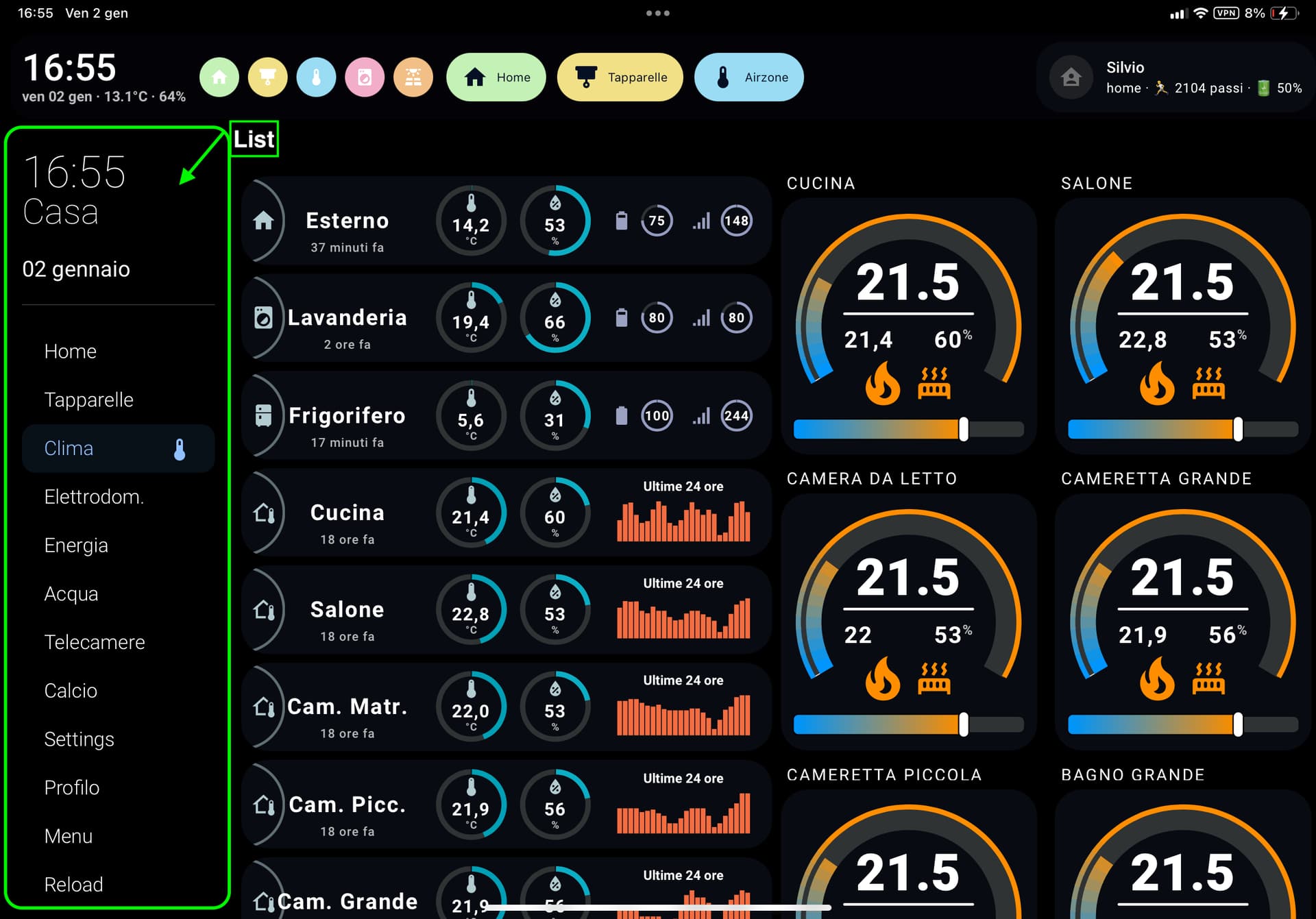
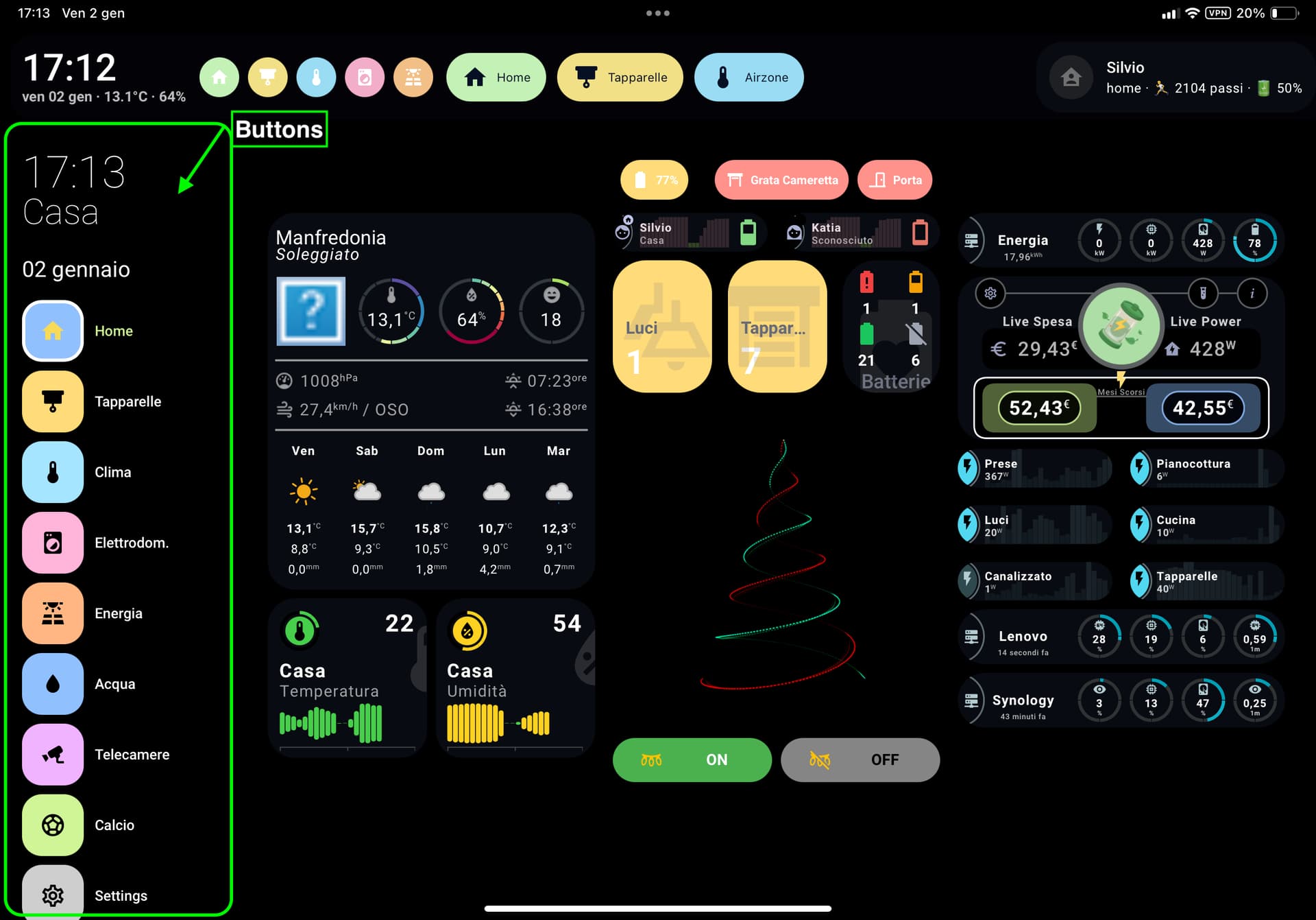
menuStyle: wide # list | wide | buttons | grid
showLabel: false # per "buttons" e "grid"
hideOnPath:
- "/config"
- "/profile/general"
# ── Testo in alto (saluto, settimana, meteo) ───────────────────────────────
template: |
<li style="margin-top:6px;">
{% if now().hour < 12 %} Buongiorno ☕
{% elif now().hour < 19 %} Buon pomeriggio 👋
{% else %} Buonasera 🌙{% endif %}
</li>
<li>Settimana {{ now().isocalendar()[1] }}</li>
<li>
{% set wx = 'weather.forecast_casa' %}
☁️ {{ states(wx) }} · {{ state_attr(wx,'temperature') }}°C · {{ state_attr(wx,'humidity') }}%
</li>
# ── Menu laterale (link viste + refresh) ───────────────────────────────────
style: |
.sidebar-inner {
background: transparent !important;
box-shadow: none !important;
}
:host {
--sidebar-background: transparent !important;
backdrop-filter: blur(0px) !important; /* opzionale */
/* ============================================================
* 🎨 SEZIONE WIDE (Rettangolare icona + testo)
* ============================================================ */
--sidebar-wide-margin-y: 16px;
--sidebar-wide-gap: 8px;
--sidebar-wide-padding-x: 14px;
--sidebar-wide-height: 48px;
--sidebar-wide-radius: 18px;
--sidebar-wide-item-gap: 10px;
--sidebar-wide-bg: rgba(255,255,255,0.18);
--sidebar-wide-icon-color: #000000;
--sidebar-wide-icon-size: 22px;
--sidebar-wide-font-size: 14px;
--sidebar-wide-line-height: 1.2;
--sidebar-wide-text-color: #111111;
--sidebar-wide-font-weight: 500;
/* Stato attivo */
--sidebar-wide-active-border-width: 0px;
--sidebar-wide-active-border-color: transparent;
--sidebar-wide-active-bg: rgba(0,0,0,1);
--sidebar-wide-active-opacity: 0.14;
--sidebar-wide-active-icon-color: rgb(247,217,89);
--sidebar-wide-active-icon-size: 26px;
--sidebar-wide-active-text-color: #111111;
/* ============================================================
* 🟥 SEZIONE BUTTONS (quadrato + icona, label opzionale)
* ============================================================ */
--sidebar-button-margin-y: 16px;
--sidebar-button-gap: 8px;
--sidebar-button-item-gap: 10px;
--sidebar-button-size: 56px;
--sidebar-button-box-size: 56px;
--sidebar-button-radius: 18px;
--sidebar-button-bg: rgba(255,255,255,0.18);
--sidebar-button-icon-color: var(--white);
--sidebar-button-icon-size: 28px;
--sidebar-button-font-size: 13px;
--sidebar-button-line-height: 1.2;
--sidebar-button-text-color: var(--white);
--sidebar-button-font-weight: 500;
/* Stato attivo */
--sidebar-button-active-border-width: 3px;
--sidebar-button-active-border-color: #ffffff;
--sidebar-button-active-shadow-color: rgba(0,0,0,0.18);
--sidebar-button-active-icon-color: rgb(247,217,89);
--sidebar-button-active-text-color: var(--green, #000);
/* ============================================================
* 🟦 SEZIONE GRID (stile iPhone — icona sopra, testo sotto)
* ============================================================ */
--sidebar-grid-margin-y: 14px;
--sidebar-grid-gap: 12px;
--sidebar-grid-item-padding: 4px;
--sidebar-grid-box-size: 52px;
--sidebar-grid-radius: 22px;
--sidebar-grid-bg: rgba(255,255,255,0.15);
--sidebar-grid-icon-size: 30px;
--sidebar-grid-icon-color: #000000;
--sidebar-grid-label-margin-top: 6px;
--sidebar-grid-font-size: 14px;
--sidebar-grid-line-height: 1.2;
--sidebar-grid-font-weight: 300;
--sidebar-grid-text-color: var(--white, #000);
/* Stato attivo */
--sidebar-grid-active-border: rgba(255,255,255,0.7);
--sidebar-grid-active-bg: rgba(255,255,255,0.25);
--sidebar-grid-active-icon-color: var(--white);
--sidebar-grid-active-text-color: var(--green, #000);
--sidebar-grid-columns: 3;
--sidebar-grid-rows: 10;
--sidebar-grid-row-height: 110px;
/* ============================================================
* 🌈 SEZIONE COMUNI (fallback generali)
* ============================================================ */
--sidebar-selected-bg: rgba(0,0,0,1);
--sidebar-icon-color: #000000;
--primary-text-color: #000000;
}
/* --- DIMENSIONE ORARIO --- */
.digitalClock {
font-size: 40px !important;
line-height: 1 !important;
}
.digitalClock.with-seconds {
font-size: 48px !important;
line-height: 1 !important;
}
/* --- DIMENSIONE DATA --- */
.date {
font-size: 20px !important;
font-weight: 400 !important;
margin-top: 4px !important;
line-height: 1.2 !important;
#customSidebar {
max-height: none !important;
height: auto !important;
overflow-y: visible !important;
}
}
sidebarMenu:
- action: navigate # Home
navigation_path: "/xxxxhome"
name: "Home"
icon: mdi:home
background_color: "var(--blue)"
icon_color: "var(--black)"
- action: navigate # Tapparelle
navigation_path: "/xxxx/tapparelle"
name: "Tapparelle"
icon: mdi:blinds
background_color: "var(--yellow)"
icon_color: "var(--black)"
- action: toggle-sidebar
icon: mdi:menu
name: "Menu"
background_color: "var(--grey)"
icon_color: "var(--black)"
- icon: mdi:application
name: Top bar
action: toggle-topmenu
background_color: "var(--lime)"
icon_color: "var(--black)"
Thanks. Re-installed it via HACS custom repo and it’s working now.
1 Like
ludbA
January 12, 2026, 2:44pm
9
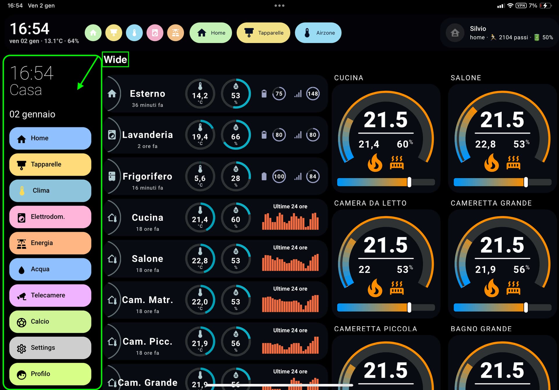
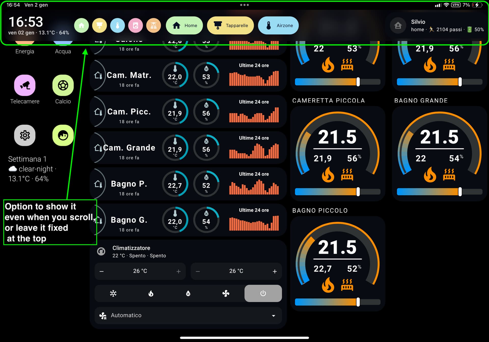
Got it working eventually… One ask - sidebar has many items in it, and it develops its own vertical scroll bar on smaller screens. Is there a way to force it not to have a scroll bar and render fully?
Bobsilvio
January 13, 2026, 8:56am
10
Yes, use style and height
style: |
  :host {
    height: auto !important; # or 100px 200px
    max-height: none !important;
  }

  #customSidebar {
    height: auto !important;
    max-height: none !important;
    overflow: visible !important;
  }

  .sidebar-inner,
  .sidebar-content,
  .sidebar-menu {
    overflow: visible !important;
    max-height: none !important;
  }
Bobsilvio
February 7, 2026, 8:25am
11
New Version 1.2
1 Like
Kelvin
February 7, 2026, 5:34pm
12
I could’nt get it to work
vartem
February 20, 2026, 1:51pm
13
Hi,
I’m unable to get the bottomCard to work. I’ve tried layout-card, vertical-grid and simple cards ( like clock) but nothign works
sidebar:
  debug: false
  width:
    mobile: 0
    tablet: 16
    desktop: 16
  breakpoints:
    mobile: 767
    tablet: 1624
  hideTopMenu: true
  showTopMenuOnMobile: false
  hideHassSidebar: true
  clock: false
  digitalClock: true
  digitalClockWithSeconds: false
  twelveHourVersion: false
  period: false
  date: true
  dateFormat: dddd, MMMM DD
  menuStyle: list
  showLabel: true
  updateMenu: true
  hideOnPath:
    - /config
    - /profile/general
  sidebarMenu:
    - action: navigate
      navigation_path: /office-tablet/0
      name: Home
      icon: mdi:home
      active: true
    - action: navigate
      navigation_path: /office-tablet/climate
      name: Climate
      icon: mdi:thermometer
    - action: navigate
      navigation_path: /office-tablet/calendar
      name: Calendar
      icon: mdi:calendar
    - action: navigate
      navigation_path: /office-tablet/weather
      name: Weahter
      icon: mdi:sun-angle
    - action: navigate
      navigation_path: /office-tablet/security
      name: Security
      icon: mdi:security
    - action: toggle-topmenu
      icon: mdi:menu
      name: Top Bar
  bottomCard:
    type: custom:clock

  style: |
    :host {
      --sidebar-background: transparent !important;
    }

    .digitalClock {
      font-family: sens-serif;
      font-weight: 500;
      text-align: center;
      text-transform: uppercase;
    }

    :host .date {
      text-align; center;
    }

    .sidebarMenu li {
      padding: 13px 20px !important;
    }

    .sidebarMenu li ha-icon {
      maring-top: -4px !important;
    }

    .sidebarMenu li.active ha-icon {
      color: var(--accent-color) !important;
    }
Bobsilvio
February 20, 2026, 9:19pm
14
test this:
bottomCard:
    type: custom:button-card
    cardStyle: |
      :host {
        display: block !important;
        width: 100% !important;
      }
    cardOptions:
      show_icon: false
      show_name: false
      show_state: false
      tap_action:
        action: none
      custom_fields:
        time: >
          [[[
            const d = new Date();
            return d.toLocaleTimeString([], { hour: '2-digit', minute: '2-digit' });
          ]]]
        meta: >
          [[[
            const d = new Date();
            const dow = d.toLocaleDateString('it-IT', { weekday: 'short' });
            const day = d.toLocaleDateString('it-IT', { day: '2-digit', month: 'short' });
            const wx = states['weather.forecast_casa'];
            const st = wx?.state ?? '';
            const t = wx?.attributes?.temperature;
            const h = wx?.attributes?.humidity;
            const wxLine = (t !== undefined && h !== undefined) ? `${t}°C · ${h}%` : st;
            return `${dow} ${day} · ${wxLine}`;
          ]]]
      styles:
        card:
          - background: transparent
          - padding: 0
          - border-radius: 0
        grid:
          - grid-template-areas: '"time" "meta"'
          - grid-template-columns: 1fr
          - grid-template-rows: auto auto
          - row-gap: 2px
        custom_fields:
          time:
            - font-size: 34px
            - font-weight: 500
            - line-height: 1
            - color: var(--black)
            - text-align: left
            - white-space: nowrap
          meta:
            - font-size: 13px
            - font-weight: 600
            - line-height: 1.1
            - color: var(--black)
            - text-align: left
            - white-space: nowrap
            - overflow: hidden
            - text-overflow: ellipsis
            - max-width: 520px
TheSpirit
March 17, 2026, 10:25am
15
the new gui version is in italien. how can i change this to englisch?
If you need help translating UI elements, I can help you in French and English (I am italian)
 Project goal
 modern
 Main Features
 Custom Sidebar
 Custom Header
 leftCard
 Styling
 Credits
 All details, installation instructions & examples:
 GitHub - Bobsilvio/sidebar-card
 Feedback welcome!
 ideas
ideas bug reports
 feature suggestions