New Energy flow Sankey chart: very nice, but upstream devices break floors and areas?

I really like the new Energy flow chart!
So thank you developers :slight_smile:

This is an example of my Energy flow for today:

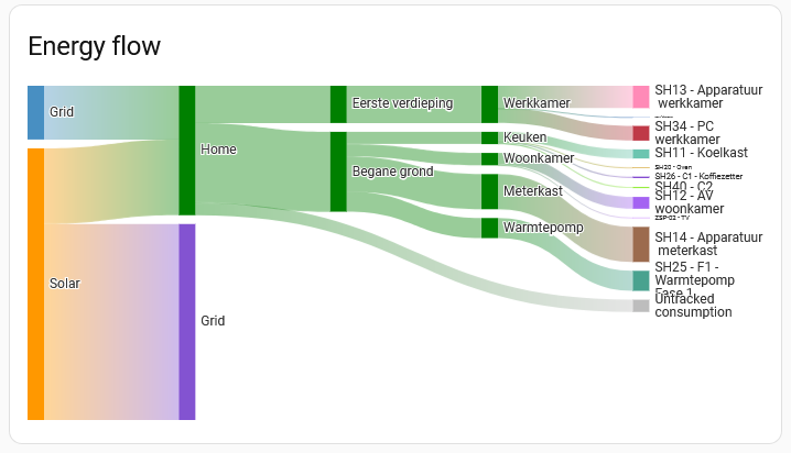
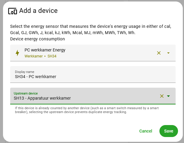
However, I found out that a specific Shelly device that I have measuring my PC energy usage (SH34 in the graph) was not yet given its proper upstream device: the Shelly that measures the energy usages for the whole of my office room (SH13).
So I corrected this, and that gave me the correct energy usage:

However, I now have lost the floor and area separation in the Energy flow chart:

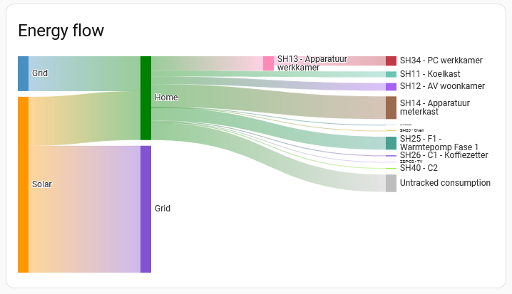
The values are correct, including the increased Untracked consumption: SH13 - SH34
But why are the floor and areas not shown any more?
Is this due to a lack of space in the graph?
If so, I think I would prefer to see the floors and areas separation but to leave out the upstream devices (the SH13 in this case).

Anyway, I think I will rearrange the power sockets in my office such that I don’t have to use this upstream devices set-up any more: one Shelly for the PC, and the other Shelly for the rest of the devices in the office. That will decrease the untracked consumption again as well.

5 Likes

Seconding this observation.
From one perspective, this makes sense - you can’t easily visualise both hierarchies at once, because they’re conflicting.
On the other hand, I would prefer the area-based hierarchy view, if I could have it, but losing the ability to avoid double-counting energy (or having to exclude measurements to avoid the above) kinda puts a spanner in the works.
Would be good to be able to choose which view to use, where the upstream hierarchy is defined.

I’m running into this, too. I use a Shelly 3-phase sensor for the range/oven breaker, but one of these phases is the oven so I want to see it broken out. I can add the ā€œphase aā€ sub-sensor as the oven, but to avoid doublecounting, I then have to select the 3-phase energy as the upstream. When I do this, I lose the area hierarchy.

I could add the phase b/c sub-sensors as two range sensors, but I don’t really care if I cooked on the left or the right side of the range… It’s suboptimal to have this one upstream device just remove all the area hierarchies. Since both the phase a and the 3-phase energy sensors are configured to be in the kitchen, there’s no conflict so it could really display both.

1 Like

A solution to this might be to create an extra template sensor that adds the two range sensors together (phase b plus c), and use that new sensor next to the oven sensor, so that you have an oven sensor and a range sensor?

Yeah, that’s what I did. But it would be nice if the already existing functionality worked as it seems it should.

I ran into this as well :frowning:

The solution seems to be ā€œcreate your own energy dashboardā€: "Rooms" membership lost in sankey chart once one energy device belongs to another Ā· Issue #26781 Ā· home-assistant/frontend Ā· GitHub

1 Like

Also now running into this and very sad it doesn’t work. I have a Vue 3 with CT breakers I would like to map to downstream devices, but doing so breaks my room/floor view in the Sankey graph, but it doesn’t HAVE to! What I don’t get is even if tried assigning the breakers to the same area as the device that’s downstream of it (e.g. the same floor/room), it refuses to work… but there would be only 1 clean way to represent such a scenario… at least in that case it would make sense to have it work?

1 Like

Running into this has lead me here as well… Very annoying!

I don’t see any logic reason why the granularity needs to be lost here it’s just another level for the downstream device.

@thusassistint could you please explain how you managed to get Home Assistant to show that graph at all??? Even with the drawback you are mentioning that it apparently doesn’t always respect floors/areas, it’s still a WHOLE lot nicer than the meager dashboards I’ve been able to cobble together.

Where are you able to enter that ā€œupstream deviceā€ hierarchy? I do not see it in the settings for devices/entities… Nor do I see, e.g., a Lovelace card type for the Sankey chart?

Many thanks!

I am running into this issue as well. Building my own completely custom dashboard seems like a lot of effort. Especially since the upstream ā€œdeviceā€ is the energy meter for the whole house.

It looks like you are not yet aware of the HA build-in Energy Dashboard?
The Sankey chart is part of it.
To set it up (assuming you are using version 2026.2 or newer of Home Assistant) go to: Settings → Dashboards → Energy and click on the pencil button in the right upper corner (Edit dashboard).
There you can set your energy boundary conditions and define individual devices with their upstream devices.
See also: Understanding Home Energy Management and Integrating individual device energy usage

You can use all Energy Dashboard cards on your own dashboards: Energy cards
For the Energy Sankey card see: Sankey energy graph

Thank you! Yes, I had not found that part of the built in energy dashboard. Thanks for pointing me in the right direction!

One question: the hierarchical relationship between devices (i.e., the ā€œupstream deviceā€ field) seems to be a pretty significant attribute of a device (or, more precisely, an entity), yet I only see it being editable in the context of a specific dashboard. When I add devices in the energy dashboard, is the ā€œupstream deviceā€ getting set globally for that entity somehow (and therefore being used if I create my own Energy Sankey graph in another dashboard — or is it possible to access in calculations I do outside of that dashboard), or is it more accurately thought of as a configuration property of that specific graph?

Yes, the upstream device setting is defined for the HA Energy dashboard, but is global in the sin that it is used as well when additional Sankey Cards are placed on other dashboards.
As far as I know however, you can not access these upstream settings outside of the Energy dashboard cards.
The advantage of using the Sankey card on another dashboard is that you have extra configuration options: you can set the visibility of the floors and areas (true or false).
This is an example of a Sankey card with both set to true:

type: energy-sankey
title: Energy flow
layout: horizontal
group_by_area: true
group_by_floor: true

Personally I am not using the upstream devices setting because this still removes the floors and areas from the Sankey chart on the native Energy dashboard, but with the Sankey card on another dashboard and with the floors and areas set to true all levels are visible.
As a test I added one upstream device setting, and this is the result:

This however clearly isn“t a very useful graph, with the entity names unreadable.
Personally I am not so much into fancy dashboard lay-outs, and I have no idea whether it is possible to get a larger graph on the dashboard. Can someone else with more knowledge on dashboard lay-outs comment on this please?

OK, I found one way to get a nicer HA Energy flow Sankey chart: add a new dashboard view with a Panel (single card) layout. That wil give a full page wide auto-scaling graph.

This is an example (still without the upstream devices):

Thanks. I agree with your comments about graph readability. But more than that I would like to be able to access the values for the ā€œuntrackedā€ consumption.

The actual thing that this energy sankey graph does that is really missing from Home Assistant is the ability to readily compute the amount of power or energy that is flowing through an upstream device but not seen by one of the downstream devices (and with the ability to total over different time horizons in the case of energy, including intelligently correcting for periodic resets of some of the downstream energy monitors). This is my ā€œeverything elseā€ energy (or power) consumption and tells me wether I need to find a way to add more monitoring or rearrange the monitoring I have (e.g., switch CT monitors to different breakers).

In an ideal world this information would be a property of the devices and accessible like other entities of that device.

It would also be nice to be able to generate my own ā€œhierarchy viewā€ of devices (similar to Unifi’s ā€œtopologyā€ view), but again, it seems like Home Assistant sequesters all of this information in configuration data for one dashboard rather than tied to the devices themselves….

As far as I know the only direct option at the moment to see the ā€œeverything elseā€ energy consumption is the ā€œUntracked consumptionā€ in the Sankey chart. This value is shown when hovered over the graph. I think that by default the graph is updated once per hour.
Of course you can create your own template sensors to calculate this value, but it would be very nice when the already existing value can be accessed directly as an entity.
Another option seems to be to access this data via SQL (see for instance this post), but I don“t have any experience with that.

What I do with any graph in HA (to aid my failing eyesight) is add a tap action to the graph on the ā€˜normal’ page which links to an identical graph on a Panel dashboard. These full graph panels are setup as sub views so they don’t normally show on the top row of icons. There is a back button on a sub view which you can use to navigate back to the main display. Works nicely.