The longer I try to read, the worse it is. Sooo big and space everywhere. But I cannot zoom via browser or text size in preference menu, because then the font, etc. is smaller, but the margins and spaces and paddings are still way to much now.
If you go to Preferences | Interface in your profile you can adjust the text size, which also reduces line spacing. Still a lot of space between posts, though.
Well, since my post was for some reason linked in the OP, I’ll chime in…
I’m hoping all that extra white space was an inadvertent and unfortunate side-effect of trying to make the forum look better on a small screen like a mobile device.
On a normal monitor or laptop screen, and arguably on a tablet, it’s horrible.
We saw how responsive the HA team can be to user feedback after the backup debacle. I’m hopeful that this issue can be resolved as easily.
@MissyQ (sorry for looping you in, but your post is closed): But I still wonder if our CSS experts would not be able to give the standard stylesheet a little more love to reduce this awful and far to much new padding in desktop version?
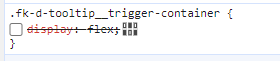
Compared to other forums. This is as before. But the paddings from the row are not collapsing anymore.
Until now, everything is from style is same as in other forum, which looks like this before. So I doubt, that it is really a wanted change, but only by mistake somewhere in the structure or inherited style.
I didn’t find the difference in settings until not.
Forum software update also seems to have broken using the tab key/shift-tab combination to increase/decrease indentation in the post editor. Which is pretty much an essential feature for a forum which is a whole lot about posting YAML code…
Many of us (admins/mods) don’t like the changes either. Understand that we are using a software we did not develop and downgrading is not an option. We performed a simple update. I have it on good authority that we will be adjusting the default themes in the future. There is no time-frame for this, it’s just something that will be done.
Yes, but Discourse is supporting own css. So it should be an easy thing to adapt the most critical things directly. But good that you mentioned, that at least there is a change to have the theme adjusted.
One the other hand side, I still doubt, that the space esp. in the unread section and overviews is really wanted. It looks (as shown above) like a bug. And if we find a bug in HA, we are reporting it as well. So I wonder if the forum team cannot report this to discourse as well.
Without this flex, it looks like before. So as said, there is no additional padding, but only this new element, which limits the collapse as before and bring the spaces now as a sum of all.