I have 3 blinds with their own Up/Down arrow in a “Blinds” group component. They are individually controlled through a Broadlink RM Pro and they work fine. Can anybody help me find a way to include some sort of “All Up, All Down” next to the component title, like a group switch? Ideally, icons should also be Up and Down arrows. Thanks!
When you create a cover group (or light group, etc.), can you still list and control the individual entities on the UI?
@uspino you might be able to add something like control: visible to your group config to force the control to show. The docs mention that you can specify control: hidden, but don’t provide details as to whether or not the opposite of this exists.
@touliloup When I click in Blinds it opens a new window with info on how long ago where they open, and the same individual controls for each blind.
@treno Creating a Cover Group works, but it creates another component card, so I’d had one for individual switches, one for all switches. I think I can combine both in one, but “Up/Down All” would still appear in the list of blinds, not int in the component title. It wouldn’t be as intuitive/cosmetic as in the rest of components.
Anybody knows anything about a “master switch” variable? Maybe the “all on/all off” only works with switches by design, not covers. And that would be unfortunate because closing all blinds or opening all blinds is very commonly used in home automation…
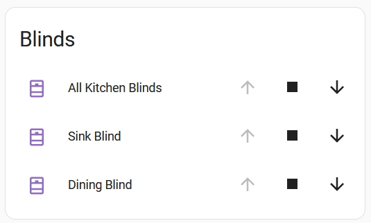
I have this issue as well. As recommended, I created a cover group which contains two individual covers. And then added the cover group entity inside the cover card:
This works, but the master control appearing in the list is not as intuitive as when it appears in the header - like when you do it with switches:
So if anyone ever gets to this (old) post as I did.
My config looks like this:
So far I am happy with this only that the Icon does not get the status of 100%
But the status in total does work.
If 4 of 5 are closed my total has a status of 20% open.