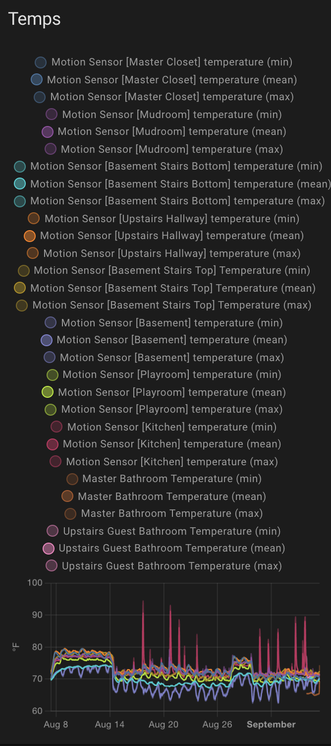
I really like the statistics graph but I think the color scheme makes it clear what’s the mean, the min and the max so I would love to have an option to continue to display the 3 graphs but not their legends.
Don’t forget to vote for your own request.
2 Likes


That’s the best example for this request yet.
Wow! I came here because I thought my statistics card looked cluttered 
To further this request, it would also be fantastic to be able to customise the name of the items in the legend. Sometimes abbreviations are enough, especially on a card with many entries.
Unfortunately, customizing the name won’t remove the legend. You will get the min/max/mean next to the name no matter what you specify for the name even if you are only graphing the mean.
Why thank you  haha
haha
I couldn’t agree more. In an environment where I know exactly what is being displayed there’s no need to display the chart_type. Therefore it would be great if there was something like this:
type: statistics-graph
title: 'My Graph'
entities:
  - entity: sensor.inside_temperature
    name: Inside
    hide_type: true   <-------------------------------
3 Likes
+1
A hide function would be great. Such a beautiful graph, but with this messy legend is kind of useless in some cases.
1 Like
Yes please can you think about the possibilities of hide the labels and change color ? the graph otherway is very beautiful
Also, for a single entity (I have e.g. one graph for one room) it would be nice to hide it all together 
2 Likes
I found a way to hide the legends using this module:
and adding the following to the yaml for the statistics graph config:
style:
  .: |
    h1 {
      padding-bottom: 0;
    }
  statistics-chart$ha-chart-base$: |
    .chartLegend {
      display: none;
    }
A simple option would be a lot easier, but this is working for me in the meantime.
13 Likes
Great finding!
I hide the legend and show my own with the entities card. I think showing the current values of my entities is also a good thing.
In order to reduce my lengend’s size Im trying to reduce vertical space between entities and text size.
To mimic also the statistics card behaviour it would be nice hide/show the corresponding stat lines by clicking the entity.
Any clue about these two improvements?
type: custom:vertical-stack-in-card
cards:
  - type: entities
    entities:
      - entity: sensor.ble_temperature_livingroom
        name: Salon
        icon: hass:circle
        card_mod:
          style: |
            :host {
              --card-mod-icon: mdi:circle;
              --card-mod-icon-color: steelblue;
              }
      - entity: sensor.ble_temperature_bedroom
        name: Habitacion
        card_mod:
          style: |
            :host {
              --card-mod-icon: mdi:circle;
              --card-mod-icon-color: purple
              }
      - entity: sensor.ble_temperature_kidsroom
        name: Niños
        card_mod:
          style: |
            :host {
              --card-mod-icon: mdi:circle;
              --card-mod-icon-color: springgreen
              }
    title: Temperature
  - type: statistics-graph
    entities:
      - entity: sensor.ble_temperature_livingroom
        name: Salon
      - entity: sensor.ble_temperature_bedroom
        name: Habitacion
      - entity: sensor.ble_temperature_kidsroom
        name: Niños
    days_to_show: 1
    chart_type: line
    stat_types:
      - mean
      - min
      - max
    style:
      .: |
        h1 {
          padding-bottom: 0;
        }
      statistics-chart$ha-chart-base$: |
        .chartLegend {
          display: none;
        }

5 Likes
But this hide all legends, not just the min/max
I’m not sure why but when I try this CSS approach I get
Key 'style' is not expected or not supported by the visual editor.
I don’t think that is an error. It just means you need to edit yaml/text mode.
You can hide just the min/max entries using something like:
style:
  statistics-chart$ha-chart-base$: |
    .chartLegend li[title*=max] {
      display: none !important;
    }
    .chartLegend li[title*=min] {
      display: none !important;
    }
2 Likes
That is what i was looking for, now how to hide “(mean)” text?
Adding these two css styles to what @mejran wrote do the (hacky visual) trick:
    .label {
      text-overflow: "" !important;
    }
    .label::after {
      content: "\00a0(mean)";
      margin-right: -7em;
    }
Anything more robust needs to be done in javascript or, even better, the card’s design.