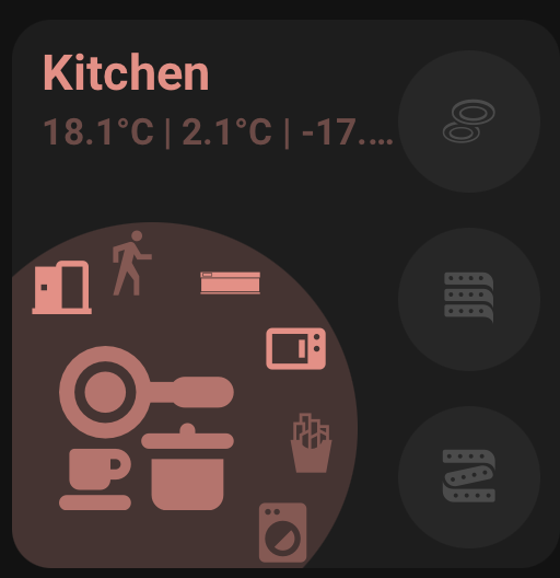
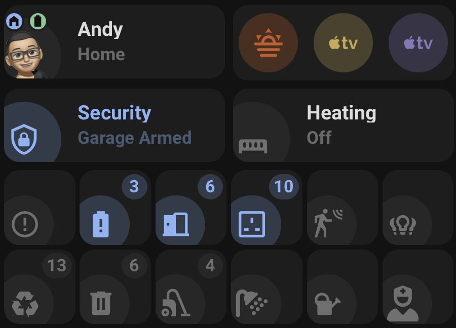
Orbit Cards is a collection of modern Home Assistant dashboard cards with a shared visual style, shared editor controls, and support for custom icons, dynamic colours, popups, navigation, and compact grouped layouts.
Named colours, theme colours, hex colours, rgb(), hsl(), and light colour support where supported.
Colour preview swatches with a native colour picker and selectable theme colour previews.
Material Design Icons and local SVG/image icons.
Tap, hold, navigation, service, popup, and Browser Mod actions.
Dynamic entity state updates scoped to only the entities used by each card.
Grouped compact layouts for Status Icon Only and Action Card.
Installation
HACS
Open HACS.
Go to Frontend.
Open the menu and choose Custom repositories.
Add:
https://github.com/andyblac/Orbit-Cards
Select category Dashboard.
Install Orbit Cards.
Refresh Home Assistant.
Add one of the Orbit cards from the dashboard card picker.
Manual
Download dist/orbit-cards.js from the repository.
Copy it to:
/config/www/orbit-cards.js
In Home Assistant, go to Settings -> Dashboards -> Resources.
Add this resource:
/local/orbit-cards.js
Set the resource type to JavaScript module.
Refresh Home Assistant.
Updating
After updating the JavaScript file, refresh the browser or reload Home Assistant frontend resources. Some browsers and Home Assistant apps cache frontend resources aggressively, so a hard refresh may be needed after manual updates.
A Wiki guide is in my GitHub Repo , Please report any bugs / issues.
Add shared localisation helper with Home Assistant language detection
Add English and English UK translation files
Add partial translation files for German, Spanish, French, Italian, Dutch, and Brazilian Portuguese
I would appreciate the help with translations, I have used AI to partially translate some languages, If any native speakers could check and correct if they are incorrect.
This release is a major editor, naming, and interaction update for Orbit Cards. It renames the Room Card to Area Card, adds native-style interaction controls across all cards, improves picker behaviour, and refines grouped card layouts.
Highlights
Renamed Orbit Room Card to Orbit Area Card
Added native-style Interactions sections across Area, Status, and Action cards
Reworked editor controls to more closely match Home Assistant
Improved entity, area, navigation, icon, colour, and theme pickers
Refined grouped layouts for Status icon-only and Action card views
Added legacy migration and compatibility helpers for existing configs
Area Card
New preferred card type: custom:orbit-area-card
Legacy custom:orbit-room-card remains supported as a fallback alias
Existing Room Card configs are migrated when opened in the editor
Legacy room_name config is migrated to area_name
Old navigate.navigation_path config is still supported as a fallback
Card navigation now uses tap_action
Removed the old standalone Navigation Path editor field
Added interactions for:
Card tap, hold, and double tap
Main entity/icon tap, hold, and double tap
Side buttons
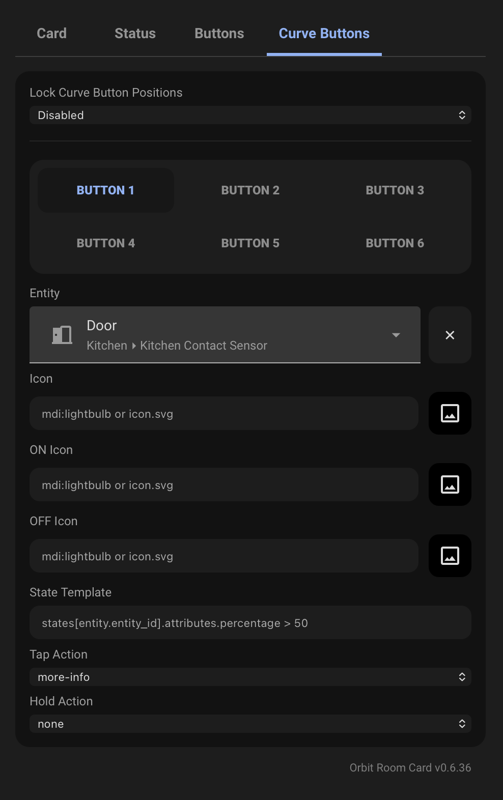
Curve buttons
Action button
Improved Area / Entity / Custom icon source behaviour
Cleans stale custom icon config when using Area or Entity icon source
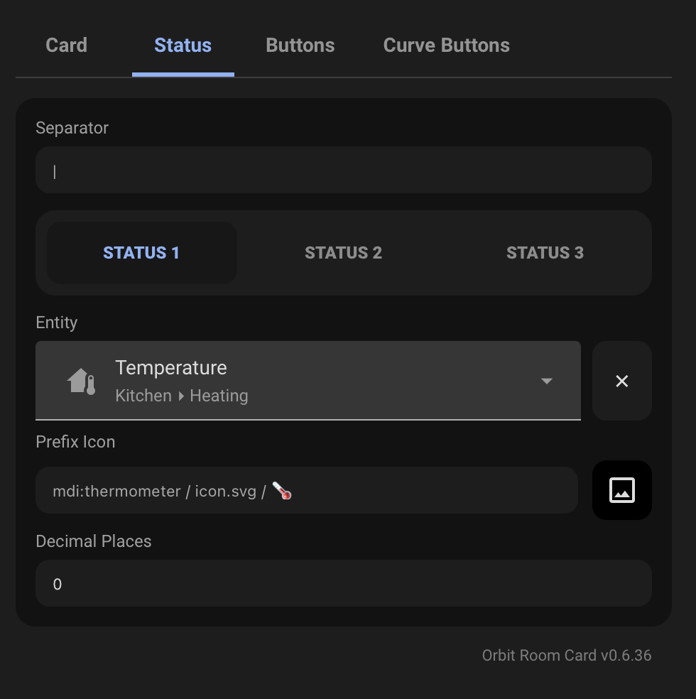
Status Card
Added native-style Interactions support
Added card tap, hold, and double tap actions
Added icon tap, hold, and double tap actions
Added double-tap runtime handling
Improved Status Card name handling
Updated template fields and helper text
Refined Status icon-only grouped layout spacing
Improved shadow rendering and card spacing in grouped layouts
Updated Status editor controls to better match the Area Card editor
Action Card
Added tap, hold, and double tap interactions
Added double-tap runtime handling
Improved grouped Action Card layout spacing
Fixed clipped shadows in grouped layouts
Updated editor controls for better consistency with the other Orbit cards
Orbit Cards already has a multi-card style layout for Status and Action cards. I wanted to make that idea more general, so it could be used with any card, not just Orbit’s own cards.
The goal is to make layouts like this easier:
A row of gauges
A tabbed control panel
A compact dashboard section
Multiple related cards grouped under one visual block
What I’d like feedback on
If anyone tests it, I’d especially like feedback on:
Does the editor feel natural?
Does the tab layout behave how you would expect?
Are the styling options enough, or too much?
Does wrapping feel consistent with native Home Assistant layouts?
Any cards that do not behave correctly inside it?
Any confusing naming in the YAML or editor?
This is still early, so config may change a little before I call it stable.