Percent-Circle
A custom Lovelace card for Home Assistant that displays a circular progress ring (0–100%).
 Features
- Percent value from:
percent_entity(e.g. sensor with 0–100)percent_template(Jinja template, requires admin user)entity(fallback)
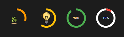
- Dynamic ring colors with
thresholds - Optional image centered inside the circle
- static (
image) - from entity (
image_entity) - from template (
image_template)
- static (
- Transparent background &
no_cardmode forpicture-elements - Animated transitions for ring & color
 Installation
Via HACS (Custom Repository)
- Open HACS → Frontend → Custom Repositories.
- Add the repository:
URL:(https://github.com/kubakuhn/Percent-Circle/)
Type:Lovelace - Install the card.
- Check the resource entry in settings, it should be:
url: /hacsfiles/percent-circle/percent-circle.js
type: module
Manual Installation
Copy percent-circle.js to:
/config/www/percent-circle.js
Add the following to your resource definitions:
url: /local/percent-circle.js?v=1
type: module
 Options
| Name | Type | Required | Default | Description |
|---|---|---|---|---|
| percent_entity | string | no | – | Entity that provides a value from 0–100 |
| percent_template | string | no | – | Jinja template that returns 0–100 (Admin user required) |
| entity | string | no | – | Fallback entity for percent |
| image | string | no | – | Static image URL |
| image_entity | string | no | – | Entity whose state is an image URL |
| image_template | string | no | – | Template for image URL |
| size | number | no | 120 | Circle size in px (design size when fit: container) |
| stroke | number | no | 10 | Stroke width of the ring |
| image_scale | number | no | 0.8 | 0–1, ratio of the image diameter |
| color | string | no | #000 | Text color |
| ring_color | string | no | #03a9f4 | Ring color (fallback if no thresholds) |
| track_color | string | no | #e0e0e0 | Background ring color |
| thresholds | list | no | – | Thresholds for ring color (see examples) |
| no_card | bool | no | false | Renders without <ha-card> (ideal for picture-elements) |
| fit | string | no | – | "container" → SVG fills the container (style: width/height controllable in %) |
 Examples
1) Simple: Percent from Entity
type: custom:percent-circle
percent_entity: sensor.battery_level
size: 180
stroke: 14
ring_color: "#03a9f4"
track_color: "#e0e0e0"
2) With Thresholds (e.g., Battery)
type: custom:percent-circle
percent_entity: sensor.battery_level
size: 160
stroke: 12
thresholds:
  - value: 20
    color: "#f44336"
  - value: 50
    color: "#ff9800"
  - value: 80
    color: "#ffc107"
  - value: 100
    color: "#4caf50"
3) With Image from Entity
type: custom:percent-circle
percent_entity: sensor.cpu_usage
image_entity: sensor.user_avatar_url
size: 200
stroke: 16
image_scale: 0.9
4) Image & Percent Value via Template
 Requires admin user in the frontend.
type: custom:percent-circle
percent_template: >-
  {% set v = states('sensor.battery_level') | float(0) %}
  {{ [0, [v, 100] | min] | max }}
image_template: >-
  {% if is_state('binary_sensor.charge','off') %}
    /local/pics/charge.png
  {% else %}
    /local/pics/discharge.png
  {% endif %}
size: 150
stroke: 12
5) Overlay in picture-elements
type: picture-elements
image: /local/Background.png
elements:
  - type: custom:percent_circle
    no_card: true
    percent_entity: sensor.battery_level
    image: /local/pics/battery.png
    size: 50
    stroke: 5
    image_scale: 0.8
    track_color: transparent
    color: transparent
    thresholds:
      - value: 20
        color: "#f44336"
      - value: 100
        color: "#4caf50"
    style:
      left: 50%
      top: 50%
      transform: translate(-50%, -50%)
 Notes
Notes
- Caching: If you update the JS file, increase the
?v=number in the resource definition to avoid browser cache issues. - Templates: For
percent_template&image_templateyou need admin rights in the frontend. For reliable usage → better create a template sensor in the backend and use it aspercent_entityorimage_entity. - Images:
/local/...refers to/config/www/....
 Tips
Tips
color: transparent     # hides the percentage text
track_color: transparent  # hides the background ring