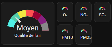
I’m using sections and I would like ONE card arranged in this manner:

So far, I’ve tried:
- not doing anything but the dashboard rearranges the cards the way it wants on different devices (whereas I’d like to put all gauges on one card and that card to be a full section width)
- combining horizontal and vertical stacks but it fucks up the sizes:

- a grid but it doesn’t allow me to specify the size of the cards:

I would prefer to use layout_options: or something similar rather specifying sizes in pixels (the card will be displayed on different screens)
EDIT : The code of the cards
          - type: gauge
            entity: sensor.qualite_globale_clermont_ferrand
            name: Qualité de l'air
            min: 0
            max: 7.5
            segments:
              - from: 0
                color: transparent
                label: Indisponible
              - from: 0.5
                color: '#50F0E6'
                label: Bon
              - from: 1.5
                color: '#50CCAA'
                label: Moyen
              - from: 2.5
                color: '#F0E641'
                label: Dégradé
              - from: 3.5
                color: '#FF5050'
                label: Mauvais
              - from: 4.5
                color: '#960032'
                label: Très mauvais
              - from: 5.5
                color: '#872181'
                label: Extrêmement mauvais
              - from: 6.5
                color: '#888888'
                label: Événement !
            needle: true
            layout_options:
              grid_columns: 2
              grid_rows: 2
          - type: gauge
            entity: sensor.qualite_globale_clermont_ferrand
            name: Global
            min: 0
            max: 7.5
            segments:
              - from: 0
                color: transparent
              - from: 0.5
                color: '#50F0E6'
              - from: 1.5
                color: '#50CCAA'
              - from: 2.5
                color: '#F0E641'
              - from: 3.5
                color: '#FF5050'
              - from: 4.5
                color: '#960032'
              - from: 5.5
                color: '#872181'
              - from: 6.5
                color: '#888888'
                label: '!!!'
            needle: true
            layout_options:
              grid_columns: 1
              grid_rows: 1
          - type: gauge
            entity: sensor.pm10_clermont_ferrand
            name: PM10
            min: 0
            max: 7.5
            segments:
              - from: 0
                color: transparent
              - from: 0.5
                color: '#50F0E6'
              - from: 1.5
                color: '#50CCAA'
              - from: 2.5
                color: '#F0E641'
              - from: 3.5
                color: '#FF5050'
              - from: 4.5
                color: '#960032'
              - from: 5.5
                color: '#872181'
              - from: 6.5
                color: '#888888'
                label: '!!!'
            needle: true
            layout_options:
              grid_columns: 1
              grid_rows: 1
          - type: gauge
            entity: sensor.pm25_clermont_ferrand
            name: PM25
            min: 0
            max: 7.5
            segments:
              - from: 0
                color: transparent
              - from: 0.5
                color: '#50F0E6'
              - from: 1.5
                color: '#50CCAA'
              - from: 2.5
                color: '#F0E641'
              - from: 3.5
                color: '#FF5050'
              - from: 4.5
                color: '#960032'
              - from: 5.5
                color: '#872181'
              - from: 6.5
                color: '#888888'
                label: '!!!'
            needle: true
            layout_options:
              grid_columns: 1
              grid_rows: 1
          - type: gauge
            entity: sensor.ozone_clermont_ferrand
            name: O₃
            min: 0
            max: 7.5
            segments:
              - from: 0
                color: transparent
              - from: 0.5
                color: '#50F0E6'
              - from: 1.5
                color: '#50CCAA'
              - from: 2.5
                color: '#F0E641'
              - from: 3.5
                color: '#FF5050'
              - from: 4.5
                color: '#960032'
              - from: 5.5
                color: '#872181'
              - from: 6.5
                color: '#888888'
                label: '!!!'
            needle: true
            layout_options:
              grid_columns: 1
              grid_rows: 1
          - type: gauge
            entity: sensor.dioxyde_d_azote_clermont_ferrand
            name: Azote
            min: 0
            max: 7.5
            segments:
              - from: 0
                color: transparent
              - from: 0.5
                color: '#50F0E6'
              - from: 1.5
                color: '#50CCAA'
              - from: 2.5
                color: '#F0E641'
              - from: 3.5
                color: '#FF5050'
              - from: 4.5
                color: '#960032'
              - from: 5.5
                color: '#872181'
              - from: 6.5
                color: '#888888'
                label: '!!!'
            needle: true
            layout_options:
              grid_columns: 1
              grid_rows: 1
          - type: gauge
            entity: sensor.dioxyde_de_soufre_clermont_ferrand
            name: Souffre
            min: 0
            max: 7.5
            segments:
              - from: 0
                color: transparent
              - from: 0.5
                color: '#50F0E6'
              - from: 1.5
                color: '#50CCAA'
              - from: 2.5
                color: '#F0E641'
              - from: 3.5
                color: '#FF5050'
              - from: 4.5
                color: '#960032'
              - from: 5.5
                color: '#872181'
              - from: 6.5
                color: '#888888'
                label: '!!!'
            needle: true
            layout_options:
              grid_columns: 1
              grid_rows: 1
EDIT : I tried n°2 with a blank card on the bottom row. It’s a bit better but still nowhere near as readable as my mockup
 vs
vs 
It’s better if I make it wider but the small gauges are still a bit too small:

