You mean like scrolling back and forth but with buttons?
Interesting. I’ll have to try it. It shouldn’t be too hard
I was thinking also that the zoom in and zoom out buttons ( plus and minus) should only apply to the x axis
Yes, so probably less buttons with predefined amount of hours would be necessary, I think, if I can easily scroll between views.
About zoom… yes, probably zooming only x axis would be more effective, otherwise I noticed that I need to move down the graph everytime.
I noticed that on mobile and pc there’s a little difference in showing time and day, and that on pc it results cut.
PC:

Mobile:

It happens only in 12h view, while both 6h and 1d views are ok, and only on PC.
Probably showing the year is not necessary and can save space.
Really good idea! I’ll try it out when I have a free day soon 
BTW, do you mind sharing your screenshots and yaml examples here?
I’m hoping in time we’ll accumulate a collection of cool plots and inspirations for yaml configs. I’ll really appreciate it if you drop a message there (the plots you posted here for example)
Hi.
Ok, no problem, but yaml is really just the default history graph mask with my entities selected, and then edited to paste the custom code took from your examples.
You made everything so easy 
1 Like
new v0.5.0 release with lambda transforms! 
entities:
  - entity: sensor.temperature_in_celsius
    name: living temperature in Farenheit # Overrides the entity name
    lambda: |- # Transforms the data
      (ys) => ys.map(y => (y × 9/5) + 32)
    unit_of_measurement: °F # Overrides the unit
More examples here
new v0.6.0 release with attribute plotting & more!
entities:
   - climate.bathroom::temperature
Now this is possible:

2 Likes
Hi!
I missed few releases. Today HACS notified the update, I did it, but then I had some problems:

it says that it couldn’t find the card, but it was there (and I rebooted):
I tried to re-download, I manually selected v 0.70 and it started working again
Now I have to check the news… and I must try the attribute plotting!
Oh, that’s odd! Is anybody else having this problem?
Check out also this one:
@Markuska00 made a very cool example there. I’m thinking about an easier way to expose these styles
Sneek peek:
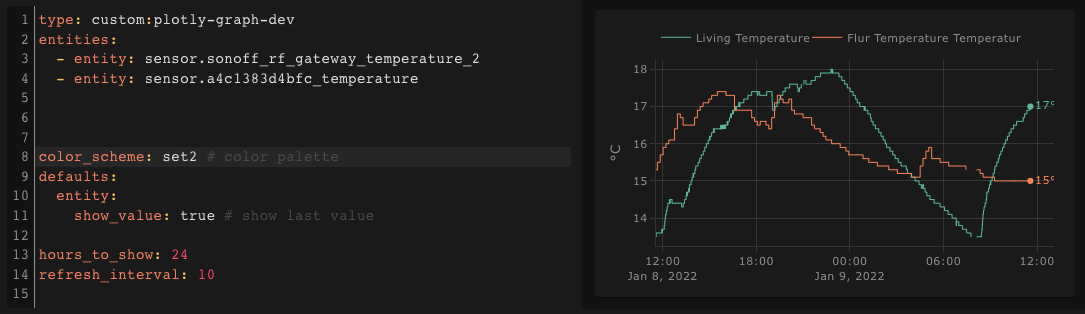
- 25 color palettes
- default yaxes
- easy config to show last value of trace in the plot
Coming soon! v1.1.2
HI, thanks for the amazing work! I just discovered this project and I am now working on replacing my mini graph cards with it, as it is more useful for me.
What I wanted to ask if it may be possible for you to add an option to change the line color based on value. The example of what I have now:

Thanks!
Happy to hear you find it useful!
Painting a single trace with multiple colors is unfortunately not possible with the underlying plotting library, I don’t think it will ever be possible
Hi,
I just installed your card (nice work by the way) and everything is working fine on MacOS 12.1 with Chrome including range selection.
But on Safari when trying to change the range to a wider selection, the only part of the graph showed is from the original range although data for this timeframe is present in the Home Assistant database (for instance, when starting with a 24h view and trying to show a 7 days view, only the original 24h view is showed).
The inspector output this error message:
“Unhandled Promise Rejection: Error: Error computing range substraction. Please report an issue in the repo of this card”
The same bug is also present on Safari for iOS.
Sorry to bother you with this issue !
Hey Chaps, thanks!
Could you put this in the github issues instead?
Please add the contents of the console between “----ERROR TO REPORT-----” and the “error computing range subtraction” message and I’ll give it a look on the weekend.
News:
The card is now in the HACS default repository, so no need to copy and paste the url to install it, just a search in hacs
Great new card. I started to convert some of the apexcharts cards I had to this new setup.
Couple of questions:
- in apexcharts, it’s possible to group values by duration and return the average. So for instance I may have a sensor updating every 30 seconds, by just take the average for each 2 minutes interval. How would you do this using lambda functions ?
- Is there a way to state the fill opacity ?
Fill opacity can be done… with fillcolor. Last element is the opacity.
 type: custom:plotly-graph
 entities:
   - entity: sensor.lumi_lumi_weather_1cc7e307_temperature
     fill: tozeroy
     fillcolor: rgba(168, 216, 234, 0.5)
2 Likes
Regarding averaging, yes it is possible through lambdas, you can return the x coordinate value array like this: Custom x coordinates of traces
Let me know if you are not used to JavaScript and I’ll post the code when I have some time at the computer.
About fill opacity, Dynamix72 nailed it