I see. How does the data look like?
In my system then it’s a sensor that updates every 5 minutes with a bearing angle. If you graph it then

Here’s the CSV.
Time stamp,State
sensor.wind_dir
2024-01-18 21:22:28,271.1
2024-01-18 21:25:12,275.6
2024-01-18 21:30:12,277.9
2024-01-18 21:35:12,271.5
2024-01-18 21:40:13,270.8
2024-01-18 21:45:12,255.7
2024-01-18 21:50:12,251.9
2024-01-18 21:55:12,243.1
2024-01-18 22:00:12,249.8
2024-01-18 22:05:12,240.1
2024-01-18 22:10:12,239.2
2024-01-18 22:15:12,242.2
2024-01-18 22:20:12,243.6
2024-01-18 22:25:12,249.3
2024-01-18 22:30:13,253.3
2024-01-18 22:35:12,252.6
2024-01-18 22:40:12,249.8
2024-01-18 22:45:13,245.6
2024-01-18 22:50:12,243.9
2024-01-18 22:55:12,242.7
2024-01-18 23:00:13,232.1
2024-01-18 23:05:13,237.9
2024-01-18 23:10:13,242.3
2024-01-18 23:15:13,238.6
2024-01-18 23:20:13,236.1
2024-01-18 23:25:13,240.8
2024-01-18 23:30:13,231.4
2024-01-18 23:35:13,236.1
2024-01-18 23:40:13,234.7
2024-01-18 23:45:13,232.9
2024-01-18 23:50:13,233.6
2024-01-18 23:55:13,242.6
2024-01-19 00:00:13,242.2
2024-01-19 00:05:13,239.9
2024-01-19 00:10:13,242.2
2024-01-19 00:15:13,245.6
2024-01-19 00:20:13,246.6
2024-01-19 00:25:13,248.4
2024-01-19 00:30:13,253.3
2024-01-19 00:35:13,258.5
2024-01-19 00:40:13,258.3
2024-01-19 00:45:13,252.1
2024-01-19 00:50:13,255.2
2024-01-19 00:55:13,252.2
2024-01-19 01:00:13,250.6
2024-01-19 01:05:13,252.2
2024-01-19 01:10:13,251.9
2024-01-19 01:15:13,251.5
2024-01-19 01:20:13,248.0
2024-01-19 01:25:13,250.5
2024-01-19 01:30:13,246.7
2024-01-19 01:35:13,244.8
2024-01-19 01:40:13,250.1
2024-01-19 01:45:13,246.4
2024-01-19 01:50:13,254.4
2024-01-19 01:55:13,248.5
2024-01-19 02:00:13,249.9
2024-01-19 02:05:13,254.0
2024-01-19 02:10:13,252.7
2024-01-19 02:15:13,267.6
2024-01-19 02:20:13,262.5
2024-01-19 02:25:13,264.8
2024-01-19 02:30:13,260.6
2024-01-19 02:35:13,258.2
2024-01-19 02:40:13,261.2
2024-01-19 02:45:13,263.1
2024-01-19 02:50:13,259.3
2024-01-19 02:55:13,271.3
2024-01-19 03:00:13,269.2
2024-01-19 03:05:13,265.5
2024-01-19 03:10:13,272.8
2024-01-19 03:15:13,271.0
2024-01-19 03:20:13,266.1
2024-01-19 03:25:13,268.8
2024-01-19 03:30:13,257.4
2024-01-19 03:35:13,251.0
2024-01-19 03:40:13,249.7
2024-01-19 03:45:13,247.5
2024-01-19 03:50:13,248.4
2024-01-19 03:55:13,257.6
2024-01-19 04:00:13,262.3
2024-01-19 04:05:13,249.2
2024-01-19 04:10:13,262.4
2024-01-19 04:15:13,265.2
2024-01-19 04:20:13,250.9
2024-01-19 04:25:13,243.9
2024-01-19 04:30:13,250.0
2024-01-19 04:35:13,247.9
2024-01-19 04:40:13,245.2
2024-01-19 04:45:13,256.1
2024-01-19 04:50:13,258.3
2024-01-19 04:55:11,266.3
2024-01-19 05:00:13,262.7
2024-01-19 05:05:13,255.9
2024-01-19 05:10:13,250.8
2024-01-19 05:15:13,251.3
2024-01-19 05:20:13,246.9
2024-01-19 05:25:13,247.4
2024-01-19 05:30:11,249.3
2024-01-19 05:35:11,251.8
2024-01-19 05:40:11,258.9
2024-01-19 05:45:11,254.4
2024-01-19 05:50:11,253.8
2024-01-19 05:55:11,253.5
2024-01-19 06:00:11,251.3
2024-01-19 06:05:11,259.3
2024-01-19 06:10:11,250.5
2024-01-19 06:15:11,249.2
2024-01-19 06:20:11,244.1
2024-01-19 06:25:11,242.0
2024-01-19 06:30:11,243.4
2024-01-19 06:35:12,244.4
2024-01-19 06:40:11,237.1
2024-01-19 06:45:11,227.8
2024-01-19 06:50:11,231.1
2024-01-19 06:55:11,229.5
2024-01-19 07:00:11,227.7
2024-01-19 07:05:11,231.1
2024-01-19 07:10:11,239.0
2024-01-19 07:15:11,237.9
2024-01-19 07:20:11,241.8
2024-01-19 07:25:11,241.1
2024-01-19 07:30:11,237.4
2024-01-19 07:35:11,236.9
2024-01-19 07:40:11,227.4
2024-01-19 07:45:11,223.8
2024-01-19 07:50:11,221.7
2024-01-19 07:55:11,219.1
2024-01-19 08:00:11,219.4
2024-01-19 08:05:11,216.7
2024-01-19 08:10:12,218.3
2024-01-19 08:15:11,215.4
2024-01-19 08:20:11,218.5
2024-01-19 08:25:11,214.1
2024-01-19 08:30:11,211.8
2024-01-19 08:35:11,213.4
2024-01-19 08:40:11,214.6
2024-01-19 08:45:11,213.5
2024-01-19 08:50:11,213.8
2024-01-19 08:55:11,217.1
2024-01-19 09:00:11,218.8
2024-01-19 09:05:12,219.6
2024-01-19 09:10:11,220.6
2024-01-19 09:15:12,218.4
2024-01-19 09:20:11,219.9
2024-01-19 09:25:11,221.8
2024-01-19 09:30:11,223.6
2024-01-19 09:35:11,224.1
2024-01-19 09:40:11,222.9
2024-01-19 09:45:11,225.0
2024-01-19 09:50:11,224.1
2024-01-19 09:55:11,227.2
2024-01-19 10:00:11,225.4
2024-01-19 10:05:12,223.0
2024-01-19 10:10:11,225.0
2024-01-19 10:15:12,225.4
2024-01-19 10:20:12,224.3
2024-01-19 10:25:12,219.0
2024-01-19 10:30:12,219.7
2024-01-19 10:35:12,221.7
2024-01-19 10:40:12,225.0
2024-01-19 10:45:12,227.8
2024-01-19 10:50:12,226.5
2024-01-19 10:55:12,227.7
2024-01-19 11:00:12,226.5
2024-01-19 11:05:12,223.7
2024-01-19 11:10:12,225.5
2024-01-19 11:15:12,226.2
2024-01-19 11:20:12,228.3
2024-01-19 11:25:12,228.4
2024-01-19 11:30:12,232.3
2024-01-19 11:35:12,235.2
2024-01-19 11:40:12,235.7
2024-01-19 11:45:12,232.0
2024-01-19 11:50:12,231.3
2024-01-19 11:55:12,233.3
2024-01-19 12:00:12,225.5
2024-01-19 12:05:12,224.4
2024-01-19 12:10:12,226.0
2024-01-19 12:15:12,228.3
2024-01-19 12:20:12,227.5
2024-01-19 12:25:12,227.3
2024-01-19 12:30:12,224.5
2024-01-19 12:35:12,226.1
2024-01-19 12:40:12,227.9
2024-01-19 12:45:12,227.3
2024-01-19 12:50:12,221.8
2024-01-19 12:55:12,225.4
2024-01-19 13:00:12,228.2
2024-01-19 13:05:12,229.1
2024-01-19 13:10:12,235.8
2024-01-19 13:15:12,243.2
2024-01-19 13:20:12,241.4
2024-01-19 13:25:12,230.8
2024-01-19 13:30:12,231.0
2024-01-19 13:35:12,230.1
2024-01-19 13:40:12,227.3
2024-01-19 13:45:12,223.8
2024-01-19 13:50:12,230.6
2024-01-19 13:55:12,222.6
2024-01-19 14:00:12,225.7
2024-01-19 14:05:12,222.5
2024-01-19 14:10:12,221.7
2024-01-19 14:15:12,224.0
2024-01-19 14:20:12,228.7
2024-01-19 14:25:12,227.2
2024-01-19 14:30:12,226.6
2024-01-19 14:35:12,223.1
2024-01-19 14:40:12,226.3
2024-01-19 14:45:12,225.6
2024-01-19 14:50:12,223.9
2024-01-19 14:55:12,226.2
2024-01-19 15:00:12,225.4
2024-01-19 15:05:12,222.7
2024-01-19 15:10:12,217.9
2024-01-19 15:15:12,218.5
2024-01-19 15:20:12,223.7
2024-01-19 15:25:12,226.5
2024-01-19 15:30:12,225.5
2024-01-19 15:35:12,227.8
2024-01-19 15:40:12,224.3
2024-01-19 15:45:12,219.1
2024-01-19 15:50:12,207.6
2024-01-19 15:55:12,209.6
2024-01-19 16:00:14,212.0
2024-01-19 16:05:15,213.2
2024-01-19 16:10:15,213.0
2024-01-19 16:15:15,213.3
2024-01-19 16:20:15,210.6
2024-01-19 16:25:15,210.2
2024-01-19 16:30:15,207.3
2024-01-19 16:35:15,210.9
2024-01-19 16:40:15,211.8
2024-01-19 16:45:15,212.2
2024-01-19 16:50:15,215.1
2024-01-19 16:55:13,216.4
2024-01-19 17:00:13,215.1
2024-01-19 17:05:13,215.2
2024-01-19 17:10:13,216.4
2024-01-19 17:15:13,215.3
2024-01-19 17:20:13,213.4
2024-01-19 17:25:13,215.7
2024-01-19 17:30:13,217.2
2024-01-19 17:35:13,215.4
2024-01-19 17:40:13,215.6
2024-01-19 17:45:13,213.1
2024-01-19 17:50:13,211.7
2024-01-19 17:55:13,212.2
2024-01-19 18:00:13,212.1
2024-01-19 18:05:13,209.6
2024-01-19 18:10:13,206.1
2024-01-19 18:15:13,203.1
2024-01-19 18:20:13,203.8
2024-01-19 18:25:13,210.2
2024-01-19 18:30:13,211.6
2024-01-19 18:35:13,203.2
2024-01-19 18:40:13,200.4
2024-01-19 18:45:13,202.9
2024-01-19 18:50:13,206.3
2024-01-19 18:55:13,206.5
2024-01-19 19:00:13,202.0
2024-01-19 19:05:13,200.3
2024-01-19 19:10:13,202.1
2024-01-19 19:15:13,203.4
2024-01-19 19:20:13,202.8
2024-01-19 19:25:13,203.6
2024-01-19 19:30:13,202.2
2024-01-19 19:35:13,207.1
2024-01-19 19:40:13,210.9
2024-01-19 19:45:13,213.8
2024-01-19 19:50:13,213.4
2024-01-19 19:55:13,210.0
2024-01-19 20:00:13,212.4
2024-01-19 20:05:13,217.3
2024-01-19 20:10:13,214.0
2024-01-19 20:15:13,213.4
2024-01-19 20:20:13,215.4
2024-01-19 20:25:13,210.3
2024-01-19 20:30:13,212.1
2024-01-19 20:35:13,210.6
2024-01-19 20:40:13,211.6
2024-01-19 20:45:13,212.0
2024-01-19 20:50:13,209.8
2024-01-19 20:55:13,213.0
2024-01-19 21:00:13,208.9
2024-01-19 21:05:13,208.8
2024-01-19 21:10:13,207.8
2024-01-19 21:15:13,207.0
2024-01-19 21:20:13,205.6
And the wind rose for the last 6 hours of data

I have this same problem, I have tried the front-end section and get the same thing. When I try to add a new repository it says it is already in the store. What are you specifically searching for?
To do it in % of time, you’ll have to write down a histogram algorithm (I don’t see any histogrampolar chart type in plotlyjs)

type: custom:plotly-graph
entities:
  - entity: sensor.wind_dir
    r: $ex xs
    theta: $ex ys
    type: scatterpolar
hours_to_show: 2d
layout:
  height: 500
Thanks for trying, I was looking at this example but couldn’t work out if it was possible within HA.
2 questions:
-
Is there a way of specifying a grid row height? I have 4 rows and would like to have them different heights.
-
Is there a way to overlay yaxis3 and yaxis4 data? In my case, boiler running state (on/off) with boiler temp.
Thank you!

.
type: custom:plotly-graph
entities:
  - entity: sensor.371_eddie_hydronic_temperature
    name: |
      $ex meta.friendly_name + " " + Math.round(ys[ys.length - 1]) + "  "
    line:
      color: orange
    yaxis: y1
  - entity: sensor.371_1st_floor_temperature
    name: |
      $ex meta.friendly_name + " " + Math.round(ys[ys.length - 1]) + "  "
    line:
      color: orange
    yaxis: y1
  - entity: sensor.371_carmine_413709040008_temperature
    name: |
      $ex meta.friendly_name + " " + Math.round(ys[ys.length - 1]) + "  "
    line:
      color: indigo
    yaxis: y1
  - entity: sensor.371_meadow_416484569487_temperature
    name: |
      $ex meta.friendly_name + " " + Math.round(ys[ys.length - 1]) + "  "
    line:
      color: gray
    yaxis: y1
  - entity: sensor.thr316_371_boiler_temperature
    name: |
      $ex meta.friendly_name + " " + ys[ys.length - 1] + "  "
    line:
      color: black
    yaxis: y4
  - entity: sensor.371_2nd_floor_temperature
    name: |
      $ex meta.friendly_name + " " + ys[ys.length - 1] + "  "
    yaxis: y1
    line:
      color: steelblue
  - entity: sensor.carmine_temperature
    name: |
      $ex meta.friendly_name + " " + ys[ys.length - 1] + "  "
    yaxis: y1
    line:
      color: green
  - entity: sensor.sonoff_1001392b9f_temperature
    name: |
      $ex meta.friendly_name + " " + ys[ys.length - 1] + "  "
    yaxis: y1
    line:
      color: green
  - entity: sensor.sonoff_1001829f81_temperature
    name: |
      $ex meta.friendly_name + " " + ys[ys.length - 1] + "  "
    yaxis: y1
    line:
      color: deepskyblue
  - entity: sensor.371_hydronic_temperature
    name: |
      $ex meta.friendly_name + " " + ys[ys.length - 1] + "  "
    yaxis: y1
    line:
      color: blue
  - entity: sensor.371_3rd_fl_hydronic_temperature
    name: |
      $ex meta.friendly_name + " " + ys[ys.length - 1] + "  "
    yaxis: y1
    line:
      color: red
  - entity: sensor.371_meadow_123_1min
    name: |
      $ex meta.friendly_name + " " + Math.round(ys[ys.length - 1]) + "  "
    statistic: mean
    period: 5minute
    yaxis: y2
    line:
      color: blue
  - entity: sensor.371_1st_fl_123_1min
    name: |
      $ex meta.friendly_name + " " + Math.round(ys[ys.length - 1]) + "  "
    yaxis: y2
    line:
      color: orange
    statistic: mean
    period: 5minute
  - entity: sensor.371_2nd_fl_123_1min
    name: |
      $ex meta.friendly_name + " " + Math.round(ys[ys.length - 1]) + "  "
    yaxis: y2
    line:
      color: steelblue
    statistic: mean
    period: 5minute
  - entity: sensor.371_carmine_123_1min
    name: |
      $ex meta.friendly_name + " " + Math.round(ys[ys.length - 1]) + "   "
    yaxis: y2
    statistic: mean
    period: 5minute
    line:
      color: green
  - entity: sensor.371_main_and_eddie_s_123_1min
    name: |
      $ex meta.friendly_name + " " + Math.round(ys[ys.length - 1]) + "     "
    yaxis: y2
    line:
      color: deepskyblue
    statistic: mean
    period: 5minute
  - entity: binary_sensor.371_1st_fl_electric_heat_graph_binary
    name: |
      $ex "1st fl Electric   "
    yaxis: y3
    line:
      color: yellow
      width: 3
  - entity: binary_sensor.371_2nd_fl_electric_heat_graph_binary
    name: |
      $ex "2nd fl Electric   "
    yaxis: y3
    line:
      color: purple
      width: 4
  - entity: binary_sensor.371_basement_hydronic_heat_graph_binary
    name: |
      $ex "In-Floor Hydronic Graph "
    yaxis: y3
    line:
      color: black
      width: 5
  - entity: binary_sensor.371_3rd_fl_hydronic_heat_graph_binary
    name: |
      $ex "3rd fl Hydronic Graph "
    yaxis: y3
    line:
      color: yellow
      width: 6
  - entity: binary_sensor.371_carmine_hydronic_heat_graph_binary
    name: |
      $ex "Carmine Hydronic Graph "
    yaxis: y3
    line:
      color: green
      width: 7
  - entity: binary_sensor.371_2nd_fl_hydronic_heat_graph_binary
    name: |
      $ex "2nd fl Electric Graph "
    yaxis: y3
    line:
      color: black
      width: 8
  - entity: binary_sensor.371_meadow_hydronic_heat_graph_binary
    name: |
      $ex "Meadow Hydronic Graph "
    yaxis: y3
    line:
      color: purple
      width: 9
  - entity: binary_sensor.371_eddie_hydronic_heat_graph_binary
    name: |
      $ex "Eddie Hydronic Graph  "
    yaxis: y3
    line:
      color: pink
      width: 10
layout:
  dragmode: pan
  grid:
    rows: 4
    columns: 1
    roworder: top to bottom
    pattern: coupled
  yaxis:
    fixedrange: true
    side: left
    title:
      text: Temperature
    range:
      - 50
      - 100
  yaxis2:
    side: left
    title:
      text: Watts
    fixedrange: false
    range:
      - 0
      - 5000
  yaxis3:
    side: left
    range:
      - 0
      - 1
    categoryorder: array
    categoryarray:
      - 'off'
      - 'on'
  yaxis4:
    side: left
    fixedrange: false
    range:
      - 30
      - 110
  margin:
    t: 20
    l: 60
    r: 40
    b: 40
  height: 1400
defaults:
  yaxes:
    side: left
    overlaying: 'y'
    visible: true
    showgrid: false
    fixedrange: true
  xaxes:
    showgrid: false
  entity:
    show_value: true
hours_to_show: 3h
color_scheme: 1
Yes, see here: Subplots in JavaScript
Thank you, but I think this is over my head.
I don’t see a way on that linked page to adjust the height of the individual plots in a stacked plot.
Search for “domain” in the linked page. You can manually set the percentage and position of each of the yaxes. Give it a try and let me know if you succeeded.
Hello, I need your help.
I have different sensors shown on the excelent Plotly Graph, but currently some of them are not shown.

WP means Heat pump, Strom = Energy total and PV = Solar
- PV sensor not shown any value altough available.
- show too many decimals, how can I cut?
- The today values are not refreshed immediately, takes some times, although refresh interval is set.
YAML:
type: custom:plotly-graph
refresh_interval: 10
autorange_after_scroll: true
entities:
  - entity: sensor.wp_daily
    statistic: state
    name: |
      $fn ({ ys,meta }) =>
        "WP" + " " + "(" +ys[ys.length - 1]+"kWh)"
    period: day
    type: bar
    texttemplate: '%{y}'
    filters:
      - filter: i>0
    marker:
      color: rgb(255, 155, 48)
  - entity: sensor.energy_daily_1_8_0
    statistic: state
    name: |
      $fn ({ ys,meta }) =>
       "Strom" + " " + "(" +ys[ys.length -1]+"kWh)"
    period: day
    type: bar
    texttemplate: '%{y}'
    filters:
      - filter: i>0
    marker:
      color: rgb(84, 144, 194)
  - entity: sensor.pv_tagesertrag
    statistic: state
    name: |
      $fn ({ ys,meta }) =>
       "PV" + " " + "(" +ys[ys.length -1]+"kWh)"
    period: day
    type: bar
    texttemplate: '%{y}'
    filters:
      - filter: i>0
    marker:
      color: green
hours_to_show: 5d
defaults:
  entity:
    line:
      width: 2
  yaxes:
    fixedrange: true
title: null
layout:
  barmode: group
PV sensor definition:

For the PV sensor, I changed some setting parameter, especially the statistic value, but no success.
When I’m using statistic ‘max’, it shows values, but not correct.
The PV sensor is based on MQTT and shows me the daily values.
What I’m doing wrong?
Thanks.
Klaus
I am using Plotly to show the gas usage for my house. I can get it to work using:
type: custom:plotly-graph
entities:
  - entity: sensor.monthly_gas_consumption
    type: bar
    statistic: state
    period:
      0s: day
      1M: day
      3M: week
      6M: month
    name: Monthly
    texttemplate: '%{y}'
    filters:
      - filter: x < new Date(Date.now() - 1000*60*60*24*31)
  - entity: sensor.monthly_gas_consumption
    type: bar
    statistic: state
    period:
      0s: day
      1M: day
      3M: week
      6M: month
    name: This Month
    texttemplate: '%{y}'
    filters:
      - filter: x > new Date(Date.now() - 1000*60*60*24*31)
refresh_interval: 30
hours_to_show: 6M
layout:
  xaxis:
    rangeselector:
      'y': 1.2
      buttons:
        - count: 1
          step: month
        - count: 3
          step: month
        - count: 6
          step: month
However that shows me the total for the month. I would like to show the daily average but when I change the ‘statistic’ to be ‘mean’ the bar disappears (on both entities).
What do I need to set so I get the daily average?
Susan

How do i get log scale working with this?
Hey Klaus!
For the decimals try %{y:.2f}, for more see: Text template in JavaScript
Regarding the missing data, it is most likely the case that the sensor class is such that HA isn’t storing those statistics. Please use the standard statistics and history cards to corroborate there’s indeed data available. Then google something like “home assistant sensor class statistic”
Same as the answer above. What you could doo is to use a shorter period and do the average inside the card through filters. You can pick the mean, moving average, etc.
How do i get log scale working with this?
You google “how to log scale in plotly” ![]()
Hey @Mateine,
thanks for your quick reply.
I would say, the sensor works correctly and shows in other charts the current value, only in your graph we have a delay.
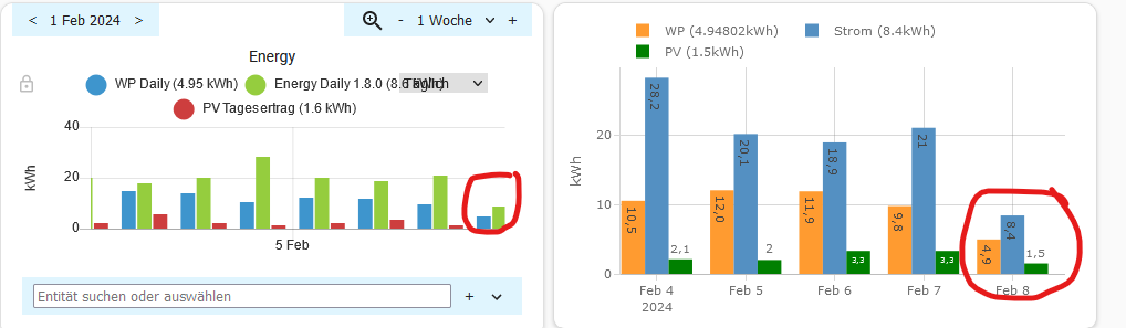
On the left it shows 8.6 and yours shows 8.4.
The other problem:
type: custom:plotly-graph
refresh_interval: 1
autorange_after_scroll: true
entities:
  - entity: sensor.pv_tagesertrag
    statistic: state
    name: |
      $fn ({ ys,meta }) =>
       "PV" + " " + "(" +ys[ys.length -1]+"kWh)"
    period: day
    type: bar
    texttemplate: '%{y}'
    filters:
      - filter: i>0
    marker:
      color: green
hours_to_show: 5d
defaults:
  entity:
    line:
      width: 2
  yaxes:
    fixedrange: true
title: null
layout:
  barmode: group
That script shows nothing on the chart, only when I change the state to max, but here the values are working not proper. Some values on different days are equal, but it must be different.
Thanks again.
OK - consider me officially ‘dumb’ but I can’t see any documentation that tells me how to do what you suggest.
You say ‘use a shorter period’ - where? Do you mean the source sensor should be a daily integration rather than the monthly one? (I tried that but I only ever saw the last reading for the month, not the average for all reading for the month.)
When you say ‘average inside the card through filters’ I can’t see ‘average’ (or ‘mean’) in the page you link to. (‘median’ is there but that is not what I want.)
Can you (or some other kind soul) provide an example?
Susan
Hello
I’ve read al the 577 replies to this post and I didn’t find what a was looking for.
I want to get the same effect as the previous post: Something similar to the HA climate graphic with the temperature setpoint line (climate.salon::temperature) filled when the heating is active. In my case that is detected by the valve state sensor.salon_calefaccion that is a float. something similar to this:

This is my code (asking to ChatGPT as i’m not confident with plotly yet):
type: custom:plotly-graph
entities:
  - entity: climate.salon::temperature
    yaxis: y1
    fill: tozeroy
    mode: none # hide line when zero
    name: Tª Consigna Calefacción # custom name
    # Use a conditional color based on another variable
    fillcolor: |
      {% if states('sensor.salon_calefaccion')|float > 0 %}
        rgba(0, 0, 255, 0.5) # blue with transparency
      {% else %}
        rgba(0, 0, 0, 0) # transparent
      {% endif %}
    # Show the value of the variable on hover
    hoverinfo: |
      Tª Consigna Calefacción: {{y}}<br>
      Salon Calefaccion: {{states('sensor.salon_calefaccion')}}
  - entity: climate.salon::current_temperature
    yaxis: y1
  - entity: climate.valvula_radiador_salon::temperature
    yaxis: y2
    fill: tozeroy
  - entity: climate.valvula_radiador_salon::current_temperature
    yaxis: y2
  - entity: climate.salon::temperature
    yaxis: y3
    fill: tozeroy
  - entity: sensor.termometro_irati_andion_temperature
    yaxis: y3
  - entity: sensor.termometro_cuarto_juegos_temperature
    yaxis: y3
defaults:
  yaxes:
    side: left
    overlaying: 'y'
    visible: true
    showgrid: true
  entity:
    line:
      width: 2
layout:
  dragmode: pan
  annotations:
    - xref: paper
      yref: paper
      'y': 0.85
      text: Salón
      showarrow: false
    - xref: paper
      yref: paper
      'y': 0.495
      text: Radiador Salón
      showarrow: false
    - xref: paper
      yref: paper
      'y': 0.125
      text: Habitaciones
      showarrow: false
  margin:
    t: 30
    l: 45
    r: 30
    b: 50
  showlegend: false
  height: 600
  yaxis:
    fixedrange: true
  yaxis2:
    fixedrange: true
  yaxis3:
    fixedrange: true
  grid:
    rows: 3
    columns: 1
    pattern: coupled
    roworder: top to bottom
hours_to_show: 24
refresh_interval: 10`

Does the fillcolor attribute accept conditional expression? Is there any way to do it work?
Thanks
Hello,
A sensor (LD2450) provides data (x(t),y(t)) which I display in a graph (x on the x-axis, y on the y-axis).
This displays the trajectory of the person detected. I display it over a period of 20 minutes (hours_to_show: 20m). If I display it over a longer period the graph becomes too busy.
I’d like to be able to shift this period in time with a horizontal bar or two buttons (< >) to move forwards or backwards in time.
Do you have any ideas on how to do this?
Thank you in advance.