agak79
February 26, 2024, 9:04pm
615
mateine:
discard the first datapoint. This is because Home Assistant sends a “fake” datapoint at the exact beginning of the requested range (i.e the leftmost date in the visible range), with the value before it.
When derivating or integrating, the math takes into account the time differenc
Ok, now this solved the first wrong value when accesing the card:
type: custom:plotly-graph
hours_to_show: 168
defaults:
  yaxes:
    fixedrange: true
layout:
  xaxis:
    rangeselector:
      'y': 1.25
      buttons:
        - count: 1
          step: day
        - count: 7
          step: day
        - count: 1
          step: month
        - count: 1
          step: year
entities:
  - entity: sensor.salon_heating_equivalente_today
    statistic: sum
    period:
      0s: hour
      24h: hour
      7d: day
      1M: day
      6M: month
      1y: month
    name: Horas calefaccion equivalentes
    unit_of_measurement: h
    type: bar
    filters:
      - filter: i>0
      - derivate: |
          $ex {
             const [start, end] = get('visible_range');
             const dist = +end-start;
             const day = 1000*60*60*24;
             const month = day*30;
             if (dist <= day) return 'd';
             if (dist <= month) return 'd';
             return 'M';
          }
refresh_interval: 10
But when pressing any of the buttons that modified the period , the values are still wrong:
1d button: More then 18h in 1h period seems impossible to me
1M button:
! year button is not charguing anything, I guess because the 1 year period : 1 month is not completed yet??
joshude
February 27, 2024, 7:47am
616
I have a graph with my current power consumption and the production of power of my small solar panels.
agak79
February 27, 2024, 1:14pm
617
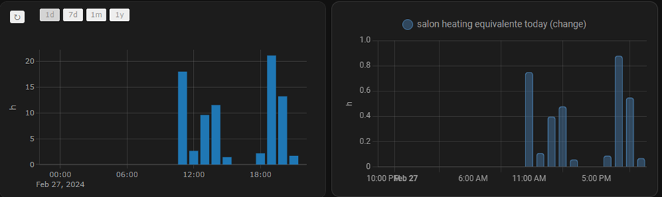
Hi @mateine , more on this graph.
I compared my graph bar with the actual variable I want to represent and detected more strange behavior.
For example, the variable is recording values since february 17th but the bar graph is only showing values since february 20th:
Do you think this is a wrong configuration of the statistics graph or it’s a bug?
I paste the code again as I did some minor changes to test them:
type: custom:plotly-graph
hours_to_show: 168
defaults:
  yaxes:
    fixedrange: true
layout:
  xaxis:
    rangeselector:
      'y': 1.25
      buttons:
        - count: 1
          step: day
        - count: 7
          step: day
        - count: 1
          step: month
        - count: 1
          step: year
entities:
  - entity: sensor.salon_heating_equivalente_today
    statistic: sum
    period:
      0s: hour
      24h: hour
      7d: day
      1M: day
      6M: month
      1y: month
    name: Horas calefaccion equivalentes
    unit_of_measurement: h
    type: bar
    filters:
      - filter: i>0
      - derivate: |
          $ex {
             const [start, end] = get('visible_range');
             const dist = +end-start;
             const day = 1000*60*60*24;
             const month = day*30;
             if (dist <= day) return 'd';
             if (dist <= month) return 'd';
             return 'M';
          }
refresh_interval: 10
stomko
February 27, 2024, 6:45pm
618
Looking for advice - so I have few sensors. Some are statistic sensors such as:
state_class: total_increasing
source: sensor.meter_electric_consumption_kwh
status: collecting
last_period: 12.9
last_valid_state: 13819.8
meter_period: daily
cron pattern: 0 0 * * *
last_reset: 2024-02-26T23:00:00.009322+00:00
unit_of_measurement: kWh
device_class: energy
friendly_name: daily_energy
While others just have certain value:
unit_of_measurement: kWh
friendly_name: Daily self consumed energy
I currently use graph using apex chart card that displays both correctly. However using plotly, second one is not displayed.
type: custom:plotly-graph
entities:
  - entity: sensor.daily_self_consumed_energy
    name: |
      $fn ({ ys,meta }) =>
        "Self" + "(" +ys[ys.length ]+" kWh)"
    type: bar
    statistic: max
    period: day
    texttemplate: '%{y}'
    marker:
      color: green
  - entity: sensor.daily_energy
    name: |
      $fn ({ ys,meta }) =>
        "From Grid" + "(" +ys[ys.length - 1]+" kWh)"
    type: bar
    statistic: state
    period: day
    texttemplate: '%{y}'
    marker:
      color: red
hours_to_show: 5d
layout:
  xaxis:
    rangeselector:
      'y': 1.2
      buttons:
        - count: 7
          step: day
        - count: 14
          step: day
        - count: 30
          step: day
  yaxis:
    fixedrange: true
It displays sensor.daily_energy sensor just fine, however other is not, regardless if I use max, mean or min. How can I do that?
With Apex, I get something like this:
Appreciate the help
mateine
February 27, 2024, 7:48pm
619
Can check against the standard statistics card in home assistant?
mateine
February 27, 2024, 7:57pm
620
Try removing the “statistic” key for sensors without statistics. Also i suggest you remove the first datapoint when using bar charts with a filter like this: filter: i>0
stomko
February 27, 2024, 8:14pm
621
Ok changed it tk this, but it still does not show. + When I scroll through the graph, bars chage their thickness.
type: custom:plotly-graph
entities:
  - entity: sensor.daily_self_consumed_energy
    name: |
      $fn ({ ys,meta }) =>
        "Self" + "(" +ys[ys.length ]+"kWh)"
    type: bar
    period: day
    texttemplate: '%{y}'
    filter: i>0
    marker:
      color: green
  - entity: sensor.daily_energy
    name: |
      $fn ({ ys,meta }) =>
        "From Grid" + "(" +ys[ys.length - 1]+"kWh)"
    type: bar
    statistic: state
    period: day
    texttemplate: '%{y}'
    filter: i>0
    marker:
      color: red
hours_to_show: 5d
layout:
  xaxis:
    rangeselector:
      'y': 1.2
      buttons:
        - count: 7
          step: day
        - count: 14
          step: day
        - count: 30
          step: day
  yaxis:
    fixedrange: true
mateine
February 27, 2024, 8:38pm
622
agak79
February 27, 2024, 9:20pm
623
There is a gap in the 19th and also the value the 20th is different in the HA-card. The 18th doesn’t appear in plotly
Changing to 1 day graphs and period to hour, it can be see the bars are similar but the valors are completely illogical in plotly whereas in HA native card the have a logical value each hour
Changing to 1 month does’t change the native statistics card, as there is only dates since the 17th, but the values seem again to be logical, whereas in plotly the bars seems to be proportionally correct but the values aren’t.
stomko
February 28, 2024, 1:03am
624
Thank you. So I changed my template sensor to:
state_class: total_increasing
unit_of_measurement: kWh
device_class: energy
friendly_name: Daily Self Consumed Energy
But it still shows “undefined” for the value in the name, and there is no graph displayed. I also tried to remove “statistic” as you recommended, but that did not change anything. Is there anything else that I am not getting?
mateine
February 28, 2024, 2:14pm
625
it will take some time for the sensor statistics to be collected and stored. Give it a couple of days
Haldi
February 29, 2024, 2:48am
626
Hello,
on_dblclick: |-
$fn ({ hass }) => () => {
hass.callService('light', 'turn_on', {
entity_id: 'light.portique_lumiere'
})
}
But the doubelclick does not support navigation actions or does it? the default tap_action is not supported either right?
tap_action:
action: navigate
navigation_path: /lovelace/living_room
i found this thread where someone found a workaround.
Ahh, I finally figured it out.
What I wanted to do was call a script and change the dashboard page with a single button push.
action: custom is what I’m calling it, but anything that’s not a real action ( more-info , toggle , call-service , none , navigate , url , assist) will work.
Figured this out with help from this issue comment
Using the amazing Button Card you can do this: Call a script or 2 and then navigate to a new page (or scroll the window position back up to the top (commented ou…
but i cannot get the
window.history.pushState(null,"","/lovelace-main/0");
window.dispatchEvent(new CustomEvent("location-changed"));
to work.
Any ideas on this topic?
stomko
February 29, 2024, 12:23pm
627
Thanks. It took some time but statistics started to work after.
I am trying to display daily consumption. This is what it looks like:
Is there a way how can I move “total” line graph to the back, so that bars are in the front?
And this is the code:
type: custom:plotly-graph
entities:
- entity: sensor.hourly_energy
name: |
$fn ({ ys,meta }) =>
"Grid" + "(" +ys[ys.length - 1].toFixed(2)+"kWh)"
type: bar
filters:
  - filter: i>0
statistic: state
period: hour
texttemplate: '%{y}'
marker:
color: red
- entity: sensor.hourly_self_consumed_energy
name: |
$fn ({ ys,meta }) =>
"Self" + "(" +ys[ys.length - 1].toFixed(2)+"kWh)"
type: bar
filters:
- filter: i>0
statistic: state
period: hour
texttemplate: '%{y}'
marker:
color: rgb(0, 204, 0)
- entity: sensor.hourly_electricity_exported_to_grid_huawei
name: |
$fn ({ ys,meta }) =>
"Export" + "(" +ys[ys.length - 1].toFixed(2)+"kWh)"
type: bar
filters:
- filter: i>0
statistic: state
period: hour
texttemplate: '%{y}'
marker:
color: rgb(230, 230, 0)
- entity: sensor.hourly_house_total_consumed_energy
name: |
$fn ({ ys,meta }) =>
"Total" + "(" +ys[ys.length - 1].toFixed(2)+"kWh)"
type: line
line:
shape: spline
color: rgb(255, 214, 204)
fill: tozeroy
statistic: state
period: hour
texttemplate: '%{y}'
marker:
color: rgb(255, 214, 204)
hours_to_show: current_day
layout:
barmode: stack
xaxis:
rangeselector:
'y': 1.2
yaxis:
fixedrange: true
One another question. For similar with my water usage, I have values in cubic meters. I display that on the bar, so I get values like “0.323”. How can I multiply it by 1000 to get “323” value instead? I am using texttemplate: '%{y}'
wwtomlinson
March 1, 2024, 7:20am
628
I have a simple plot but have been unable to disable the two-finger scroll. I’m on a MacBook and every time I scroll down on my dashboard, my plot zooms out when I scroll with two fingers with the mouse over the plot. I’ve set drag mode and scrollZoom both to false, but the behavior does not change. Any suggestions? I would like to not fully disable zooming (by fixing the axes).
Is there a way how can I move “total” line graph to the back
Try changing the order of the entities array
How can I multiply it by 1000
try:
entity: sensor.xyz
texttemplate: '%{y:.1f}'
unit_of_measurement: L
filters:
  - multiply: 1000
disable the two-finger scroll
try:
config:
  scrollZoom: false
stomko
March 1, 2024, 11:34am
631
Filter worked, thanks.
OzStone
March 1, 2024, 5:51pm
632
Make sure you’re wrapping the javascript inside of a $fn function that is used to add custom behavior.
Does that help?
on_dblclick: |-
  $fn ({ hass }) => () => {
     window.history.pushState(null,"","/lovelace/living_room")
     window.dispatchEvent(new CustomEvent("location-changed"))
   }
This is a very cool card that I only just discovered from your reference to my my tap_action navigate post . I installed plotly and got it working using the code above.
2 Likes
Ok, I found out why changing the order of the traces/entities doesn’t affect what occludes what. It is because all your entities have the same unit_of_measurement and therefore the same yaxis. In this case it looks like Plotly decides what to do itself.
The trick is to set yaxis yourself:
  - entity: sensor.sensor_background
    yaxis: y
    type: bar
  - entity: climate.sensor_foreground
    yaxis: y2 # <---- here, this forces a new axis and it will be rendered on top.
You can then hide the y2 axis and force it to stay in sync with y
layout:
  yaxis2:
    visible: false
    matches: y
Haldi
March 2, 2024, 12:59am
634
OzStone:
Does that help?
absolutely!
1 Like