Sadly that didn’t help.
Sadly that didn’t help.
maybe the $ symbol interferes, try adding a space before the % symbol. Also try removing the toFixed(2) so plotly does the formatting by itself (that’s what .2f does)
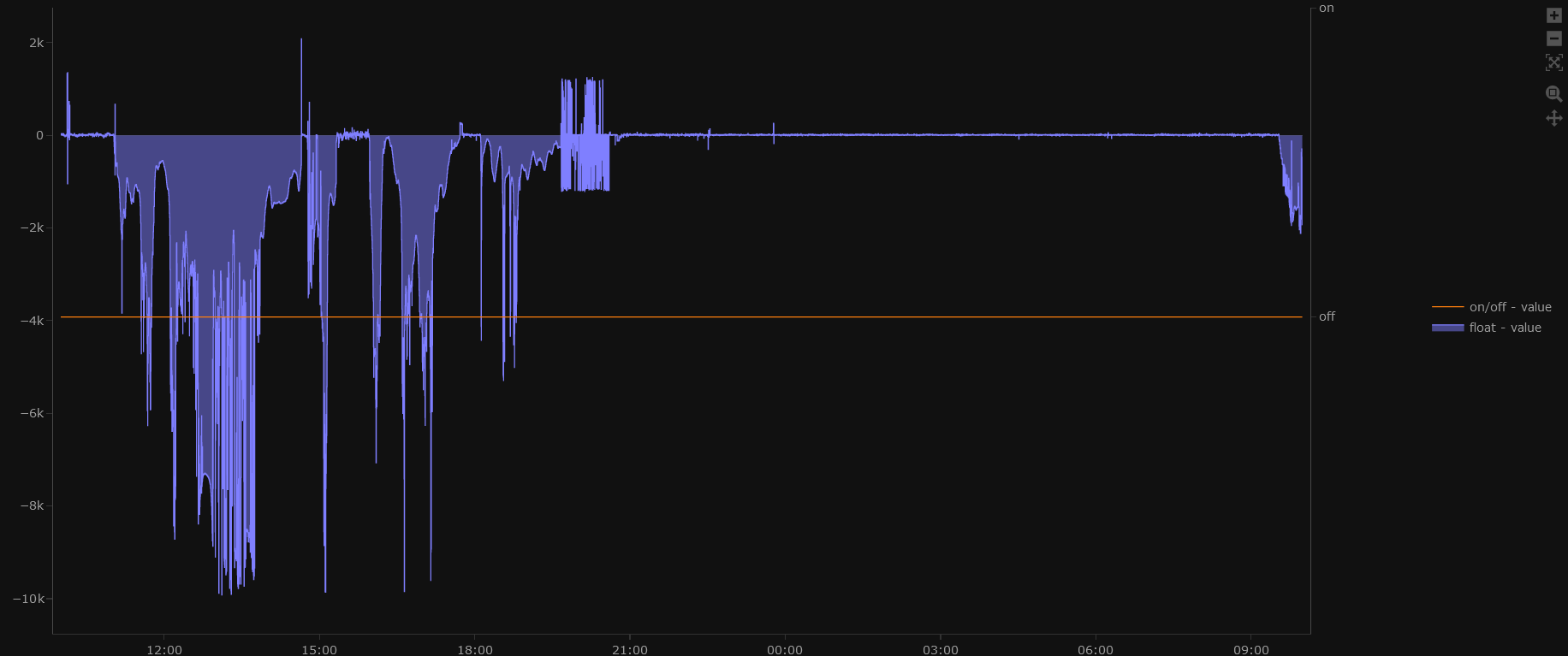
I am trying to overlay two y-axis: one with a value from a float sensor (positive and negative values) with a (binary) on/off-sensor.
Current result looks like this:
Expected result:
The “off” value shall be synchron to the zero-line of the float-value (left yaxis)
The “on” value shall be synchron to the maximum of the left yaxis
How can I reach this?
here the code snipped:
type: custom:plotly-graph
hours_to_show: 24
refresh_interval: 60
autorange_after_scroll: true
entities:
  - entity: sensor.<float-value-in-positive-and-negative-range>
    name: float - value
    yaxis: 'y'
    line:
      color: 7f7fff
      width: 1
      shape: hv
    fill: tonexty
  - entity: binary_sensor.<on/off-value>
    name: on/off - value
    yaxis: y5
    line:
      color: 990000
      width: 1
      shape: hv
layout:
  plot_bgcolor: rgba(0, 0, 0, 0)
  paper_bgcolor: rgba(0, 0, 0, 0)
  showlegend: true
  dragmode: zoom
  line:
    width: 0
    color: rgba(0, 0, 0, 0)
  legend:
    orientation: v
    x: 1.1
    'y': 0.5
    xanchor: left
    yanchor: middle
  xaxis:
    showgrid: false
    width: 1
  yaxis:
    overlaying: false
    side: left
    showgrid: false
    width: 1
    visible: true
    mirror: true
    min_value: 0
    title:
      standoff: 25
  yaxis5:
    overlaying: 'y'
    showgrid: false
    visible: true
    width: 0
    mirror: true
    categoryorder: array
    categoryarray:
      - 'off'
      - 'on'
  margin:
    t: 5
    l: 70
    r: 90
    b: 50
    pad: 7
Hi, I used a template for a daily energy production chart that I found somewhere on the web. I have inserted my entities but the green column is showing over the other columns for each day. What should I edit to make it appear like the others?

type: custom:plotly-graph
view_layout:
  grid-area: daily
entities:
  - entity: sensor.solax_today_s_solar_energy
    statistic: state
    name: |
      $fn ({ ys,meta }) =>
        "Solární panely" + " 🔆 " + "(" +ys[ys.length - 1]+"kWh)"
    period: day
    type: bar
    texttemplate: '%{y}'
    filters:
      - filter: i>0
    marker:
      color: rgb(255, 155, 48)
  - entity: sensor.solax_house_load_today
    statistic: state
    name: |
      $fn ({ ys,meta }) =>
        "Spotřeba domu" + " ⚡ " + "(" +ys[ys.length - 1]+"kWh)"
    period: day
    type: bar
    filters:
      - filter: i>0
    texttemplate: '%{y}'
    marker:
      color: rgb(55, 135, 115)
  - entity: sensor.solax_today_s_import_energy
    statistic: state
    name: |
      $fn ({ ys,meta }) =>
        "Spotřeba ze sítě" + " 💡 " + "(" +ys[ys.length - 1]+"kWh)"
    period: day
    type: bar
    texttemplate: '%{y}'
    filters:
      - filter: i>0
    marker:
      color: rgb(84, 144, 194)
  - entity: sensor.solax_battery_output_energy_today
    statistic: state
    name: |
      $fn ({ ys,meta }) =>
        "Vybíjení baterie" + " 🖱️ " + "(" +ys[ys.length - 1]+"kWh)"
    period: day
    type: bar
    texttemplate: '%{y}'
    filters:
      - filter: i>0
    marker:
      color: rgb(151, 90, 182)
  - entity: sensor.solax_battery_input_energy_today
    statistic: state
    name: |
      $fn ({ ys,meta }) =>
        "Nabíjení baterie" + " 🔋 " + "(" +ys[ys.length - 1]+"kWh)"
    period: day
    type: bar
    texttemplate: '%{y}'
    filters:
      - filter: i>0
    marker:
      color: rgb(200, 135, 225)
hours_to_show: 5d
title: Denní produkce
refresh_interval: 120
defaults:
  yaxes:
    fixedrange: true
layout:
  legend:
    bgcolor: rgba(0,0,0,0)
    itemsizing: constant
    font:
      size: 11
  height: 410
config:
  displayModeBar: false
  scrollZoom: false
time_offset: 12h
I doubt, that the yaml is the one, which produces the chart. In the code the is no second axis (assignment), … And if I try the code, it produces one chart in a form you are expecting to have.
You’ll either have to fix the ranges (i.e pixel coordinates) of both yaxes (see plotly docs for layout/yaxis/range) or find the max of the first entity with a filter, store it in a variable and then use that variable to map the binary sensor to be either zero or the stored max value. You’ll also have to set the yaxis of the binary sensor to the left one (yaxis: y) or set the unit_of_measurement to match.
The width of the bars is determined by the two closest datapoints in the x axis, that for each yaxis. I suggest you force the width of bars to a fixed value (you’ll have to search the plotlyjs docs)
Try this
type: custom:plotly-graph
view_layout:
  grid-area: daily
entities:
  - entity: sensor.solax_today_s_solar_energy
    statistic: state
    name: |
      $fn ({ ys,meta }) =>
        "Solární panely" + "🔆" + "(" +ys[ys.length - 1]+"kWh)"
    period: day
    type: bar
    offset: $fn() => -1000*60*60*7.5
    width: $fn() => 1000*60*60*3
    texttemplate: '%{y}'
    marker:
      color: rgb(255, 155, 48)
  - entity: sensor.solax_house_load_today
    statistic: state
    name: |
      $fn ({ ys,meta }) =>
        "Spotřeba domu" + "⚡" + "(" +ys[ys.length - 1]+"kWh)"
    period: day
    type: bar
    offset: $fn() => -1000*60*60*4.5
    width: $fn() => 1000*60*60*3
    texttemplate: '%{y}'
    marker:
      color: rgb(95, 182, 173)
  - entity: sensor.solax_today_s_import_energy
    statistic: state
    name: |
      $fn ({ ys,meta }) =>
        "Spotřeba ze sítě" + "💡" + "(" +ys[ys.length - 1]+"kWh)"
    period: day
    width: $fn() => 1000*60*60*3
    type: bar
    texttemplate: '%{y}'
    marker:
      color: rgb(84, 144, 194)
  - entity: sensor.solax_battery_output_energy_today
    statistic: state
    name: |
      $fn ({ ys,meta }) =>
        "Vybíjení baterie" + "🖱️" + "(" +ys[ys.length - 1]+"kWh)"
    period: day
    type: bar
    texttemplate: '%{y}'
    offset: $fn() => 1000*60*60*1.5
    width: $fn() => 1000*60*60*3
    marker:
      color: rgb(151, 90, 182)
  - entity: sensor.solax_battery_input_energy_today
    statistic: state
    name: |
      $fn ({ ys,meta }) =>
        "Nabíjení baterie" + "🔋" + "(" +ys[ys.length - 1]+"kWh)"
    period: day
    type: bar
    width: $fn() => 1000*60*60*3
    offset: $fn() => 1000*60*60*4.5
    texttemplate: '%{y}'
    marker:
      color: yellow
hours_to_show: 5d
title: Denní produkce
refresh_interval: 120
defaults:
  yaxes:
    fixedrange: true
layout:
  legend:
    bgcolor: rgba(0,0,0,0)
    itemsizing: constant
    font:
      size: 11
  height: 410
config:
  displayModeBar: false
  scrollZoom: false
time_offset: 12h
It work. Thank you
I try width 5 and adjust the offsets but… looks like i won’t be able to fit the full width of the column for a day. Can the total width of the column for individual days be increased so that I can fit 6 entities with individual widths of 5? Here is the code where I tried it
type: custom:plotly-graph
view_layout:
  grid-area: daily
entities:
  - entity: sensor.solax_today_s_import_energy
    statistic: state
    name: |
      $fn ({ ys,meta }) =>
        "Spotřeba ze sítě" + " 💡 " + "(" +ys[ys.length - 1]+"kWh)"
    period: day
    offset: $fn() => -1000*60*60*15
    width: $fn() => 1000*60*60*5
    type: bar
    texttemplate: '%{y}'
    marker:
      color: rgb(84, 144, 194)
  - entity: sensor.solax_today_s_solar_energy
    statistic: state
    name: |
      $fn ({ ys,meta }) =>
        "Solární panely" + " 🔆 " + "(" +ys[ys.length - 1]+"kWh)"
    period: day
    type: bar
    offset: $fn() => -1000*60*60*10
    width: $fn() => 1000*60*60*5
    texttemplate: '%{y}'
    filters:
      - filter: i>0
    marker:
      color: rgb(255, 155, 48)
  - entity: sensor.solax_today_s_export_energy
    statistic: state
    name: |
      $fn ({ ys,meta }) =>
        "Přetoky" + " 💡 " + "(" +ys[ys.length - 1]+"kWh)"
    period: day
    type: bar
    offset: $fn() => -1000*60*60*5
    width: $fn() => 1000*60*60*5
    texttemplate: '%{y}'
    filters:
      - filter: i>0
    marker:
      color: rgb(250, 250, 40)
  - entity: sensor.solax_house_load_today
    statistic: state
    name: |
      $fn ({ ys,meta }) =>
        "Spotřeba domu" + " ⚡ " + "(" +ys[ys.length - 1]+"kWh)"
    period: day
    type: bar
    offset: $fn() => 1000*60*60*0
    width: $fn() => 1000*60*60*5
    texttemplate: '%{y}'
    marker:
      color: rgb(55, 135, 115)
  - entity: sensor.solax_battery_output_energy_today
    statistic: state
    name: |
      $fn ({ ys,meta }) =>
        "Vybíjení baterie" + " 🖱️ " + "(" +ys[ys.length - 1]+"kWh)"
    period: day
    type: bar
    texttemplate: '%{y}'
    offset: $fn() => 1000*60*60*10
    width: $fn() => 1000*60*60*5
    marker:
      color: rgb(151, 90, 182)
  - entity: sensor.solax_battery_input_energy_today
    statistic: state
    name: |
      $fn ({ ys,meta }) =>
        "Nabíjení baterie" + " 🔋 " + "(" +ys[ys.length - 1]+"kWh)"
    period: day
    type: bar
    offset: $fn() => 1000*60*60*15
    width: $fn() => 1000*60*60*5
    texttemplate: '%{y}'
    marker:
      color: rgb(200, 135, 225)
hours_to_show: 5d
title: Denní produkce
refresh_interval: 120
defaults:
  yaxes:
    fixedrange: true
layout:
  legend:
    bgcolor: rgba(0,0,0,0)
    itemsizing: constant
    font:
      size: 11
  height: 410
config:
  displayModeBar: false
  scrollZoom: false
time_offset: 12h
There are only 24 hours in a day. You have six bars so the widest you can make them is 4 hours but then there will be no gaps between successive bars or days
Ah, thanks for the clarification. I understand now
I am looking for a way to set a minimum range of the y axis. So normally I would like the y axis just to scale automatically (for example between 0 and 100 when the maximum is 100), but I would like to have the minimum scaling to be between 0 and 10, so that it does not scale back from 0 to 0.5 when the maximum value is 0.5. Is this possible?
It looks like you can set autorange to min and then set a range on the yaxis and it will only use the min value. This seems to be new, I’ll update plotly in the next release
Hello!
I’m unable to add text before a value in the title; here’s my code:
layout:
  title:
    text: $ex hass.states["sensor.yahoofinance_isp_mi"].state
    xanchor: right
    yanchor: top
In this way it show the value of the sensor, but I’d like to add some text like “Last price” before; I tried several conbination but no way…
Anyhelp please?
Thank you
Try with
$ex "Latest price: " + hass.states["sensor.yahoofinance_isp_mi"].state
not working, But this one works:
text: $ex ( "Last:" + " "+ hass.states["sensor.yahoofinance_isp_mi"].state)
Oh yea, yaml and unescaped colons…
You can also do:
text: |
  $ex "Latest price: " + hass.states["sensor.yahoofinance_isp_mi"].state
to avoid parsing issues
Tank you, of course working fine!