Plotly interactive Graph Card

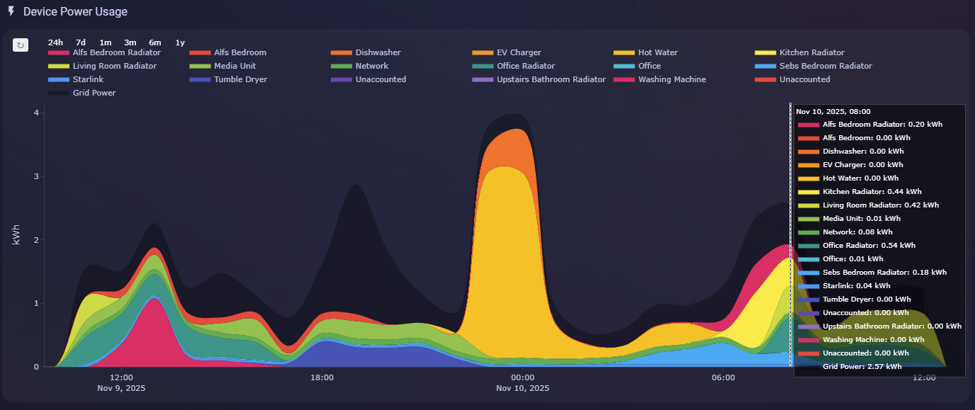
When using hovermode: x unified is there a way to hide a series from the hoverlabel when the y value is 0? I tried a custom function $fn({}) y >0 y:null but it would just return blank line but the square color of the series was still there.

I’m using auto-entities to pull out all my energy sensors and then the defaults on plotty to setup the functions.
type: custom:auto-entities
card:
  type: custom:plotly-graph
  hours_to_show: 12
  refresh_interval: 60
  layout:
    hoverlabel:
      border: 0
      bgcolor: rgba(0, 0, 0, 0.5)
      font:
        color: white
        size: 10
    hovermode: x unified
    plot_bgcolor: transparent
    xaxis:
      autorange: true
      rangeselector:
        "y": 1.2
        bgcolor: transparent
        activecolor: "#5a5f8e"
        font:
          color: "#fff"
        buttons:
          - count: 24
            step: hour
          - count: 7
            step: day
          - count: 1
            step: month
          - count: 3
            step: month
          - count: 6
            step: month
          - count: 1
            step: year
      nticks: 8
      showgrid: false
      fixedrange: false
    yaxis:
      autorange: true
      nticks: 5
      showgrid: false
      fixedrange: true
  config:
    displayModeBar: false
    scrollZoom: true
    responsive: true
  defaults:
    entity:
      filters:
        - force_numeric
        - resample: |
            $ex {
             const range = get('visible_range');
              const time_span = range[1] - range[0];
              const days = 1000 * 60 * 60 * 24;
              
              if (time_span >= 30 * days) return "1M";
              if (time_span >= 3 * days) return "1d"; 
              if (time_span >= 1 * days) return "1h"; 
              return "10m";
            }      
        - derivate: |
            $ex {
             const range = get('visible_range');
              const time_span = range[1] - range[0];
              const days = 1000 * 60 * 60 * 24;
              
              if (time_span >= 30 * days) return "M";
              if (time_span >= 3 * days) return "d"; 
              if (time_span >= 1 * days) return "h"; 
              return "m";
            }  
      extend_to_present: true
      hovertemplate: "%{fullData.name}: %{y:.2f} kWh<extra></extra>"
      type: area
      fill: tonexty
      stackgroup: one
      line:
        width: 0
        shape: spline
      statistic: state
      period:
        0s: 5minute
        24h: hour
        2d: hour
        10d: day
        1M: week
        3M: week
        4M: month
        6M: month
        1y: month
filter:
  template: >
    {% set excluded_sensors = state_attr('sensor.excluded_sensors', 'energy') or [] %}  
    {% set colors = ['#f44336','#e91e63','#926bc7','#6e41ab','#3f51b5','#2196f3','#03a9f4','#00bcd4','#009688','#4caf50','#8bc34a','#cddc39','#ffeb3b','#ffc107','#ff9800','#ff6f22'] %}  
    
    {% set ns = namespace(entities=[], index=0) %} 
    {% set filtered_sensors = states.sensor
      | selectattr('attributes.device_class', 'equalto', 'energy')
      | selectattr('attributes.unit_of_measurement', 'equalto', 'kWh')
      | rejectattr('state', 'equalto', 'unavailable')
      | rejectattr('entity_id', 'in', excluded_sensors)
      | sort(attribute='attributes.friendly_name', reverse=true)
      | list %}
    {% set all_sensors =  filtered_sensors %}
    {% for entity in all_sensors %}
      {% set name = state_attr(entity.entity_id, 'friendly_name') | replace('Energy', '') | replace('Power', '') | replace('Summation delivered', '')| trim %}
      {% set color = colors[ns.index % colors|length] %}
      {% set ns.entities = ns.entities + [{
        'entity': entity.entity_id, 
        'name': name,
        'fillcolor': color
      }] %}
      {% set ns.index = ns.index + 1 %}
    {% endfor %} 
    {% set ns.entities = [{
      'entity': 'sensor.grid_energy',
      'name': 'Grid Power',
      'fillcolor': 'rgba(0, 0, 0, 0.3)',
      'type': 'area',
      'stackgroup': 'two'
    }] + ns.entities %}
    {{ ns.entities }}
show_empty: true
unique: true
grid_options:
  columns: full
  rows: 8

I’ve read up n some of this GitHub discussions which helped with a few items.

my github gist has the code and image plotty-auto-entities-energy-history.yaml · GitHub
Hi, thanks!
There is currently no loading indicator

Wow it kooks great!
I’m not aware of any way of doing this. You may want to ask in a plotlyjs forum

What is the syntax for using an attribute in an annotation?
I’ve tried
annotation:

  • x: $ex hass.state_attr[“sensor.planet_sun”,“Az”].state
    and
    -x: $ex hass.states[“sensor.planet_sun”].state::Az
    and other variants, but I just can’t seem to get at an attribute unless I specify a new sensor using a template.

I should add that I really think this card is very visually appealing and concise: it looks just like the horizon card, with more things you can add, clickable items too…

3 Likes

Looks so great, I would love to have the code for this card.

1 Like

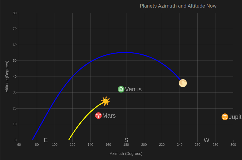
It’s pretty minimal really: the sun and the moon are series entities on a scatter plot so that I can show the path of the sun and moon for the previous 12 hours, all the other planets are annotations. You just need sensors for all of them - there are multiple sources for that. I encoded separate sensors for each planet Az and Alt using a template sensor for each attribute.

Here is the sun entity:

hours_to_show: 12
entities:
  - entity: sensor.planet_sun
    attribute: Az
    internal: true
    fn: $fn ({ ys, vars }) => vars.azimuth = ys
  - entity: sensor.planet_sun
    attribute: Alt
    internal: true
    fn: $fn ({ ys, vars }) => vars.elevation = ys
  - entity: ""
    x: $fn ({ ys, vars }) => vars.azimuth
    "y": $fn ({ y, vars }) => vars.elevation
    mode: markers
    text: Sun
    name: ☀️ Sun
    marker:
      color: yellow
      size: 3
    type: scatter

And here is one of the annotations:

layout:
  height: 500
  width: 800
  annotations:
    - x: $ex hass.states["sensor.planet_saturn_az"].state
      "y": $ex hass.states["sensor.planet_saturn_alt"].state
      text: 🪐Saturn
      font:
        size: 20
      showarrow: false
      xanchor: left

1 Like

The attributes may not be directly accessible, you may need to add it as an internal:true entity and store the attributes in a var.
I suggest you look at the debugging section of the readme in the repo, you can use the chrome devtools to see what properties are available in the hass object

Thanks, I’ll do that. The template sensor to get an attribute from another sensor isn’t difficult - e.g. template state is {{ state_attr(‘sensor.planet_jupiter’,‘Alt’) }}, but it does clutter up Home Assistant with redundant sensors.

Thanks a lot for your code. I can already display sun & moon, but for the planet data I couldn’t find any source in HACS. Since I do not want to highjack this thread, I’ve create a new one for my question.

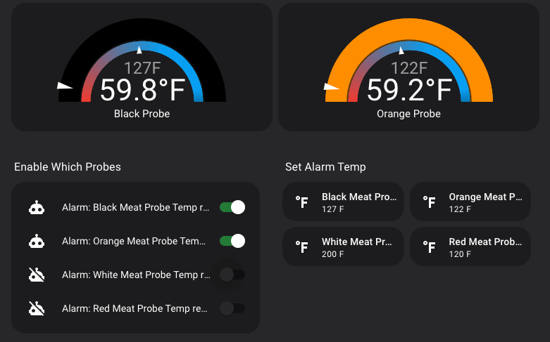
I have a multi-line graph. I want to show each line of the data but ONLY if another entity’s state is TRUE. Otherwise I want to hide the line.

I can do this in lovelace for each card I want to show with this:

visibility:
  - condition: state
    entity: automation.black_meat_probe_temp_reached
    state: "on"

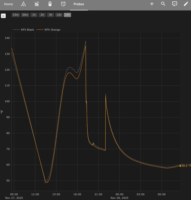
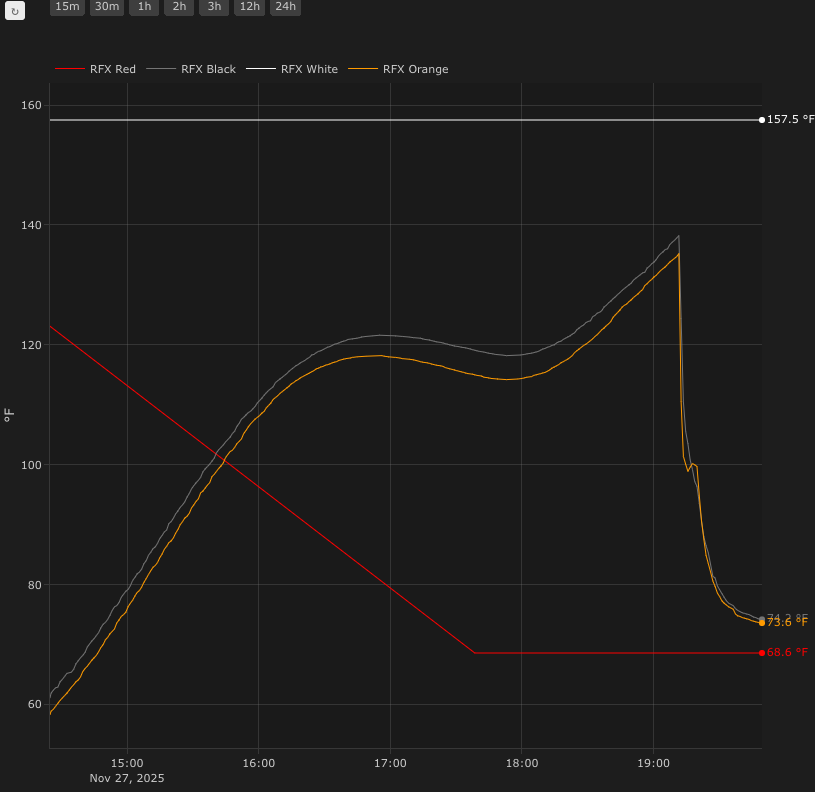
My Plotly config for 4 sensors

type: custom:plotly-graph
defaults:
  entity:
    show_value: true
  yaxes:
    side: left
    overlaying: "y"
    visible: true
    showgrid: true
    fixedrange: true
entities:
  - entity: sensor.rfx_red_temp
    name: RFX Red
    line:
      color: red
      shape: spline
      width: 1
      smoothing: 0
  - entity: sensor.rfx_black_temp
    name: RFX Black
    line:
      color: grey
      shape: spline
      width: 1
      smoothing: 0
  - entity: sensor.rfx_white_temp
    name: RFX White
    color: white
    line:
      color: white
      shape: spline
      width: 1
      smoothing: 0
  - entity: sensor.rfx_orange_temp
    name: RFX Orange
    color: white
    line:
      color: orange
      shape: spline
      width: 1
      smoothing: 0
refresh_interval: 10
hours_to_show: 1
layout:
  grid:
    rows: 1
    columns: 1
    pattern: coupled
    roworder: top to bottom
  margin:
    r: 60
  height: 800
  xaxis:
    rangeselector:
      bgcolor: "#474747"
      "y": 1.1
      buttons:
        - count: 15
          step: minute
        - count: 30
          step: minute
        - count: 1
          step: hour
        - count: 2
          step: hour
        - count: 3
          step: hour
        - count: 12
          step: hour
height: 800
autorange_after_scroll: true

Hi there!
you could do something like this:

entities:
   - entity: sensor.maybe_hide
     internal: "$ex hass.states['automation.black_meat_probe_temp_reached'].state !== 'on' "

That worked perfectly!

you could also do visible: $ex ...... == 'on' ? 'visible' : 'legendonly'
this would hide it by default but you can still click on the name of the entity to see it

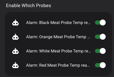
My use case has 4 temp probes. I only enble the ones I’m using

With this visibility feature, I can now automatically hide unused probes.


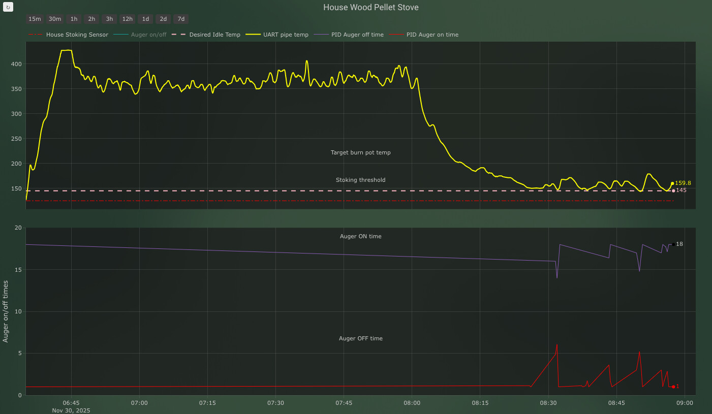
On a different graph, I’m trying to get 2 rows, one at ~90% height, the other at the bottom at ~10% height. I’m messing w/ the domain tag, but cant seem to get it right. Both graphs keep coming out the same height…

type: custom:plotly-graph
defaults:
  entity:
    show_value: true
  yaxes:
    side: left
    overlaying: "y"
    visible: true
    showgrid: true
    fixedrange: false
hours_to_show: 3
entities:
  - entity: sensor.house_stoking_sensor
    show_value: 0
    filters:
      - filter: y !== null && +y > 100
    yaxis: y1
    line:
      color: red
      dash: dashdot
  - entity: sensor.house_auger_display_sensor
    name: Auger on/off
    visible: legendonly
    show_value: 0
    filters:
      - filter: y !== null && +y > 90
    yaxis: y1
    line:
      color: aqua
  - entity: number.house_desired_pipe_temp
    name: Desired Idle Temp
    yaxis: y1
    line:
      color: pink
      shape: spline
      dash: dash
      width: 2
      smoothing: 0
  - entity: sensor.house_uart_pipe_temp
    name: UART pipe temp
    filters:
      - median:
          window_size: 3
          extended: 0
          centered: true
    yaxis: y1
    line:
      color: yellow
      shape: spline
      width: 2
      smoothing: 0
  - entity: sensor.house_stove_pipe_temp
    unit_of_measurement: Tuya Pipe Temp
    internal: true
    yaxis: y1
    show_value: true
    line:
      color: green
      shape: spline
      width: 2
      smoothing: 0
  - entity: number.house_pid_auger_off_time
    name: PID Auger off time
    yaxis: y2
    line:
      color: ligt blue
      shape: spline
      width: 1
      smoothing: 0
  - entity: number.house_pid_auger_on_time
    name: PID Auger on time
    yaxis: y2
    line:
      color: red
      shape: spline
      width: 1
      smoothing: 0
title: House Wood Pellet Stove
autorange_after_scroll: true
refresh_interval: auto
default_trace:
  line:
    width: 2    
layout:
  height: 800
  margin:
    r: 100
  yaxis:
    domain: # this is the % of the y axis height 
      - 0.9
      - 0.9
    categoryarray: # set it here to ensure "false" is always under. Otherwise plotly will invert the order depending on what it sees first
      - false
      - true
    visible: true
    zeroline: false
    fixedrange: true
    range:
      - 100
      - 400
  yaxis2:
    domain: # this is the % of the y axis height 
      - 0.1
      - 0.1
    categoryarray: # set it here to ensure "false" is always under. Otherwise plotly will invert the order depending on what it sees first
      - false
      - true
    title: Auger on/off times
    fixedrange: 1
    zeroline: 0
    auorange: 0
    range:
      - 0
      - 20
  grid:
    rows: 2
    columns: 1
    pattern: coupled
    roworder: top to bottom
  refresh_interval: 1s
  xaxis:
    rangeselector:
      bgcolor: "#474747"
      "y": 1.05
      buttons:
        - count: 15
          step: minute
        - count: 30
          step: minute
        - count: 1
          step: hour
        - count: 2
          step: hour
        - count: 3
          step: hour
        - count: 12
          step: hour
        - count: 1
          step: day
        - count: 2
          step: day
        - count: 7
          step: day

Took me a while to find the right configurations and get enough of a hang on the expressions/formula to cobble this together.

Multiple Plots made with Data from Home Assistant, passed thru AppDaemon, back into an Attribute in Home Assistant, Ultimately onto these half decent Graphs that do show me in fact that the changes in value are correlated with the heating cycle of my thermostat! Haha overly complicated way to visualize it but also curious if the Sun/Moon/Tides Cycle had anything to do with the changes when Temperature alone wasnt accounting for it, some values around 6 hrs == Tides ? :thinking: Maybe just maybe, despite my terrible math telling me the moons gravity would barely be able to change a single bit of value lmao, More likely just the daily Temperature Cycling of the Room, but those non-correlated bumps are still gnawing at my brain!
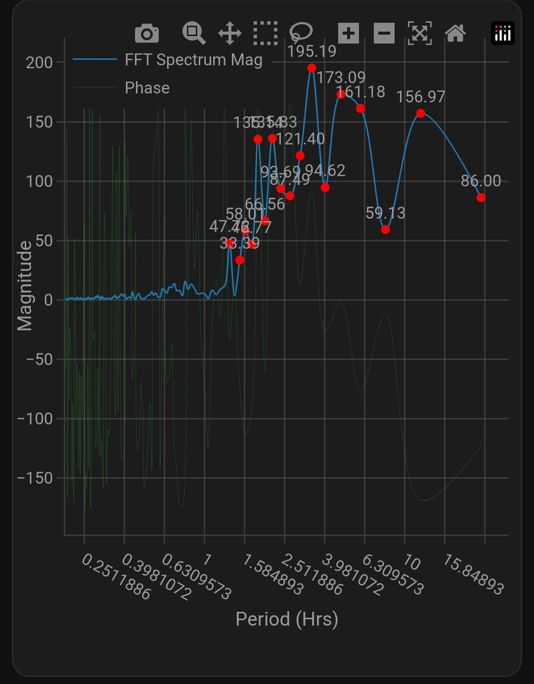
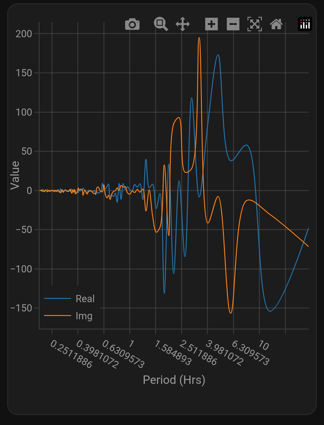
Not useful outright but imagine the usefulness of this kinda capability for certain situations throughout the home? Recognizing imminent attic fan failure from vibration frequencies? Maybe person recognition from cadence or sound recognition? Maybe even power usage by individual Device thru frequency patterns? would be Cool stuff i think and wonderful to see it all live

Main Plot FFT with only markers Over a certain Threshold labeled

for the interested , the data was recorded eith esphome , smoothed with a home assistant helper, Derived with another Helper, passed to a script in AppDaemon Addon, fft data stored in an Attribute of another template helper sensor, then taken by plotly, plotted Logarithmically on the x axis to visibility, and margins adjusted for better viewing in the home assistant companion app, default drag changed so scrolling doesnt accidently zoom me in.

Setup is an HX711 Sensor to a 5 kg Load Cell, One half taped down to a desk with a ds18b20 Temp sensor attached, the other end Free hanging. In an attempt to Quantify the always changing value that seems repetitive enough , hoping to be able to eventually calibrate it to where i can accurately measure Weight without Taring.

code for the above plots in order:

type: custom:plotly-graph
grid_options:
  columns: full
refresh_interval: 10
raw_plotly_config: true
disable_pinch_to_zoom: true
config:
  toImageButtonOptions:
    format: svg
    filename: MagPlot
    height: 500
    width: 700
    scale: 1
layout:
  xaxis:
    title: Period (Hrs)
    type: log
    tickmode: linear
    tick0: 0
    dtick: 0.2
  yaxis:
    title: Magnitude
  legend:
    x: 0
    "y": 1
  margin:
    r: 10
    l: 35
    t: 15
    b: 100
  dragmode: pan
entities:
  - entity: sensor.hx711_dominant_cycle
    name: FFT Spectrum Mag
    unit_of_measurement: Magnitude
    mode: lines
    line:
      shape: spline
      width: 1
    type: scatter
    x: >
      $ex
      hass.states['sensor.hx711_dominant_cycle'].attributes.fft_spectrum_data.map(d
      => d[0])
    "y": >
      $ex
      hass.states['sensor.hx711_dominant_cycle'].attributes.fft_spectrum_data.map(d
      => d[1])
  - entity: sensor.hx711_dominant_cycle
    name: Major Peaks
    mode: markers+text
    showlegend: false
    marker:
      color: red
      size: 6
    textposition: top center
    textlimit: |
      $ex { vars.textlimit = 20 }
    x: >
      $ex
      hass.states['sensor.hx711_dominant_cycle'].attributes.fft_spectrum_data
      .filter(d => d[1] > vars.textlimit)  .map(d => d[0])
    "y": >
      $ex
      hass.states['sensor.hx711_dominant_cycle'].attributes.fft_spectrum_data
      .filter(d => d[1] > vars.textlimit) .map(d => d[1])
    text: >
      $ex
      hass.states['sensor.hx711_dominant_cycle'].attributes.fft_spectrum_data
      .filter(d => d[1] > vars.textlimit ) .map(d => d[1].toFixed(2))
  - entity: sensor.hx711_dominant_cycle
    name: Phase
    mode: lines
    line:
      shape: spline
      width: 0.1
    type: scatter
    x: >
      $ex
      hass.states['sensor.hx711_dominant_cycle'].attributes.fft_phase_data.map(d
      => d[0])
    "y": >
      $ex
      hass.states['sensor.hx711_dominant_cycle'].attributes.fft_phase_data.map(d
      => d[1])

type: custom:plotly-graph
grid_options:
  columns: full
refresh_interval: 10
raw_plotly_config: true
disable_pinch_to_zoom: true
config:
  toImageButtonOptions:
    format: svg
    filename: Real-ImgPlot
    height: 500
    width: 700
    scale: 1
layout:
  xaxis:
    title: Period (Hrs)
    type: log
    tickmode: linear
    tick0: 0
    dtick: 0.2
  yaxis:
    title: Value
  legend:
    x: 0
    "y": 0
  margin:
    r: 10
    l: 35
    t: 10
    b: 100
  dragmode: pan
entities:
  - entity: sensor.hx711_dominant_cycle
    name: Real
    mode: lines
    line:
      shape: spline
      width: 1
    type: scatter
    x: >
      $ex
      hass.states['sensor.hx711_dominant_cycle'].attributes.fft_real_data.map(d
      => d[0])
    "y": >
      $ex
      hass.states['sensor.hx711_dominant_cycle'].attributes.fft_real_data.map(d
      => d[1])
  - entity: sensor.hx711_dominant_cycle
    name: Img
    mode: lines
    line:
      shape: spline
      width: 1
    type: scatter
    x: >
      $ex
      hass.states['sensor.hx711_dominant_cycle'].attributes.fft_imaginary_data.map(d
      => d[0])
    "y": >
      $ex
      hass.states['sensor.hx711_dominant_cycle'].attributes.fft_imaginary_data.map(d
      => d[1])

type: custom:plotly-graph
grid_options:
  columns: full
refresh_interval: 10
raw_plotly_config: true
disable_pinch_to_zoom: true
config:
  toImageButtonOptions:
    format: svg
    filename: MagPlot
    height: 500
    width: 700
    scale: 1
layout:
  xaxis:
    title: Period (Hrs)
    type: log
    tickmode: linear
    tick0: 0
    dtick: 0.2
  yaxis:
    title: Magnitude (∘C/Hr)
  legend:
    x: 0
    "y": 1
  margin:
    r: 10
    l: 35
    t: 15
    b: 100
  dragmode: pan
entities:
  - entity: sensor.desk_temp_dominant_cycle
    name: FFT Spectrum Mag
    unit_of_measurement: Magnitude
    mode: lines
    line:
      shape: spline
      width: 1
    type: scatter
    x: >
      $ex
      hass.states['sensor.desk_temp_dominant_cycle'].attributes.fft_spectrum_data.map(d
      => d[0])
    "y": >
      $ex
      hass.states['sensor.desk_temp_dominant_cycle'].attributes.fft_spectrum_data.map(d
      => d[1])
  - entity: sensor.desk_temp_dominant_cycle
    name: Major Peaks
    mode: markers+text
    showlegend: false
    marker:
      color: red
      size: 6
    textposition: top center
    textlimit: |
      $ex { vars.textlimit = 0.05 }
    x: >
      $ex
      hass.states['sensor.desk_temp_dominant_cycle'].attributes.fft_spectrum_data
      .filter(d => d[1] > vars.textlimit)  .map(d => d[0])
    "y": >
      $ex
      hass.states['sensor.desk_temp_dominant_cycle'].attributes.fft_spectrum_data
      .filter(d => d[1] > vars.textlimit) .map(d => d[1])
    text: >
      $ex
      hass.states['sensor.desk_temp_dominant_cycle'].attributes.fft_spectrum_data
      .filter(d => d[1] > vars.textlimit ) .map(d => d[1].toFixed(2))

type: grid
cards:
  - type: custom:config-template-card
    grid_options:
      columns: full
    entities:
      - input_number.fft_window_size
    variables:
      span: states['input_number.fft_window_size'].state / 24
    card:
      chart_type: line
      period: hour
      type: statistics-graph
      entities:
        - sensor.hx711_filtered
      stat_types:
        - mean
      days_to_show: ${span}
  - type: custom:config-template-card
    grid_options:
      columns: full
    entities:
      - input_number.fft_window_size
    variables:
      span: states['input_number.fft_window_size'].state / 24
    card:
      chart_type: line
      period: hour
      type: statistics-graph
      entities:
        - sensor.rjfedorc3_temp
      stat_types:
        - mean
      days_to_show: ${span}
  - type: custom:config-template-card
    grid_options:
      columns: full
    entities:
      - input_number.fft_window_size
    variables:
      span: states['input_number.fft_window_size'].state / 24
    card:
      chart_type: line
      period: hour
      type: statistics-graph
      entities:
        - sensor.hx711_correlation_factor
      stat_types:
        - mean
        - min
        - max
      days_to_show: ${span}
  - type: custom:plotly-graph
    grid_options:
      columns: full
    refresh_interval: 10
    raw_plotly_config: true
    disable_pinch_to_zoom: true
    config:
      toImageButtonOptions:
        format: svg
        filename: MagPlot
        height: 500
        width: 700
        scale: 1
    layout:
      xaxis:
        title: Period (Hrs)
        type: log
        tickmode: linear
        tick0: 0
        dtick: 0.2
      yaxis:
        title: Magnitude (∘C/Hr)
      legend:
        x: 0
        "y": 1
      margin:
        r: 10
        l: 35
        t: 15
        b: 100
      dragmode: pan
    entities:
      - entity: sensor.desk_temp_dominant_cycle
        name: FFT Spectrum Mag
        unit_of_measurement: Magnitude
        mode: lines
        line:
          shape: spline
          width: 1
        type: scatter
        x: >
          $ex
          hass.states['sensor.desk_temp_dominant_cycle'].attributes.fft_spectrum_data.map(d
          => d[0])
        "y": >
          $ex
          hass.states['sensor.desk_temp_dominant_cycle'].attributes.fft_spectrum_data.map(d
          => d[1])
      - entity: sensor.desk_temp_dominant_cycle
        name: Major Peaks
        mode: markers+text
        showlegend: false
        marker:
          color: red
          size: 6
        textposition: top center
        textlimit: |
          $ex { vars.textlimit = 0.05 }
        x: >
          $ex
          hass.states['sensor.desk_temp_dominant_cycle'].attributes.fft_spectrum_data
          .filter(d => d[1] > vars.textlimit)  .map(d => d[0])
        "y": >
          $ex
          hass.states['sensor.desk_temp_dominant_cycle'].attributes.fft_spectrum_data
          .filter(d => d[1] > vars.textlimit) .map(d => d[1])
        text: >
          $ex
          hass.states['sensor.desk_temp_dominant_cycle'].attributes.fft_spectrum_data
          .filter(d => d[1] > vars.textlimit ) .map(d => d[1].toFixed(2))
  - type: tile
    entity: sensor.desk_temp_dominant_cycle
    vertical: false
    features_position: bottom
    grid_options:
      columns: full
column_span: 4

Real and Imaginary Plotted

Temperature FFT

Hello everyone, I have a problem that couldn’t solve out. Will appreciate any help possible, thank you in advance…

I have a template sensor:

template:
  - sensor:
      - name: "VinAssistant Archive 2022"
        unique_id: vinassistant_archive_2022_01
        icon: mdi:bottle-wine
        state: "Finished"
        attributes:
          grape: "Merlot"

          ph_history: |
            [
              ["2022-09-27", 2],
              ["2022-10-16", 2.2],
              ["2022-11-01", 3.7]
            ]

I want to create a graph using above pH values but this version does not work;

type: custom:plotly-graph
title: 2022 Merlot - pH History
hours_to_show: 24
refresh_interval: 10
entities:
  - entity: sensor.vinassistant_archive_2022_01
    name: pH Value
    x: |
      {{ state_attr('sensor.vinassistant_archive_2022_01', 'ph_history') 
         | from_json 
         | map(attribute=0) 
         | map('format', '%sT00:00:00.000Z') 
         | list 
      }}
    y: |
      {{ state_attr('sensor.vinassistant_archive_2022_01', 'ph_history') 
         | from_json 
         | map(attribute=1) 
         | list 
      }}
    line:
      color: red
      width: 5
    type: scatter
    mode: lines+markers
layout:
  xaxis:
    type: date
    tickformat: "%d.%m.%Y"
    range:
      - "2022-09-26"
      - "2022-11-01"

But when I write the x values by hand it works;

type: custom:plotly-graph
title: 2022 Merlot - pH History
hours_to_show: 24
refresh_interval: 10
entities:
  - entity: sensor.vinassistant_archive_2022_01
    name: pH Value
    x: [2022-09-26, 2022-10-23, 2022-11-01]
    y: |
      {{ state_attr('sensor.vinassistant_archive_2022_01', 'ph_history') 
         | from_json 
         | map(attribute=1) 
         | list 
      }}
    line:
      color: red
      width: 5
    type: scatter
    mode: lines+markers
layout:
  xaxis:
    type: date
    tickformat: "%d.%m.%Y"
    range:
      - "2022-09-26"
      - "2022-11-01"

What am I missing?

Thank you…