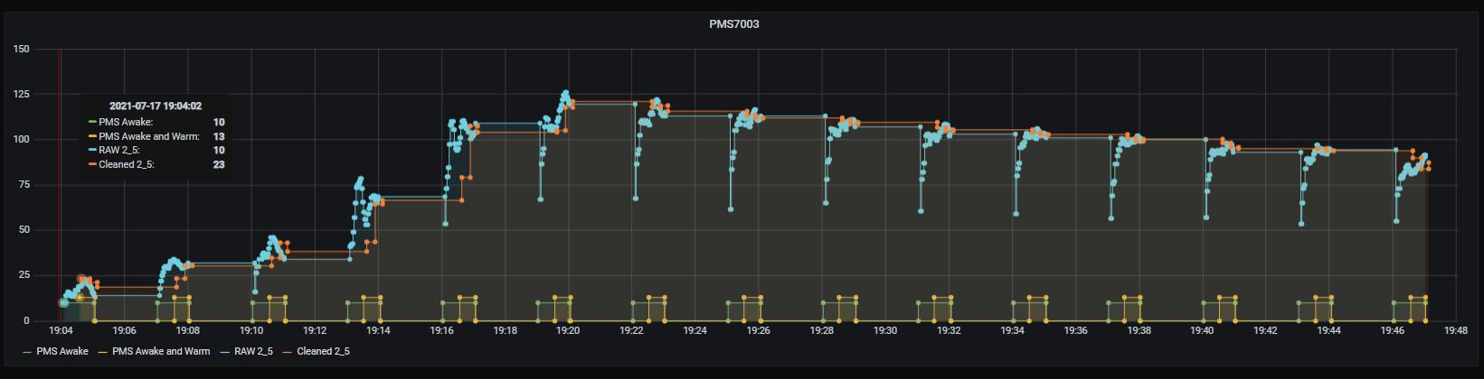
Here’s how my filtering looks across a period where 2.5 is increasing rapidly because I started cooking, then tailing off as smoke etc disperses.
Green indicates PMS is awake.
Blue is raw data from that period - you can see the ramp up during fan warm up pretty clearly (especially in the second half after I’ve finsished cooking).
Yellow indicates the period of data I am keeping (warm up ignored)
Orange is the final aggregated/smoothed data I’ll send/keep in HA.
Not perfect, but not bad…