PQINA Flip Clock card

Hi,

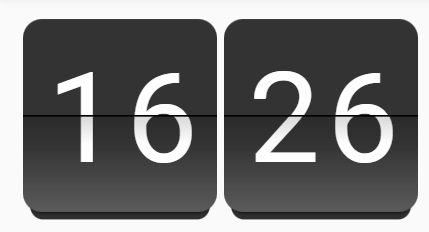
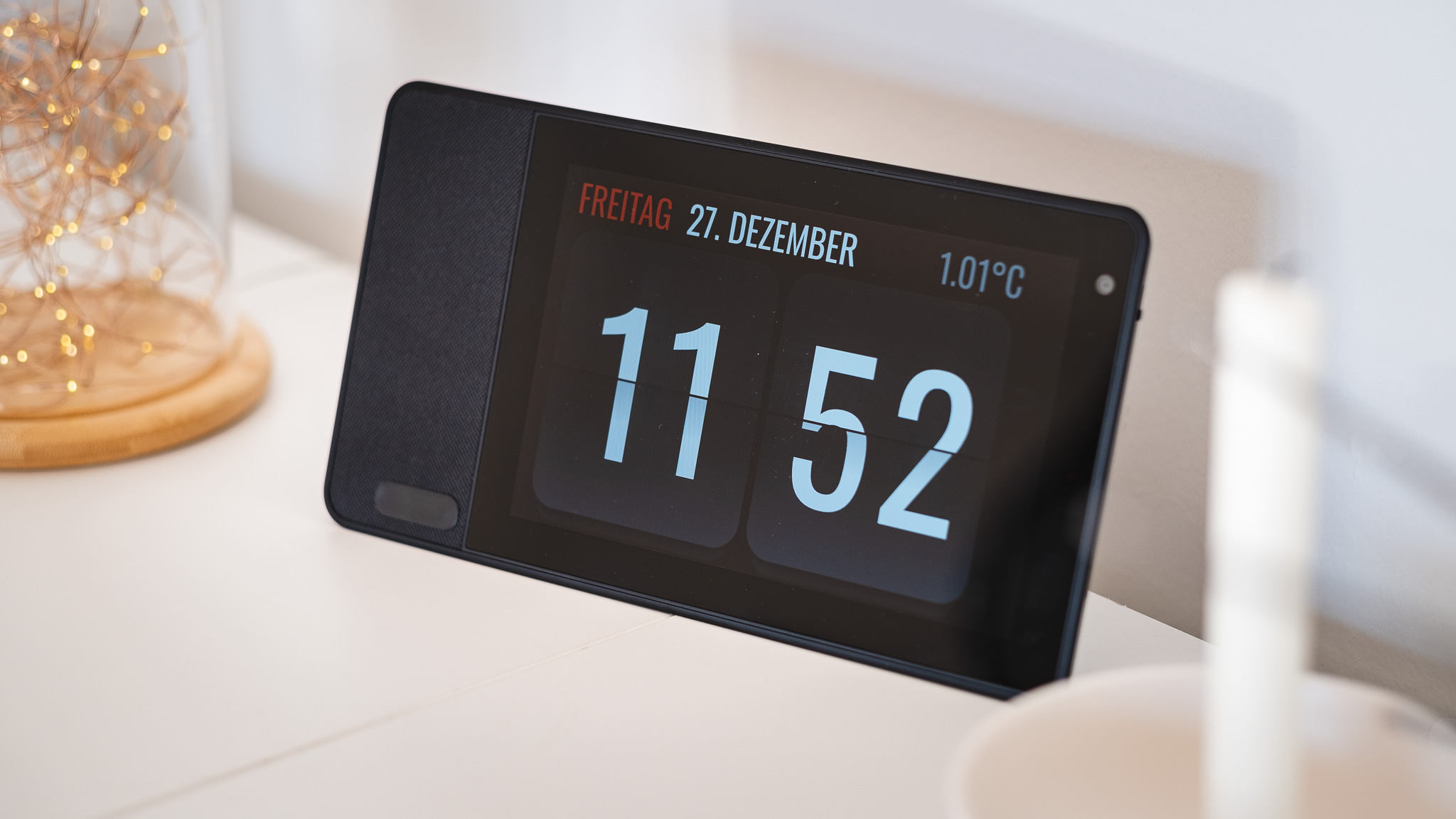
I created a little custom card with a flip clock, as I use the Lenovo Thinksmart View 8 as smart clock in our living room.

The clock is the “screensaver” and a click reveals the HA dashboard.
Might also work well for wall mounted tablets, or if you’re just in the need of a clock on your dashboard. :wink:

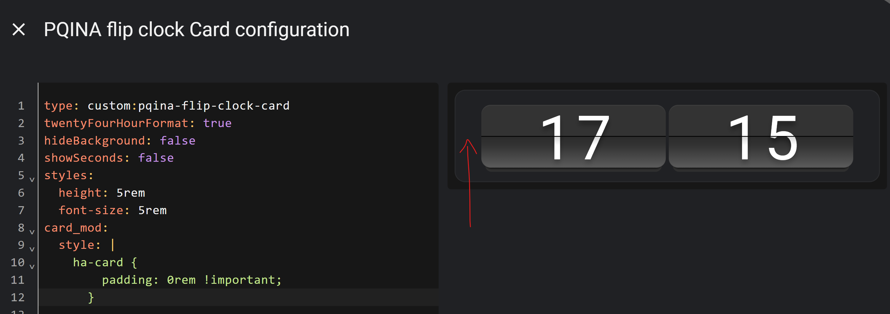
As this is my first custom card and a very early version, configuration is YAML only at the moment (hope to add GUI configuration later).

The card uses the wonderful PQINA flip web component which can be found here:

If you like it, buy the original creator (NOT ME) a coffee and send a few nice greetings from the HA community:

But now the important stuff.

This is how it looks like:

With a few customized attributes:

On my smart clock device:

Installation through HACS is described here:

Hope you like it. :slight_smile:

10 Likes

I do like it, very much. Thank you.

1 Like

its work with timer into pop up too?
@Thyraz

Hi Tal,

you mean as a count-down flip card, that could be used to display running timers of HA on a dashboard?
That isn’t possible right now, but adding a timer mode is a nice idea.
I’m currently a little bit busy with other things, but will add it when I find some spare time. :slight_smile: :+1:

Great I will wait to use this.
Thank you very much I really appreciate it.

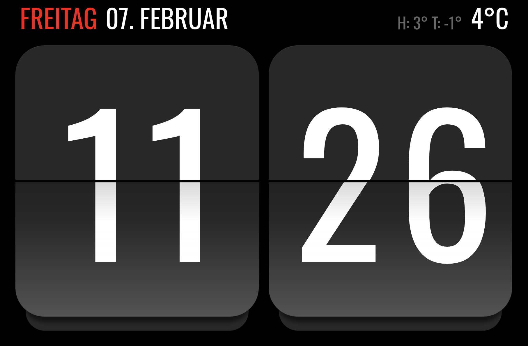
Which card did you use to design the clock? I realy like the minimalistic design with the red colored day and the temperature on top. Would you mind sharing the Yaml-code??
Danke :slight_smile:

sure, here you go:

type: custom:layout-card
layout_type: custom:grid-layout
cards:
  - type: custom:bubble-card
    card_type: separator
    sub_button:
      - entity: binary_sensor.midnighthelper
        name: Midnight-Helper
        show_name: true
        show_icon: false
    styles: >-
      ha-card {
        font-family: 'Oswald';
        line-height: 1.2em;
        font-size: 2.8em;
        height: 100px;
        margin-top: 4px;
        padding-left: 16px;
      } .bubble-name:before {
        opacity: 1.0;
        color: red;
        content: attr(data-before);
        padding-right: 0.3em;
      } .bubble-name {
        opacity: 1.0;
        margin: 0px;
      } .bubble-separator .bubble-name {
        font-weight: 400 !important;
      } .bubble-sub-button-container {
        display: none;
      } .bubble-line {
        display: none;
      } ${card.querySelector('.bubble-name').setAttribute('data-before', new
      Date().toLocaleDateString('de-DE', {weekday: 'long'}).toUpperCase())};
      ${card.querySelector('.bubble-name').innerText = new
      Date().toLocaleDateString('de-DE', {day: '2-digit', month:
      'long'}).toUpperCase()};
    view_layout:
      grid-area: date
  - type: custom:bubble-card
    card_type: separator
    styles: >-
      ha-card {
        font-family: 'Oswald';
        line-height: 1.2em;
        font-size: 1.7em;
        height: 100px;
        margin-top: 22px;
        padding-right: 15px;
      }  .bubble-separator {
        margin-left: 8px;
      }  .bubble-separator .bubble-name {
        font-weight: 400 !important;
      }  .bubble-sub-button-container {
        display: none;
      }  .bubble-line {
        display: none;
      } .bubble-icon {
        margin: 0px !important;
      }  .bubble-name {
        opacity: 0.4;
        margin-right: 0px;
        width: 100%;
        text-align: right;
      } ${ card.querySelector('.bubble-name').innerText = "H: " +
      Math.round(hass.states['input_number.today_temp_high'].state) + "° T: " +
      Math.round(hass.states['input_number.today_temp_low'].state) + "°"};  ${
      setTimeout(() => { card.querySelector('.bubble-name').innerText = "H: " +
      Math.round(hass.states['input_number.today_temp_high'].state) + "° T: " +
      Math.round(hass.states['input_number.today_temp_low'].state) + "°"},
      60000) };
    view_layout:
      grid-area: range
  - type: custom:bubble-card
    card_type: separator
    name: Name
    sub_button: null
    styles: >-
      ha-card {
        font-family: 'Oswald';
        line-height: 1.2em;
        font-size: 2.8em;
        margin-top: 4px;
        padding-right: 30px;
      }  .bubble-separator .bubble-name {
        font-weight: 400 !important;
      }  .bubble-sub-button-container {
        display: none;
      }  .bubble-line {
        display: none;
      } .bubble-icon {
        margin: 0px !important;
      }  .bubble-name {
        opacity: 1.0;
        margin-right: 0px;
        width: 100%;
        text-align: right;
      }  ${ card.querySelector('.bubble-name').innerText =
      Math.round(hass.states['sensor.multisensor_zufahrt_temperature'].state) +
      "°C"};  ${ setTimeout(() => { card.querySelector('.bubble-name').innerText
      = Math.round(hass.states['sensor.multisensor_zufahrt_temperature'].state)
      + "°C" }, 60000) };
    view_layout:
      grid-area: temp
  - type: custom:pqina-flip-clock-card
    view_layout:
      grid-area: clock
    showSeconds: false
    twentyFourHourFormat: true
    hideBackground: true
    tap_action:
      action: navigate
      navigation_path: /lovelace/1
    styles:
      width: 100%
      height: 53cqw
      textColor: rgb(255, 255, 255)
      font: Oswald
      fontSize: 38cqw
      textOffsetVertical: "-0.05em"
      frontFlapColor: rgb(40, 40, 40)
      rearFlapColor: rgb(40, 40, 40)
layout:
  margin: 0px 0px 0px 0px
  card_margin: 0px 0px 0px 0px
  grid-template-columns: auto 1fr auto auto
  grid-template-rows: 60px 420px 1px
  gap: 0px 0px
  grid-template-areas: |
    "date var range temp"
    "clock clock clock clock"
    "bottom bottom bottom bottom"

Be warned, I used Bubble Card seperators here, as they have a field to easily enter custom styles.
But I needed a lot more extra CSS than I thought, so this isn’t a really clean solution (but I was too lazy to rework it so far).

So it might be a better idea to use Markdown Card or something like that for the texts …

That’s the current look, I just added high/low temps compared to the old photo:

edit:
Ah I see I used a helper in the config.
It’s just a daytime sensor helper in HA, that activates on 0:00 and deactivates on 0:01.
Wasn’t sure if the date would be updated automatically on a day change otherwise …

2 Likes

Very nice work!! Thank you!!

This looks such an awesome card but when I try and download via HACS Custom repositories I get this error / sorry I don’t know what this means or what to do to fix it

The version cf361fc for this plugin can not be used with HACS.

Hi Bruce,

I tried on a fresh HA instance and was able to install it without problems. :face_with_monocle:
Also searched for similar problems and found some topics suggesting that restarting HA might help, while it didn’t solve it for others.

Not sure if this is a HACS but or if it has to do something with the release.
But there isn’t much you have to do for integration into HACS. They just pull the released versions from Github …

1 Like

Hey buddy, that worked
SORRY I DIDN’T TRY THE OBVIOUS - DOH

1 Like

What would be the best way to get rid of the 16px padding around the clock

Tried card_mod but it seems to be hidden elsewhere:

:host ::slotted(.card-content) {
    padding: 16px;
}

It’s a good question where it’s coming from, as this isn’t in my CSS styles.
I guess the pqina flip component is adding this to it’s slotted host to give it some “space” around.

I can get rid of it with these settings:

card_mod:
  style: |
    .card-content {
      padding: 0px;
    }
1 Like

Hi there, thanks so much for this beautiful card — it looks great!

I was wondering if it might be possible to add support for the countdown/count-up functionality from the Flip library? I think it could add some really fun and useful use cases.

For example, something like:

var counter = Tick.count.down(entity);

Would love to hear your thoughts on this — and thanks again for your work!

Sorry for the late reply.
I always wanted to take a look about the timers in HA topic, as I haven’t used one so far.

But I currently have not that much spare time …
So not sure what would be needed.

Are timers always pre-defined and not dynamically created?
So it would simply display the current time of the timer entity you pass?

No worries, thanks for getting back!

I’ve actually already created my own request for a target timer mode and went ahead and opened a pull request on your repo:

:link: feat: add target_timer mode for unified countdown/countup by timmaurice · Pull Request #4 · Thyraz/pqina-flip-clock-card · GitHub

Looking forward to your feedback when you get a chance — and totally understand about time constraints!

1 Like

Hi, I am using your card on my dashboard, showing hours and minutes. Is it possible to split tap action to left and right side, so that if I tap hours one action would run and if I tap minutes, another action would run

Hello
What model is your smart clock device? :slight_smile:

Hi sgaluf.

currently this isn’t possible.
I added it to the backlog for my HA integrations.

As I use the clock and other elements on the lockscreen where it’s used as shortcuts to other dashboards, that might also be handy for my use case.

It’s a Lenovo Thinksmart View 8.
They have been very cheap when they got cancelled, but as far as I know they aren’t a good deal anymore.

A lot more interest in this device after it was successfully hacked raised the prices quite a bit.

1 Like