netti
December 23, 2025, 6:47am
1
Hello,
is it possible to have a split between the enterties in the expander card?
Expander card will not split it. I have a full row. The row will lined under each other:
What do I have to do to get the result in picture one with the expander card? Is it possible with yaml code?
And last question → Is it possible to get the details in the first line of the expander card?
Thanks and have a merry christmas.
Greetings Tim
you Could put the entities inside a horizontal-stack-card or custom:vertical-stack-in-card(horizontal-option)(inside the Expander-Card), the options are endless
Which “details” are you talking about ?, again as above options are endless(almost)
you could(in some cases) use card-mod to set a fix width/height of the entities, if the cards don’t support it
netti
December 23, 2025, 2:03pm
3
boheme61:
horizontal-stack-card
Thanks → horizotal-stack worked.
type: custom:expander-card
title: Rauchmelder
cards:
  - type: heading
    icon: mdi:alarm-light
    heading: Alarmmeldungen
    heading_style: subtitle
  - type: horizontal-stack
    cards:
      - type: tile
        entity: binary_sensor.mel_ez_rauchmelder_alarm
        name: Alarmmeldung
        icon: mdi:smoke-detector-variant-off
        color: red
        show_entity_picture: false
        hide_state: false
        vertical: false
        features_position: bottom
      - type: tile
        entity: binary_sensor.mel_eg_ez_nebenstellenalarm
        name: Nebenstellenanlarm
        icon: mdi:smoke-detector-variant-off
        color: red
        vertical: false
        features_position: bottom
  - type: heading
    icon: mdi:list-status
    heading: Status
    heading_style: subtitle
  - type: horizontal-stack
    cards:
      - type: tile
        entity: binary_sensor.mel_eg_ez_status_rauchalarm
        name: Rauchalarm
        icon: mdi:check-decagram
        vertical: false
        features_position: bottom
      - type: tile
        entity: binary_sensor.mel_eg_ez_status_waermealarm
        name: Wärmealarm
        icon: mdi:check-decagram
        vertical: false
        features_position: bottom
  - type: horizontal-stack
    cards:
      - type: tile
        entity: binary_sensor.mel_eg_ez_status_knx
        name: KNX-Status
        icon: mdi:check-decagram
        vertical: false
        features_position: bottom
      - type: tile
        entity: binary_sensor.mel_eg_ez_draht
        name: Draht-Status
        icon: mdi:check-decagram
        vertical: false
        features_position: bottom
  - type: heading
    icon: mdi:smoke-detector-alert
    heading_style: subtitle
    heading: Störungen
  - type: horizontal-stack
    cards:
      - type: tile
        entity: binary_sensor.eg_ez_storung
        name: Störungen
        vertical: false
        features_position: bottom
      - type: tile
        entity: binary_sensor.eg_ez_stoerung_rauchkammer
        name: Rauchkammer
        vertical: false
        features_position: bottom
  - type: horizontal-stack
    cards:
      - type: tile
        entity: binary_sensor.mel_eg_ez_batterie
        name: Batterie
      - type: tile
        entity: binary_sensor.eg_ez_stoerung_kommunikation_knx
        name: Kommunikation KNX
        vertical: false
        features_position: bottom
  - type: horizontal-stack
    cards:
      - type: tile
        entity: binary_sensor.eg_ez_stoerung_montage_melder
        name: Meldermontage
        vertical: false
        features_position: bottom
      - type: tile
        entity: binary_sensor.mel_eg_ez_stoerung_temperatursensor
        name: Temperatursensor
  - type: heading
    icon: mdi:home-alert
    heading: Schalter
    heading_style: subtitle
  - type: horizontal-stack
    cards:
      - type: tile
        entity: switch.mel_ez_rauchmelder_testalarm
        name: Testalarm
        vertical: false
        features_position: bottom
      - type: tile
        entity: switch.eg_ez_signalgeber
        name: Signalgeber
        vertical: false
        features_position: bottom
  - type: tile
    entity: button.mel_eg_ez_quiterung_stoerung
    name: Quttierung
    vertical: false
    features_position: bottom
  - type: heading
    icon: mdi:temperature-celsius
    heading_style: subtitle
    heading: Temperaturwert
    grid_options:
      columns: 12
      rows: auto
  - type: tile
    entity: sensor.mel_eg_ez_temperaturmeldung
    name: Temperatur
    vertical: false
    features_position: bottom
    grid_options:
      columns: 6
      rows: 2
grid_options:
  rows: auto
  columns: 12
expanded: false
title-card-clickable: true
title-card-button-overlay: false
clear: true
animation: false
clear-children: false
My last question was to deifne badges into the title.
I want to bing an icon into the title- left side and some badges.
type: custom:expander-card
title: Rauchmelder
*Here I want to put in my Badges*
cards:
Like I do it for the aditional title above:
type: heading
icon: mdi:smoke
heading: Rauchmelder
heading_style: title
badges:
  - type: entity
    entity: sensor.mel_eg_ez_temperaturmeldung
  - type: entity
    entity: binary_sensor.mel_ez_rauchmelder_alarm
grid_options:
  columns: 12
  rows: 1
But copy the badges from this title to expander card title will not work.
Check the Githup-repos about his newly added features( Update the Card first in HACS
netti
December 25, 2025, 1:36pm
5
Hello Community,
I checked the community and I found a lot of information. I use google and different forums but i still have some open questions.
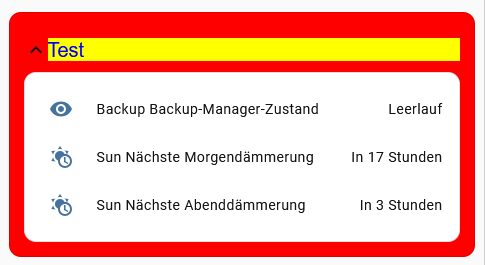
I am now able to put more color on my card. It a Demo Card to lern.
type: custom:expander-card
title: Test
cards:
  - type: entities
    entities:
      - sensor.backup_backup_manager_state
      - sensor.sun_next_dawn
      - sensor.sun_next_dusk
style: |
  /* Titel */
  .header {
    flex-direction: row-reverse !important;
    padding: 0.8em 0 !important;
  }
  .header > .title {
    transition: color 0.35s ease, font-size 0.35s ease;
  }
    .header.animation.open > .title,
  .header.animation.opening > .title
  {
    color: blue;
    background-color: yellow;
    font-size: var(--ha-font-size-xl);
  }
  .header.animation.close > .title,
  .header.animation.closing > .title
  {
    color: green !important;
    background-color: blue;
    font-size: var(--ha-font-size-xs) !important;
  }

  /* Umgebung */
    .expander-card.animation.open,
    .expander-card.animation.opening {
    background-color: red;
  }
  .expander-card.animation.close,
  .expander-card.animation.closing {
    background-color: #C8A2C8;
  }
But I am not able to fill the container with color? I tried so much diffrent things →
outer.conter
but nothing works.
Could someone give me a hint how i can configuere the box color, text color at box?
I read all the information carefully but i have no clue how to fix:
Expander card for HomeAssistant
And a second question:
Is it possible to have a red one when it is off? And is it possible to have different icons for different status?
 - type: tile
        entity: switch.dim_eg_wz_gang_dim_sperre
        name: "Gang:"
        icon: mdi:lock
        color: green
        show_entity_picture: false
        hide_state: false
        state_content:
          - state
          - last_updated
        vertical: false
        features_position: bottom
Thanks.
Best regards
Tim
Search in the Card_Mod Topics , and templates, for the cards which supports templates
dcapslock
December 28, 2025, 8:37am
7
If you want the child cards to take on the background of the outer epxander-card, use the clear-children option.
Other options:
Set CSS variables which the card uses on .outer-contaner { }.
e.g.
style: |
  .outer-container {
    --card-background-color: yellow;
  }
If what you need to style in a card has no CSS variable, you will need to use card-mod.
netti:
And a second question:
Is it possible to have a red one when it is off? And is it possible to have different icons for different status?
As of version 4.3.0 you can set icon and arrow-color using Javsscript templates using all available function from home-assistant-javascript-templates. Check latest readme for examples and link to functions available (e.g. a template for arrow_color might be [[[ return is_state('light.bed_light', 'on') ? 'yellow' : 'grey' ]]] )