Hey guys,
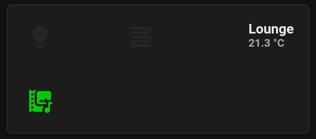
really struggling with this one. I want to make a button card that can navigate to another dashboard. I want the button to be a certain size (retangular and to have 2 side by side on the dashboard). I have made what I want but I cant get the size and spacing right. I want the 2 rows of icons to be small and close to each other, and I want the right vertical stack to be the same height as the the 2 icon rows. Can anyone help?
type: custom:stack-in-card
title: null
mode: vertical
cards:
  - type: vertical-stack
    cards:
      - type: horizontal-stack
        cards:
          - type: custom:button-card
            entity: light.lights_house
            card_mod:
              style: |
                ha-card {
                border: none;
                margin: -1px 0px !important;
                height: 80px !important;
                width: 80px !important;
                box-shadow: 0px 0px 0px 0.5px rgba(255,255,255,0.48);
                padding: 0.5rem 1rem;
                }
            name: Lights
            show_name: false
            tap_action:
              action: navigate
              navigation_path: lights
            hold_action:
              action: none
            double_tap_action:
              action: none
            styles:
              name:
                - text-transform: capitalize
                - font-size: 14px
                - font-weight: bold
                - align-self: end
            state:
              - icon: mdi:lightbulb
                color: rgb( 255,250 ,0, 100%)
                operator: template
                value: |
                  [[[
                    return (states['light.lights_house'].state === 'on')
                  ]]]
              - icon: mdi:lightbulb
                operator: template
                color: rgb( 128,128 ,128, 10%)
                value: |
                  [[[
                    return (states['light.lights_house'].state === 'off')
                  ]]]
          - type: custom:button-card
            entity: sensor.wiser_heating
            icon: mdi:heating-coil
            name: Heating
            card_mod:
              style: |
                ha-card {
                border: none;
                margin: -1px 0px !important;
                height: 80px !important;
                width: 80px !important;
                box-shadow: 0px 0px 0px 0.5px rgba(255,255,255,0.48);
                padding: 0.5rem 1rem;
                }
            show_name: false
            tap_action:
              action: navigate
              navigation_path: heating
            hold_action:
              action: none
            double_tap_action:
              action: none
            styles:
              name:
                - text-transform: capitalize
                - font-size: 14px
                - font-weight: bold
                - align-self: end
            state:
              - icon: mdi:heating-coil
                color: rgb(255, 140, 0, 100%)
                operator: template
                value: |
                  [[[
                    return (states['sensor.wiser_heating'].state === 'On')
                  ]]]
              - icon: mdi:heating-coil
                operator: template
                color: rgb(128, 128, 128, 10%)
                value: |
                  [[[
                    return (states['sensor.wiser_heating'].state === 'Off')
                  ]]]
          - type: custom:button-card
            size: 60%
            card_mod:
              style: |
                ha-card {
                border: none;
                margin: -1px 0px !important;
                height: 80px !important;
                width: 250x !important;
                box-shadow: 0px 0px 0px 0.5px rgba(255,255,255,0.48);
                padding: 0.5rem 1rem;
                }
            entity: sensor.wiser_lts_temperature_lounge
            tap_action:
              action: navigate
              navigation_path: livingroom
            name: Living Room
            show_state: true
            show_label: true
            show_icon: false
            label: null
            card size: null
            layout: icon_name_state2nd
            icon: mdi:sofa-outline
            styles:
              card:
                - height: 65px
              name:
                - align-self: left
                - justify-self: start
                - font-weight: bold
                - font-size: 15px
                - color: rgb( 255,255,255, 90%)
              state:
                - color: rgb( 255,255,255, 60%)
                - align-self: left
                - justify-self: start
                - font-size: 12px
                - font-weight: bold
              label:
                - null
  - type: vertical-stack
    cards:
      - type: horizontal-stack
        cards:
          - type: custom:button-card
            entity: null
            card_mod:
              style: |
                ha-card {
                border: none;
                margin: -1px 0px !important;
                height: 80px !important;
                width: 80px !important;
                box-shadow: 0px 0px 0px 0.5px rgba(255,255,255,0.48);
                padding: 0.5rem 1rem;
                }
            name: Media
            show_name: false
            tap_action:
              action: navigate
              navigation_path: media
            hold_action:
              action: none
            double_tap_action:
              action: none
            styles:
              name:
                - text-transform: capitalize
                - font-size: 14px
                - font-weight: bold
                - align-self: end
            state:
              - icon: mdi:multimedia
                color: rgb(0, 204, 0, 100%)
                operator: template
                value: |
                  [[[
                    return (states['media_player.media_house'].state === 'on')
                  ]]]
              - icon: mdi:multimedia
                operator: template
                color: rgb(128, 128, 128, 10%)
                value: |
                  [[[
                    return (states['media_player.media_house'].state === 'off')
                  ]]]