any recommendations for more colors that fit to light/dark mode?
I’m rocking this dashboard for a year now and I love it. Same goes for the now playing card, however I miss some media controls in the card itself. Would it be somehow possible to add skip and play pause to the card? For example underneath the artist/song info. If someone has an idea on how to make this happen, you’re my hero! Please let me know! Thanks!
Hey good people!
I tried to make a use if this wonderful guide and theme and create my own Rounded dashboard, but I’m having very annoying bug. The swipable card with sensors is not working as it should be. It used to have correct alignment, but at some point it started to look like in the screenshot. All the config is straight up copy pasted from this thread (the updated version of the rounded theme yaml file minus the bottom bar)
Do you have any suggestions as to what needs to be changed or what (or where) might have gone wrong?
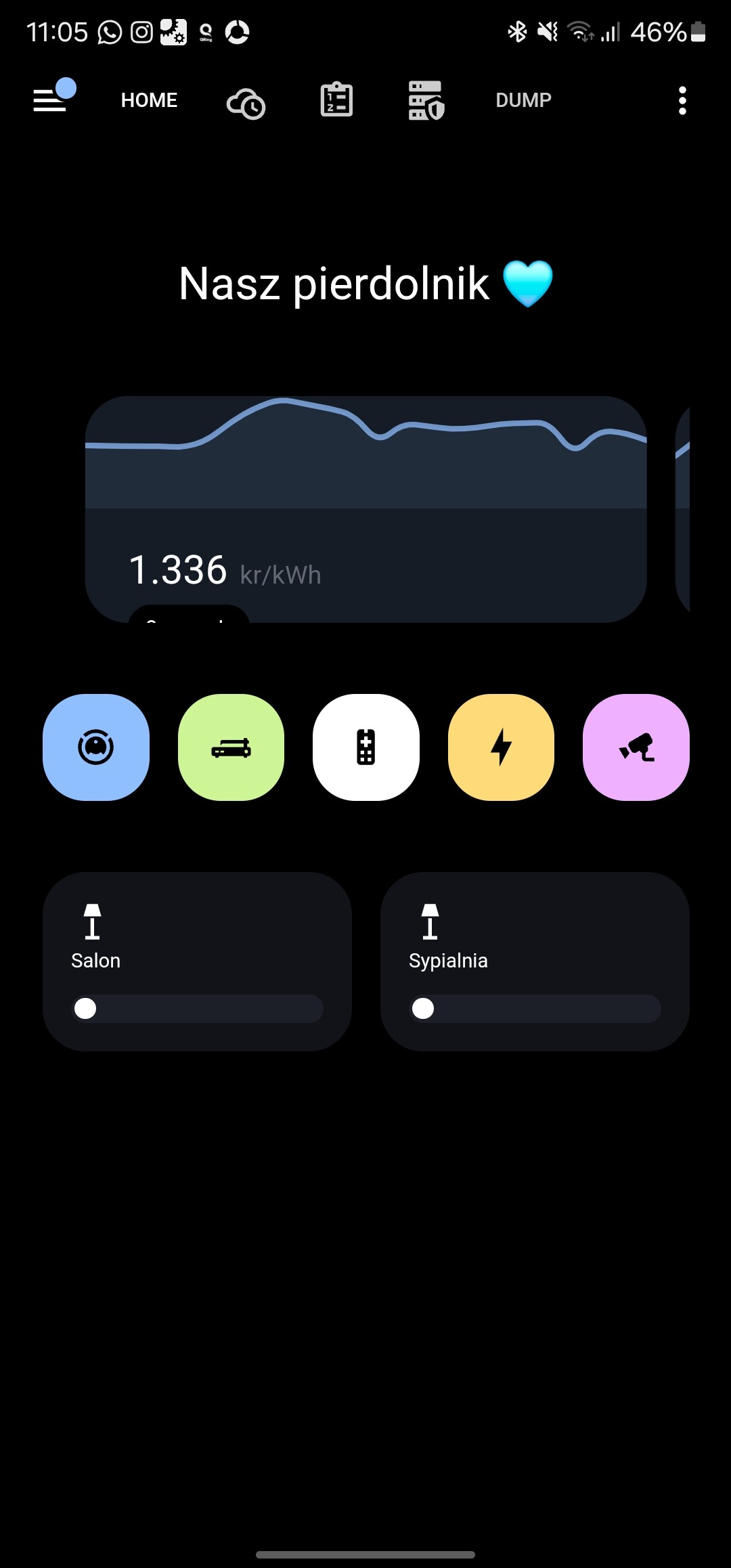
I have exactly the same problem with the incorrect display of the sensor graph card since the Home Assistant 2024.07 update 
I have already tried and commented out some settings of the card-mod-card-yaml: category in the rounded theme file. But unfortunately without success so far.
I’m also excited to see how my dashboard will turn out  Recently, I’ve been working on other projects because I was missing custom cards for my ideas. So, I wrote them myself. Home Assistant needs a bit more swipe love. CSS slider cards and a swipe button card. What’s special about them is that they are more like containers, and you can integrate any card from Home Assistant (incl. Button-Card) and adjust it to your own design. Im not a good developer, but the cards are pretty simple and working perfectly, while using mostly css and js. no swipe engine. I would be happy, if you or Leon want to test and even contribute. Bet you are better in coding, than me. Here a video, what they look like.
CSS Swipe Card and Swipe-Button-card
2 Likes
I had the same problem since the update. Fixed it by adding
      .graph .footer {
        order: 3;
      }
below
      .graph hui-graph-header-footer {
        order: 3;
      }
in Rounded.yaml. @CM000n
4 Likes
Anyone got any info on how you can get a single banner across the top? and then the individual lights underneath?
https://www.reddit.com/r/homeassistant/comments/17fc5nc/home_assistant_tablet_dashboard/#lightbox

YES, THANK YOU!!!
This worked perfectly, finally I can hand over the dashboard to my spouse 
You can try using the vertical stack, something like mushroom title card as first, and below it add the grid with your light toggles.
type: vertical-stack
cards:
  - type: custom:mushroom-title-card
    title: Lights
    alignment: center
  - square: true
    type: grid
    cards:
      - type: custom:mushroom-light-card
        entity: light.your_light_entity_here
        fill_container: true
        layout: vertical
      - type: custom:mushroom-light-card
        entity: light.your_light_entity_here
        fill_container: true
        layout: vertical
      - type: custom:mushroom-light-card
        entity: light.your_light_entity_here
        fill_container: true
        layout: vertical

[quote=“LE0N, post:2, topic:543043”]
6 zone cards
Here we also highlight one of the six buttons. In the code I use two helpers. A toggle for selecting and deselecting the area and a date helper for keeping track of the last cleaned date.
type: custom:button-card
icon: mdi:sofa-single
entity: input_boolean.woonkamer_robotstofzuiger_selecteren_voor_stofzuigen
name: Woonkamer
label: '[[[return states["sensor.robotstofzuiger_laatst_actief_woonkamer"].state ]]]'
show_label: true
tap_action:
  action: toggle
  haptic: medium
state:
  - value: 'on'
    styles:
      card:
        - background-color: var(--yellow)
        - box-shadow: none
      icon:
        - color: var(--black)
      name:
        - color: var(--black)
      label:
        - color: var(--black)
        - opacity: '0.5'
  - value: 'off'
    styles:
      card:
        - background: var(--contrast2)
        - box-shadow: none
      icon:
        - width: 24px
        - color: var(--contrast20)
      name:
        - color: var(--contrast20)
      label:
        - color: var(--contrast9)
styles:
  icon:
    - width: 24px
  img_cell:
    - justify-content: flex-start
    - margin-top: '-4px'
  name:
    - font-family: In case of a custom font, otherwise you can remove this line
    - justify-self: start
    - font-size: 12px
    - margin-bottom: 0px
  card:
    - height: 84px
    - border-radius: 24px
    - padding: 12px 0 12px 14px
    - box-sizing: border-box
    - '--mdc-ripple-press-opacity': 0
  label:
    - font-family: In case of a custom font, otherwise you can remove this line
    - justify-self: start
    - font-size: 12px
Hi everyone, if somone can help me with this one. I would like to add helpers for each room, but I don’t know how to make it. I have already all numbers for each room 
Thanks a lot and have a nice day.
Hello!
Where can I find the layouts mentioned in your code?
Thanks
Bit off topic, but as I mentioned, that I will release my swipe card here. I just want to share the link to my post with github page.
Some more options to make my rounded dashboard complete.
1 Like
Hi All,
Wanted to show what I’ve been doing based off the rounded theme.
Happy to answer any questions  .
.
Added specific assistant targeting via an animated image custom:button-card.

Imported a card_mod css change to the theme (with slight modifications) to the rounding and animation on the sidebar selection, found in: GitHub - Nerwyn/material-rounded-theme: A Material You and Google Home app influenced theme for Home Assistant

Used some styling cues from the Unifi application that I am fond of, showing a status dot and arrows.

A nice clean sub-view of important devices based on similar styling to the above.

Another view of an important sub-view.

7 Likes
Thank you @beecho01
I’m testing Assist with OpenAI APIs and I was searching for a nice way to use it from my rounded dashboard. Thanks!
How about sharing the code? Really like the Network devices page! Nice work, can I steel some of it?
/Thek
Got a yaml for your entire Dashboard ?? This looks insane!
Hi All,
I have set up a quick GitHub repository as I was exceeding the character limit on here!
beecho01/homeassistant-setup
Big thanks for the feedback. It’s really validating!
Thanks
beecho01
3 Likes
If you like to apply some custom styling to your chatbot (like color changes, when its recording or background colors),
here a button card with the whole imtegration of the code pen code. 
just needs some more “love”/adjustments to keep the animation from running infinite.
type: custom:button-card
entity: your.entity_id
name: Chatbot
label: Animated
show_name: true
show_state: false
show_icon: false
show_label: true
tap_action:
  action: none
styles:
  grid:
    - grid-template-areas: '"n ." "l ."'
    - grid-template-columns: 1fr min-content
    - grid-template-rows: 1fr min-content
  card:
    - padding: 32px
    - background: var(--background-color)
    - height: 256px
  name:
    - justify-self: start
    - align-self: end
    - margin: 0 0 0 8px
    - font-size: var(--fs-400)
    - font-family: Montserrat
    - font-weight: 500
    - color: var(--primary-text-color)
    - opacity: 0.66
    - z-index: 1
  label:
    - justify-self: start
    - align-self: end
    - margin: 0 0 8px 8px
    - font-size: var(--fs-600)
    - font-family: Montserrat
    - font-weight: 500
    - color: var(--primary-text-color)
    - z-index: 1
  custom_fields:
    custom_html:
      - position: absolute
      - left: 0
      - top: 0
      - right: 0
      - bottom: 0
      - z-index: 0
custom_fields:
  custom_html: |
    [[[
      return `
      <div class="container">
        <div id="chatbot">
          <div class="dot"></div>
          <div class="dot"></div>
          <div class="dot"></div>
        </div>
        <div id="chatbot-corner"></div>
        <div id="antenna">
          <div id="beam"></div>
          <div id="beam-pulsar"></div>
        </div>
      </div>
      `
    ]]]
extra_styles: |
  .container {
    position: absolute;
    left: 50%;
    top: 50%;
    transform: translate(-50%, -50%);
    height: 200px;
    width: 200px;
    animation: up-down 7.5s infinite ease-in-out;
  }
  #chatbot {
    position: absolute;
    left: 50%;
    top: 50%;
    transform: translate(-50%, -50%);
    width: 150px;
    height: 85px;
    border: 12px solid #3D3E45;
    border-radius: 80px;
  }
  #chatbot-corner {
    position: absolute;
    top: 140px;
    left: 55px;
    width: 0;
    height: 0;
    border-left: 20px solid transparent;
    border-right: 20px solid transparent;
    border-top: 25px solid #3D3E45;
    transform: rotate(140deg);
  }
  #antenna {
    position: absolute;
    top: 25px;
    left: 100px;
    height: 20px;
    width: 10px;
    background-color: #3D3E45;
    animation: antenna-appear 7.5s infinite ease-in-out;
  }
  #beam {
    position: absolute;
    top: -12px;
    left: -5px;
    height: 20px;
    width: 20px;
    border-radius: 50%;
    background-color: #3D3E45;
    animation: beam-appear 7.5s infinite ease-in-out;
  }
  #beam-pulsar {
    position: absolute;
    top: -12px;
    left: -5px;
    height: 20px;
    width: 20px;
    border-radius: 50%;
    background-color: #3D3E45;
    animation: beam-pulsar-appear 7.5s infinite ease-in-out;
  }
  .dot {
    height: 17.5px;
    width: 17.5px;
    position: absolute;
    top: 50%;
    background-color: #3D3E45;
    border-radius: 50%;
    animation: pulse-outer 7.5s infinite ease-in-out;
  }
  .dot:nth-child(1) {
    left: 30px;
    transform: translateY(-50%);
  }
  .dot:nth-child(2) {
    left: 75px;
    transform: translate(-50%, -50%);
    animation: pulse-inner 7.5s infinite ease-in-out;
    animation-delay: 0.2s;
  }
  .dot:nth-child(3) {
    right: 30px;
    transform: translateY(-50%);
    animation-delay: 0.4s;
  }
  @keyframes pulse-inner {
    0% { transform: translate(-50%, -50%) scale(1); }
    7.5% { transform: translate(-50%, -50%) scale(1.5); }
    15% { transform: translate(-50%, -50%) scale(1); }
    22.5% { transform: translate(-50%, -50%) scale(1.5); }
    30% { transform: translate(-50%, -50%) scale(1); }
    37.5% { transform: translate(-50%, -50%) scale(1.5); }
    45% { transform: translate(-50%, -50%) scale(1) rotate(-370deg); height: 17.5px; border-radius: 50%; }
    50% { transform: translate(-50%, -50%) rotate(10deg); height: 10px; border-radius: 50% 50% 48px 48px / 50% 50% 30px 30px; }
    55% { transform: translate(-50%, -50%) rotate(-10deg); }
    60% { transform: translate(-50%, -50%) rotate(10deg); }
    65% { transform: translate(-50%, -50%) rotate(0deg); }
    85% { transform: translate(-50%, -50%) rotate(0deg); height: 10px; border-radius: 50% 50% 48px 48px / 50% 50% 30px 30px; }
    92.5% { transform: translate(-50%, -50%) rotate(0deg); height: 10px; border-radius: 50% 50% 40px 40px / 50% 50% 25px 25px; }
    100% { transform: translate(-50%, -50%) rotate(-360deg); height: 17.5px; border-radius: 50%; }
  }
  @keyframes pulse-outer {
    0% { transform: translateY(-50%) scale(1); }
    7.5% { transform: translateY(-50%) scale(1.5); }
    15% { transform: translateY(-50%) scale(1); }
    22.5% { transform: translateY(-50%) scale(1.5); }
    30% { transform: translateY(-50%) scale(1); }
    37.5% { transform: translateY(-50%) scale(1.5); }
    45% { transform: translateY(-50%) scale(1); height: 17.5px; }
    55% { transform: translateY(-50%) scale(1); height: 5px; }
    60% { height: 17.5px; }
    75% { height: 17.5px; }
    80% { transform: translateY(-50%) scale(1); height: 5px; }
    85% { height: 17.5px; }
    100% { height: 17.5px; }
  }
  @keyframes antenna-appear {
    0% { visibility: hidden; top: 45px; height: 0 }
    50% { visibility: hidden; top: 45px; height: 0 }
    55% { visibility: visible; top: 25px; height: 20px; }
    95% { visibility: visible; top: 25px; height: 20px; }
    100% { top: 45px; height: 0; }
  }
  @keyframes beam-appear {
    0% { visibility: hidden; top: -12px; height: 0 }
    50% { visibility: hidden; top: -12px; height: 0 }
    55% { visibility: visible; top: -12px; height: 20px; width: 20px; }
    100% { visibility: visible; top: -12px; height: 20px; width: 20px; }
  }
  @keyframes beam-pulsar-appear {
    0% { visibility:hidden; top: -12px; height: 0 }
    50% { visibility: hidden; top: -12px; height: 0 }
    55% { visibility: visible; top: -12px; left: -5px; height: 20px; width: 20px; opacity: 1 }
    65% { top: -25px; left: -15px; height: 40px; width: 40px; opacity: 0; visibility: visible; }
    74% { visibility: hidden; opacity: 0; }
    75% { visibility: visible; top: -12px; left: -5px; height: 20px; width: 20px; opacity: 1 }
    85% { top: -25px; left: -15px; height: 40px; width: 40px; opacity: 0; visibility: visible; }
    94% { visibility: hidden; opacity: 0; }
    100% { visibility: hidden; opacity: 0; }
  }
  @keyframes up-down {
    0% { transform: translate(-50%, -50%); }
    12.5% { transform: translate(-50%, -48%); }
    25% { transform: translate(-50%, -50%); }
    37.5% { transform: translate(-50%, -48%); }
    50% { transform: translate(-50%, -50%); }
    62.5% { transform: translate(-50%, -48%); }
    75% { transform: translate(-50%, -50%); }
    87.5% { transform: translate(-50%, -48%); }
    100% { transform: translate(-50%, -50%); }
  }
1 Like
Ah brilliant! I was trying to do this originally, but via an iframe.
Might give this a go later 
1 Like
yeah, I guess I have seen one guy using button card as I do, with extra styles. That opened the doors to a new world for me. The card and code gets so clean and straight forward. I use it a lot in my upcoming dashboard.