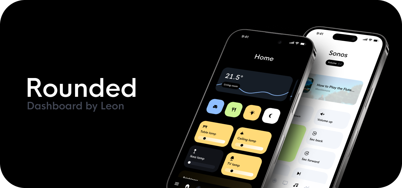
Hey there! I wanted to share something with this wonderful community that has already been so helpful to me regarding my own Home Assistant installation. A while back, I sent in my dashboard for Everything Smart Home’s video and I noticed there was quite a bit of interest in how I built it. So, it’s about time I finally shared my process.
This is my Rounded dashboard made for our mobile devices. It’s my second dashboard that I’ve created using various custom cards made by other amazing community members. I’m by no means a developer, more a designer with development interests, so I’m standing on the shoulder of giants.
Custom cards
These are the custom cards I used in the dashboard, make sure you’ve installed all of them before continuing.
- Card-mod by Thomas Lovén
- Button-card by RomRider
- My-slider-v2 by AnthonMS
- Swipe card by Bram Kragten
And in my specific case, I am using a Roborock S5 Max robot vacuum, so I also installed these Xiaomi custom cards.
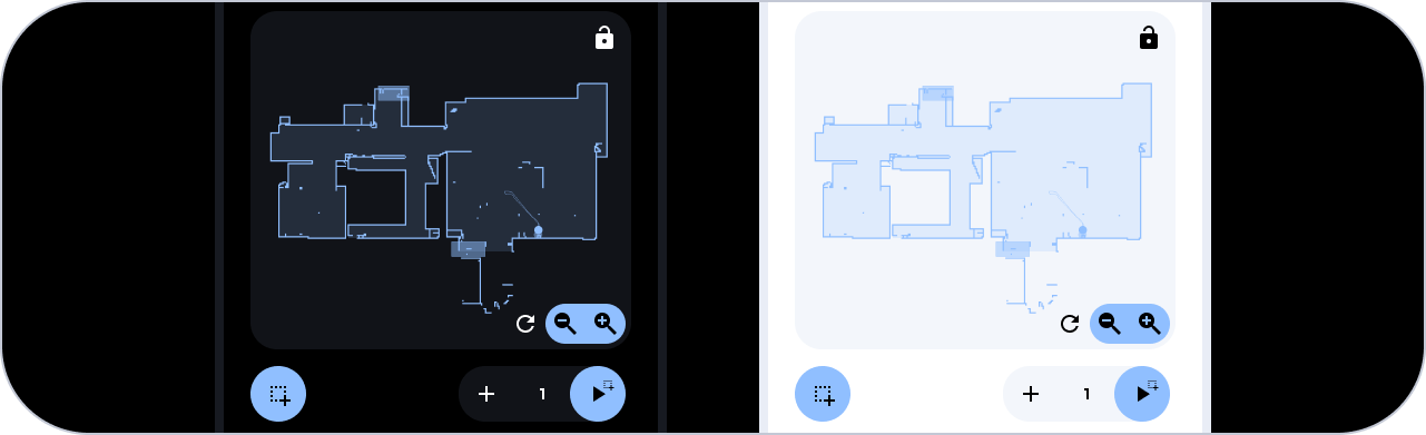
- Xiaomi Vacuum Map Card by PiotrMachowski
- Xiaomi Cloud Map Extractor by PiotrMachowski
Side note
There are different ways to style the custom cards, and I have tried quite a few methods. I believe that the current method is the most stable and easiest to understand. However, this does mean that it may not be the most scalable method, since I have chosen to style each custom button-card individually. I have previously tried to assign a card-mod class to each custom button-card and modify it in the theme.yaml, but this caused some complications, so I moved away from it.
Oh and my dashboard is mainly in Dutch, feel free to ask a question if something is unclear due to the different language 
Theme setup
Let’s first make sure everything is set up correctly so Home Assistant picks up the right theme. I have placed all my theme.yaml files in their own folder to keep things organized. Follow the following steps if you also prefer this.
-
Go to your configuration.yaml and add this code:
frontend: themes: !include_dir_merge_named themes/ -
Now create a ‘themes’ folder in your root folder and create a new file called Rounded.yaml in the themes folder.
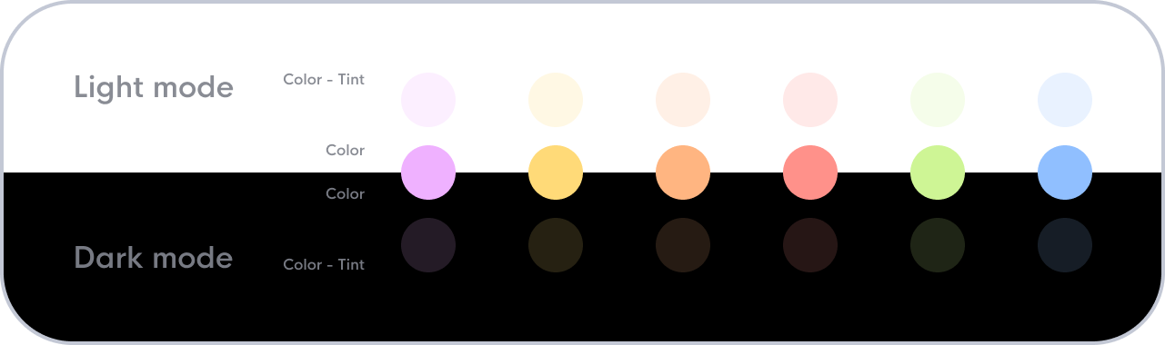
Tints & Colors
Tints
The intention was for this dashboard to be usable in both light and dark modes. To make this workable, I pre-determined shades of gray for both modes. Depending on the active mode, the light or dark shade will be chosen. The shades of gray are used in the theme as ‘contrast’ variables. Variable ‘contrast1’ represents the base color, so black for the dark mode and white for the light mode. And the higher we make the contrast number, the more contrast the shade will have compared to the base color. In other words, variable ‘contrast20’ will be the opposite, white for the dark mode and black for the light mode.

Colors
Regarding the colors, I’ve kept it simple and chosen 6 colors that work well in both light and dark modes and provide enough contrast. The only difference is the faded color tones for the backgrounds. For the light mode, the color has 20% opacity and for the dark mode, 15% opacity.
Rounded.yaml
Let’s start by setting up the Rounded.yaml. The theme has three sections:
- Default global variables
- Custom global variables
- Mode variables
Default global variables
Here I adjust all variables that already exist within Home Assistant. These are mainly colors, but can also be margins, paddings, border-radiuses, or anything else. I then adjust the existing variables to link them to new custom variables.
Custom global variables
Here we create new custom variables to define the colors mentioned above. Since the colors and 20 shades of gray will not differ in value between light and dark mode, we can define them as global variables. However, the use of the 20 shades of gray is different between light and dark mode, which is why we will also define custom variables per mode.
Mode variables
Now that we have defined the global variables for the 20 shades of gray (black1 through black20 and white1 through white20), we still need to indicate how they should be used for each mode. For this, we use the variable ‘contrast’. As discussed above, variable ‘contrast1’ will be the base color and ‘contrast20’ will provide the most contrast compared to the base color. So in light mode, ‘contrast1’ will be equal to ‘white1’ and in dark mode, ‘contrast1’ will be equal to ‘black1’. We do this so that in the future, we can simply give a card the background color ‘contrast1’ and a title color ‘contrast20’, and this will be properly handled for both modes.
Code
Finally, we end up with this code for the first part of the Rounded.yaml:
Rounded:
  ########################################################
  ############### Default global variables ###############
  ########################################################

  # Spacings and radius
  horizontal-stack-card-margin: 0px 8px
  vertical-stack-card-margin: 8px 0px
  grid-card-gap: 16px
  ha-card-border-width: "0px" # Removes default 1px line
  ha-card-border-radius: 24px
  masonry-view-card-margin: 40px 20px
  # Main Interface Colors
  primary-color: var(--blue)
  accent-color: var(--blue)
  primary-background-color: var(--contrast1)
  secondary-background-color: var(--contrast2)
  divider-color: var(--contrast3)
  # Text
  primary-text-color: var(--contrast20)
  secondary-text-color: var(--contrast9)
  text-primary-color: var(--contrast20)
  disabled-text-color: var(--contrast6)
  text-accent-color: var(--contrast1)
  # Header:
  app-header-background-color: var(--contrast1)
  app-header-text-color: var(--contrast20)
  app-header-selection-bar-color: transparant
  app-header-edit-background-color: var(--contrast2)
  app-header-edit-text-color: var(--contrast20)
  # Cards
  card-background-color: var(--contrast2)
  ha-card-background: var(--contrast2)
  ha-card-border-color: var(--contrast6)
  paper-listbox-background-color: var(--contrast3)
  # Tile card
  state-unavailable-color: var(--contrast6)
  state-light-off-color: var(--contrast10)
  state-light-on-color: var(--yellow)
  # Sidebar Menu
  sidebar-icon-color: var(--contrast6)
  sidebar-text-color: var(--contrast20)
  sidebar-background-color: var(--contrast2)
  sidebar-selected-icon-color: var(--blue)
  sidebar-selected-text-color: var(--blue)
  # Buttons
  paper-item-icon-color: var(--contrast9)
  mdc-button-outline-color: var(--contrast6)
  # States and Badges
  state-icon-color: var(--contrast9)
  # Sliders
  paper-slider-knob-color: var(--contrast20)
  paper-slider-knob-start-color: var(--contrast15)
  paper-slider-pin-color: var(--contrast5)
  paper-slider-pin-start-color: var(--contrast4)
  paper-slider-active-color: var(--contrast15)
  paper-slider-secondary-color: var(--contrast7)
  paper-slider-container-color: var(--contrast5)
  # Switches
  switch-checked-button-color: var(--green)
  switch-checked-track-color: var(--green)
  switch-unchecked-button-color: var(--contrast9)
  switch-unchecked-track-color: var(--contrast6)
  # Toggles
  paper-toggle-button-checked-button-color: var(--switch-checked-button-color)
  paper-toggle-button-checked-bar-color: var(--switch-checked-track-color)
  paper-toggle-button-unchecked-button-color: var(--switch-unchecked-button-color)
  paper-toggle-button-unchecked-bar-color: var(--switch-unchecked-track-color)
  # Table
  table-row-background-color: var(--contrast2)
  table-row-alternative-background-color: var(--contrast3)
  data-table-background-color: var(--contrast1)
  mdc-text-field-fill-color: var(--contrast3)
  # Input
  input-fill-color: var(--contrast3)
  input-dropdown-icon-color: var(--contrast9)
  material-background-color: var(--contrast2)
  input-ink-color: var(--contrast20)
  input-label-ink-color: var(--contrast9)
  input-idle-line-color: var(--contrast7)
  input-hover-line-color: var(--contrast20)
  mdc-select-fill-color: var(--input-fill-color)
  mdc-select-ink-color: var(--input-ink-color)
  mdc-select-label-ink-color: var(--input-label-ink-color)
  mdc-select-idle-line-color: var(--input-idle-line-color)
  mdc-select-dropdown-icon-color: var(--input-dropdown-icon-color)
  mdc-select-hover-line-color: var(--input-hover-line-color)
  mdc-text-field-disabled-fill-color: var(--contrast3)
  # Modal screen
  mdc-theme-surface: var(--contrast2)
  # Checkboxes
  mdc-checkbox-unchecked-color: var(--contrast15)
  # Colors
  orange-color: var(--orange)
  green-color: var(--green)
  blue-color: var(--blue)
  red-color: var(--red)
  purple-color: var(--purple)
  yellow-color: var(--yellow)
  grey-color: var(--contrast10)

  #######################################################
  ############### Custom global variables ###############
  #######################################################

  # Black / White
  black: "#000000"
  white: "#FFFFFF"
  # Colors
  purple: rgb(var(--purple-rgb))
  yellow: rgb(var(--yellow-rgb))
  orange: rgb(var(--orange-rgb))
  red: rgb(var(--red-rgb))
  green: rgb(var(--green-rgb))
  blue: rgb(var(--blue-rgb))
  # Color tints
  purple-tint: rgba(var(--purple-rgb),var(--color-tint))
  yellow-tint: rgba(var(--yellow-rgb),var(--color-tint))
  orange-tint: rgba(var(--orange-rgb),var(--color-tint))
  red-tint: rgba(var(--red-rgb),var(--color-tint))
  green-tint: rgba(var(--green-rgb),var(--color-tint))
  blue-tint: rgba(var(--blue-rgb),var(--color-tint))
  # Gradients
  brightness: linear-gradient(90deg, rgba(var(--brightness-low-rgb), 0.4) 0%, rgba(var(--brightness-high-rgb), 1) 100%)
  brightness-tint: linear-gradient(90deg, rgba(var(--brightness-low-rgb), 0.06) 0%, rgba(var(--brightness-high-rgb), var(--color-tint)) 100%)
  temperature: linear-gradient(90deg, rgba(var(--temperature-low-rgb), 01) 0%, rgba(var(--temperature-high-rgb), 1) 100%)
  temperature-tint: linear-gradient(90deg, rgba(var(--temperature-low-rgb), var(--color-tint)) 0%, rgba(var(--temperature-high-rgb), var(--color-tint)) 100%)
  # Color RGB variables
  purple-rgb: 239, 177, 255
  yellow-rgb: 255, 218, 120
  orange-rgb: 255, 181, 129
  red-rgb: 255, 145, 138
  green-rgb: 206, 245, 149
  blue-rgb: 144, 191, 255
  # Gradient RGB variables
  brightness-low-rgb: 232, 176, 29
  brightness-high-rgb: 255, 211, 94
  temperature-low-rgb: 177, 197, 255
  temperature-high-rgb: 255, 175, 131
  # Contrast variables
  black1: "#000000"
  black2: "#111318"
  black3: "#171A21"
  black4: "#1C1F27"
  black5: "#262A35"
  black6: "#353946"
  black7: "#434856"
  black8: "#535865"
  black9: "#636774"
  black10: "#777A83"
  white10: "#898C94"
  white9: "#969AA6"
  white8: "#A4A9B6"
  white7: "#B3B8C6"
  white6: "#C3C8D5"
  white5: "#D4D8E2"
  white4: "#E1E5EF"
  white3: "#EAEDF6"
  white2: "#F4F6FB"
  white1: "#FFFFFF"

  ########################################################
  ############### Variables based on modes ###############
  ########################################################

  modes:
    dark:
      # Black white contrats
      contrast1: var(--black1)
      contrast2: var(--black2)
      contrast3: var(--black3)
      contrast4: var(--black4)
      contrast5: var(--black5)
      contrast6: var(--black6)
      contrast7: var(--black7)
      contrast8: var(--black8)
      contrast9: var(--black9)
      contrast10: var(--black10)
      contrast11: var(--white10)
      contrast12: var(--white9)
      contrast13: var(--white8)
      contrast14: var(--white7)
      contrast15: var(--white6)
      contrast16: var(--white5)
      contrast17: var(--white4)
      contrast18: var(--white3)
      contrast19: var(--white2)
      contrast20: var(--white1)
      # Color tint transparancy
      color-tint: "0.15"
      # Contrast RGB variables
      contrast1-RGB: 0,0,0

    light:
      # Black white contrats
      contrast1: var(--white1)
      contrast2: var(--white2)
      contrast3: var(--white3)
      contrast4: var(--white4)
      contrast5: var(--white5)
      contrast6: var(--white6)
      contrast7: var(--white7)
      contrast8: var(--white8)
      contrast9: var(--white9)
      contrast10: var(--white10)
      contrast11: var(--black10)
      contrast12: var(--black9)
      contrast13: var(--black8)
      contrast14: var(--black7)
      contrast15: var(--black6)
      contrast16: var(--black5)
      contrast17: var(--black4)
      contrast18: var(--black3)
      contrast19: var(--black2)
      contrast20: var(--black1)
      # Color tint transparancy
      color-tint: "0.20"
      # Contrast RGB variables
      contrast1-RGB: 255,255,255
Apply theme
- Go to Developer Tools → Services.
- Run the service named “Home Assistant Frontend: Reload themes”.
- Next, open the service named “Home Assistant Frontend: Set theme” and run the service twice with both the “Dark” and “Light” modes checked.
- Now go to your profile and set the Theme to “Backend-selected”. You can also skip step 3 and directly set the theme to “Rounded” in your profile.
My dashboard
Let’s start with a quick look at my setup. My dashboard uses 4 main screens.
- Home (mostly lights)
- Robot vacuum
- Television
- Speaker

That’s it, at the moment we still live in an apartment so this gives us the opportunity to get away with few screens. I personally prefer to assign each screen a specific function, as this keeps things organised and prevents them from becoming too cluttered or difficult to manage.
Styling the cards
Let’s start styling the different cards. I will go through them one by one so we can work through the entire list.
Title card

This appears at the top of every screen. It provides some breathing space for each screen and immediately shows where you are located.
The title card is created using a custom button-card. See the code below. My dashboard also uses a custom font, which I repeat in the custom button-card for reliability, so it always loads correctly.
type: custom:button-card
name: Title here
styles:
  card:
    - font-family: In case of a custom font, otherwise you can remove this line
    - background: none
    - padding: 16px 0
    - '--mdc-ripple-press-opacity': 0
  name:
    - font-size: 32px
    - color: var(--contrast20)
Title card with badge
In addition, we also have a variant of the title card that can display an entity value. This should not be confused with the ‘chip’ card that you sometimes see. In this case, I use it only to display one entity, for example, the status of a robot vacuum. If you look at the code, you will see that we place a custom button-card inside another custom button-card. This also gives us the flexibility to make the overarching card non-clickable, but the badge clickable.
type: custom:button-card
name: Title here
custom_fields:
  badge:
    card:
      type: custom:button-card
      name: '[[[return states["vacuum.roborock_s5_max"].attributes.status]]]'
      label: >-
        [[[return states["vacuum.roborock_s5_max"].attributes.battery_level +
        "%"]]]
      show_label: true
      show_icon: false
      entity: vacuum.roborock_s5_max
      tap_action:
        action: more-info
        haptic: medium
      styles:
        grid:
          - grid-template-areas: '"n gutter l"'
          - grid-template-columns: min-content 5px min-content
          - grid-template-rows: min-content
        card:
          - font-family: In case of a custom font, otherwise you can remove this line
          - padding: 6px 10px
          - font-size: 12px
          - line-height: 18px
          - font-weight: 500
          - background: var(--contrast20)
        name:
          - color: var(--contrast1)
        label:
          - color: var(--contrast12)
styles:
  grid:
    - grid-template-areas: '"n" "badge"'
  card:
    - font-family: In case of a custom font, otherwise you can remove this line
    - background: none
    - padding: 16px 0
    - '--mdc-ripple-press-opacity': 0
  name:
    - font-size: 32px
    - color: var(--contrast20)
  custom_fields:
    badge:
      - margin: 16px auto 0 auto
      - '--mdc-ripple-press-opacity': 0.5
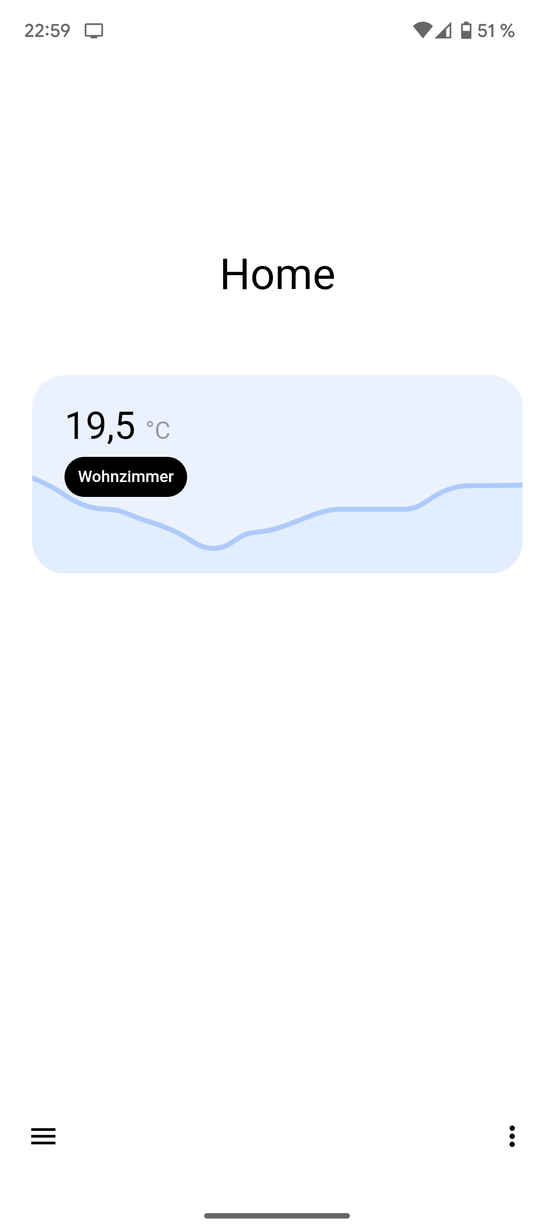
“Swipable” Graph card
This is a combination of the pre-installed Custom swipe card ****(by Bram Kragten) and the standard sensor card. Because we are going to style the standard sensor card, we will use card-mod. Card-mod offers two ways to style the cards. The first is directly in the code of the card, and the second is by adding a CSS class to the card and styling it from the Rounded.yaml. Since we are going to use the sensor card multiple times, it is more convenient to choose the second method. But first, let’s take a look at the code for the card. Currently, I have three temperature sensors in different rooms, and I place all three in the custom swipe-card. Then, I added some parameters to the custom slide-card so that all spacings and margins are correct. Feel free to check out the Github repo of the custom swipe-card to add other swipe effects if you like. I personally prefer the default effect.
type: custom:swipe-card
card_width: calc(100% - 48px)
parameters:
  centeredSlides: true
  slidesPerView: auto
  spaceBetween: 16
  initialSlide: 0
cards:
  - type: sensor
    entity: sensor.aqara_multi_sensor_woonkamer_temperature
    hours_to_show: 24
    detail: 1
    graph: line
    name: Woonkamer
    icon: none
    card_mod:
      class: graph
  - type: etc.. (copy the sensor card above to add more)
So now that we added the cards, we need to style them. As you can see, we added a card-mod class named ‘graph’ to each sensor card. Let’s now go back to our Rounded.yaml and add this code below the already placed code. Don’t forget to replace or remove the font declaration.
card-mod-theme: Rounded

  card-mod-view-yaml: |

    hui-masonry-view:
      $: |

        /* Swipe-card full width on mobile */

        @media screen and (max-width: 599px) {
          #columns .column swipe-card {
            margin-left: -4px;
            margin-right: -4px;
          }
        }

  card-mod-card-yaml: |

    .: |

      /* General changes */

      ha-card {
        transition: none !important;
        font-family: 'custom font, otherwise remove this line', 'Roboto', sans-serif !important;
      }

      /* Graph card style */

      .graph {
        background: var(--blue-tint);
        display: flex;
        overflow: hidden; /* Temporary fix for graph overflow bug */
      }

      .graph .name {
        font-size: 12px;
        line-height: 18px;
        background: var(--black);
        color: var(--white);
        padding: 6px 10px;
        border-radius: 100px;
        z-index: 1;
      }

      .graph .icon {
        display: none;
      }

      .graph .info {
        margin-top: 0;
        padding: 24px 24px 0 24px;
        order: 1;
      }

      .graph hui-graph-header-footer {
        order: 3;
      }

      .graph .header {
        padding: 0 24px;
        order: 2;
        margin: 4px 0 -16px 0;
        z-index: 1;
      }
Reload the theme
- Go to Developer Tools → Services.
- Run the service named ‘Home Assistant Frontend: Reload themes’.
The sensor cards should now be styled.
Scene buttons

Next on the list are the scene buttons. In our household, we often use a couple of scenes, which is why we have given them a prominent place. The buttons are created using custom button-cards in a grid card.
columns: 4
type: grid
cards:
  - type: custom:button-card
    icon: mdi:sofa-single
    aspect_ratio: 1/1
    tap_action:
      action: call-service
      service: scene.turn_on
      haptic: medium
      service_data:
        entity_id: scene.gezellig
    styles:
      card:
        - border-radius: 24px
        - background-color: var(--blue)
      icon:
        - color: var(--black)
  - type: etc.. (copy the custom button-card above to add more)
Light cards

These are also in their own grid card with 2 columns, but for clarity, I will only focus on the light card. The light card is a combination of the custom button-card and the my-slider-v2. The light cards have three statuses: on, off, and unavailable. Hence, value and if statements are used to check if the lamp is available and then whether it is on or off. Clicking on the cards turns the lamp on or off, and a hold action opens the more-info modal screen.
type: custom:button-card
name: Studeerkamer
icon: mdi:track-light
entity: light.studeerkamer_groep
tap_action:
  action: toggle
  haptic: medium
hold_action:
  action: more-info
  haptic: medium
custom_fields:
  slider:
    card:
      type: custom:my-slider-v2
      entity: light.studeerkamer_groep
      colorMode: brightness
      styles:
        container:
          - background: none
          - border-radius: 100px
          - overflow: visible
        card:
          - height: 16px
          - padding: 0 8px
          - background: |
              [[[
                if (entity.state == "on") return "linear-gradient(90deg, rgba(255,255,255, 0.3) 0%, rgba(255,255,255, 1) 100%)";
                else return "var(--contrast4)";
              ]]]
        track:
          - overflow: visible
          - background: none
        progress:
          - background: none
        thumb:
          - background: |
              [[[
                if (entity.state == "on") return "var(--black)";
                if (entity.state == "off") return "var(--contrast20)";
                else return "var(--contrast8)";
              ]]]
          - top: 2px
          - right: '-6px'
          - height: 12px
          - width: 12px
          - border-radius: 100px
styles:
  grid:
    - grid-template-areas: '"i" "n" "slider"'
    - grid-template-columns: 1fr
    - grid-template-rows: 1fr min-content min-content
  card:
    - font-family: In case of a custom font, otherwise you can remove this line
    - background: var(--contrast2)
    - padding: 16px
    - '--mdc-ripple-press-opacity': 0
  img_cell:
    - justify-self: start
    - width: 24px
  icon:
    - width: 24px
    - height: 24px
    - color: var(--contrast8)
  name:
    - justify-self: start
    - font-size: 14px
    - margin: 4px 0 12px 0
    - color: var(--contrast8)
state:
  - value: 'on'
    styles:
      card:
        - background: var(--yellow)
      icon:
        - color: var(--black)
      name:
        - color: var(--black)
  - value: 'off'
    styles:
      icon:
        - color: var(--contrast20)
      name:
        - color: var(--contrast20)
Colored light cards
Thanks to @StickyClient we also have a light card variant for colored light bulbs!
type: custom:button-card
name: Desk
icon: '[[[ return entity.attributes.icon ]]]'
entity: light.desk
tap_action:
  action: toggle
  haptic: medium
hold_action:
  action: more-info
  haptic: medium
custom_fields:
  slider:
    card:
      type: custom:my-slider-v2
      entity: "[[[ return entity.entity_id ]]]"
      colorMode: brightness
      styles:
        container:
          - background: none
          - border-radius: 100px
          - overflow: visible
        card:
          - height: 16px
          - padding: 0 8px
          - background: |
              [[[
                if (entity.state == "on") return "linear-gradient(90deg, rgba(255,255,255, 0.3) 0%, rgba(255,255,255, 1) 100%)";
                else return "var(--contrast4)";
              ]]]
        track:
          - overflow: visible
          - background: none
        progress:
          - background: none
        thumb:
          - background: |
              [[[
                if (entity.state == "on") return "var(--black)";
                if (entity.state == "off") return "var(--contrast20)";
                else return "var(--contrast8)";
              ]]]
          - top: 2px
          - right: '-8px'
          - height: 12px
          - width: 12px
          - border-radius: 10px
styles:
  grid:
    - grid-template-areas: '"i" "n" "slider"'
    - grid-template-columns: 1fr
    - grid-template-rows: 1fr min-content min-content
  card:
    - font-family: In case of a custom font, otherwise you can remove this line
    - background: var(--contrast2)
    - padding: 16px
    - '--mdc-ripple-press-opacity': 0
  img_cell:
    - justify-self: start
    - width: 24px
  icon:
    - width: 24px
    - height: 24px
    - color: var(--contrast8)
  name:
    - justify-self: start
    - font-size: 14px
    - margin: 4px 0 12px 0
    - color: var(--contrast8)
state:
  - value: 'on'
    styles:
      card:
        - background: |
              [[[
                  var color = entity.attributes?.rgb_color;
                  if (entity.state != "on"){
                    return 'var(--contrast20)';
                  }
                  else if (color){
                    return 'rgba(' + color + ')'
                  }
                  else{
                    return 'var(--yellow)'
                  }
              ]]]
      icon:
        - color: var(--black)
      name:
        - color: var(--black)
  - value: 'off'
    styles:
      icon:
        - color: var(--contrast20)
      name:
        - color: var(--contrast20)
Brightness and temperature sliders

This is specific to my scenario, but the top four lights are all in the living room. Instead of adjusting the brightness for each lamp every time, I have created a general slider for the brightness and temperature that only adjusts the values of the active living room lights. This can be done using a dynamic group that only contains the active lamps. If you want to know more about this, check out this topic. But let’s take a look at the cards themselves. The slider cards are also a combination of the custom button-card and the my-slider-v2 card.
type: custom:button-card
name: Helderheid
custom_fields:
  slider:
    card:
      type: custom:my-slider-v2
      entity: light.actieve_woonkamer_lampen
      colorMode: brightness
      styles:
        container:
          - border-radius: 100px
          - overflow: visible
          - background: none
        card:
          - height: 40px
          - padding: 0 20px
          - background: var(--brightness)
        track:
          - overflow: visible
          - background: none
        progress:
          - background: none
        thumb:
          - background: var(--black)
          - top: 2px
          - right: '-18px'
          - height: 36px
          - width: 36px
          - border-radius: 100px
styles:
  grid:
    - grid-template-areas: '"n" "slider"'
    - grid-template-columns: 1fr
    - grid-template-rows: 1fr min-content min-content
  card:
    - font-family: In case of a custom font, otherwise you can remove this line
    - background: var(--brightness-tint)
    - padding: 16px
    - '--mdc-ripple-press-opacity': 0
  name:
    - justify-self: start
    - font-size: 14px
    - margin: 4px 0 12px 0
    - color: var(--contrast20)
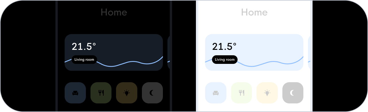
Home screen lay-out
As you could already see, my ‘Home’ screen consists of:
- Title card
- Graph card
- Scene buttons
- Grid of lights in the living room
- Sliders of the living room lights
- Grid of other lights around our apartment
However, the layout is still a point to dive deeper into. The brightness and temperature sliders are linked to the top grid of four lights by means of an overarching grid card. This ensures that there is a minimal margin between the slider and the top grid and a large margin between the slider and the bottom grid. To make it a bit clearer, I have visualized the structure.